
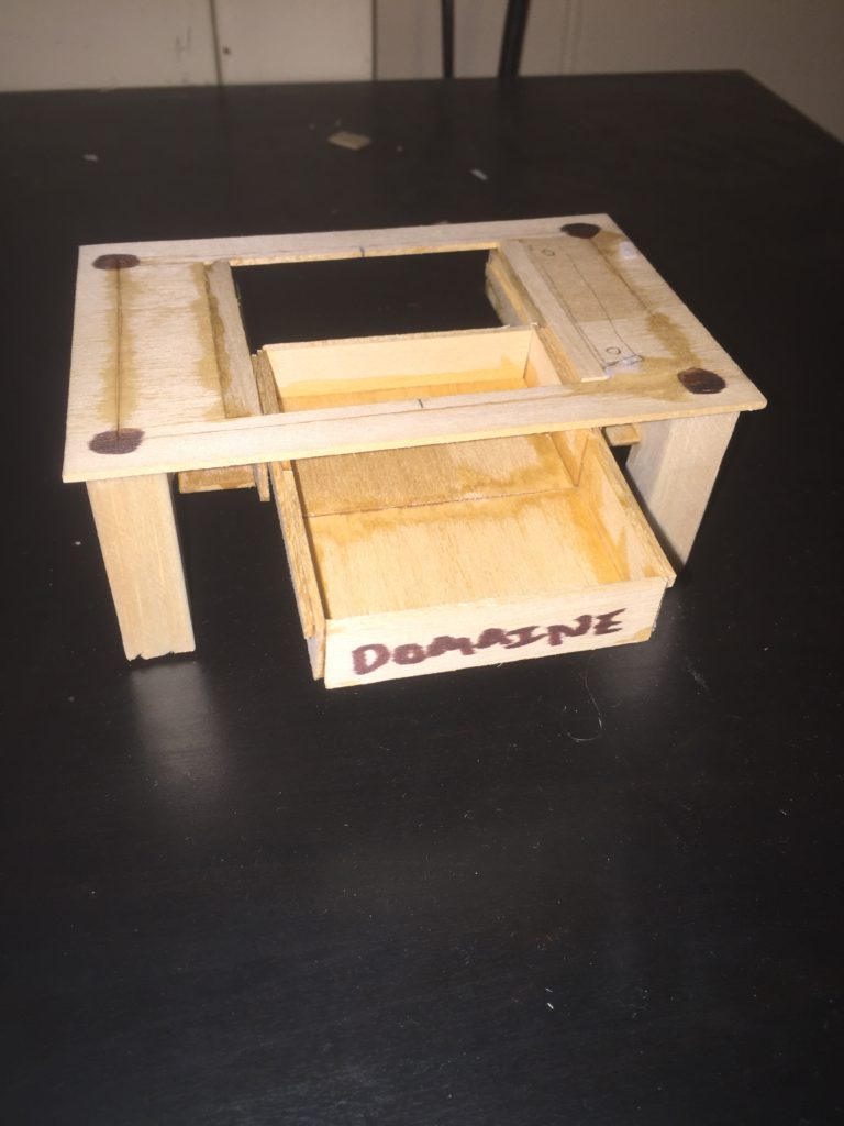
If I had to base my aesthetic of “vineyard theme” off a 20th Century Aesthetic I would say that it fits closely with Organic Design. I want my coffee table to look like it is very natural and made completely of wood and other naturally occurring materials such as cork. The oak wood should be left the same color and only be clear coated as a protection from spills and dirt. Here are a few pictures of my prototype for reference:


If I had to experiment by changing my aesthetic to a wildly different one, here is how I would change my design:
Spaghetti Western Wine Coffee Table

The legs of the coffee table would be shaped just like cowboy boots and even have spurs to go with them. The drawer knobs and top of the table designs would all be cut out of thin but weathered iron. The cup coasters would be the shape of stars and the large design in the center would be a string of sausages that are in the shape of a horseshoe. Wine would still be stored in the drawer below.
“De Stijl” Wine Coffee Table


This table would be the same basic design but it would be painted to match the theme of the famous dutch artistic movement “De Stijl”. The drawer handles would also be thing long handles to match the rectangular design. I also would make the table coasters squares instead of circles to continue with the theme.
Art Deco Wine Coffee Table

This last design would have an Art Deco aesthetic. The legs of the table would be flush with the top which would mean the table top would have this notched top, providing the table with a unique pattern. The cross pieces in the middle would have a glass cut out surrounding them. The drawers would not be rectangular but instead would be slanted which would be very unique.
https://www.google.com/search?q=de+stijl&rlz=1C1CHFX_enUS555US555&espv=2&source=lnms&tbm=isch&sa=X&ved=0ahUKEwizksj_5evSAhUH04MKHR1ZB6YQ_AUIBigB&biw=1707&bih=844#imgrc=tuQC04cPMMcC_M:
2 Comments. Leave new
Great use of color on the De Stijl sketch. Most people don’t include colors in quick sketches, but you need those primary colors to convey the De Stijl aesthetic. As a twist on the De Stijl design, you could have made the colors more representative of the different kinds of wine (red or white).
I really like this idea. I used to live on the Central Coast in California, and went to wineries almost every weekend, so I saw a ton of interesting wine holders from all different eras and aesthetics. Whatever you decide to make, it will be a hit because it can hold wine!
You should try to use different types of wine (red, white) and different color bottles to be a part of your aesthetic. Maybe you can have the colored bottles be the glass you were looking to put into your project. In order for the aesthetic to look correct, you’ll have to keep the wine rack fully stocked (Which isn’t a problem).