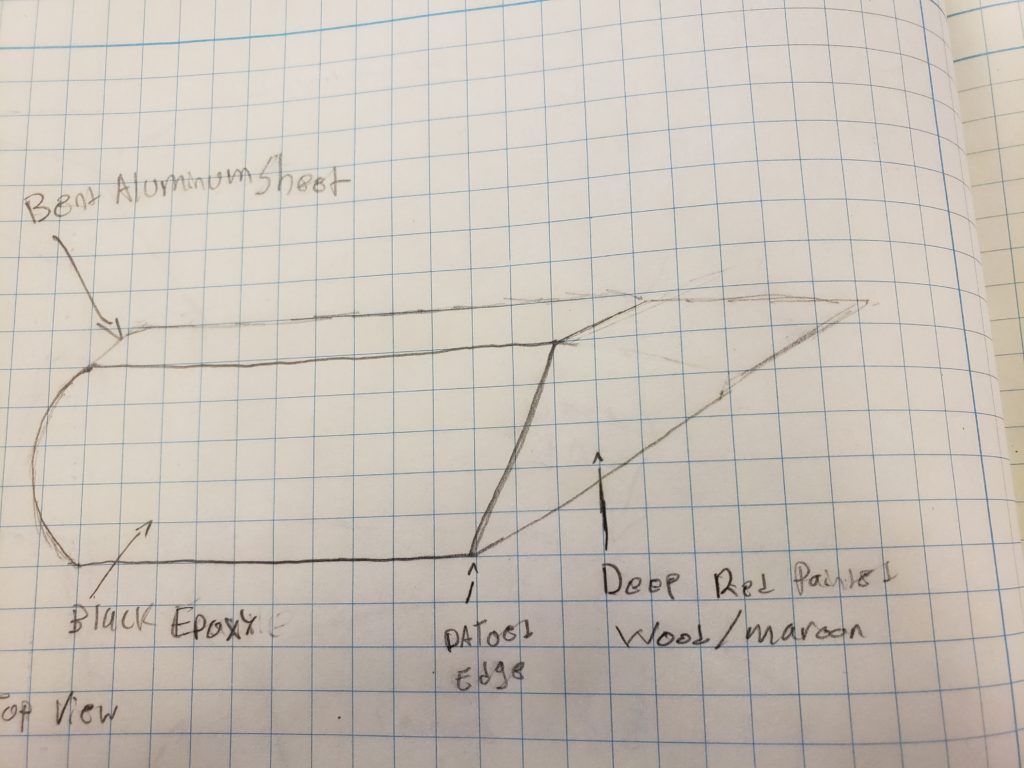
When considering 20th-century design movement comparisons, my clock is most similar to Italian Futurism. This is actually the aesthetic I am trying to portray with my current design, shown in the featured image. The main aspect that I feel portrays this aesthetic is the front panel. I purposely shaped this like the profile of a plane due to the importance of planes and other machinery in Italian Futurism. This aesthetic is also portrayed through the multiple geometric shapes present in the design and the materials used. The top, left side, and bottom of the clock will be made with bent aluminum sheet, while the right side and back will be wood painted a lively red. I chose aluminum due to the popularity of industrial material in this design movement, additionally, the red wood will provide a “pop” of color that was commonly seen in futurism art. The clock utilizes many strong lines and converges to a singular point in the back. I believe this contributes to the aggressive nature of the design style.
As a means of exploring additional 20th-century aesthetics, I have created sketches of the clock designed in three very different styles. In all these designs only the black epoxy front is shared. I chose to do this because I fell this piece of the clock is vital to the functionality and to the original idea of the clock. The sketches plus brief descriptions are included below.

The clock in style of art deco
The first style I chose to explore was art deco. The pieces of this design that portray this style are the sides and corners of the front face. Both, the areas are decorated with geometric patterns made out of brass. I chose to shape the clock like a cascading staircase because I fell this also contributes to the art deco aesthetic due to its geometric look.

The next style I chose to explore was the streamlined aesthetic from 1950’s America. To portray this aesthetic I employed a curved black epoxy front and top with metallic sides. Both these materials were very common in streamlined pieces. While not illustrated great I intended the front face of the clock to be streamlined and curved in a similar fashion as some of the cars at the time. This was done to invoke a feeling of speed.

Contemporary minimalism clock
The last style I chose to explore was contemporary minimalism. This was actually one of the first designs I had for the clock, but due to the prevalence of this style in today’s design, I decided to go a different route. This aesthetic is portrayed using basic rectangular shapes and easily accessible materials. The front is once again made out of black epoxy, but the back is simply a dark stained wood. The purpose of this design is to first and foremost be functional. How the piece looks and any decorative details are an afterthought.


1 Comment. Leave new
You’ve got some pretty cool sketches. I especially like that the art deco clock is shaped like a staircase. I appreciate that you avoided a particular aesthetic for you final project due to its prevalence in design today. It would be nice if architects and product designers would do the same thing once in a while.