Comparison to 20th Century Design: Fiber Optic Clock
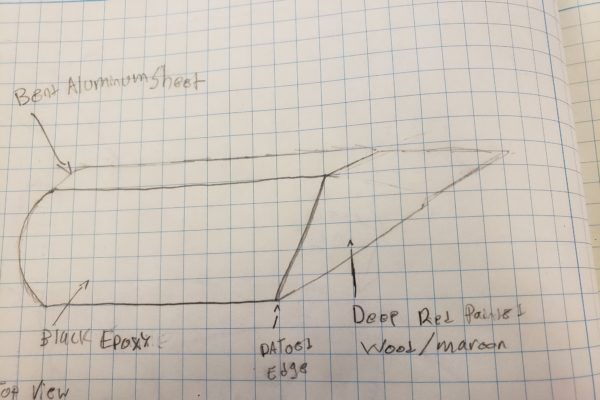
When considering 20th-century design movement comparisons, my clock is most similar to Italian Futurism. This is actually the aesthetic I am trying to portray with my current design, shown in the featured image. The main aspect that I feel portrays this aesthetic is the front panel. I purposely shaped this like the profile of a … Continue reading Comparison to 20th Century Design: Fiber Optic Clock
1 Comment