
For my upcycle project, I wanted to capture the aesthetic of the 20th century graphic artist M.C. Escher. I also wanted to try my best to constrain my artifact with actual recycled material I had in my apartment. I think this added to the overall Upcycle aesthetic of the project, but it ultimately cost me a lot of the nice perspective I was going for. I’ll explain more of this later, but for now here’s more about Escher if you don’t know much about him.


Figure 2
Figure 1 is Cycle made in May of 1938 by Escher. I really enjoy how the caricatures morph into the cubes on the left side. I also enjoy how the colors and shapes contrast the semi-complex transformations on the opposite side of the scene. Escher was a Dutch artist who lived from 1889-1972, and he’s most famous for his graphic art (like Cycle) that twisted perspective in a revolutionary way. Escher started out like most artists at his time, painting realistic snapshots of reality as close as he could. However, if you lined up most of his early work end to end, you can see the art slowly distorting and twisting as he adds his own personal style. My original project was remaking Cycle with Escher’s old style in 2D, but I wanted to challenge myself to use the recyclable materials in a creative way, so I ultimately decided on recreating some of this picture in 3D with 2D “Escher” perspective. At first, I thought I could try to make it as close to 1:1 in terms of the amount of shapes and buildings, but I decided that I wanted to simplify this scene. I ended up making a CAD model that roughly resembles the shape of what I wanted to attempt to build, and my final project’s shape is actually very similar to it.

![]()
![]()
Figure 3
![]()

Figure 4
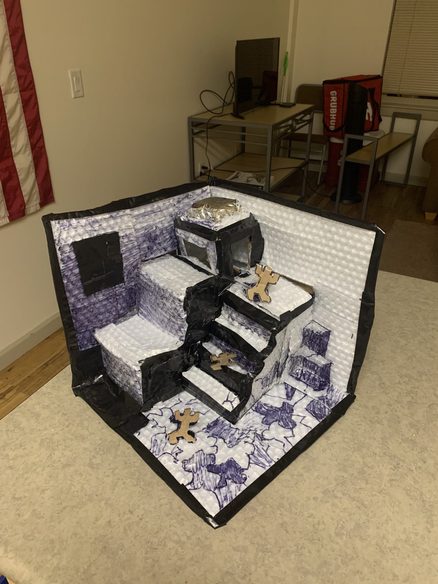
I started out with the HelloFresh box and the reflective bubble wrap that it came with. To my surprise, the inside of this material was white, so I thought it would be a cool idea to totally recycle this package including the bubble wrap. This is where the vision of my artifact was finalized. My project will be made as 3D as possible, and then I can use the white bubble wrap to draw on for any perspective. The functional goal will be for the perspective to only match up when viewed from a 45 degree angle. The artistic goal is for me to make this project with constraints on the materials I can use. It turns out that the only way to draw a semi-straight line on the bubble wrap is with a marker. I tried every other way to color it, but paint just pooled at the bottom of the bubbles and ran off the plastic, and every other tool just didn’t show up on the plastic lining. I also only had tape in my house, so I couldn’t use glue. These two factors were the biggest constraints I gave myself, and they are responsible for most of the hardships while making this.
![]()

Figure 5

Figure 6

Figure 7

Figure 8
I made the basic shape of the platform out of cardboard and tape. I was okay that this part looked bad because it was going to be covered anyway, and the way I taped it made it easy to take the different carboard modules out for work and repairs. I then tried to staple the bubble wrap to the cardboard, but the bubble wrap was just a little bit too thick. I could only use staples in a couple places, and for the rest I used the tape. This is the part that I was not okay with looking bad, so I tried to make everything line up in a somewhat reasonable fashion. I put the bubble wrap on in sections so I could replace them easily if they weren’t drawn on right. I had to use a Sharpie to keep the bleeding of the ink to a minimum, so any mistakes I made meant I had to throw away that piece. I made a lot of mistakes while drawing, and working with the bubble wrap in general, so I’m glad that I constructed it in this way.

Figure 9

Figure 10

Figure 11
An example of this is in the cube corner. This is the part of my project I really did not want to look bad. My goal is to draw these three cubes on three different planes with perspective. If you ignore the Sharpie chicken scratch, Figure 9 shows that the lines don’t align anymore, which meant I needed to redraw the cubes. I took the stair section of the piece off and replaced the lining so I could redraw my cubes. The final result isn’t completely straight, and the shading isn’t perfect, but it kind of works. The reason the marker looks so funny is because I wanted to try to use it as shading, so the black parts would be fully marker and the grey parts would be less shaded marker. This did not work at all, and I should have used the black duct tape as shading for the whole project instead of just for the side of the staircase. However, the tape and the plastic did not like each other, so crafting little fine details in tape for perspective was impossible in the end.
![]()
![]()

Figure 12

Figure 13
The final result of my artifact is close to what I had in mind, but not perfect. I think that the tape did add an element to it, and I enjoy the black frame around the edges of my project. I should have used glue for everything else. Also, the bubble wrap was a nice idea in theory for the upcycle part of the project, but I think it ultimately took away from the overall aesthetic of the whole thing. The marker on the bubbles was too clunky for shading or drawing straight lines in general. If I were to to make this again, I would use white cardboard or cover it in construction paper. Other than that, I am proud of the perspective I was able to achieve, specifically with the cube corner. This means I was able to fulfill my functional goal completely, but only partially fulfill my artistic goal if I’m being honest. I will use the lessons from this, like giving more time for prototyping and more time for testing the shading, to make my future projects better.
2 Comments. Leave new
I think your final project turned out amazing, and I feel that it really captured M.C Escher’s aesthetic really well. The contrast was really nice between the black and the white, however my favorite part of your project was adding the 3D texture with the bubble wrap. To me it still feels like M.C Escher aesthetic but fully its own in the 3D setting. Overall fantastic work.
Bryce, I think this was an awesome idea for a project, and it ended up looking super cool! I think you were destined to have problems as soon as you chose M.C. Escher, but handled it really well overall! I can definitely see the inspiration in your final product, especially when viewed at certain angles like you mentioned. I also really like that you tried to use exclusively materials you found in your apartment, as I think this really adds to the Upcycle spirit. In the end, do you think it was worth it to pursue a 3D project rather than 2D? Great job on this project!