
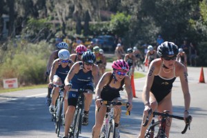
As a competitive triathlete and avid cyclist, I thought it would be a fun project to make a bicycle chainring clock. What motivated me in this project was not only my love of anything to do with bicycles, but the fact that I am graduating this Spring and I wanted to give my collegiate coach a present to remember the four years I have spent here with the CU Triathlon Team. I am definitely a gift giver and it’s one way I like to show my love and appreciation of others.
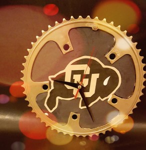
The aesthetic I am aiming for here is both school representation/pride, sports, and simplicity. The pin at the top of the clock serves as the 12 0’clock position and the rest of the times can be determined from the teeth on the clock. I am also proud to be a CU Buffalo, so I wanted to show my pride in my project by using school colors. I spray painted the chainring gold and pasted a picture of Ralphie as the background image to the clock.
I spent a long time simply trying to figure out what project I wanted to do. I am a passionate individual, so it was important for me to find a project in which I feel passionate about and enjoy the process of working on it. I did a lot of exploration on the internet and also went to a few art stores to see if they offered me any inspiration. I left every store empty handed and more unsure of what I wanted to do. My older sister was the person who initially gave me the idea of making a bicycle wheel clock, but I wanted to make something smaller and easier to carry around, so I thought “what about making a chainring clock?!” I spent much time on websites like pinterest to see if this had been done before, and luckily it had been. I am not excellent when it comes to electronics, so I decided that I would use the electronic components from a clock that was already together.
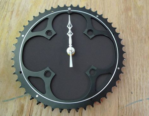
This chainring below is very similar in design to mine. I liked the matte black look and simplicity of this clock, however I didn’t really feel like there was much emotion or spirit put into this clock. I decided to look at alternatives in which I could incorporate the black background look and simplicity of the clock which I liked.
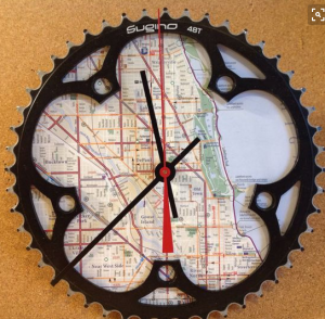
Next I found this clock, and it really sparked interest in me. As an cyclist, we are consistently trying to find new routes. I love analyzing the map of Boulder with my friends and trying to come up with a new route we can ride. I then thought it would be a great idea to incorporate a map into the background of the chainring, however, this design seemed like it added too much complexity and made the times more difficult to read.
I finally had my ah-hah moment when I realized that I could express my Boulder pride by including a buffalo and then keep the matte black background and simplicity I was going for. This is what I came up with. Gold and black! Let’s go Buffaloes!
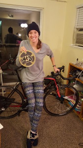
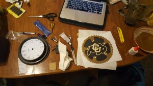
I used a pencil to trace out the shape of the inside of the chainring, so I knew what size cardboard I needed to cut out. I then used a knife and tried to cut out the shape to my best ability. I then glues the cardboard to the chainring using E6000 glue and then glued black construction paper on the cardboard. I also want to note that the cardboard I used on this project is from the box that the actual clock came in. The greatest challenge on this project was being very careful while taking apart the electrical components, the motor, and hands of the clock and reassembling it on my mount. Initially the clock wasn’t working because there is a specific orientation that the arms need to be put on the pin, and also I bent them a little because they are fragile so I needed to bend them back into a straight position and I think it turned out pretty well!
My aesthetic vision was successfully achieved in that I wanted to create a clock that matched the Colorado Buffaloes school colors, showing my pride. I also wanted to have a black background, so that it could serve as a contrast and match the black and gold buffalo which I wanted to put in the middle of the clock. Initially, I was hoping to have a smaller buffalo in the middle of the clock and then to somehow incorporate mountains in part of the design, but I decided to go with the simpler look. I also initially was thinking of going for a matte black chainring color, however, my sister suggested that I spray paint it gold. The gold color provided a perfect mix of colors for the chainring, and I am glad that I followed her advice. I was aiming for a functional aesthetic in the respect that it is a working clock, easy to read and well centered. I was able to achieve a number of the functional aesthetics that I wanted. however, it was more difficult than I expected it to be to center the clock. I maybe should have done a better job of measuring where the center of the chainring lies.
My team came up with the following design process shown below. The process that we came up with was fairly linear, which is definitely ideal but not realistic for a typical engineering project or any project for that matter. 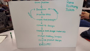
My actual design process was the following. Though the pattern appears to be linear, it wasn’t. It took a lot of time and effort for me to simply find a design and commit to it. Then it was difficult trying to decide aesthetically and functionally what I wanted for the design. When I made up my mind, I committed and went for it.

47 Comments. Leave new
You did a really good job. It’s impossible to tell that you bent the clock hands at all. If you make another, you could try to find a 4 bolt chainring, putting the bolts at 12, 3, 6 and 9 respectively.
The simplicity of this clock really brings out a minimalistic beauty in your project! The gold spray paint is a fantastic touch with the CU buff logo! Your coach is going to love it!
The gold chainring looks great with the buffalo in the background, I’m sure your coach will love it.
Go Buffs! Enjoyed that your project was a gift. It was really good to see that you had included the design loop for your project.
Very professionally done. I like the gold plate effect, it really adds a nice touch.
I like how you painted the chainring gold. It’ll make a really fun gift for your coach, great idea!
I actually like how it looks with the map (before you printed it). I would definitely like to own this clock. Can this have a stand or it has to be on the wall? Otherwise it’s a great idea and I think it is going to be a great gift to your coach. Color the hands of the clock so we can see the time.
The color scheme looks good, especially for showing your school pride. I like how simple the design is. Nicely done!
I think your coach will appreciate and like your gift given that it is specially made with care to details, nice work.
This came out very nicely, love the CU colors.
It looks very clean and simple. There is something very nice about not having a very busy clock but at the same time, I feel like something more could be added. However, I could really see on the shelf at a store somewhere to purchase.
The chain ring actually gives a nice industrial aesthetic. I wonder if you would be able to do the same thing with a full cassette of chain ring to give a 3D effect. I was thinking that it would be interesting if you could make the image in the center interchangeable, and use the screw holes on the chain ring to clamp together a clear piece of plastic. Nice work!
Very finished look. I like the paint job to the gear to get the colors to align with CU colors. Also great job problem solving to fix the arms of the clock when they broke. Engineering at its finest!
The gold paint came out nice! I think it will be nice gift especially since you trained on that chainring.
It is great that your coach is such an inspiration. I like the simplicity and CU logo in the center. I might opt for numbers or gold hands on the clock as the black hands blend in with the background and are a little tough to see. Great job!
Fantastic clock and execution of a simple minimalist aesthetic! I really like the school pride look as well. Is the pin a bike part or just a push pin? I think different color hands would help them contrast against the face better.
Great Buff aesthetic– the gold paint on the chainring looks awesome!
I like the the swatch watch – no number aesthetic. I’m sure your coach will be on time from now on.
I’m glad you added your own flare with ralphie, hopefully athletics doesn’t protest.
Great concept! Looks great. Did you consider using bike components to make the clock hands too?
I like the look without numbers- it looks more like art like this! the Buff in the middle is cool- how’d you find a graphic that fit?
Awesome job!
Very cool. I like the finish you added to the chainring. Maybe add a few numbers to more easily tell the time?
The final product looks very polished and professional. Glad you decided against putting numbers on the face of the clock; the minimal design looks great.
That’s super cool! I love the school pride. Its definitely nice to make your own school swag since all of it is so expensive!
Love the clean look of the whole thing: the design is neatly implemented. There is just enough flair with the CU logo and chainring, but it doesn’t distract from the function of the piece.
Thanks for including me in your video haha. I’m glad you figured out why it wasn’t working at first! The absence of numbers keeps it simple and sleek looking
The clock looks amazing! I am impressed by how well you were able get the ascetics down. I would recommend making the clock hands bigger and a different color since it is hard to read from afar.
Way to use your passion as an aesthetic! I really like the whole mechanism and Boulder feel.
Very cool idea, I think your coach will love it, especially because you ended up with a professional looking project.
I’m sure your coach will love it! Very thoughtful and symbolic.
Great use of old bike parts, like the simplicity of the finished product, looks very clean and well built.
Really like the simplistic look. Even though you used recycled materials, it came out looking really slick and professional. Did you consider making a stand for it so that your coach has more options on where to put it?
The book store should sell these! Is the back of it durable in the event that it gets poked or dropped slightly?
It looks really well done! Good work keeping it simple and visually appealing.
I like the matching color schemes! The red hand adds nice offset to the gold and black and gives it a very professional look. I agree that leaving off the numbers was a good choice. It makes it very clean, good job.
I really like the map clock, but the CU logo is nice too, especially with the gold chain ring. It would be an interesting idea to color the teeth at the different times, so at the 1 position, maybe 1 tooth is painted black, and at the 2 position, 2 teeth are colored and so on.
The clock turned out looking way cool. Go buffs!
There are so many things that I like about! I love that you represented CU Boulder and that you were inspired by your track coach. Plus it is very aesthetically pleasing and something that I would use in my house.
Turned out really good and I like how it has meaning too
I love that you created a project using your passion. It turned out great! I hope your coach loves it!
Clean cut, very cool looking. Is there a way to hang it (some kind of attachment)?
I think this turned out really well with the gold chain ring. Looks a lot more put together than a lot of the bike clocks you see out there. Also, fantastic gift idea! I agree that that can help motivate you during a project.
That clock would definitely sell in the bookstore, it looks really well done.
I really like the aesthetic of your clock. The colors match your CU aesthetic and I like that it is a combination between your love for CU and bicycling. Great job!
I love the motivation behind your project! Overall it looks very clean and beautiful and well done!
Fantastic work so far, Brittany!! It looks fantastic! It would be awesome if you had a spare chain to attach somewhere and hang off to make it look like a mechanical clock similar to this: http://www.dcwstore.com/media/Antique-Replica-Designer-Clocks/Kassel-retro-style-black-forest-cuckoo-clock-HHCC.jpg
This looks so good! I can’t wait to see the finished product!
As a bike racer myself, I absolutely loved this whole idea of a chainring clock. I also loved your personal touches that I wouldn’t have thought of myself such as using the positioning bolt on the chainring for the 12 O’clock position. Yay bikes!