
Aesthetic Exploration: Aesthetics of Apple
![]()
Sleek, sexy, contemporary design is the cornerstone of Apple. From Macs to iphones, Apple has defined contemporary aesthetics for its products, making it the most valuable company in the world (www.finance.yahoo.com, “Can Apple Hold Its Place as World’s Most Valuable Company Again in 2017?” January 3, 2017). Once a fledgling computer software and hardware business trying to compete with software behemoth Microsoft and hardware giant IBM, Apple was formed April 1, 1976 according to Apple.com. In 2007 the iphone transformed the market and the company.
Visionaries who pioneered the transformation include high school friends Steven Jobs and Steven Wozniak. Since its inception, apple has influenced everything from operating software to products such as the iphone and transformed an industry with superior aesthetically designed products.
Defining attributes of Apple aesthetics include:
-Clarity and brightness of colors
-Sleek styling with rounded edges, smooth surfaces (non-textured anything), shiny, a cool color palette for the base materials like white and silver.
-High quality materials compared to competitors: plastics, glass, and metal which allow slim, thin, non-bulky, lightweight design with a superior feel.
-Forefront of technology with touchscreens, for example, the iphone when the standard was a Blackberry with a keyboard.
Below Images and Captions are courtesy of:
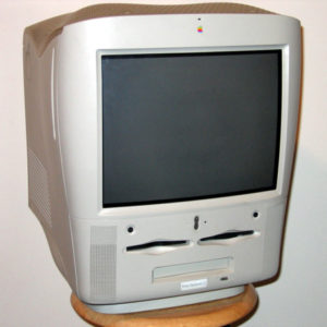
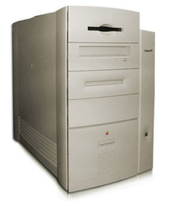
POWERMAC G3 ALL-IN-ONE – 1998
These were sold to the educational market only. Image: Wikipedia
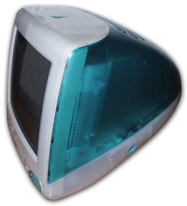
IMAC G3 TRAY-LOADING, BONDI BLUE – 1998
In doing away with the tower and keeping the computing power, Apple completely revolutionized the desktop computer industry. The iMac G3’s were available in a bouquet of various colours. Johnathan Ive, the designer who was later the mastermind of the Cube, designed the iMac G3. Image: Wikipedia
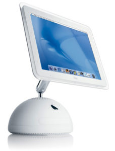
IMAC G4 – 2002
The iMac G4 was produced from 2000-2004 and represents the first iteration of Apple’s desire to “slim down” the components necessary for an out of the box personal computer experience. It was nicknamedthe iLamp because of its swiveling monitor. Image: Marc Burr
POWER MACINTOSH G3 – 1997
The PowerMac G3 was tested and proven to be the fastest desktop computer of its time by Byte Magazine. Image: Wikipedia
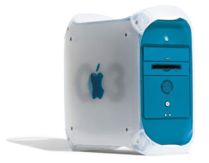
POWERMAC G3 BLUE AND WHITE – 1999
This shared the hardware with its predecessor but little else. The case was redesigned to bring it in line with the new iMac. Image: Apple.com
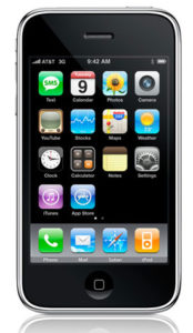
IPHONE – 2007
The iPhone is the cellular phone of choice of nearly every tech aficionado, even winning over BlackBerry fanboys with its touch screen and wide range of cheap and free applications available from the iTunes AppStore. Image: Apple.com
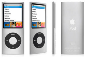
IPOD Fourth Generation – 2008
Image: Apple.com
6 Comments. Leave new
Apple has came to be a prominent logo worldwide. It is a symbol of aesthetics itself. Since apple designs both its products and its stores to be clean, sleek, and aesthetically pleasing, it is very difficult to forget. The design is simple yet elegant.
Scrolling through your post was like having memory after memory come back to me from my childhood. I can still remember a majority of those computers and phones sitting in the various homes in which I grew up. I think its very interesting that apple products have traditionally always stuck with simple, color designs and products with natural curves. To me, it almost feels like the products are being made to match the curvature of the logo itself. In recent years that may not be the case however.
I really like that you chose to write about Apple. I feel that Apple products are so popular now that we often overlook how far Apple goes to ensure the products are aesthetically pleasing. I know that Apple goes to extremes, often making 10+ versions of each iPhone before deciding which design they want to go with. I will say that I think companies like Samsung and Dell are catching up, but I think Apple still takes home the biggest prize.
Apple has a very specific aesthetic and I do believe it played a major role in the growth of the company. I can remember back to my elementary school days when we had those IMAC G3 computers in the computer lab. There were blue ones and orange ones and I think red or pink ones, and those computers were so cool and fun to use. The Apple logo and aesthetic was interesting and not a boring business-type logo that the big name competitors had like IBM and Gateway. Apple really cared, at least until recently, about how their products performed and how they looked. This is a major reason why, at least in my opinion, that Apple is so successful today.
I like that you chose such an iconic symbol to report about. When you think about it, the aesthetic of a logo is everything. If it does not look good, will be people buy your product? The apple logo is a symbol of intelligence and power, because Apple is such a large and growing company. It is interesting that something so simple as an apple could become such a large part of our world. When I look around, almost everyone I know is holding (or wearing) some form of apple. Their design is truly simple yet remarkable.
Katie, this is a great post that shows the interesting evolution behind a legendary and influential company. It is clear that Apple has created a superior product, featuring powerful hardware capable of processing large sums of data in a reliable manner. Additionally, the products are sleek and visually appealing, even featuring cool colors that the user could pick and choose from. To this day, Apple still allows their consumers to pick a limited selection of colors and sizes. Do you think Apple is limiting their user base by only offering a few colors, or do you believe that this limited color scheme is a large part of the aesthetic? When the original iPod mini came out, it was offered in many colors, but this was discontinued on future generations of iPods. Apple will periodically bring these colors back, but not with any consistency. I wonder why their industrial and design engineers have made this decision. Based on the evolution of the current products, what will the aesthetics of the next generation Apple products look like? I think there is a noticeable trend from generation to generation, and the next product will be relatively apparent.
I think this is an interesting post, but I’d like to see a little more on competitors products, such as IBM or Gateway, and the influence that they had on Apple (or vice versa).