
Presentation video privately hosted on YouTube.
When Dr. Hertzberg had mentioned early in the class that having a personal website was a good idea for professional and artistic expression, I kinda shrugged it off… we’ve all got Facebook, Twitter, LinkedIn, etc. Why do I need a website? But the idea stuck with me at least, and later when she explained more of the design project goals I started thinking that it might actually be a pretty cool thing to work on. It would give me the opportunity to do some pretty heavy design work, aggregate other areas of my online presence including artwork I post to Instagram and Society6, as well as provide a professional portal into my past work and personal interests that go beyond a simple resume. It could be targeted to a specific audience and show the best of what I have to offer as a design engineer and creative mind. It will also be the home of a podcast I started with my brother, called Thinkly.
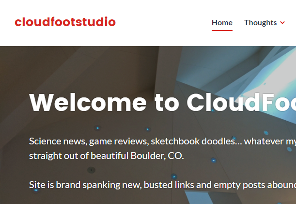
So I hopped in. There are several options I evaluated for hosting the first draft of my website—I compared Wix, SquareSpace, Weebly, and GoDaddy, but WordPress had the best templates and the most intuitive customization structure for page layout and menu organization. So I grabbed a modern template and went for it. I was definitely going for a sort of “helvetica” aesthetic here… clean and intentional sharp lines, distinct (one might say high-contrast) graphical elements, welcoming but professional curves. I don’t know if I’ll actually use the Helvetica font, but I can definitely say it’s been an initial inspiration for the layout and balance of the web design. But I’ve already customized the colors be employing some of my favorite color here… primary greys and blacks, red accents, and most likely a deep blue or black logo.
As mentioned in my Inspirations blog post, because my first name is Luke, since I was very young I’ve received the “I am your father” -type treatment from people who meet me. I don’t think that necessarily had a hand in my affection for Star Wars (engineering minds often enjoy science-fiction), but it certainly gave me the screenname of “skywalker” in early online games like RuneScape and Call of Duty. Later, in college, when I started putting up music and artwork on YouTube and Facebook, I decided use a kind of joke on skywalker—cloudfoot—as the name for my creative endeavors, with “studio” appended. CloudFootStudio was born. I like the rounded edges, the simplicity, the cartoonish and approachable nature of the imagery, and it naturally lent itself to the creation of a clear and unique icon or logo, although I have yet to settle on the precise incarnation of the image.

I was pleasantly surprised at how easy it was to achieve a mobile-friendly layout, as well. This is one of my main constraints, and a fairly common-sense design requirement for any modern website. The template I installed immediately proved dynamic enough to adjust based on the width of the screen on which it is viewed. I just have to ensure that, as I make changes, I don’t introduce any incompatibilities with the interface or overlapping graphical elements. I also have some work to do making entire boxes/regions click through to the links instead of just the text within them.
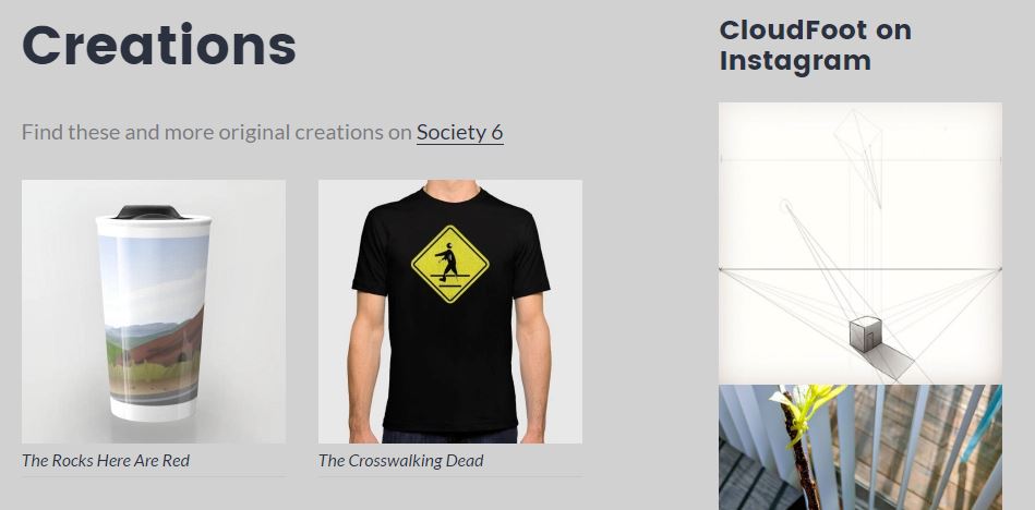
I also knew I needed it to be dynamic, more so than a typical updated-every-now-and-then website might be. So I’m taking a page from my favorite online journals and incorporating Twitter and Instagram directly into the pages appropriate for that content. So first I needed some pages. One of the earliest pages I knew I wanted was something I called Creations to showcase some of the products that I’ve put up on Society6—a site where you upload images, photographs, drawings, designs, etc. and configure them to be put on products such as T-shirts, coffee mugs, wall clocks, or poster prints. I haven’t made a ton of sales but it’s a great way to get some exposure, gain confidence, and even give your family unique gifts by purchase your own products, hehe. Anyway, this page seemed like the ideal location for my Instagram feed, because that in essence is also a set of creations, albeit ones that are more likely to be doodles, photographs, or text images rather than things ready for products and sale. It’s a perfect fit and I’m quite proud of how this technique applies the “dynamic” constraint to web design, especially without be having to go into the web editor and make changes daily or weekly to get anything new to display.
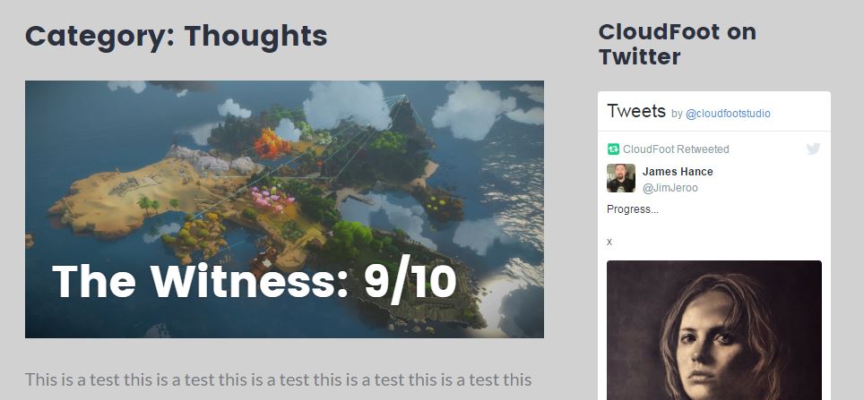
Another dynamic section is my Thoughts page, the home of any posts or reviews of movies, books, videogames, etc. that I feel strongly about. In this page, I can use the WordPress posts feature to upload new content easily when I have something to share. Currently I’ve got a single blog post and some filler, but I anticipate at least weekly additions as well as contributions from my brother and other design-oriented friends who are skilled writers and thinkers. Twitter also belong on this section because—although yes, my posts are often artistic in nature—it is a platform perfectly suited to concise, relevant, or humorous thoughts. Tweets, retweets, and quotes will show up here, which again allows me to update my site frequently and effectively without the effort of making substantive alterations to the webpages themselves.
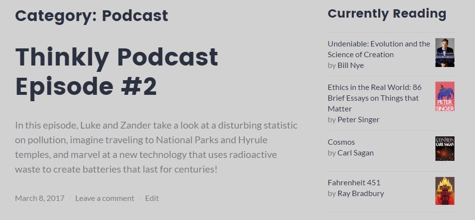
One of my favorite sections I’m calling the Library because it will be the location of my Thinkly podcast that my brother and I record weekly, as well as current literature I’m working my way through. Thinkly is a short (15-20 minutes) podcast about science and technology news, then a section on culture and media, and finally a thought for the week—something either Zander or I was curious about and decided to do some research about to learn a bit more. So far some of the news and subjects we’ve discussed include SpaceX, nuclear reactors, The Legend of Zelda, national parks, and batteries that last for centuries. If you have time, please give it a listen! We’re new to this and sure could use some feedback so we can improve the style and presentation of Thinkly.
Of course there are the obligatory About and Contact sections, but those aren’t really where design is going to come into play. Some of the important decisions I still have to make are: (1) Is there going to be a “professional” or “portfolio” section that shows products I’ve designed? How do I handle IP issues if I decide I do want engineering drawings? Do these belong in any of the existing categories or will they have to go on their own page? Will this clutter up the site? (2) How deep do I want to get into the customization of this site? Is there a way to change the geometry of the page or make entire images clickable instead of just the text? (3) Is WordPress hosting really the most efficient tool for what I want? What if I stumble across another design tool and I want to transition over? Am I stuck where I’m at? Is that a bad thing?
For now I’m extremely proud of the site I’ve created. I think it give a good sense of who I am, what I like to create, and what I’m interested in doing with my time and my future.
Design away!
11 Comments. Leave new
Wahhhh,!! I dnt think its food thats making her tummy groww!!|tiitaBoo|
http://phpscripts.co/
It looks like you’ve put a lot of thought into the design of your website. I love the science-emphasis on the articles and the podcasts and how this site is really representative of who you are. The doodles are a great artistic representation of what you’ve learned in this course and really add to the aesthetic of the site. I think the color scheme is nice, but it’s a bit confusing on the eyes with the “space” shot mixed in with the red and white. Have you considered something a bit more plain for that title image? Maybe a robot or something just to keep the colors simple? Overall, very well done — you didn’t even need a Powerpoint presentation to convey your project.
I like that you’re using this project to further your professional development. Very cool site, and I like how minimalist and modern it is. Its obvious that you’ve spent a long time working on this prototype! One suggestion, be careful not to overcrowd your page. You have a lot of sections and content: it would be best to focus on a specific topic/genre. That way, you’ll attract a better following.
Your design is clean and bold. The color palette is great, and the dynamic content is well chosen. The different sections of your site is entertaining and informational. The domain name is catchy and the font you used is clean and modern. The Material Design aesthetic is spot on.
I like your approach to make a web page as the main project and I personally feel you pulled it off! How do you plan to make it interactive when you display to an audience?
Having a personal and professional website is such a valuable thing to have now, given the digital revolution we are going through. Online portfolios and resumes are becoming so popular and easy to show potential employers. I really like all of the content you plan to have on the site. As far as aesthetics goes, I would be careful with having a white background and bright flash colors as they can be hard on the eyes when you view them for awhile (reading articles or looking through photos). You should do some research on the effects of colors on digital screens on the eyes and see what could be best to use but still looks nice.
I am excited to listen to the podcasts and read the articles you post!
It is always a really good idea to have a personal website. I have created two so far (one required through my major and one for fun/ update my aesthetic). I think it is very smart to make this as your final project, I wish I would have thought of this. Your aesthetic is very consistent throughout, so good job there.
I have a whole book all about css and html if you’d be interested in borrowing it, it is super helpful! I like that your website goes beyond what a personal website usually is. Usually, I see personal websites with just a portfolio, resume and maybe an about me page so all your various entries and subjects are appealing and will be very beneficial, I think!
Making a personal website for our main project is a great idea! Your prototype website is already looking very good and clean. By the end of the semester I can imagine your page being full of content and becoming a useful portfolio you can show to friends, family, and future employers.
You’ve got a wide variety of categories featured in your website. Your podcasts look really interesting. I’ll make sure to check them out. Your doodle section too has some interesting sketches. With that said adding different colors to different sections might give the website a whole new aesthetic.
great idea to create a website for yourself! And it looks really good so far! Having a professional website will definitely set you apart for employer in the future.
Your choice of minimalist aesthetic for your website makes it feel professional. While the standard header image + top right nav bar + top left logo for Bootstrap/Wordpress websites is easy on the eyes, I would like to see a migration away from the standard aesthetic minimalist template. To do this, I suggest experimenting with user experience: how can you make your site more enjoyable to navigate and stand out from the surfeit of blogsites? That will generate more viewers for your site.
The podcasts are really cool and I think add a different touch to your website and make it a lot more personal. The website is very neat and clean. It definitely meets the aesthetic and looks like it’s very easy to navigate.