
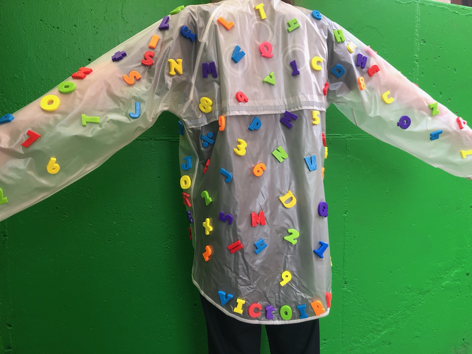
My initial idea was to do something along the lines of up-cycled fashion however I did not know exactly what I wanted to do whether it be a hat, a purse, a dress or pants, etc. I decided to go out to a thrift store to get some ideas. Thrifting is a favorite hobby of mine because you can find the most unique or basic things all for a lowered price! And since someone was going to throw it away anyway at least they can donate their trash to thrift stores so that it can become someone else’s treasure. So I looked around for inspiration, and I stumbled upon a bag of alphabet fridge magnets. I loved the colors and they reminded me of growing up with those on my fridge back in the day.
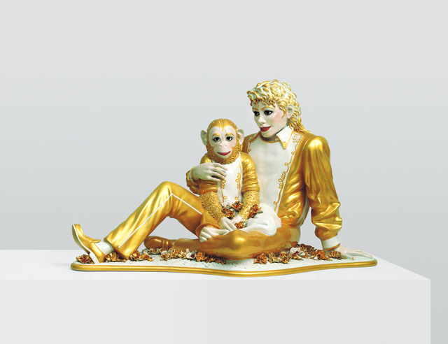
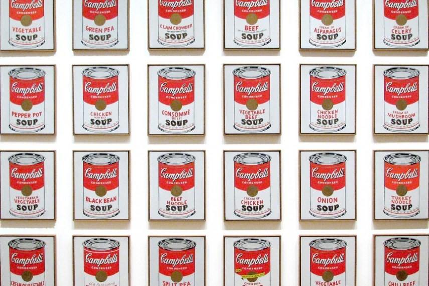
This brings me to my aesthetic inspiration for this project: the art form Kitsch. Kitsch is the German word for trash and is often used to describe cheap, meaningless forms of pop culture/commercial culture. It is identifiable by it’s cheesiness or tackiness, and appeals to popular or uncultivated taste because the forms are often garish or overly sentimental, simply meaning that these objects are considered by other people to be ugly, without style, false, or in poor taste but enjoyed or appreciated by still other people in an ironic or knowing way or because it is funny or recognizable. I believe my jacket is exemplary of the Kitsch aesthetic because it reminds me of my fridge as a child and thinking how fun and colorful the magnets are. I personally love bright colors and while the jacket is made out of materials that other considered trash/donation, I find sentiment and personal fascination. The art pieces below were made by other kitsch artists which have created pieces that are sentimental yet ironic to them and are often perceived by the public as controversial or meaningless (especially Koons’ work). If you are having trouble understanding Kitsch then I suggest reading my aesthetic exploration post on it.
Below is a sculpture of Michael Jackson and his beloved pet chimpanzee Bubbles by the artist Jeff Koons. (https://www.sfmoma.org/read/discussion-questions-jeff-koonss-michael-jackson-and-bubbles/)
Andy Warhol – Campbell Soup Cans. 1962, (https://www.moma.org/collection/works/79809)
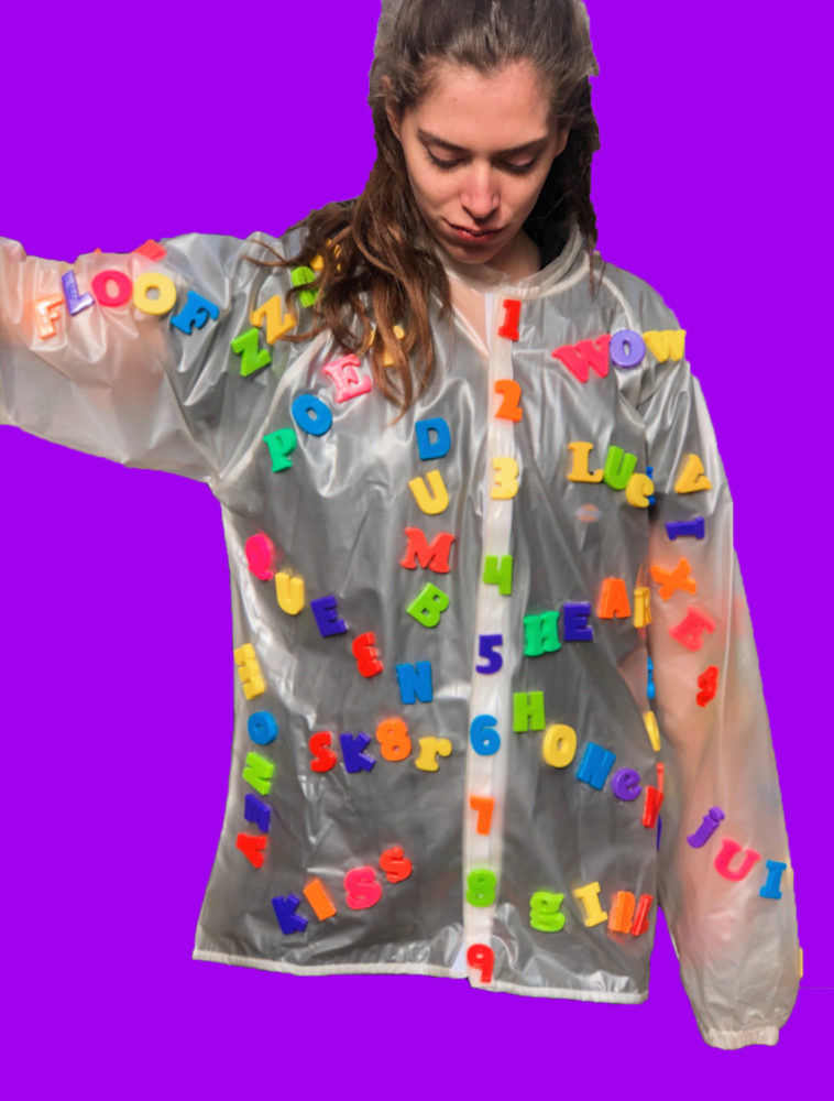
I first laid out the letters how I thought I wanted them which was completely random but then I thought it would be cooler if I made words out of them.
I started making more words and decided to cover the entire front of the jacket with random funny/cute words. I then glued them down with e6000 glue in the orientation I planned.
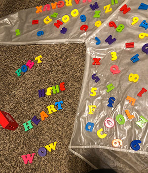
I also had a few number magnets so I made them appear as buttons on the front of the jacket.
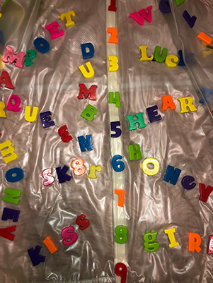
I then glued the rest of the letters, numbers, and symbols randomly all over the back.
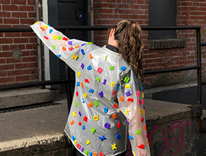
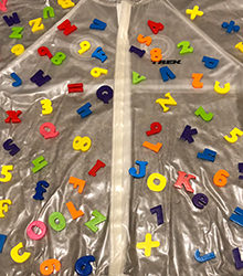
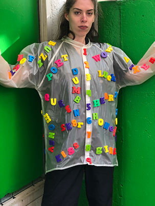
Here are more pictures of the jacket up close!
This is the link to my presentation video on youtube!
6 Comments. Leave new
I like this jacket! I would definitely wear it. I also think you represented the Kitsch aesthetic really well. I like how you used the refrigerator magnets! I am also curious why you used a clear jacket; it looks like a poncho you would buy at Disney World. This question was asked, but I was also curious how you chose the words you did. I think the letters would look great on a white jacket as well as well as matching pants. Great job!
Thanks Daniel! I chose to use a clear jacket because I wanted the lettering to really stand out and also because it also functions as a rain jacket. To be honest I just randomly chose the words. I would also love to make pants if I find more letters and totally white would be really cool!
I really enjoyed this report Victoria. What stands out the most to me is the unique nature of your project. I’ve never seen anything like it so I applaud your originality. In addition to the kitsch aesthetic, I also feel this project exemplifies avant-garde fashion. Does this piece inspire you to do more? If so, what exactly? I think this look would make an interesting series. And this isn’t a huge deal, but it would be nice if your finished product photo was a bit larger just so we could all see a bit more of the detail.
Thank you Jackson! I’m honestly flattered because I really enjoyed your project as well. To answer your questions, I would love to do more and am always searching for more arts and crafts supplies. I would love to create a whole series of kitschy clothing but don’t really have a specific ideas for each piece. Also thank you for the suggestion I added some more pictures!
In-depth critique by Benjamin Robles:
Hello Victoria, here is my critique following the 4 steps outlined in Lerman, Liz, Critical Response Process.
1. Statement of meaning: I really enjoy the random order of your work. I say that because at first glance it seems completely random and out of order. But when I look closer, I can see the words you planned to write. The numbers being up and down and following sequential order makes it seem put together. I also like how the words’ letters are different colors as opposed to a word being all one color. And as for your aesthetic, of Kitsch, I think you nailed it. It is something I grew up with and would totally considered trash after it left my fridge but you made something you would see in a pop culture music video.
2. Artist Questioner: Well this is where you as me a question. If you do, I will be sure to reply.
3. Neutral Questions: You chose to use a semi transparent fabric, was this for a particular reason? You also chose to do a top piece of clothing rather than something like pants, is there a reason?
4. Permission opinion: I am going to assume you give me permission. I am going to refer to your post. In my opinion, I think you should talk about the images of inspiration you used. I did not understand the soup cans with respect to your aesthetic. Also, you should have a source link and reference, unless you took them. Which you might have!
I hope this was useful!
Benjamin Robles
Thank you Benjamin! I think you answered most of my questions but I will be sure to answer yours; I chose the transparent fabric because I wanted the numbers and letters to stand out on the fabric and it also doubles as a rain jacket! Also I chose to do a jacket because I felt that would be the most feasible with the lettering because if I made pants the letters might fall off where the legs rub together. Also, thank you for reminding me about referencing I went back and added missing ones. As for the connection between the inspiration and my piece I was inspired by the Kitsch aesthetic which is kind of hard to explain I recommend skimming over my aesthetic inspiration post. Basically kitsch is ironic/trashy/pop culture related art and the Warhol soup cans are part of this art form.