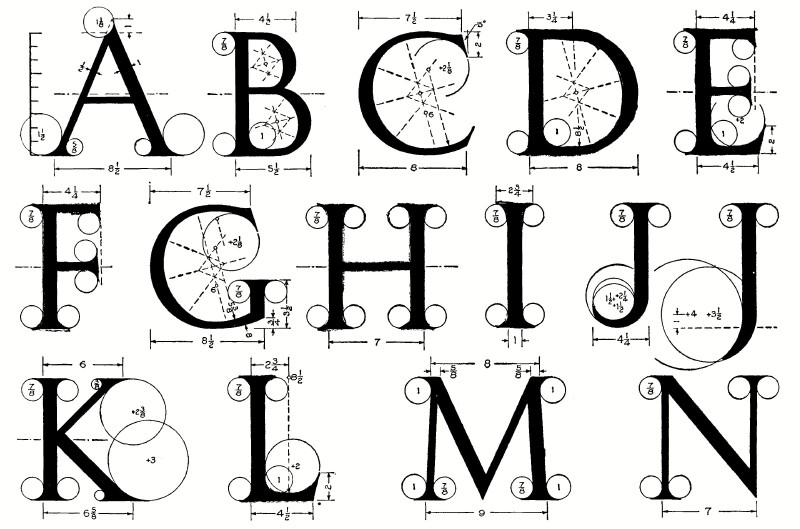
I found this web text from 1912 about lettering and thought it was kind of cool! These days most of our “lettering” is done by a computer, but I’ve found this resource invaluable both for understanding the role of existing fonts in design, and for designing my own! I’d highly suggest giving it a virtual leafing through!
I also appreciate how the authors are very opinionated about certain fonts. This is their opinion of the “Modern Roman” font:
“In the eighteenth century modifications were introduced…which we have called Modern Roman. This modern form has lost all the variety and beauty of its old prototype, is essentially inartistic and of absolutely no value in design, as in the attempt for uniformity it has become only mechanical and monotonous…”
You can read it at this link!
https://www.kellscraft.com/EssentialsofLettering/EssentialsofLetteringContentPage.html
Featured image from The Essentials of Lettering by Thomas E. French and Robert Meiklejohn


1 Comment. Leave new
Fonts are fascinating! ‘Helvetica’ is a documentary about fonts that I recommend. Has the sort of info that once you know it, and see the examples, you cannot unsee them later.