
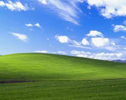
Bliss – Photograph taken by Charles O’Rear
https://en.wikipedia.org/wiki/Bliss_(image)
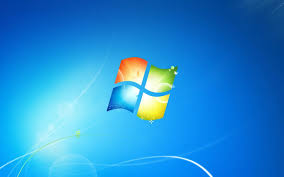
The Frutiger Aero aesthetic is an aesthetic originating from early 2000’s corporate and digital consumer electronics culture. The Frutiger Aero aesthetic is most recognizable by the iconic Windows XP operating system default desktop background image Bliss, originally photographed by Charles O’Rear in 1996.
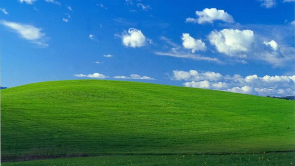
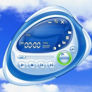
Frutiger Aero is characterized by by large sections of vibrant colors like greens, blues, and whites, often with transparent or translucent motifs. Common subject matter includes clouds, water, tropical fish, green hills and generous use of light coupled with glossy reflections. Shapes of Frutiger Aero include round edged squares, curved lines, and partially soft corners.

Frutiger Aero Desktop Background
https://www.dazeddigital.com/life-culture/article/58103/1/what-is-frutiger-aero-aesthetic-tiktok-msn-messenger-windows-vista-noughties
The biggest contributor to the Frutiger Aero aesthetic was the arrival of household consumer electronics like desktop computers. Microsoft capitalized on the Frutiger Aero aesthetic with the Windows XP operating system, but can be found across a large portion of consumer products such as Apple’s electronic devices specifically, fountain drink advertising, corporate marketing, and even gaming consoles like the Wii.
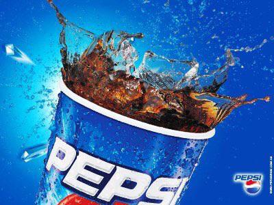
Pepsi Soft Drink Advertisement
Find larger link below
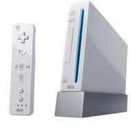
Nintendo Wii Gaming Console
https://www.gamestop.com/consoles-hardware/retro-consoles/retro-nintendo-hardware/nintendo/consoles/products/nintendo-wii/10113363.html
When the aesthetic first debuted in the early 2000’s it had no identifiable name; “Frutiger Aero” was coined by Sofi Lee in 2017 for a categorization to the Consumer Aesthetics Research Institute (CARI). The title Frutiger Aero comes from the Frutiger font commonly used in the aesthetics’ text and Windows Aero, the name of the default Windows XP user interface theme. The intent of Frutiger Aero in early consumer electronics was to provide a visual emotion of simplicity and welcoming, hoping to overcome the stereotype that only computer scientists and tech wizards could operate a computer. Up until the late 1990’s and very early 2000’s computers often still used pixelated text and numbers on a default harsh solid color background to interact with the user. Companies like Microsoft had the intent of marketing computers to upper and middle class households, but couldn’t make the idea of a household computer that everyone in the family could easily use take off. Multiple companies came to the same conclusion that a ‘softer’ user interface was the solution to the perceived difficulty of using a computer. and subsequently designed aesthetics like Frutiger Aero to be easily approachable.
Early Computer Music Controller App
Find image link embedded in Frutiger Aero Vibes music playlist below
Frutiger Aero declined in popularity around 2010 in favor of more minimalistic matte design aesthetics in both advertising and electronics. The most clear evidence of this change is the four panel Windows logo changing from the curved and lens flared Frutiger Aero logo on a blue background to a flattened out, proportionally symmetric Windows logo of solid color panels on a black background.
Windows XP Operating System Logo
https://commons.wikimedia.org/wiki/File:Unofficial_fan_made_Windows_XP_logo_variant.svg
Image Citations:
https://en.wikipedia.org/wiki/Bliss_(image)
https://www.dazeddigital.com/life-culture/article/58103/1/what-is-frutiger-aero-aesthetic-tiktok-msn-messenger-windows-vista-noughties
https://www.gamestop.com/consoles-hardware/retro-consoles/retro-nintendo-hardware/nintendo/consoles/products/nintendo-wii/10113363.html
https://commons.wikimedia.org/wiki/File:Unofficial_fan_made_Windows_XP_logo_variant.svg
Information Citations:
https://aesthetics.fandom.com/wiki/Frutiger_Aero
https://cari.institute/aesthetics/frutiger-aero
3 Comments. Leave new
Hello Barrett,
This is a super interesting aesthetic. I’ve grown up seeing this with the Windows logo, and played wii as a kid, but didn’t know there was a whole dedicated aesthetic to it. It seems like recently many companies have moved away from using this aesthetic, are their any companies or locations where you see this aesthetic often nowadays?
Barrett, what a creative aesthetic to identify! I really appreciate the depth with which you commented on the history, nature, and importance of Frutiger Aero.
I also found it very helpful that you included images of the examples which you reference throughout your post. Can you tell us about why you chose to post all of the images at the top, instead of throughout the text? I think this inspired my curiosity as I wanted to read more, after scrolling through the images, wondering how they were all connected.
Barrett, I think this was a super interesting aesthetic choice and not one that I would initially think of but immediately pictured when categorized. You did an effective job of describing the history and usage of this aesthetic, particularly in the marketing field. The narrative of using Frutiger Aero as a method to ease people into technology was super interesting. I would love to know a bit more about where else this aesthetic appeared and if you believe it has transitioned to anything else. Thanks for the post.