
Just to recap the topic of my project, for my upcycling artifact I am making a small model of a 1970s era computer terminal. I am reusing some old keyboard switches, glass panes, and laser cut wood scraps to create the body of the computer. I will also use some LEDs to backlight the “display”, which will have a cutout of the command line interface. While most old computer displays use green monochrome displays, I am going to add the ability to cycle through various colors using the recycled keyboard switches, which will add some more interactivity.
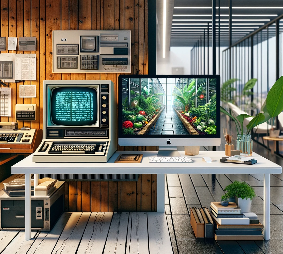
I would characterize these old computer models as having a very boxy aesthetic, with curved edges and cream colored plastic. From a design standpoint, models such as the VT100 have built in keyboards, with the full range of keys including the numpad. Like most functional equipment produced in that era and before, the designs are very utilitarian and industrial. When I think of the opposite of this aesthetic, I immediately think about the minimalist design of modern consumer desktop computers, such as the newer Apple iMacs. Instead of plastic, newer computer opt for a sleek brushed aluminum finish, with large, vibrant displays and thin bezels. Instead of a command line interface, they have a graphical interface with characteristic wallpapers of mountain landscapes or other nature scenes. In terms of colors, modern computers rarely deviate from white, black, or brushed metal finishes.

Image 1: Generated by ChatGPT showing the aesthetic of 1970s vs Modern
I completed some basic sketches of what the two aesthetics would look like applied to my project. On the modern PC, the display shows a mountain landscape wallpaper. If I had to create this in my project, instead of laser cutting the text for the command line, I would probably paint the glass pane to have the mountain landscape that would then be backlit by the LEDs. The keyboard is wireless, sleek, and has flat membrane switches with only the minimum amount of keys necessary on the keyboard. In comparison the 1970s aesthetic is has very bulky and large keys, lots of extra buttons and switches. It is important to note the auditorily, the modern pc is made to have a keyboard that is quiet when typing, but the older machine has loud and clacky keys. The modern PC also has a mouse, which wasn’t needed in 1970s computers due to the command line interface. The edges of the display are sharp and angular, and both the display/body and peripherals are made to be as flat and minimalist as possible. The brushed aluminum would be difficult to achieve with upcycled materials, but perhaps it could be mimicked with some foil applied to the exterior of the wood body pieces. All these features hopefully would capture the contrast between the sleek and minimalist design of modern computers, and the industrial, utilitarian look of older machines.
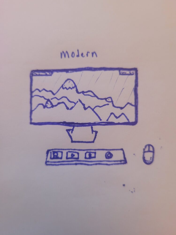
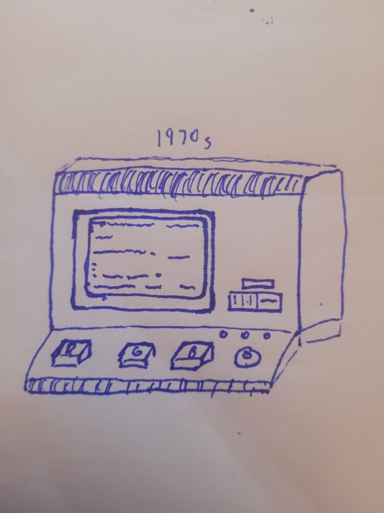
Image 2, 3: Comparison of what 1970s vs Modern Aesthetic for my project
CREDIT:
Image 1: chat.openai.com
2 Comments. Leave new
Hi Luke, I liked that you called out the importance of sound in the older vs modern computer aesthetic! I think Emilee brought up an interesting point about trying to create a modern look with old materials and think there could be a way to have a sleeker less boxy look with old timey materials. One thing I was wondering is what words are you displaying on the computer terminal? Would the words change for a modern take?
Hi Luke,
The images and examples you provided make it clear you put a lot of thought and consideration into how you would achieve a Modern aesthetic for a computer terminal. If I did not know your original aesthetics post, I would have thought it was your main project from how clear your vision and plan was! I especially appreciated the ChatGPT image to help convey your ideas. I am curious if you considered how you could use the same materials as your original project but alter it to fit a more modern use and style. What differences would you face in the fabrication process itself vs the visual aspects?