
Overall
My upcycle project, HOME., is a vector image designed to look like star charts of 19th century science graphics with my own touches added here and there. I made it using Inkscape, an open-source vector graphics software (which I would recommend within my limited experience with both graphic design and Inkscape itself).
The final version of HOME.
HOME. features the constellation Orion, one of the most recognizible in the northern hemisphere. I chose it for its distinct look; it is readily seen as its common depiction as a hunter with a raised hand. Further, I am amused by the idea that somebody making a print like this in the 1800s would label Orion ‘Home’ knowing that the Earth lies inside the Orion arm (yes, named after the constellation) of the Milky Way, given that the true structure of our galaxy wasn’t found until the 20th century.
Initially, I had planned on making this as a wood carving/engraving, to A) show proudly on my wall and B) be reminiscent of the engraved printing plates that were used in many the prints of the era. However, I’ve recently been too busy with my other classes and responsibilities to dedicate the kind of time that me learning this area of woodworking would require, so I settled on creating it digitally instead.
I made the chart by first designing shapes for the stars and lines, then overlaying an actual star chart on my workspace, placing the stars and lines in a manner similar to tracing with a backlight. The star chart used as reference (see below, [1]) was made by freestarcharts.com, a lovely source overall.
A star chart of Orion, as made by freestarcharts.com. [1]
Design Choices
I had tried a few 4-spoke star shapes for a while before moving to Inkscape – see below some of my first designs. I eventually settled on a 20:15:5√8 vertical:horizontal:midpoint ratio after some earlier designs were deemed too tall or not pointy enough. I made this shape in Inkscape by manualy inputting points, and then copied it to the rest of their places, scaling them down slightly for the dimmer stars. I had considered using graphic stars with more spokes to denote brighter actual stars, but I decided against that as geometrically designing other types would have been considerably more time. (I was unsatisfied with Inkscape’s built in star pattern generator; when they were stretched to give the taller-than-wide look I was looking for, the horizontal spokes were much fatter at their base than the vertical spokes, which I did not find appealing.)
My own brainstorming of the pointed stars as well as the chart layout and caption font design.
The dotted pattern that forms the lines of the constellation was once a squashed hexagonal shape, like may be cut on either side with a chisel; however, these looked bulky between the stars, and wouldn’t fit between the close stars of Orion’s bow without being shrunk to a degree that their unique shape was lost on the observer. Instead, I ended up using a staggered line – dot, dash, dot – to connect the stars, which I liked the look of much better. Plus, this approach allowed me to use Inkscape’s line boundary tools to make it, which were much easier than duplicating the hexagonal elements and distributing them on the lines myself.
The pale brown color was chosen to look like the off-white paper or parchment of the 1800s West that actual charts were commonly printed on. Similarly, the black used in HOME. isn’t pure; it’s slightly transparent to look similar to the dark inks of the time, which could not produce the deep, bleedless blacks that modern digital displays can.
While finishing the project, I had also tried to reverse the image to again reference the printing plate negatives that the physical, wooden version of this project was designed to be close too. I decided against including it in the final version, as the flipped image of Orion was not as offputting as I thought it would be (we always see it in one orientation in the sky!), as well as this digital version being closer to a print than the plate metaphorically. However, it is still interesting to see the constellation flipped and how foreign the typeface of the caption looks, so you may see the reversed version below. This version was also made before my switch to a dark background.
The typeface used for the caption is Cheltenham, originally developed in 1896 for the Cheltenham Press. While it is a little late in my specified time period, I chose it regardless as the font has the slight ornament of simple serifs, fitting with my aesthetic, and I have worked with it personally for some time. (You may recognize it from the headlines of the New York Times, or some of the title cards of Cowboy Bebop).
Influences
Unfortunately, a lot of the direct influence on this piece is hard to track down; for this piece, I often referenced my internal perception of how a chart from this era should look like, rather than looking directly at the charts themselves. As I’ve looked at many of these over the years, this makes directly sourcing my influences difficult. However, below are a few examples that I have looked at over the course of my research for this project.
A star chart from Smith’s Illustrated Astronomy [2]: You can see Orion on the equator, slightly to the left of center.
A star chart from William Peck’s work [3]. Like many star charts, stars of different brightness are given different shapes.
A print by John Emslie depicting the phases of the moon [4]. Note the all-capitals title at the top of the page – that is exactly the aesthetic feature I tried to capture in HOME.’s own caption.
Concerns
I worry that this project didn’t display a lot of artistic effort from me. It is not an original shape – Orion’s been in the sky for a long, long time – and my move to a digital format means that some of the feeling of craftsmanship from working the wood myself is lost. While I took great care in choosing the geometry of the piece, from the ratio of the full page as 3:2 to the particular width of the connecting lines to the ratios of sizes of the stars, it still feels shallow in a way that I have trouble putting into words. I did spend a good few hours on this, regardless, but I’d like to avoid this feeling in my future project in the class. Another entire piece in the same style, using Ursa Major, was even considered to ‘pad out’ this report and project. I want my final project to be big, and in a way I can take more than a passing pride in.
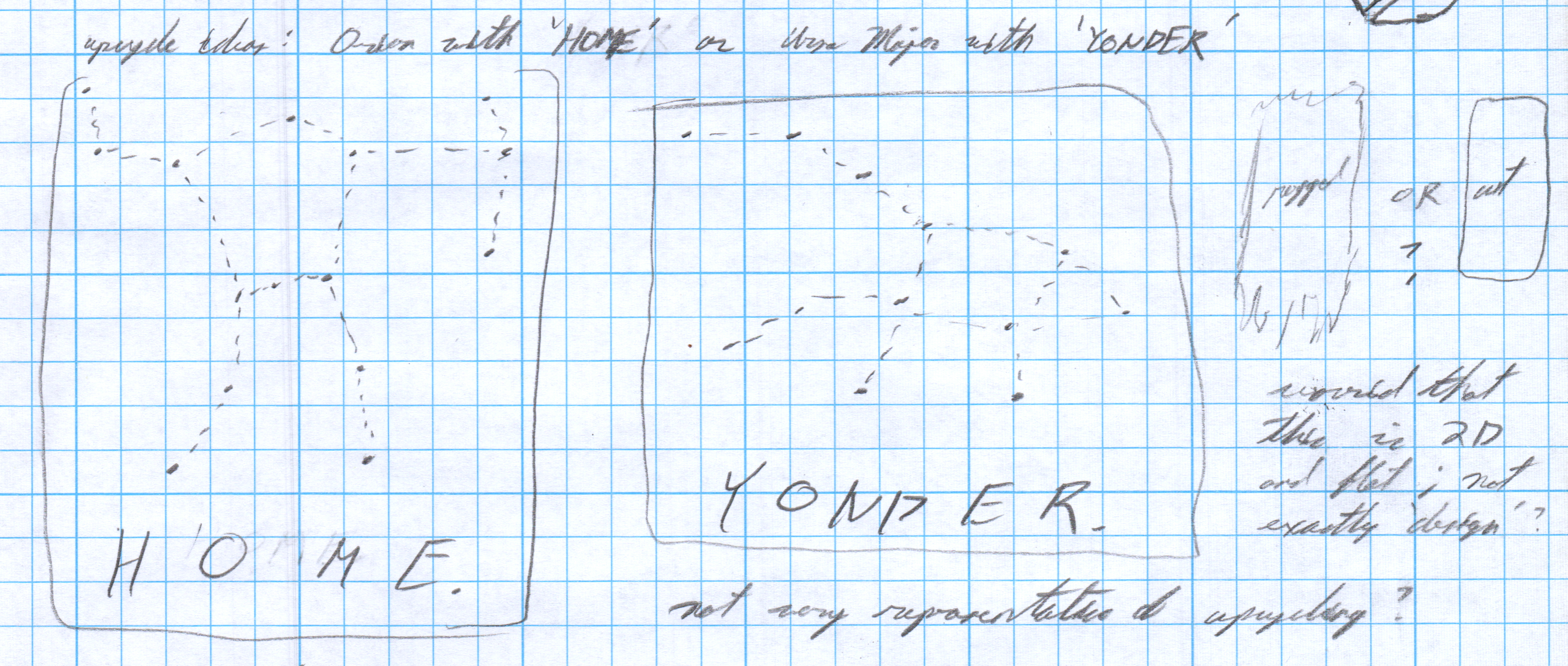
Some intial sketches, showing my idea for a second piece, YONDER., featuring Ursa Major.
Sources
[1] “Orion Star Chart” Orion – Constellation Guide. freestarcharts.com, freestarcharts.com/orion. Accessed 16 Feb 2024.[2] Smith, Asa. Smith’s Illustrated Astronomy. Cady & Burgess, New York, 1849. https://library.si.edu/digital-library/book/smithquotsillus00smit.
[3] Peck, William. A Popular Handbook and Atlas of Astronomy. G.P. Putnam’s Sons, London, 1891. https://archive.org/details/popularhandbooka00peck/page/n9/mode/2up.
[4] Emslie, John. Astronomical Diagrams. Published by James Reynolds, 1851, London. Courtesy of the David Rumsey Map Collection, David Rumsey Map Center, Stanford Libraries. https://www.davidrumsey.com/luna/servlet/view/all/who/Emslie%2C+John?sort=pub_list_no_initialsort%2Cpub_date%2Cpub_list_no%2Cseries_no.
1 Comment. Leave new
Hi! I LOVE your finished piece. It looks super polished and professional. I’d definitely buy a print of this off of Etsy! I really also love the amount of ideation you put into your project, from start to finish. I think this piece would look awesome if it had some animation to it! I’m taking a creative coding class this semester, and thought an awesome way to do so would be to slightly move coordinate points across a canvas using a program. Anyways, your final product is super impressive – amazing job overall!