

Post 7: Plans and Alternatives – Hailey Usher
Where I’m At
This week, I’ve had some more time to sharpen my ideas for the upcoming final project. Last week, I shared that I was thinking of designing a booklet or poster series based on an artist, album, or song lyrics.
As I continued to brainstorm, I decided that I needed to simplify my idea to instead put more time and energy into the aesthetic of the project itself. So, I landed on the idea of designing a physical booklet of graphic spreads. Each page will correspond to a song title from the album Midnights, from Taylor Swift. This is one of my favorite albums of all time, and I feel that Swift’s lyricism and vibrant worldbuilding will lend itself well to the outlet of my project.
The print will be a high-quality, A4 sized booklet, complete with a cover, About page, and at least 13 page-wide designs for the songs (corresponding to the number of songs on the album). As a stretch goal, I would consider adding her bonus songs from the “3 AM” edition of the album.
For my design aesthetic, I did some more digging on Minimalism and landed on a subset of the aesthetic, which is known as Duotone Minimalism. Duotone minimalism uses (as the name implies) two colors for the entire design. Also, other elements like font and imagery must be minimal. I think this aesthetic will help the book employ a succinct visual identity.
To help get my ideas across, I’m including some images from my Pinterest search spree.
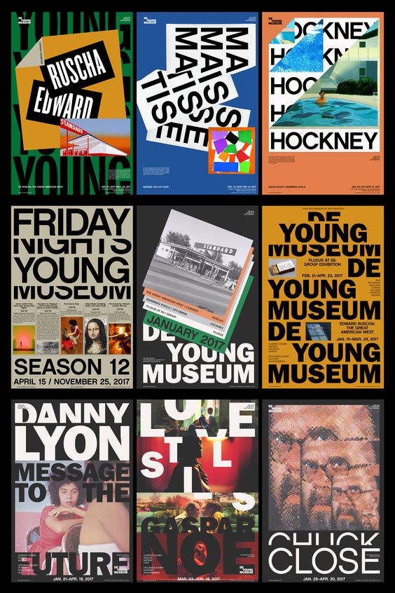
An example of a cohesive booklet design – Pinterest
 Another example of a cohesive booklet design – Pinterest
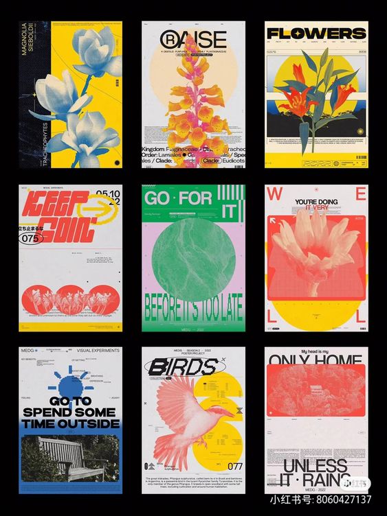
An example of a song title page – Etsy
Another example of a song title page – Pinterest
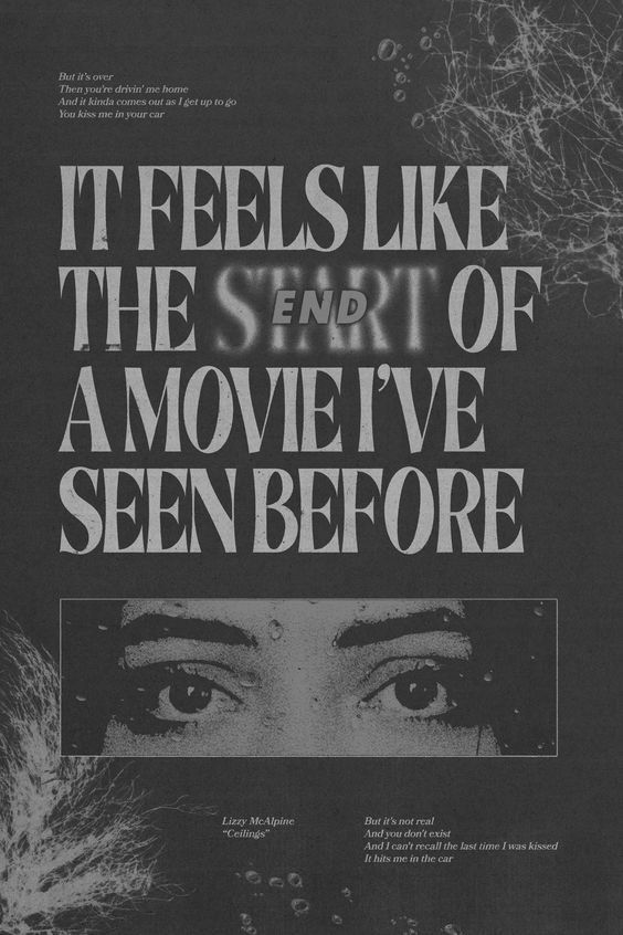
Another example of a song title page – Pinterest
Another example of a song title page – Pinterest
Opposite Aesthetic
So, knowing my roadmap and main aesthetic that I want to follow, I then began thinking about the opposing viewpoint. What if… My aesthetic for this booklet were to be Maximalism?
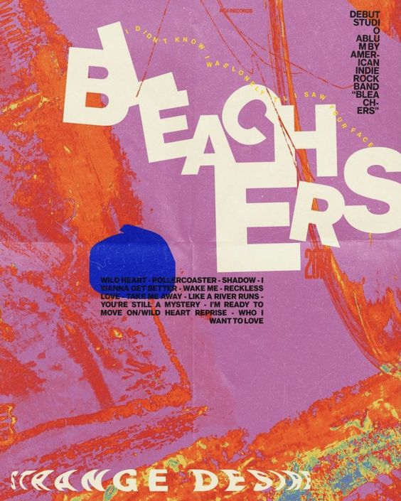
Maximalist design entails vibrant colors, intricate patterns, and big, bold lettering when possible. In essence, maximalism is everything that minimalism isn’t. Especially in the graphic design sphere, maximalism is very in-your-face. As I browsed the web for examples of maximalist graphic designs, I spent a lot more time on each graphic looking at all of the detail put in by the designer.
To further my study on minimalism versus maximalism, and to see my booklet from two differing viewpoints, I decided to challenge myself to make two different book covers that adhere to each design. For both covers, I used an already-existing graphic as a starting to work off of, and to observe the “rules” of each design method. I worked in Adobe Illustrator. Here’s how it went!
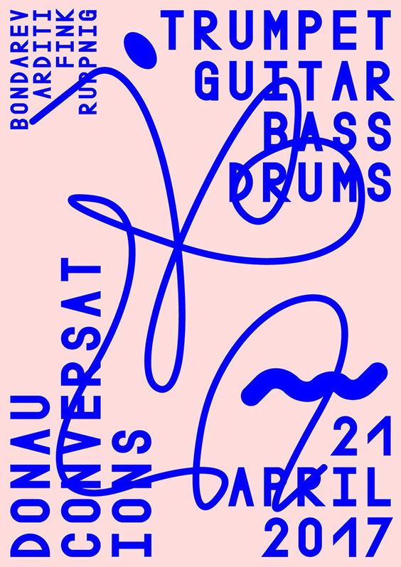
Original Design (Minimalist, Duotone) – Pinterest
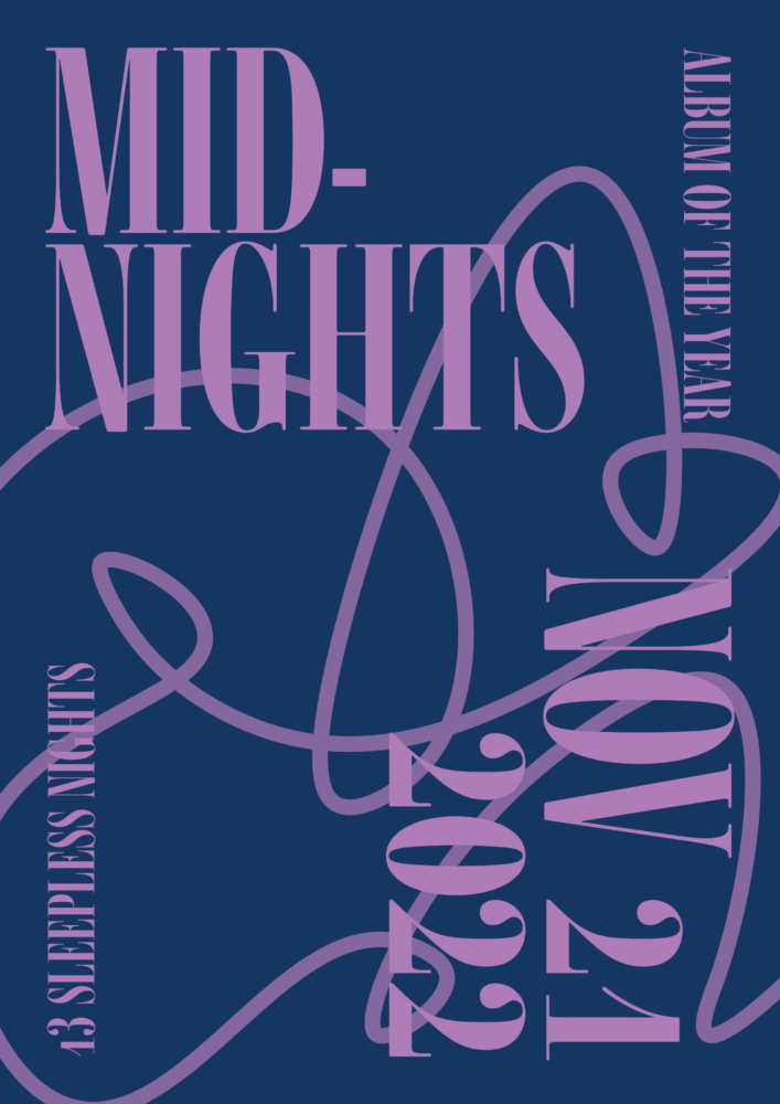
My Design
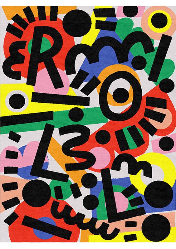
Original Design (Maximalist) – Caroline Dowsett
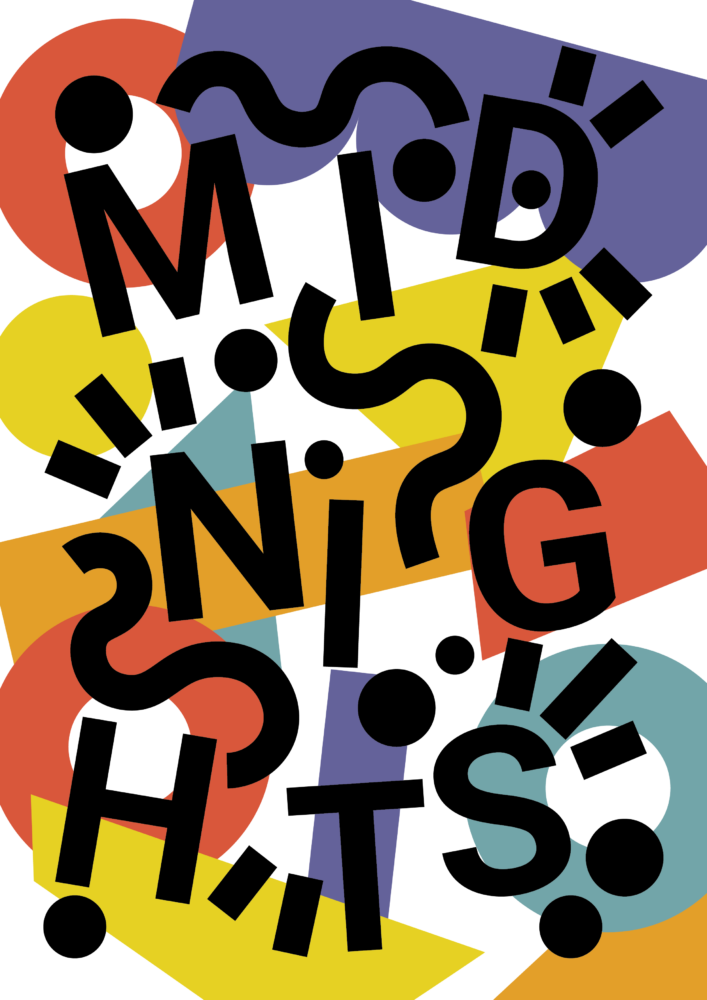
My Design
My Thoughts
Performing this miniature “design study” helped me to better intrinsically understand the design elements that go into minimalism and maximalism, and how they differ from each other.
As I move into the next stages of my final project, I can foresee myself struggling with adhering to the rules of minimalist duotone design. In my artistic work, I love using bright, bold colors and expressive graphics. However, I feel that putting these “blockers” on my creative abilities will ultimately help me grow as a graphic designer, and also to help the booklet pages feel succinct.
As always, I’m excited to hear from everyone regarding my project plans – Which design style do you personally prefer? Let me know! Thanks for reading!
2 Comments. Leave new
Hailey, really great post. I think the amount of research you’ve already put into this aesthetically is impressive; props to you for pushing yourself to find a more specific subset of the minimalist aesthetic, I think it’ll help your project stand out. I really love the design studies you did, it shows that you really want to understand the aesthetic space you’re trying to work in. If you want to dig a little bit deeper, I think it might be cool if you tried to reinterpret a maximalist work in a minimalist style, which I think will really force you to reckon with the differences between the two – but again, you’ve already put in an impressive amount of work. Looking forward to seeing what you come up with!
Great work on this post Hailey. I personally prefer the maximalist design but I agree it may be better to push yourself with minimalism. I also appreciate your deep dive into the difference between the two. Have you considered if you will represent the elements of each song from midnights or will it just include the title of the song on the poster? I am excited to see how this turns out!