
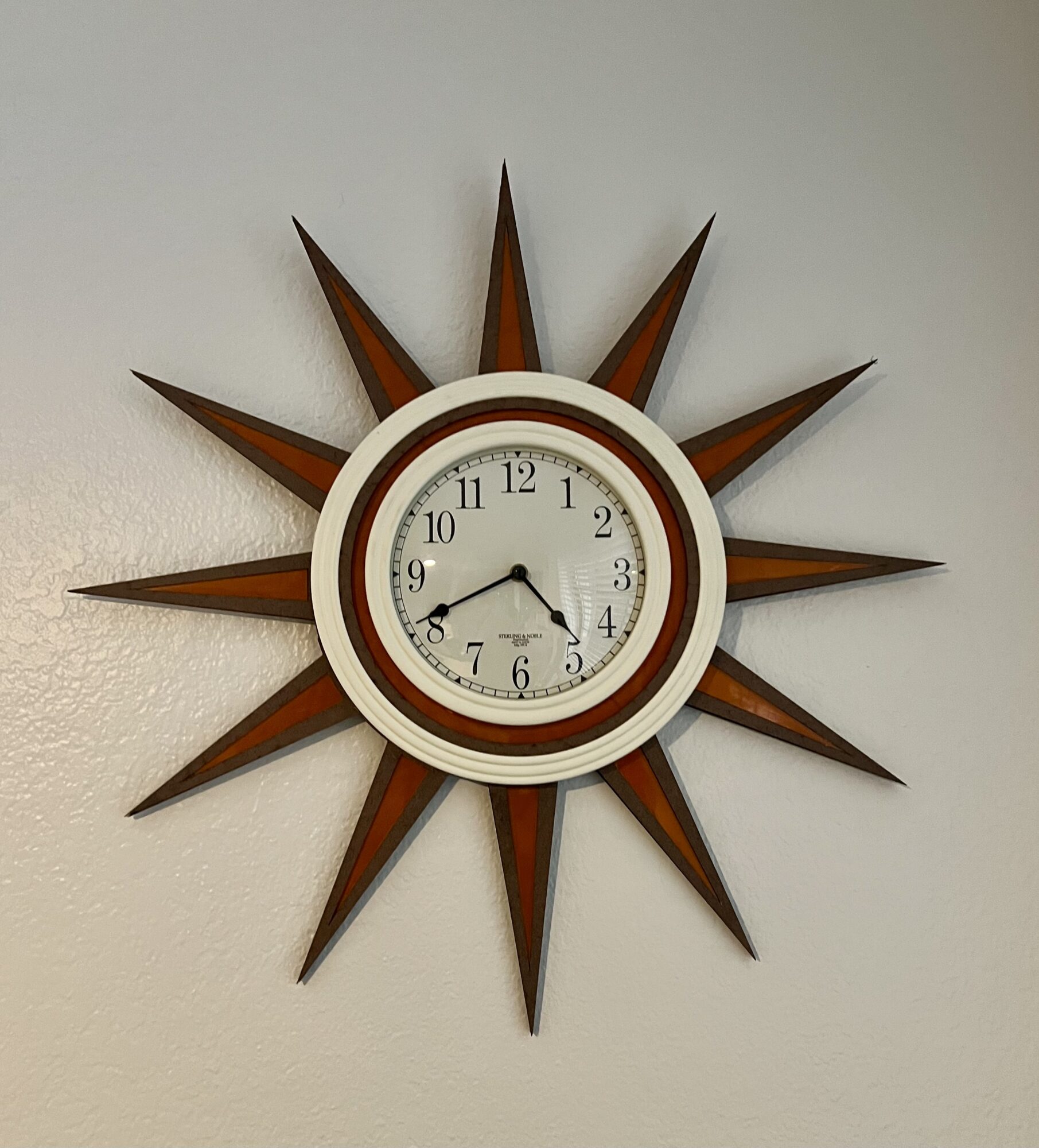
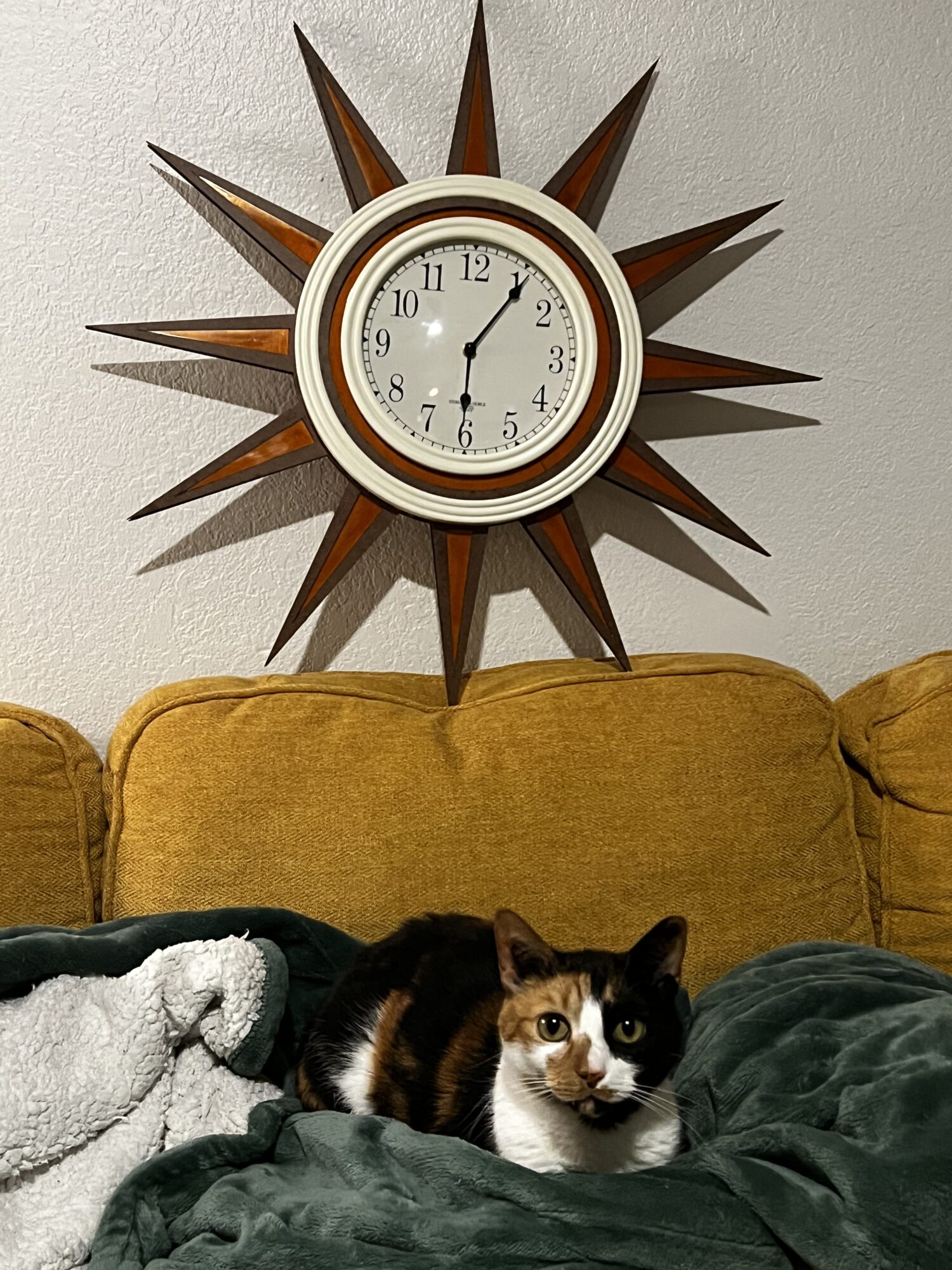
This is the Retro Revival Clock!
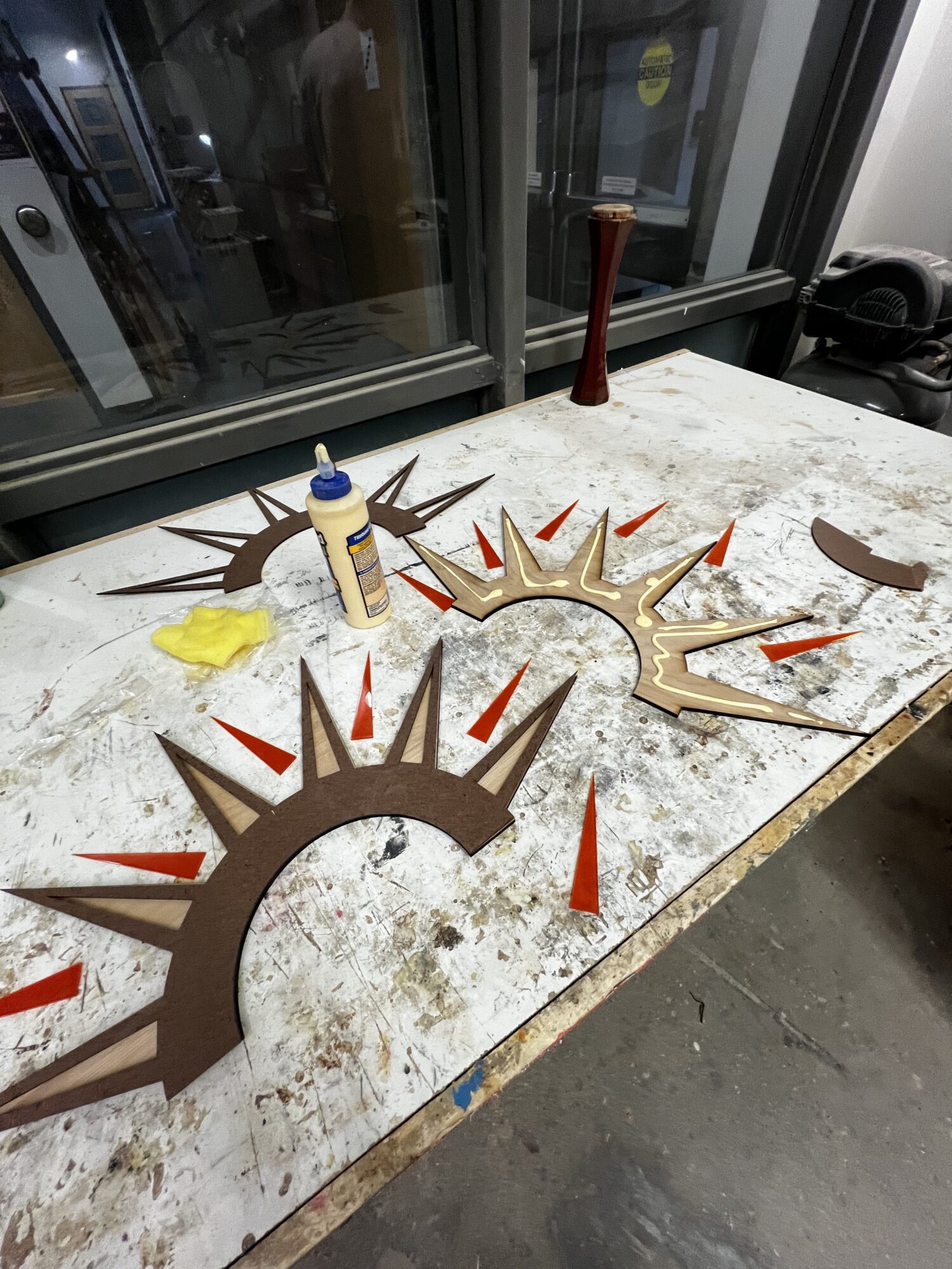
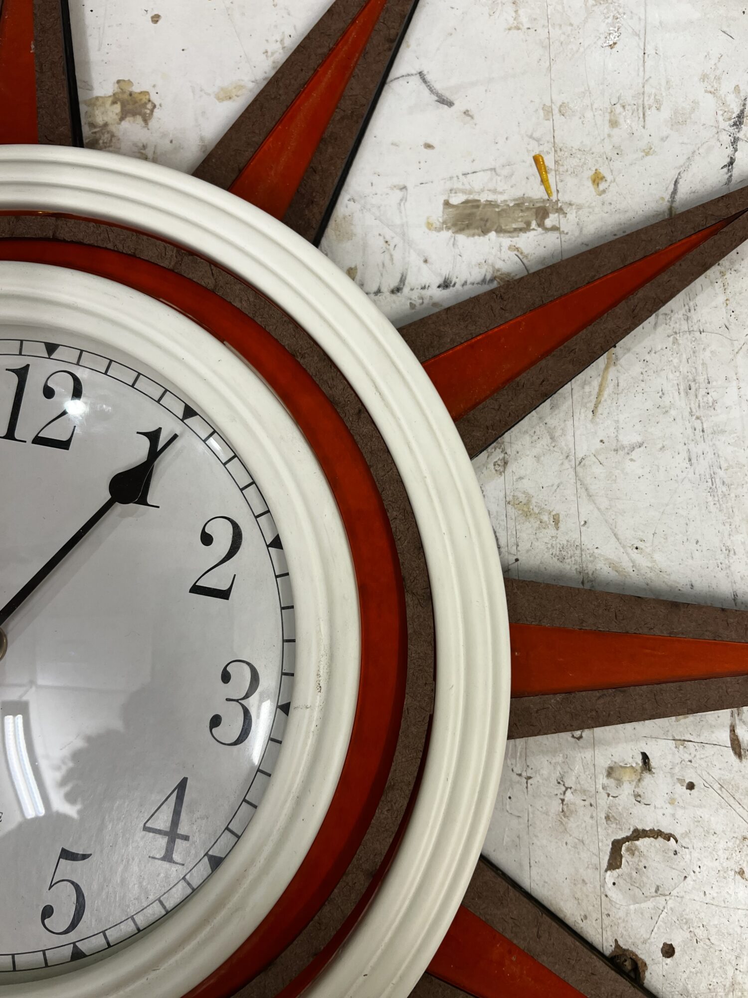
I cleaned her all up today and made sure all of the orange acrylic is clean and added in the battery so she’s fully functional!
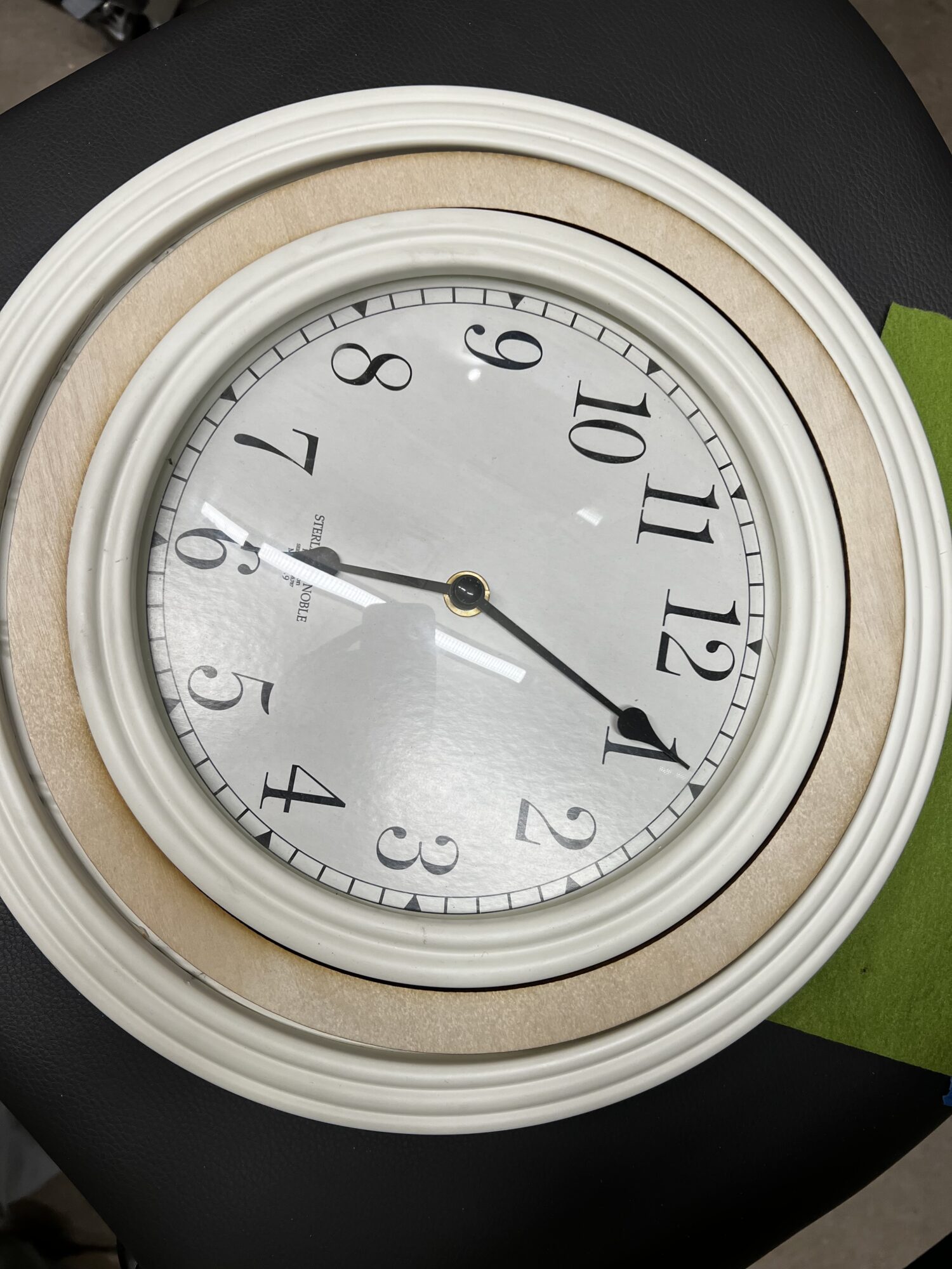
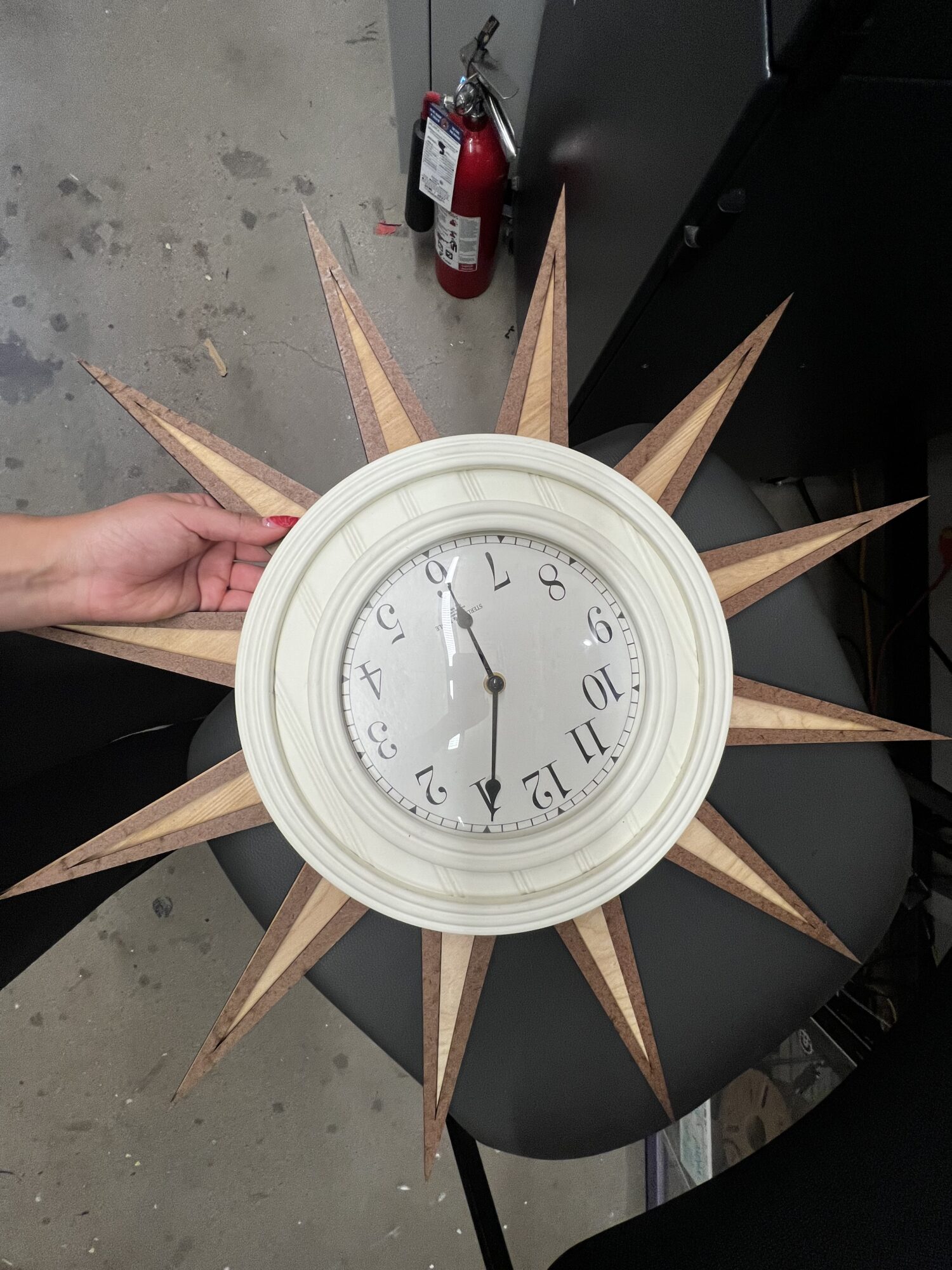
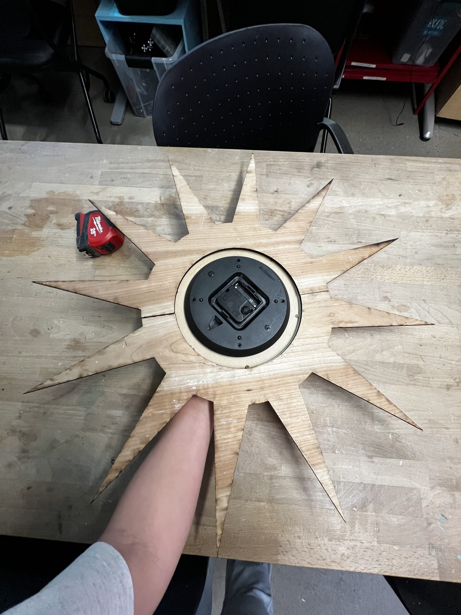
I sanded down the outer edges an cleaned up any black residue left by the laser cutter so that if touched it’s not leaving any residue. I also cleaned the off white parts of the clock and the glass since it got dirty while building.
In my initial research for Retro Revival I had chosen the following three characteristics:
– Bold letters, graphics, and/or colors/color-blocking.
– Clean edges that tend to have curves or be geometric.
– Warmth, whether in color, wood, or image filter.
With this clock, the typeface on the clock itself is bold and has the serif, giving it a much older look. The exposed wood is intentional to give the warm feeling. And the orange was specifically chosen as it is a bold color that not only complements the rest but gives it that pop of color that makes it feel retro.