
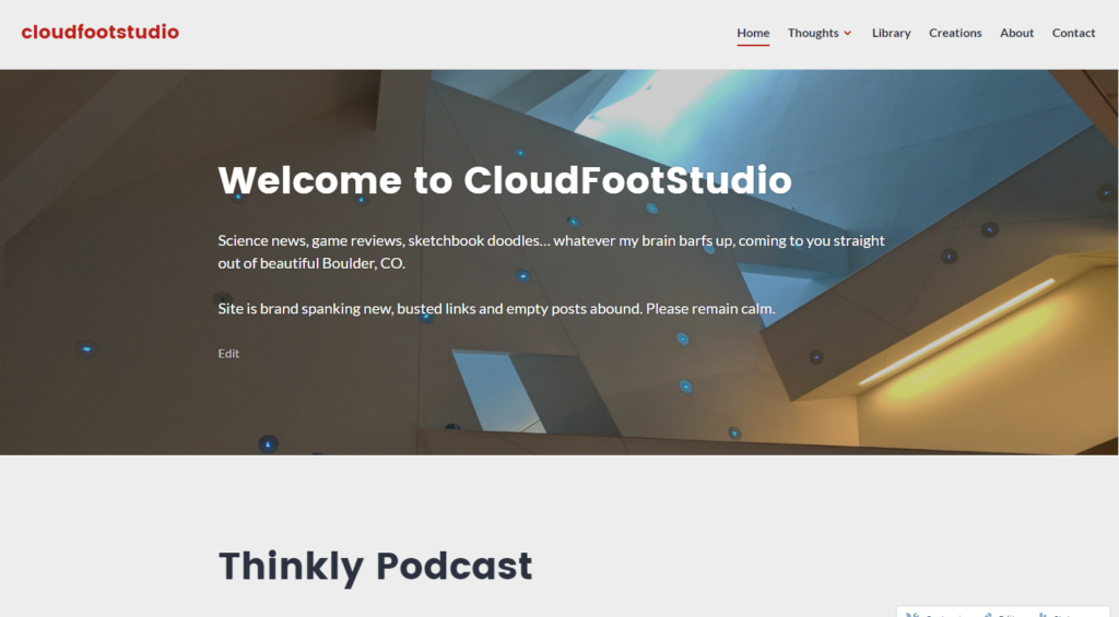
My existing web design fits clearly in the Modern aesthetics of the early 21st century. Clean colors, strong lines, geometry mixed with rigidity… it speaks to professionalism, organization, and confidence.
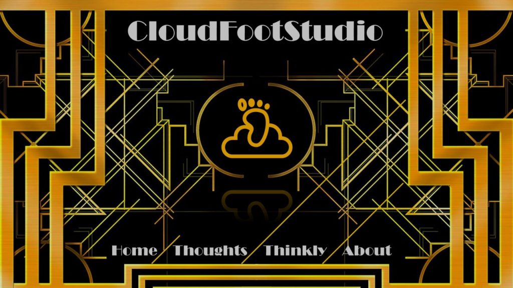
But in order to cast my project in a few different aesthetics, I first look at the classy but gaudy artistic styles of the Art Deco movement. Borrowing inspiration from galleryhip.com, I created the front page styled in that shimmery, elitist aesthetic.
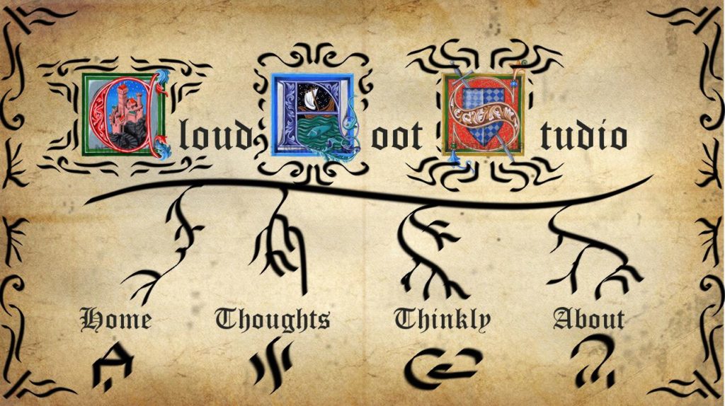
That turned out pretty great! But it kind of makes me sick, so let’s go for something a little bit more organic. Something with a well-established historical relevance and wildly different approach. Maybe some curves and details reminiscent of Arts & Crafts… How about Medieval manuscript? Illuminated letters and all, borrowed from ArtOfTheBooke on etsy.com
Nah, that’s not really doing it for me. Kinda cool and hits at historicity, but not really what I’m going for. What if I try something modern and sleek, something that’s not so complicated but still has great curves mixed with some straight lines, but that feels pretty machined? I know! “Streamline”….
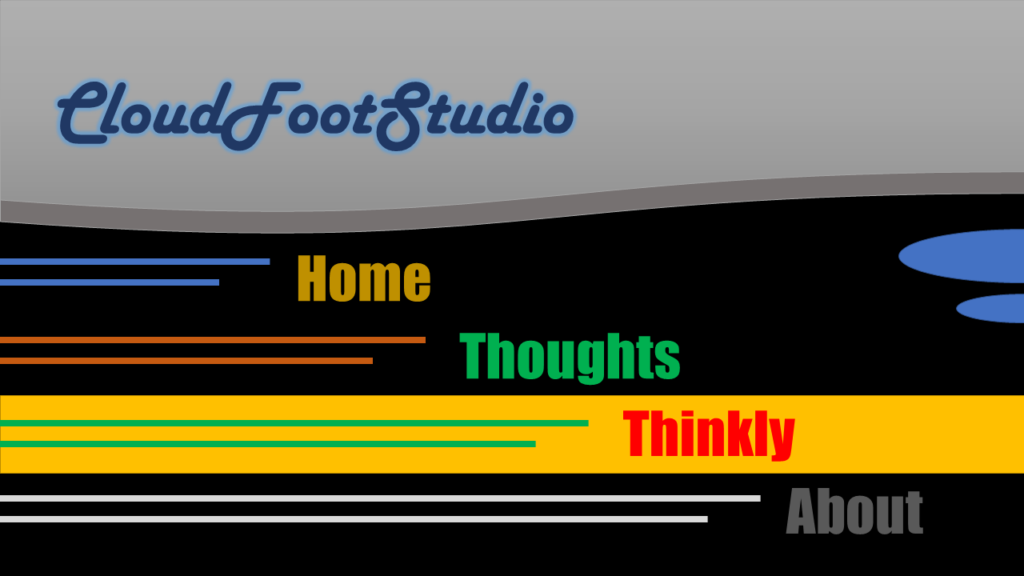
That’s pretty neat, got a lot of colors and lines, feels very stylish and confident. But it’s got too much going on. Too much “shape” to it.
5 Comments. Leave new
I really like the Art Deco styling, it gives the website a very sophisticated look. The second one I think has more promise than you think! It reminds me of the menu and title scenes of Monty Python! It certainly does not convey modern, but it is comical, which is useful for some websites. I must say I do not like the look of the third aesthetic very much, the simple colors, geometries, and fonts remind me of a powerpoint slide. It looks very cheap and generic. I think the first two showed a lot of promise though!
I think you did a great job representing 3 very different aesthetics with your website. Personally, I like the simple minimalist, clean aesthetic of your original design. The other three versions are super loud and bright which are hard on the eyes.
This is a really great job picturing this into different aesthetics. I like how it was done on the computer and i feel like the addition of color really adds to the difference between the aesthetics compared with just a sketch in black and white. I really like the art deco rendering as i feel like this really nailed the style but i agree looking at it does make you a little sick after a while!
I think you hit these aesthetics on the head. Streamline is definitely a more creative one, but I am actually a fan of the art deco aesthetic. Its obvious how much thought and work you put into these, good job.
These are all great aesthetics to demonstrate different styles from the the 20th century, combined with a modern website. You’re right about it fitting the Modern aesthetics with clean lines and well-defined features, which makes sense because the invention of websites coincides with the modernist era. It’s interesting that if you veer too far from what is considered “normal,” it comes off gimmicky or edgy. That leads me to believe the evolution of different aesthetic styles takes a long time. It’ll be interesting to see how things evolve over the next few years. Overall, you did a fantastic job applying these aesthetics to the website design!