
What and why?
For my Final Project I have decided to do a wall clock. My decision behind it was due to many reasons. First was the feedback I got from the previous project, where i focused too much on the functionality, which ultimately limited my choices in the aesthetics. For this project I wanted to do a project that serves a simple functionality while giving me the freedom in the aesthetics. Thus, a wall clock was one of many options I came up with.
Aesthetics
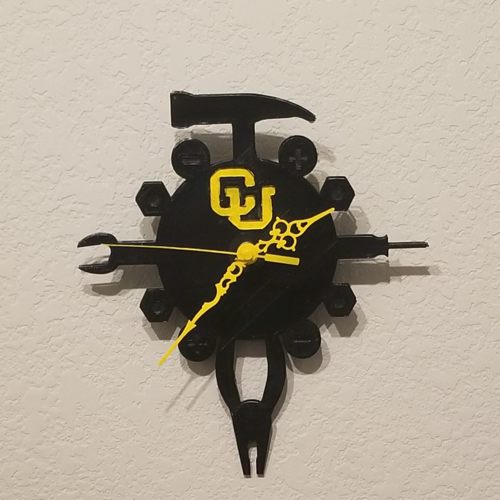
I decided to go for a mechanical engineering theme for my wall clock, where I used tools such as hammer, wrenches, screwdrivers, fasteners, etc, as the clock numbers. As for the color, i followed the cu boulder logo. I felt like making the clock talk about my journey in college. A mechanical engineer at CU Boulder.
Material and budget
Wall arms ( owned )
3d printing filament ( 40$)
spray paint (6$)
Battery pack (6$)
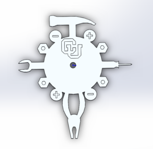
CAD
Future Recommendations
For the future I would love to add spinning gears with an external motor to give more mechanical feeling. I also would love to make a case for the clock to protect it and make it durable.
10 Comments. Leave new
Presentation- I thought you presented your ideas very smoothly, and in a very good fashion. Although you were not able to bring your piece in to present, I appreciate that you gave us dimensions for how big it was in real life. Great job!
Post- I liked that you chose to make an item that sort of told a story about you and who you are, because in a way I realized thats what many of us did, consciously or not. With that, you also executed this very well with the aesthetic you chose, both color wise, and thematic elements.
This clock was well designed and nicely executed. The overall product looks great. I think it’s awesome that you incorporated the CU aesthetic as well.
I think you have achieved a great balance between detail and simplicity. Your aesthetic clearly screams mechanical engineering, but it does not feel at all cluttered. My favorite aspect is the intricate clock hands. Well done!
HI Abdulaziz,
Nice project you have here! I also built a clock for the final project but in a different style. I like how yours have a strong CU ME design theme and it shows how you are a proud buff lol. For me I laser cut the “Made in Boulder CO” letters on the dial but unfortunately they don’t show very well. Anyways, the black and yellow color combination of your clock is on point! However it think it be really cool that if you could make any of the tools move to act as the second hand so that you have move dynamic elements, just my 2 cents.
Hi Abdulaziz,
This is a really nice project you got here! I loved how you incorporated tools that are often associated with engineering on to your clock without making it look too busy. Also, the color combination that you used came out really well. You took the colors of CU Boulder and elevated them to fit the aesthetic of your project. Good job!
I really like the way you designed the clock on CAD. I’m happy to see the 3D printing results. Good job!
Really neat idea. You could maybe use a really small motor mounted to the back parallel to the surface and then use a worm gear to change the direction.
Hello Aziz, it looks like you did a great job with your project. It is really cool that you were able to print the body of the clock and incorporate it with the old components of a clock. Glad to hear that you were able to paint the PLA!
Your final product looks really good! The mechanical engineering aesthetic really stands out right when you look at it. I really like this project because you will be able to use this long after this class ends. What future improvements do you have for this clock? Good job!
It’s obvious that you focused more on the aesthetics this time. It would look cool to paint the little graphics like the + & – with gold to have them stick out more. You struck a nice balance with having heavier weights on both top and bottom. Good work.