
For my Upcycle project, I had initially wanted to work with fast food wrappers in some manner from the get go – taking inspiration from art and sculptures from other artists who have worked with a similar medium; that is, with objects or materials that might typically be considered garbage. A sculpture using fast food wrappers is a way to transform something which we consider useless and essentially trash into something that is visually pleasing or meaningful. Generally, I would consider this project falling under a more Kitsch or contemporary aesthetic; meaning will be derived from the transformation of the materials into something that either makes a statement or allows for some derivation of personal meaning. I think the juxtaposition in the material and the form is an interesting way to incorporate an otherwise ‘single-use’ material; since fast food is so common virtually everywhere you go, I thought it would be interesting to manipulate it in a way that’s not commonly seen.
Here are two pieces that inspired me initially with the form and the structure of my project:
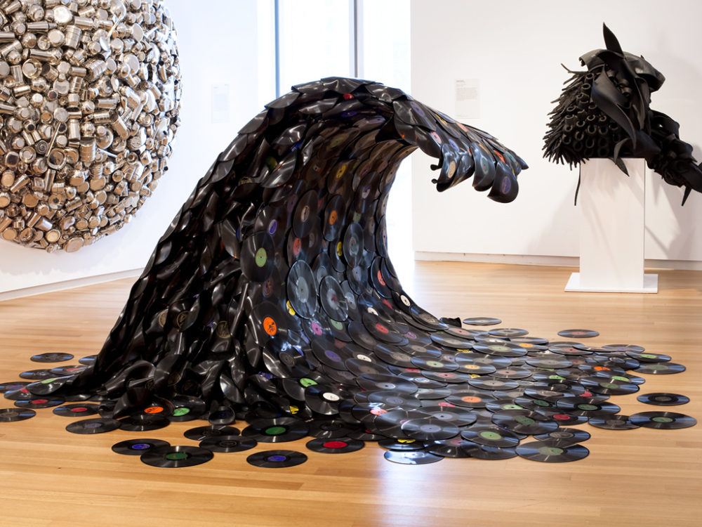
http://www.jeanshin.com/soundwave.htm
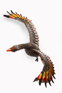
http://federicouribe.com/
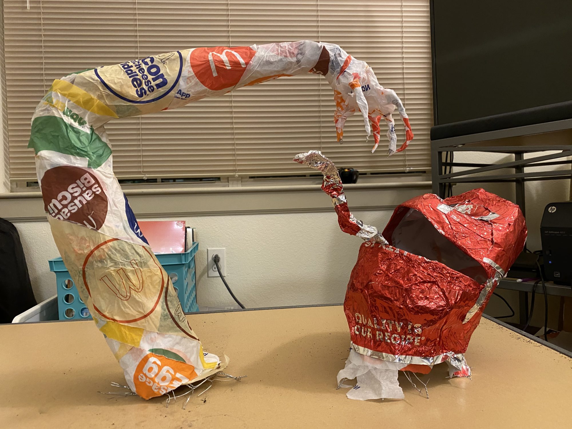
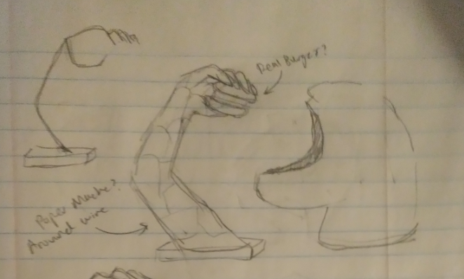
My vision for this project, coupled with a few idea iterations, ended up becoming a sculpture of an arm gripping an object, with a larger independent face structure; the whole piece will be of moderate size (with the head being the size of about a real head). A sketch for the initial design and form is below:
I wanted the aesthetic to be more kitsch or contemporary focused, as well as a bit surreal – I think that the nature of the material worked with lends itself to tackiness, garishness, or a general ‘disgusting’ feeling, which contrasts with the familiar nature of the form and structure. Similarly, I also wanted the piece to be a more sinister or unnatural, with elongated limbs and non-recognizable facial features. Functionally, the sculpture doesn’t serve much physical usage outside of being art. The piece needs to be striking and unique, while also depicting something familiar. Contemporary pieces also usually have a more complex message – I think that using fast food wrappers as a medium to create something relatively sinister or unnatural brings to mind eating fast food, and the effects it has on someone. I think that the thought I had going into the project was ‘you are what you eat‘.
The design process was relatively straightforward – since I had a general idea of the material and form (that it was to be a natural form, like an animal or body parts) of the sculpture from the beginning, there was not very much iteration in terms of defining the project itself. Rather, a lot of the design process was deciding on what specifically the form was going to be, and how to manufacture it in a way that would allow it to meet aesthetic goals while not being overly complex.

The two major points were deciding on the specific form of the sculpture, and the method of fabrication. With some suggestions from an earlier post, I ultimately settled on the arm and head, as well as using chicken wire fence as the inner structure upon which the fast food wrappers would be glued and layered.
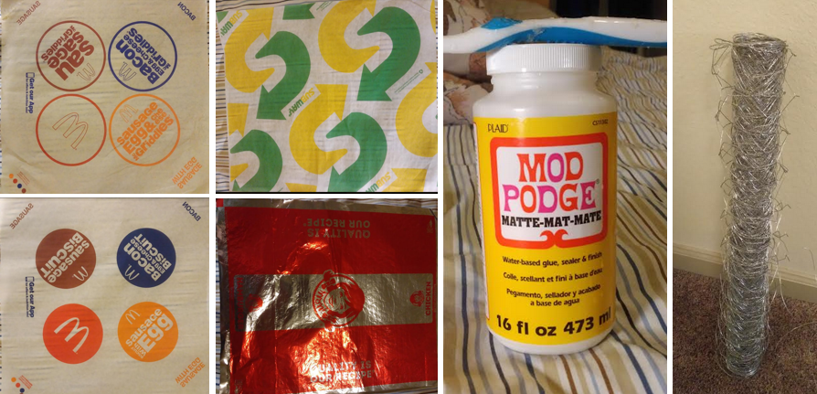
In terms of fabrication, the process was pretty straightforward as well. The materials used were: chicken wire fencing, a milk jug fast food wrappers, and Mod Podge water-based glue. I began by forming the general shape of the arm with the chicken wire fence as an inner layer for support and to establish the general structure. After, I began laying strips of fast food wrappers down in layers by applying a layer of glue and simply affixing it to the chicken wire frame. Over time, as more and more layers were applied, I also further changed the frame (since chicken wire is fairly malleable) into a more and more refined shape of the arm. After leaving adequate time for all the layers to properly dry, a final finishing layer was laid on top in a more aesthetically pleasing way, with the logos pronounced and arranged in easily identifiable ways. The process was completed similarly for the head, with a cut and glued milk gallon jug as the base instead of the chicken wire frame – however, instead of a diverse final layer, the final outer layer of the head was constructed solely of a bright red reflective wrapper, to draw immediate attention as well as lend to the uncomfortable and unnatural shape. Below are some photos taken of the fabrication process.
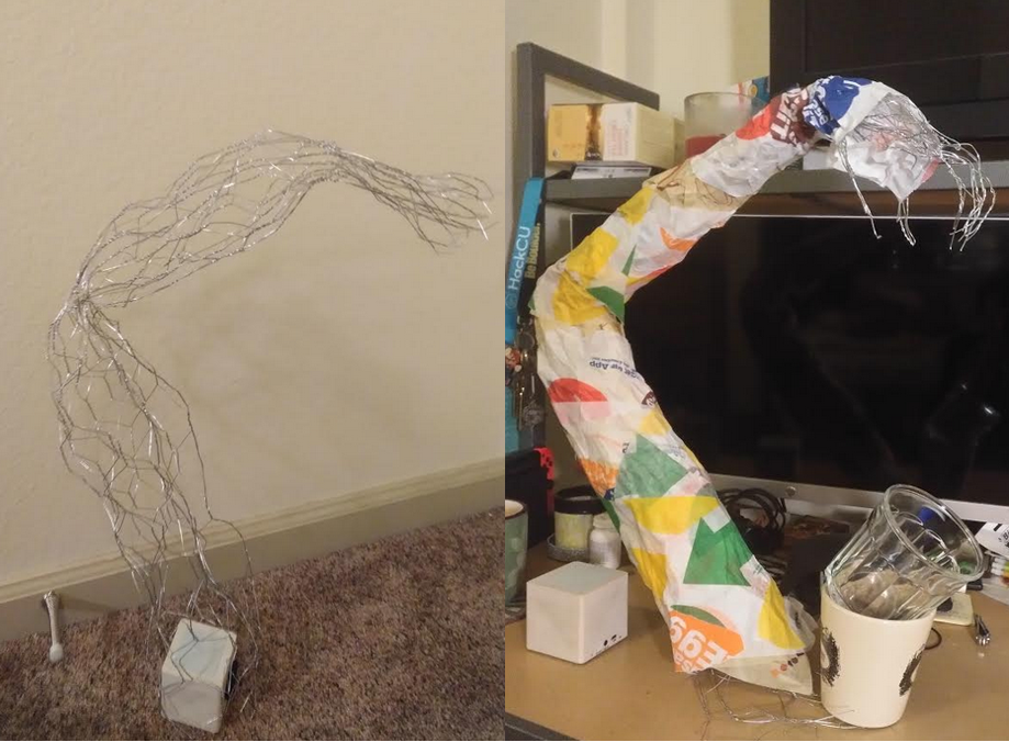
And here’s the final artifact:
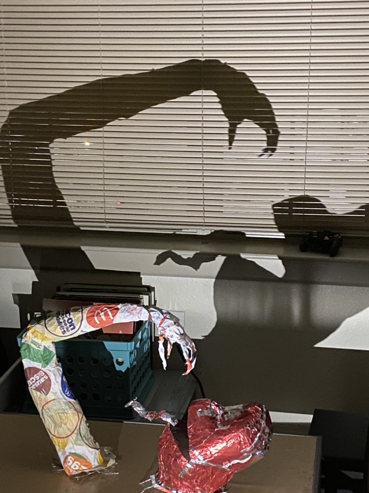
I’m pretty pleased with the final result – I have zero experience in the arts, so I was pleasantly surprised when the final sculpture turned out with the correct shape and structure. Functionally, beyond serving as an art piece, it looks and has the general shape of humanoid body parts, so I would say I succeeded in that area. Aesthetically, however, I believe that I’m a bit short in terms of meeting the aesthetic I set out to ’emulate’. While the general aesthetic is there (i.e. the figure is pretty horrifying, but also represents a deeper meaning), I think that the artifact could definitely use more polish in terms of both the details as well as the overall form.
I would definitely like to keep working on this particular sculpture in the future – I think that adding on with more wrappers or increasing the size would definitely benefit the striking imagery of the piece. Let me know your thoughts!
4 Comments. Leave new
Hi, Kevin,
I liked the way you structured the head piece to be. It reminded me of the M&M candy character: https://cdn-tp4.mozu.com/26445-m1/cms/files/redCharacter.png (<- This one) as I mentioned in class today. I also suggested to refine the edge in which the red foil is overlapping at to improve the aesthetics of the object and to make the head piece looks more uniform-looking.
In general, great job!
Xiang Luo
I think this is a great idea to use these wrappers. They have their own aesthetic and each brand intends to invoke certain emotions and appeal to increase their sales. I think we have an issue with consumerism in this country, and I think you captured that in your piece. It is sinister looking, however, I think this only adds to the concept. It also had that Tim Burton kind of look with a consumerism twist. I think this is the most thoughtful and insightful project I’ve seen so far. It really made me think. I agree with Jackson to “paint the inside of the mouth black to make it look more like a void”. Additionally, I think creating some kind of base for the head or just simply wrapping more of the wrappers around the base of the head would give it a more finished look. All around, great job.
Hey Kevin,
Great insight about using fast food wrappers as they are the most single used products. We often don’t realize how we’ve been surrounded by fast food( junk if I may say) and fail to see that we are slowly getting pulled into unknowingly. The sculpture has come out really really well with the arms and the mouth showing the exact emotion you stated in your abstract. I like your approach towards contemporary aesthetic, I think you have pretty much nailed it. Do you think there was any other approach to this or any other idea that struck you when you decided to move forward with fast food wrappers? About this project, is there any failure that bogged you down or was it perfectly made the first time itself? I would love to see how this can go ahead and be a bridge to changing the thought process for people about fast food joints. Great work.
Hi Sarthak, thanks for the great response and the compliments,
In response to your question, initially I was going to build upon a wire base using the wrappers in a more ‘knitted’ or intertwined fashion – I quickly realized, however, that that method would require far too many materials that I didn’t have. The biggest issue I ran into was how to initially build the structure on top of the chicken wire fence – the glue wasn’t really sticking from the wrapper onto the frame, so the first few layers are soggy messes which was eventually covered up by the top layers. I ended up using a thinner layer of more sturdy paper in the inside to help build up the outer layers.
Cheers!