
Making art from trash is an interesting experience, it incorporates creativity and recycling to generate something amazing. For my upcycle project, I used a combination of the minimalist aesthetic, but instead of leaving it devoid of emotion, as minimalism usually is, I tried to introduce some connection to my life to it. I chose to do this because I feel that while the minimalist aesthetic is beautiful, I want people to be able to relate to my artwork and understand how I feel when they see it.
![]()
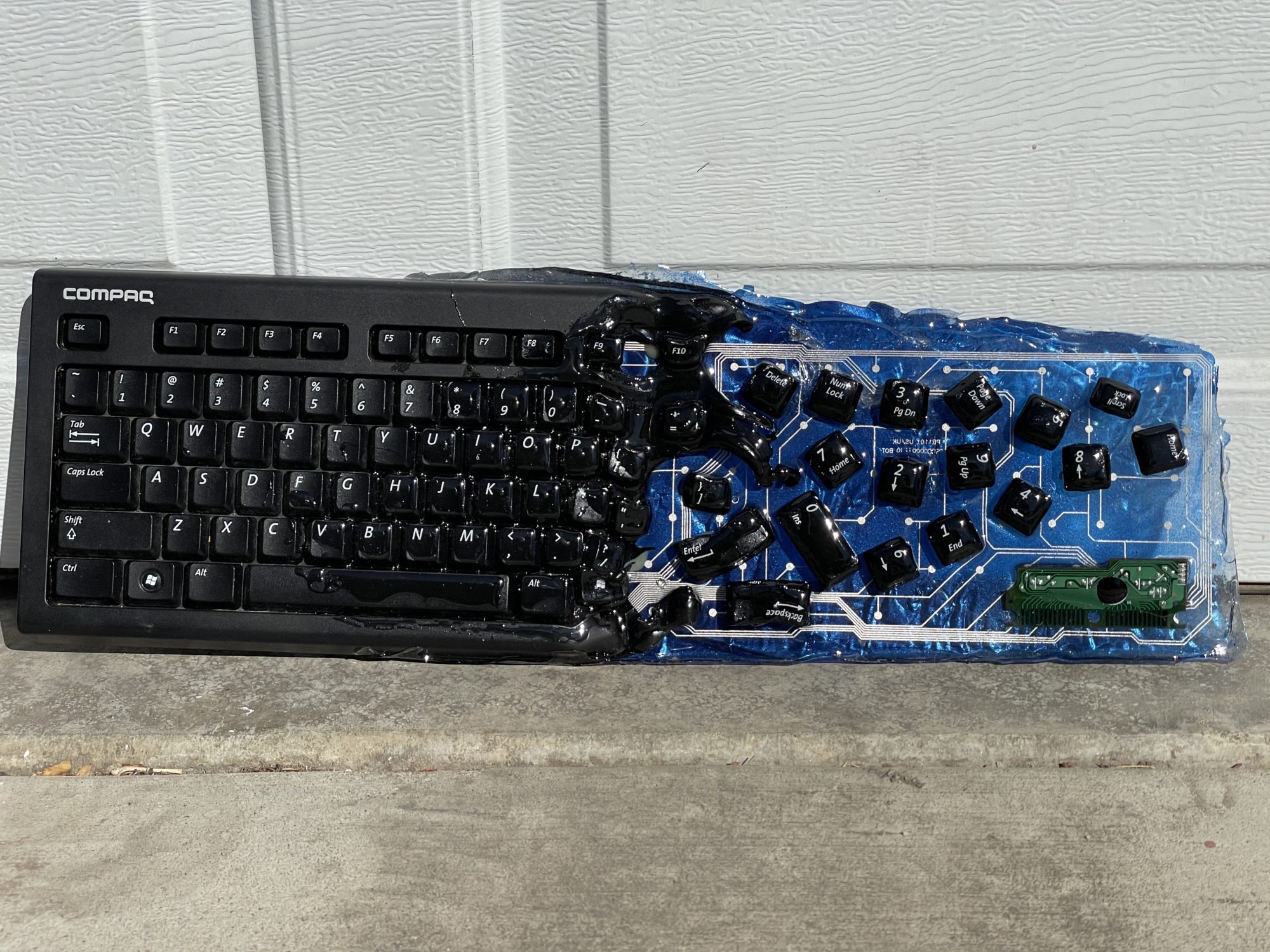
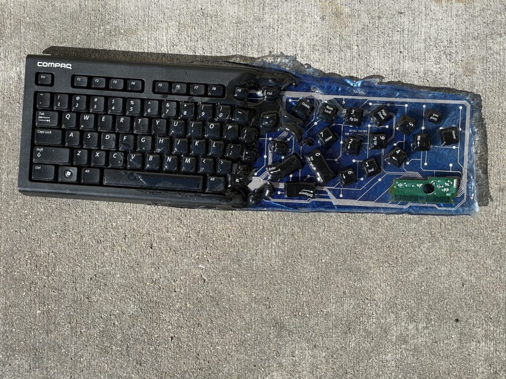
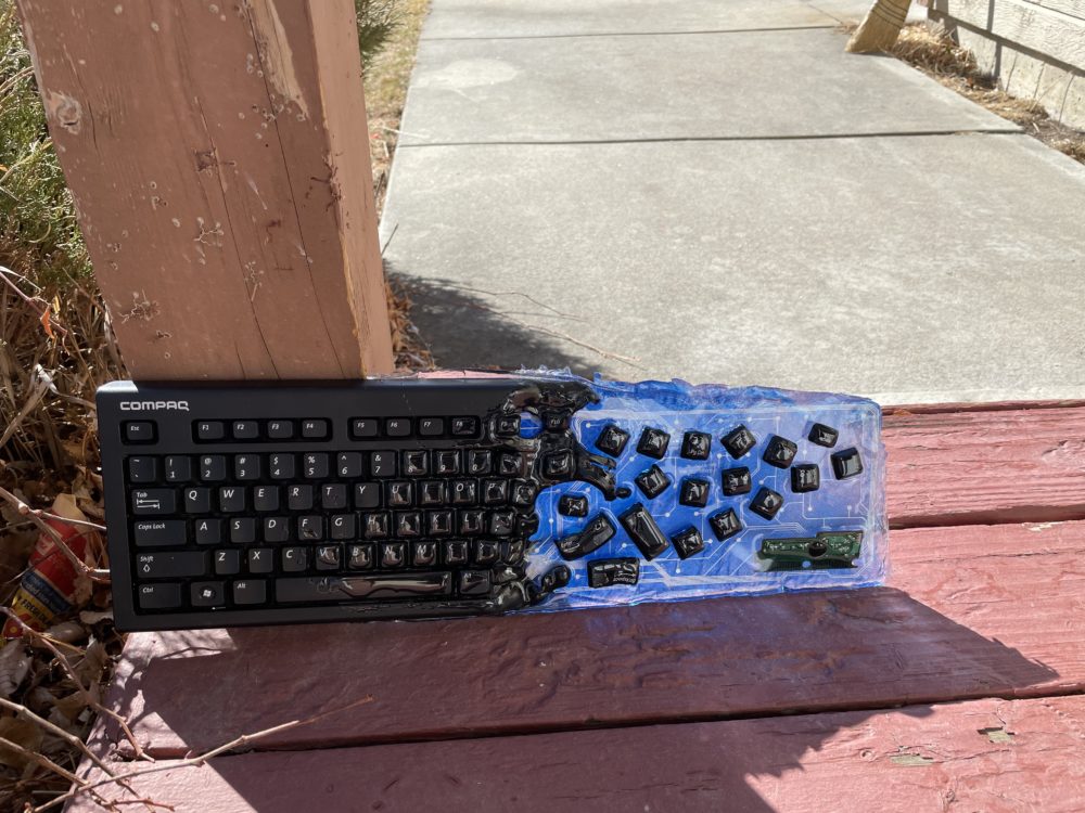
For my project, I decided to use a keyboard I found in the trash because in this time of quarantine and online classes, I spend much of my time in front of a keyboard. Sometimes I feel as though my entire life is melting into the keyboard. I tried to encompass this emotion in my artwork by physically showing the keyboard melting. I also included certain keys in odd orientations to represent things that I see in my everyday life during this unprecedented time. One of the most important components of the minimalist aesthetic is the use of open space. I created this illusion by removing a significant portion of the keyboard while leaving the underlying clear circuit. This gives a break from the dark colors of the keyboard and showcases the internal workings of the device. It took quite some time to decide how much of the open space should be filled to make the piece look complete.
Another important feature of the minimalist aesthetic is incorporating simple colors like black and white. I tried not to stray too far from this design by keeping the keyboard its natural color of black and using simple hues in my open space. This task was much easier because the internal circuit board of the computer was actually clear with white contacts. However, background colors were added to show off the details of the artwork. I also incorporated three dimensional features in my design by having some of the buttons at different levels than others. While this was initially a mistake, this creates the illusion of depth within the artwork, which is a very prevalent feature in traditional minimalist style. This design feature originated from early minimalist artists combining their sculpture and painting skills into one piece. All of these design components contribute to an artistic piece that is primarily minimalistic but with the added benefit of emotion. I didn’t want to produce something that conforms to one style only because usually the artwork ends up being very similar between different artists even though they are working with the same design features. However, while constructing this piece, I have overcome many challenges that I didn’t expect. I have found that even though you have a good idea of what you want to do, it usually won’t be as easy as you imagine.
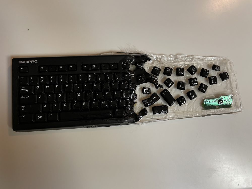
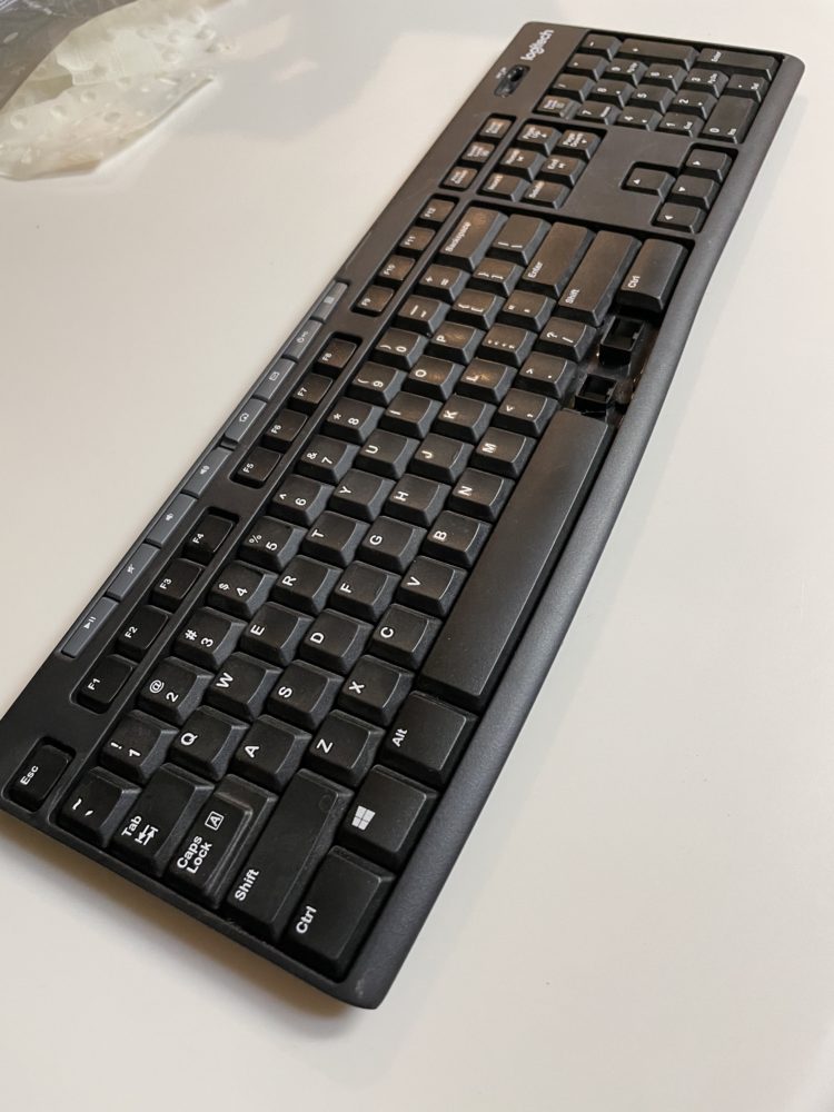
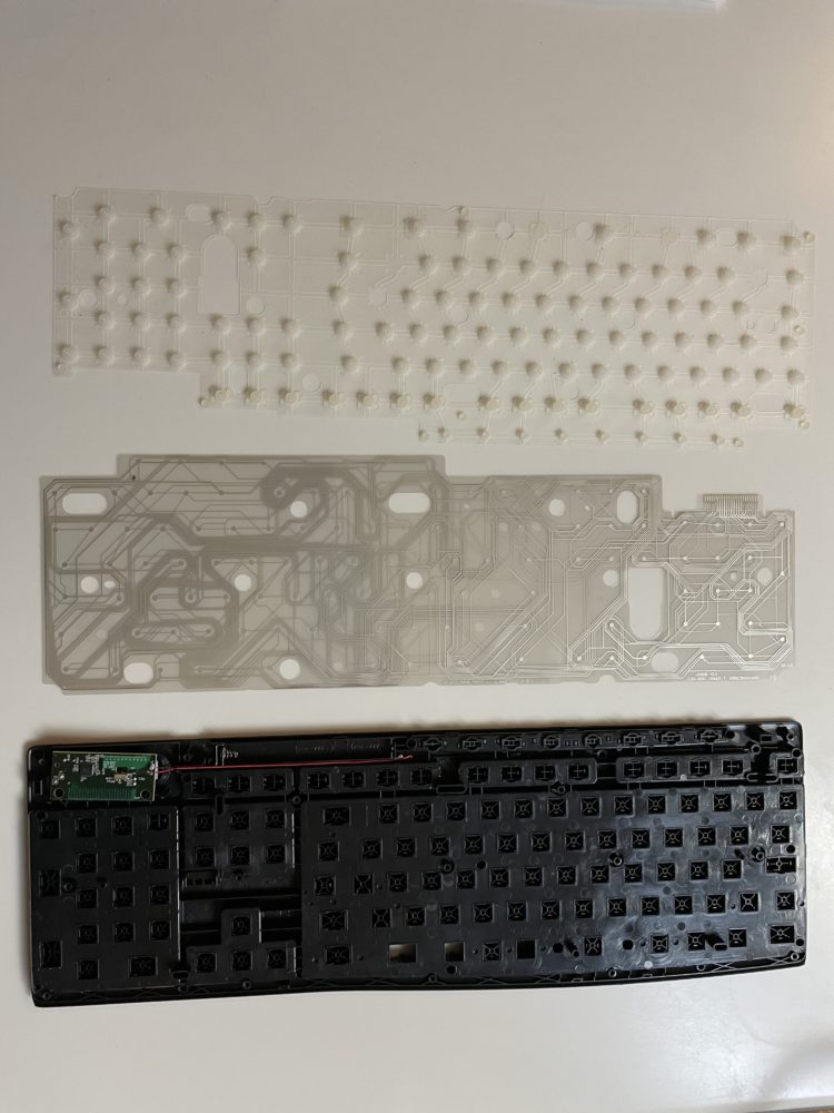
I found this outdated keyboard in my garage collecting dust and thought I could convey this idea well using it. First, I deconstructed it to examine the internals of the keyboard. I found quite a few interesting pieces; I really liked the aesthetic of the clear circuit section that was used for detecting button presses when the keyboard was in use. I also liked the rubber section to make the key presses feel better, but I couldn’t find a way to incorporate it effectively without ruining my minimalist aesthetic. I also experimented with removing the keys to be placed back into the artwork later. Next, I heated up the keyboard in the center using a heat gun to the point where I could see the plastic begin to deform before pulling it in half. This generated quite an interesting effect as is appears the keyboard is melting away into nothing. My next step was to figure out how to present all of these pieces in an aesthetically pleasing fashion.
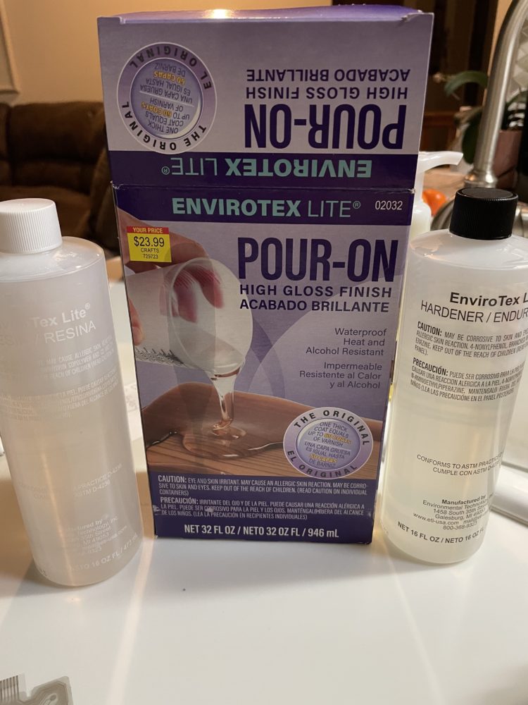
To do this, I turned to a medium I have never used before, a clear resin that can be poured over anything and then hardens to create a hovering effect of the components. Being the first time using this, it took a few tries to get the mixture correct and ensure that the resin didn’t flow past where I wanted it to. Even so, I still struggled with this in my final product, with some edges being inconsistent and some of the keys not fully covered. I also had trouble with the cure time of this resin as it has taken much longer than I anticipated which means I have to wait before I can complete the project. However, I feel that these flaws give the artwork character and add to the overall effect of the piece. My final step was to add color to the backside of the keyboard to better display the intricate circuit that controls the key presses and make the floating keys pop. I decided to use only one color, metallic blue, as it adds some meaning to how I feel about being behind a keyboard all day.
If I were to do this project over again, I would change a couple of things. I struggled most with containing the urethane to the area I wanted it to encapsulate. Instead of the urethane staying on the components as I intended, it would run off to the sides and fail to stay on the keys or circuit board. This effect also forced me to apply the urethane in small amounts as not to overflow my rudimentary containment devices that mostly consisted of boxes and pencils. In the next iteration of this project, I would build a box from scrap wood to surround the keyboard so that the urethane could be contained into the area of the keyboard and generate sharper edges around it. This change would also allow me to pour more urethane per application and likely decrease the total drying time and crafting time of the project.
I would also make some different choices about where I placed the extra keys and the circuit board I found within the keyboard. I found out too late that by not cutting the bottoms off of the individual keys, they stood up too much and were difficult to cover with urethane. However, this mistake contributed to more depth in the artwork because some keys were at different levels than others. I would also remove some of the keys from the transition area of the keyboard to improve the fading effect, as well as forego the circuit board. I feel that the circuit board doesn’t fit with the aesthetic, not only for its odd placement, but also for the green color clashing with the blue of the backdrop.
Lastly, I would try to change how the break in the middle of the keyboard came out. When I initially melted the keyboard, there were many strands that stretched out towards where the miscellaneous keys are in the final product. When the keyboard finally broke into two pieces, the strands compressed significantly and changed the aesthetic I was aiming for. Next time, I would add more heat at this point to make the plastic more willing to break in these elongated strands that would have added to the smoothness of the final product. Overall, I am very pleased with the outcome of my project. I think it represents the aesthetic of minimalism relatively well, while also incorporating some emotions from our current time into the artwork. I hope you have enjoyed the progress of my project as much as I have enjoyed creating it.
If you are interested in seeing my video presentation of this project the link is provided here: https://vimeo.com/516400252
4 Comments. Leave new
Hi Zack,
I think that you did an amazing job with this project and you were able to capture what you were going for very well. It is very true that today we are all melting into our keyboards with everything being online and I think that this was an excellent way to capture that. I think a good addition may be to do an outline around the keyboard in plexiglass to help keep the epoxy from running but overall amazing job!
Thank you for your comments, I also think that I didn’t do the outline of the keyboard very well. I will have to say I didn’t consider using plexiglass but I think it would be a good way to capture the urethane effectively. It would have also eliminated the need for plastic on the back which was difficult to remove.
Hey Zack. I was instantly drawn into this project. I didn’t realize why at first until you mentioned your inspiration being us all melting into our keyboards. I can definitely relate! I really enjoy the overall look of your piece. I hope you use it as a decoration in your workspace. I think I would agree with your own reflections about using a wooden box for the urethane and having more strands of plastic. I disagree, however, that the circuit board doesn’t fit. I think it makes for a nice visual break at that end. I think the same effect could probably be created with the space bar though. I’m curious about how you chose where to melt the keyboard?
I am glad my underlying theme was somewhat clear. I have already hung it where I do my work so I get to enjoy it every day. As for where I decided to make the break, I tried to put it in the middle of the keyboard to give it some sense of completeness on the left side. I probably could have only left a third of the keyboard intact, I think it would have been more visually appealing because I could have had more freedom with my key and component placement.