
Just a little recap for my original plan for this project…
I bought some Nerf guns at the beginning of quarantine to curb my girlfriend and I’s boredom. It quickly devolved into being paranoid of walking into a room due to the fear of catching a Nerf dart in the eye. As the months progressed, we slowly lost more darts and came to a truce as to not end in one of us being blind, thus they started to collect dust. But, I wanted to come back with a vengeance.
Since my mind is that of a student engineer, I started thinking of ways to upcycle the plastic Nerf sitting in my closet for increased performance and enhanced visual appeal. My plan was to apply an aesthetic that I’ve grown fairly fond of, outrun, due to my research of it in this course along with upgrading the components of the Nerf gun to make it more powerful than the company would likely be comfortable with.
The Upgrade
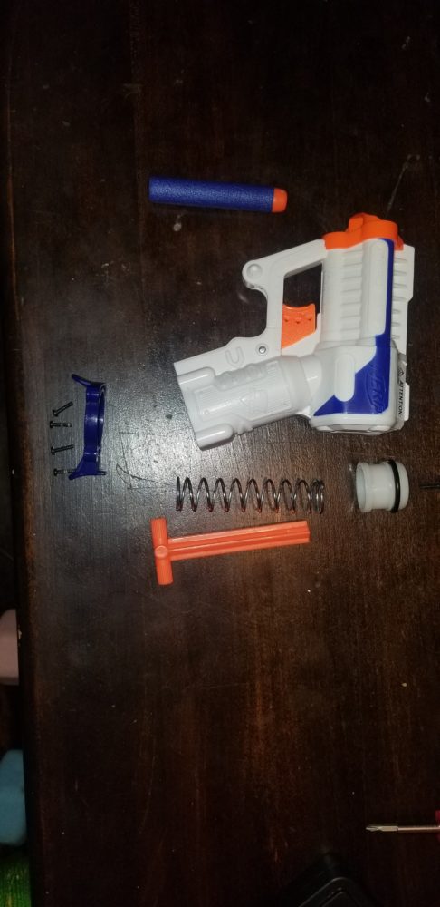
A Nerf gun is a really simple mechanical machine. It consists of a plunger than creates an air tight seal that is propelled forward by a spring. The sudden movement of the air is transferred into a chamber that holds a dart and all the energy from the air is transferred into the dart, propelling it out of the gun and across the room. I saw 2 specific pieces that I thought would greatly improve the performance of the gun: the plunger itself and the spring. Upgrading these seemed like a simple task. I did some preliminary tests to measure the spring constant of the stock spring and used video to determine how fast the dart was with everything stock. I was able to determine that the dart was capable of moving around 65ft/s.
I luckily have a mishmash of all shapes and sizes of springs from different projects over the years. I decided to pick a spring that was slightly longer than stock but about half an inch to generate more potential energy even before it is compressed and much stronger in terms of spring constant.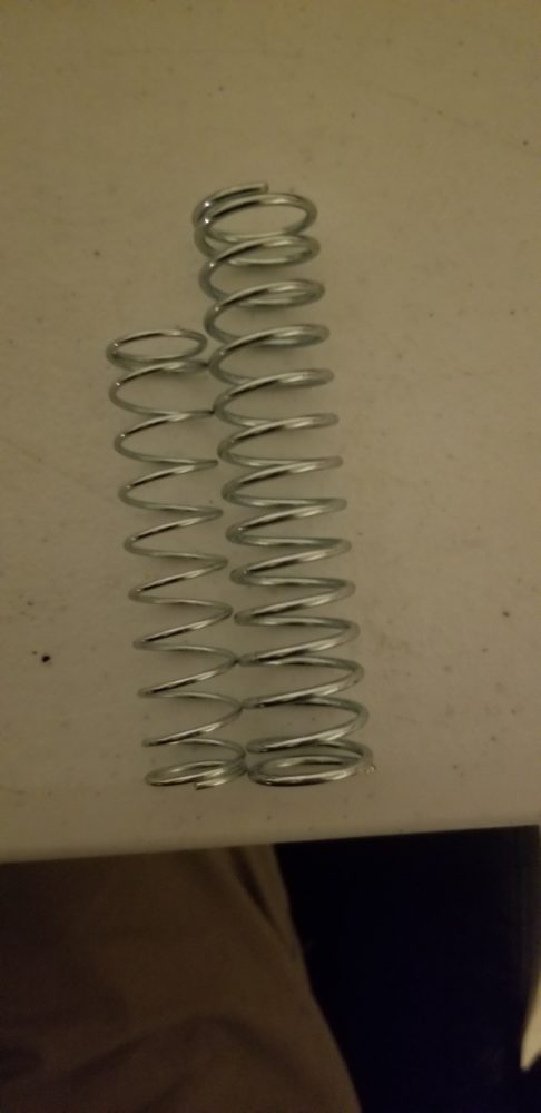
Along with the spring, I added some plumbers tape around the plunger and sprayed some WD40 on the O-ring to make sure there were no loses to a non-airtight seal or friction.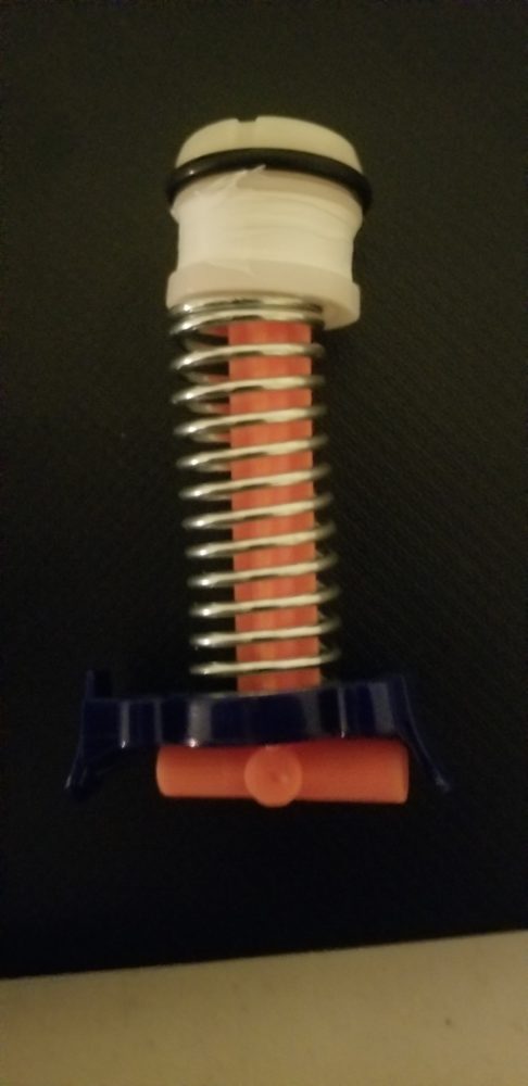
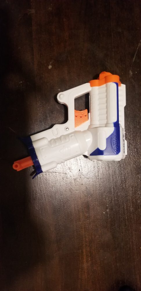
I had all the ingredients to make a Nerf gun that I was confident would shoot at least 2x as fast as the stock form. The only problem was, I severely overlooked the material limits of the body. As can be seen in the above photo, the larger spring was under a lot of compression before even being inserted into the gun. I was weary of this but thought since the plunger was being held on by the same screws, the 4 that attach it to the body should easily suffice in containing all the energy. Attempting to screw this on was a battle, and I really should have remembered the mantra that if something seems harder than it should be, you’re likely doing it wrong. I was able to get 2 of screws in and I reached for the 3rd, I heard something that sounded like breaking plastic and a spring decompressing. When I looked back, the spring managed to completely strip all of the holes that had screws in them. As it turns out, a child’s toy made of plastic does not take well to being under about 5x the normal amount of force it is under when completely stock.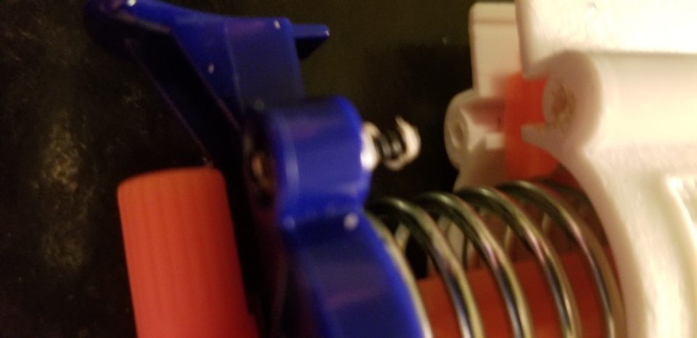 At this point I felt completely defeated. This was going to be the main draw of upgrading this entire project, and it would give me a really fun toy to mess with once this was all said and done. That being said, I persevered. I saw what was in front of me and realized I had a broken toy, but there was still a lot of potential to make it an aesthetically conforming piece. So I went all in on the aesthetic design of the toy.
The Aesthetics
I had already planned to give this a nice coat of Miami Vice inspired paint. This is commonly referred to as Outrun, and if you want to learn more about it take a look at my previous posts, but to boil it down: it is an homage to 80s retro futurism and colors where neon colors and simple shapes are dominant.
I think I am drawn to this aesthetic for 2 reasons. 1, it attempts to capture the nostalgia of the mid 80s to late 90s where all commercials and branding were in your face and truly something that has not been replicated since. I was born in the late 90s, but I sure did inherit a lot of clothes and toys that embodied everything that was the 90s aesthetic. And 2, I think it just looks really cool. The movies, books, and games that take advantage of this have the perfect blend of subtle and genuine “coolness” with slight self aware cheese. Applying that to a Nerf gun, something I fondly remember in my childhood that brings me nostalgia and a cheesy looking toy that I could try my best to turn “cool”, seemed like the perfect combination.
A lot of Outrun art is digital, and because of that they can take advantage of computer programs to genuinely give the colors a neon look. I found that the most common color scheme that works in practicality is something called “Jazz”. You may remember this from disposable cups, clothes, and modern artists trying to parody the 90s.
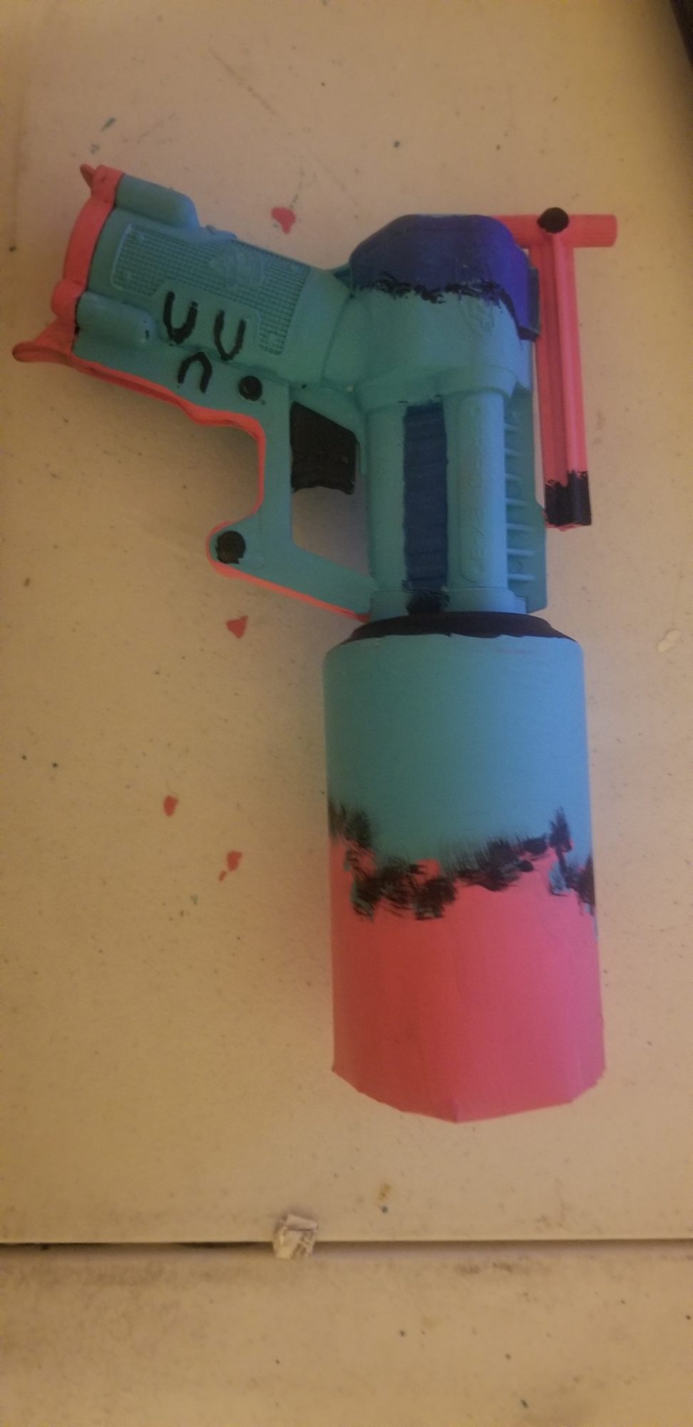
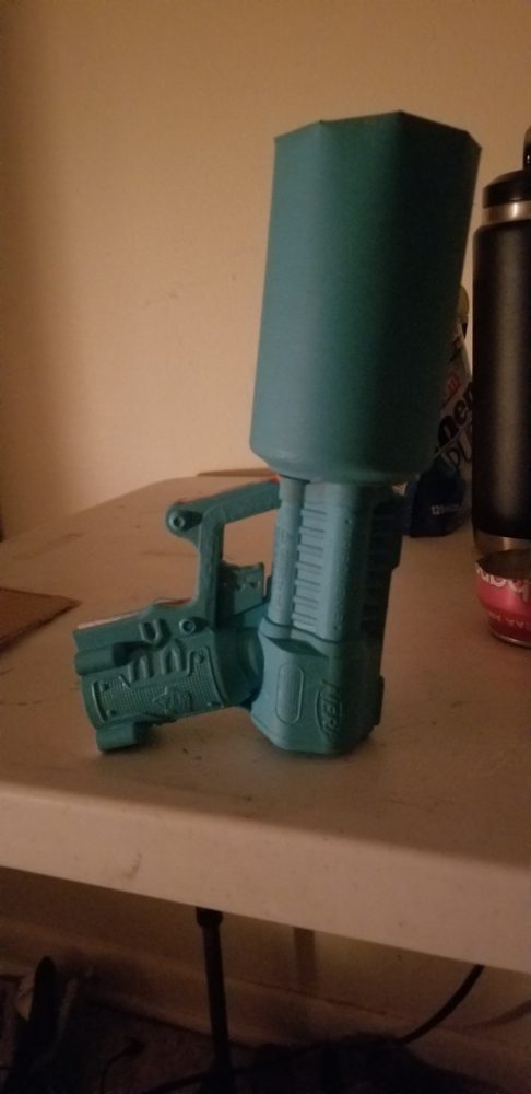
This version of Outrun takes advantage of a teal blue, bright pink, and contrasting darker/lighter shades of black or previously mentioned colors. I tried my darndest to capture this color scheme with some acrylic paint I had laying around. I started off by giving the whole gun a teal base layer.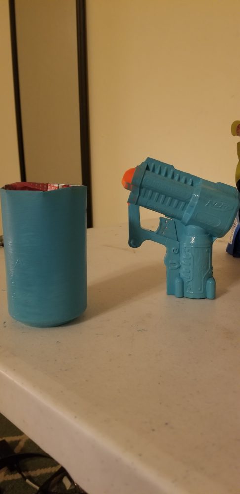
I also decided to cut up a can I had laying around to give it an oversized barrel that added some more surface area for painting along with conforming to the upcycling aesthetic.
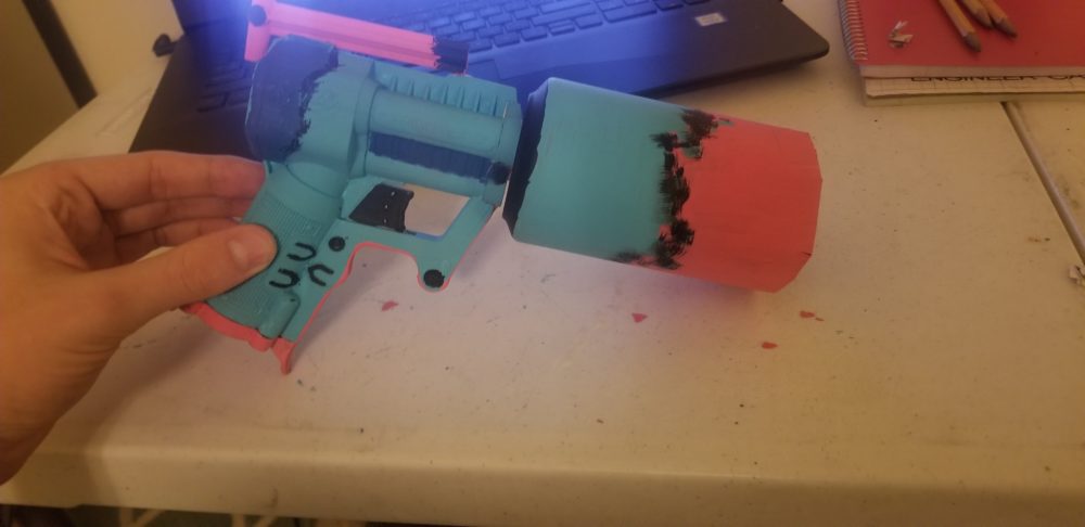
I also realized that the plunger and the bottom cover were now useless due to my over confidence in the strength of a kids toys structure, so I decided to reincorporate them into the design. I used the plunger to add some contrasting pink on the top of the gun along with contrasting pink on the bottom of the handle with the cover. I also hand painted with a sponger some pink on the end of the can. A very common thing in a lot of Outrun designs is a gradient that blends 2 colors. I really was not sure how to do this by hand with brushes since I’m almost positive this is often accomplished with aerosols or spray paint, but I tried my best to give it that illusion with the tools I had.
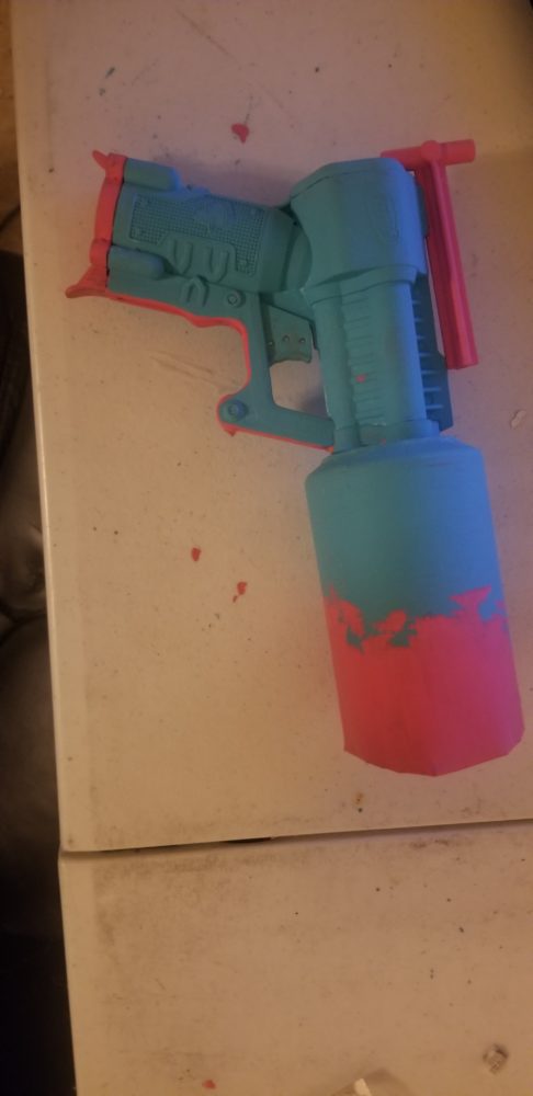
Finally to try and tie it all together, I added some different shades and some black to give it some contrast in areas that were not visually exciting. I regret adding the black to the barrel, when I added back towards the back between the dark blue and the light blue, it gave it a very natural blending look that is seen in a lot of Outrun. But I think I got overambitious with the barrel trying to accomplish the same thing, and it now sadly just looks out of place and messy.
In the end, I think I managed to successfully capture the aesthetic I was going for. I certainly learned a lot about how to successfully do so through trial and error. Sadly some of those errors clash with what I was going for on the end product, but at least I will remember what does and doesn’t work going forward. I really wish this still functioned as it originally did, but luckily I bought 2 of these at the beginning of quarantine so my quest might not be over just yet. The color scheme I picked was probably the best one for real life practical use, I think it genuinely looks like a toy from the 80s with the color schemes and ridiculous features, and I have a fun little memento of my childhood that captures an aesthetic I genuinely find appealing.
*Note: I received a lot of feedback from my group and applied it to the finished product. In the video, I only had 2 colors on it as I was not confident how to really flesh out the aesthetic but luckily my group pointed me in the right direction for finishing it up strong.
Presentation:
Sources
- https://en.wikipedia.org/wiki/Wikipedia:Non-free_content_criteria#4 – Open Source Photo
- https://www.bostonglobe.com/arts/2018/07/04/albarn-rain-cloud-reflections-leave-gorillaz-mist/M7k1w0lIvTej1YUuVgDXIN/story.html
4 Comments. Leave new
Hi Ben,
I really like how you used a tin can to model a suppressor for your nerf gun. It seems like the choice of colours to give a neon effect to support your Miami Vice aesthetic worked really well. I wonder if adding a clear coat on the final product could help you achieve the neon texture a little better.
Cool color choices, the pink and the blue fit really well. I like the uneven line/design where the blue and pink meet on the can. Does the device still function? Could you make it stronger by just adjusting the suction of the plunger and forgoing the stronger spring? The cut off can looks a little rough, adding the top of a plastic water bottle could help to round off the end and elongate the chamber for the bullet. Could make the gun look bigger and more finished.
I like the tin can that you decided to use– it reminds me of an oil can suppressor which I’ve seen in video games before! Great job with adding the embellishments and extra colors, I think your intent comes through way more clearly now. I also think you did a nice job with taking good pictures to capture the colors. Nice work Ben!
Hey Ben!
I really love how this turned out. I think that the colors that you chose to paint the gun really sold the aesthetic that you were going for- the bright pink, teal, and black are perfect. Also, another one of my favorite touches is the addition of the oversized barrel. I was wondering if you have considered any other potential upgrades? I think that if somehow you were able to add like some neon pink LED’s that would really make the whole look pop.