
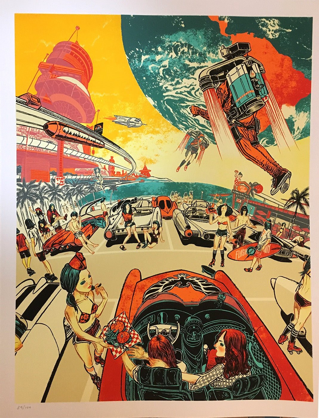
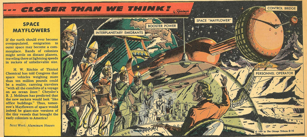
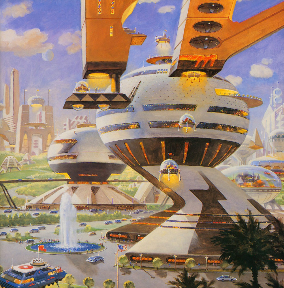
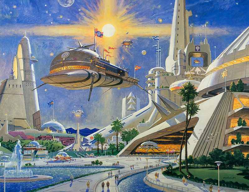
Retro-Futurism is an aesthetic that takes on an artistic style similar to that of the 40s and 50s. This is the kind of style that reminds me of classic Coca-Cola ads or drawings like “Rosie the Riveter”. What makes retro-futurism special is the incorporation of what someone from the mid 1900s might expect the distant future to look like. The contrast between the nostalgia brought on by the art style and the sci-fi features integrated throughout, the aesthetic can evokes a unique and thought provoking effect.
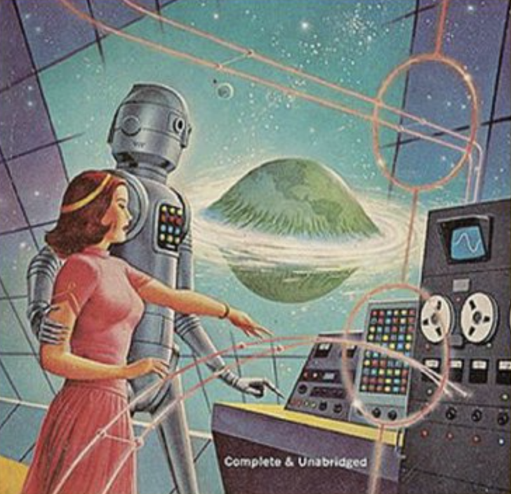
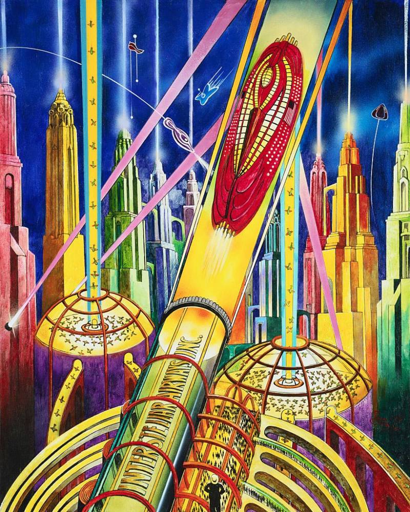
Drawings and other art pieces that exhibit this aesthetic date back to the 50s, but the term wasn’t coined until T.R. Hinchliffe wrote the book, “Retro-Futurism,” in 1967. It makes sense that this aesthetic emerged around this time because of the space race, which spanned from the mid 50s to mid 70s. Furthermore, television shows like Star Trek and Dr. Who easily could have inspired some of the art of the time that would fall under this category. Even today, the idea of space travel itself provokes thought of what the future may hold, so I can imagine that back then it was even more enthralling.
In the coming years after the space race, some of the media that came out could fall under the category of retro-futuristic. A couple of movies that stand out to me are Back To The Future and Star Wars. Of course, at the time this was just sci-fi, but since decades have passed, I would consider it retro-futurism. The aesthetic has also influenced the rest of the world, from postmodern architecture, to video games like Fallout and BioShock, to other aesthetics like vapor-wave.
These days, people still make retro-futuristic art, but typically not in the same way as they did in the 1900s. Today most of the artists I’ve seen that use this aesthetic do it more like a collage made in PhotoShop. They take drawings from old ads and articles from the “retro” time period, stitch them together, and add their own marks and effects to help the pieces come together as a whole. This technique can result in some truly gorgeous and astonishing images in my opinion. I would have liked to have included some of my favorites from Instagram, but often times it’s hard to find the original artist and date of the work. Still, I think it is worth mentioning.

Sources:
Weaver, Stephanie. “Retrofuturism: Where We Thought We’d Be vs. Where We Are.” Ripley’s Believe It or Not!, 3 Jan. 2022, https://www.ripleys.com/weird-news/retrofuturism-where-we-thought-wed-be-vs-where-we-are/
All That’s Interesting. “55 Enthralling Images of How Artists of the Past Imagined Life Today.” All That’s Interesting, All That’s Interesting, 18 Apr. 2022, https://allthatsinteresting.com/retrofuturism.
Hinchliffe, T.R.. Retro-Futurism. Pelican, 1967. https://www.redbubble.com/people/compoundeye/works/7327105-retro-futurism-t-r-hinchcliffe-pelican-1967
4 Comments. Leave new
Oh goodness! This is gold. I have been always attracted by Retro-Futuristic Art form. A section of which you hit spot on in your article! – this is one of the art forms personally for me which keeps me inspired about the future of humanity as a civilization. I believe as I look back at this art form from early 20th century, among many other art forms it has most impact on the future of technological directions and aspirations which we strived for collectively as humans.
I think these art form are derived from famous Sci-Fi authors works like H.G. Wells, Robert A. Heinlein, Issac Asimov, etc. As per your research how much impact or influence these Retro futuristic art is dominated by Sci Fi Authors of their times or is it vice versa; thought of these authors were inspired through such art form?
Yes thank you for the support. I think sci-fi writing, film, and art all go hand-in-hand. At the end of the day, all of these media are art forms in a way. I can’t say for sure which came first, but all of the above were definitely influenced by the space race and other technical advancements of the mid 1900s. Since then, there was an explosion of new ideas pertaining to space. Thanks again for the response!
I myself have always been captivated by space and interstellar travel so this aesthetic resonates well with me. I thought your post did very well giving the reader background information on how the aesthetic came about and its impact historically. Is there any specific meaning for the bright pops of color that the images all share and what are a few key aspects that you think are the most important to make something fit in this category of aesthetic? I really enjoy the and it really does remind my of the the fallout videogame series and how it connects to the time period of the space race and arms race.
I chose the images with bright pops of color because they were the images I personally liked the best. But also, most of the images I found depict a utopian society, rather than dystopian. Bright colors can indicate prosperity and happiness, but I can’t say this is why for sure. I think the most important aspects of the aesthetic are the inclusion of technology while maintaining a classic Coca-Cola advertisement type of art style. I do not consider myself an artist, and I’m not sure what to call that art style, but it’s the type of art that makes me think of the 50s. Thank you for the response and support!