
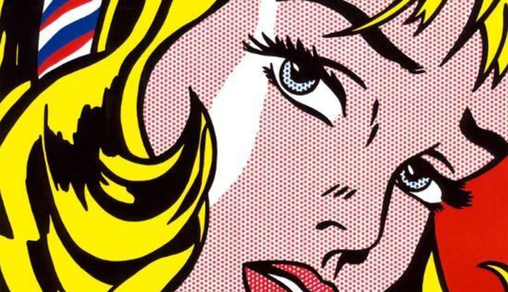
Roy Lichtenstein, Girl With Hair Ribbon, 1965
Pop art began soon after the end of World War II and stemmed from the consumer culture during the era. Brands used flashy, solid colors with distinct cartoon style, and artists began to poke fun of this by incorporating this style in their art. One of the most famous pop art pieces is the Campbell soup painting by Andy Warhol. His thirty-two canvases used to express the large amount of companies’ advertisement, mass production and celebrity culture. Each painting shows a different flavor of soup, all hand painted yet appear to be screen prints and copies. The hand painting allows for some variation, giving them all an imperfect feeling. He showed that while capitalism and advertisement was everywhere, their designs do not have to be devoid of character.
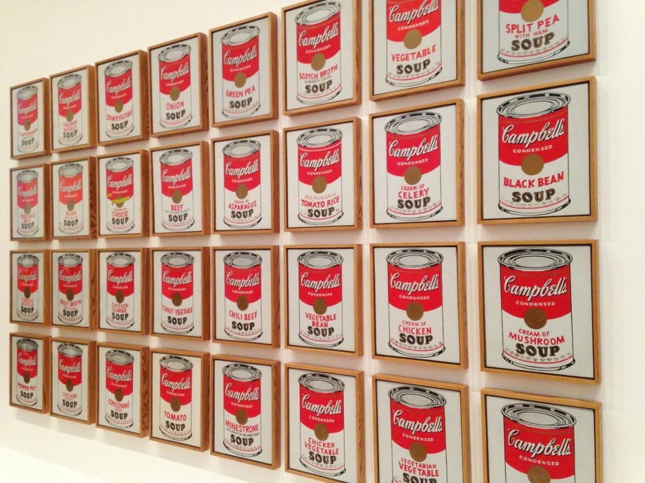
Andy Warhol, Campbell’s Soup Cans, 1962. Courtesy MoMA
The Pop Art movement was used as an outlet for people that felt that everything was mass produced and cheap. This theme is expressed through the repetition, but also through bright colors in places where they shouldn’t be. The misplaced, vibrant colors used to give an uplifting but unnatural feeling. Andy Warhol’s Marilyn Monroe paintings are a prime example of this motif. The purple skin and the bright yellow complimentary colors giving a warm bubbly sensation, but some of the colors are missing in repetition or outside the lines. It makes the repetition feel rushed and cheap.
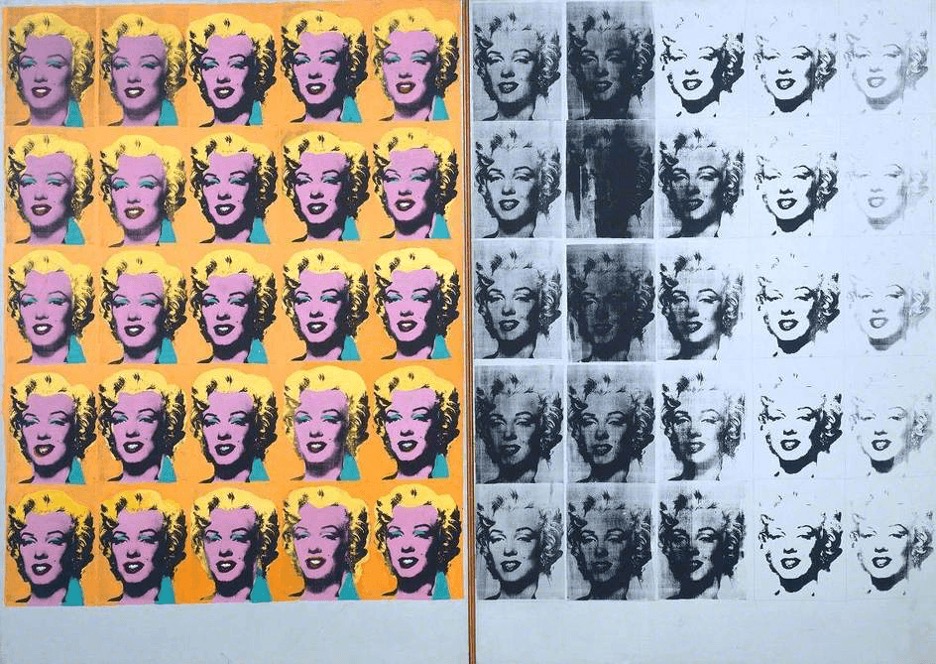
Andy Warhol, Marilyn Diptych, 1962. Courtesy Tate
Some of the most influential pop artists are Andy Warhol, Jasper Johns, Roy Lichtenstein, and Keith Haring. Many of the major artists of this period started in commercial art. “Andy Warhol was a magazine illustrator and graphic designer, Ed Ruscha was a graphic designer, and James Rosenquist started out as a billboard painter” (Wolfe). Having a background in corporate design, these artists were able to create a familiar feeling and making easier for common people to relate to the art.
Roy Lichtenstein has one of the most recognizable styles, usings dots and bright primary colors to give his paintings a comic book style feel. His images often “portraying highly charged situations” (Wolfe), with action packed scenery and fast movement. His work filled text boxes and interjections like “WHAM, POW, BOOM”, mimicking comic book and popular culture. His comic book style and bold lines led to fashion being designed around his style.
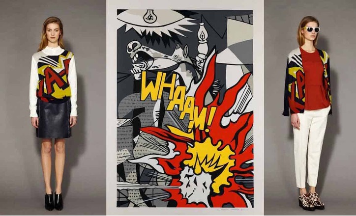
Roy Lichtenstein, Whaam!, 1963. Courtesy Tate
The pop art movement merged fine art with imagery seen in advertisement and mass media. This made fine art more relatable and accessible for the public. It challenged the idea of consumerism and the lack of character in advertisement. It redefined who art was for and what it represented, and It still influences some current commercial design and resonates in our culture.
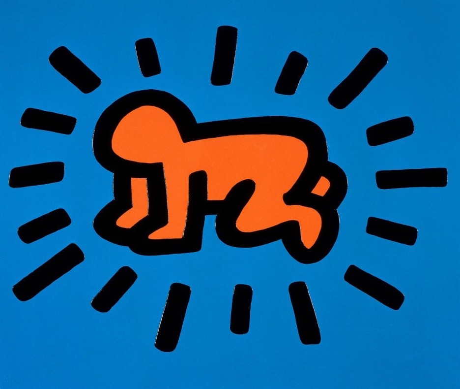
Keith Haring, Radiant Baby, 1990. Courtesy Tate
2 Comments. Leave new
I liked how you broke down how Pop Art blurred the line between fine art and mass media, making it more relatable and accessible and how you highlighted the use of bold colors and repetition to critique consumerism. The nod to artists’ backgrounds in commercial art was a cool touch too.
I enjoyed learning more about the cultural context of the pop art movement through this post. I had seen Andy Warhol and Keith Haring’s work before, but definitely gained an appreciation for how their work is meant to be a critique of consumerism. I found it interesting to see how their work is able to “re-claim” many of the styles that they are commenting on / critiquing. I think it would be interesting to explore more into how this movement is seen in contemporary art and advertising, and how artists today are continuing the movement.