
The Unexpected Red Theory is a design philosophy and aesthetic approach that centers on the deliberate use of red as a focal point or disruptive element in otherwise a neutral or monochromatic compositions. It is not simply a color choice but a statement of contrast, surprise, and energy. This aesthetic plays on the emotional and psychological impact of red, using it to evoke attention, provoke thought, and transform the atmosphere of a space or design.

Origins and Context
While the exact origins of the Unexpected Red Theory are debated and unknown, the aesthetic has gained a lot of traction in the early 20th century, coinciding with movements such as De Stijl, Constructivism, and Bauhaus. These movements have embraced bold geometric compositions and often included red as a primary color to convey energy, focus, and on the contrary a chaos that puts a place altogether.
Red’s has a psychological significance; it is deeply rooted in human perception as a color of passion, urgency, and power. Designers and artists began experimenting with red’s ability to disrupt visual balance, making it an intentional design tool that highlights difference. The theory emerged from the belief that the unexpected placement of red—a door, a chair, or a single streak of paint—can create an arresting visual experience, drawing attention and inviting deeper engagement.

Influences and Inspirations
The Unexpected Red Theory draws from several movements and cultural references:
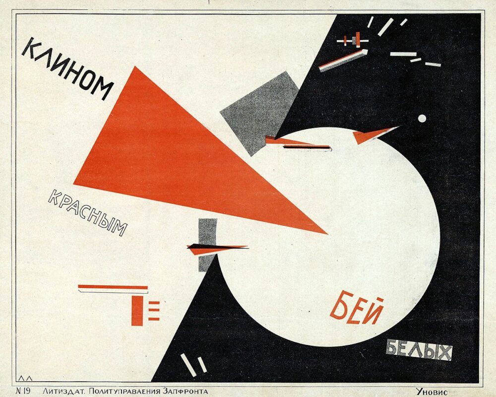
- Constructivism: Soviet designers used red to symbolize revolution and urgency.
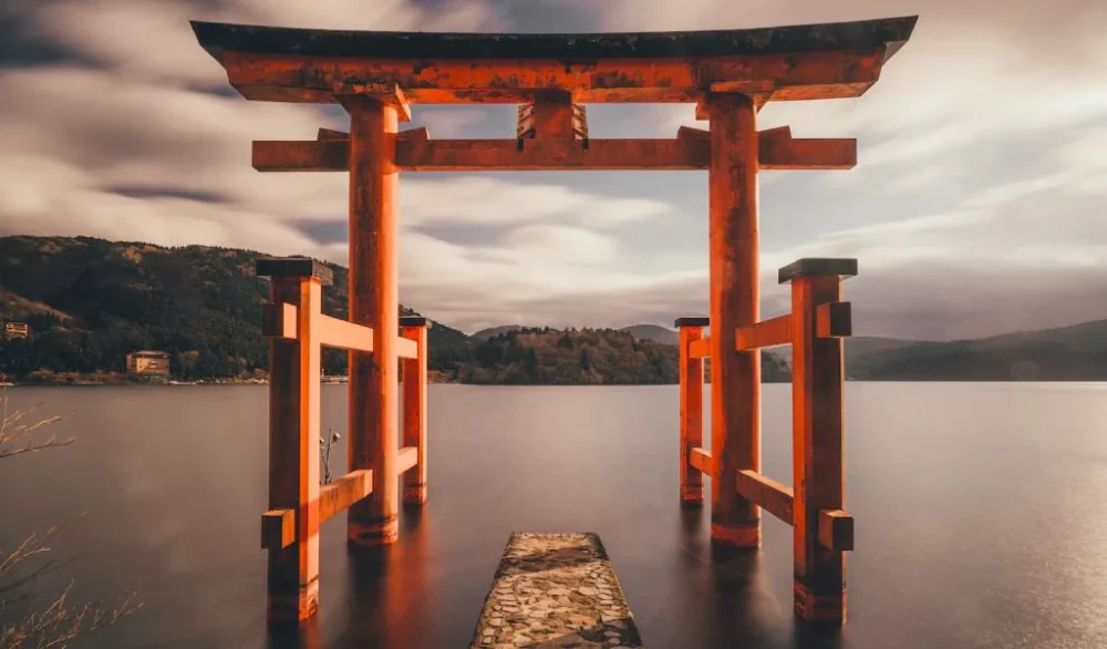
- Japanese Aesthetics: The concept of “ma” (space) often incorporates a single bold element—red—to disrupt balance and emphasize intentionality.
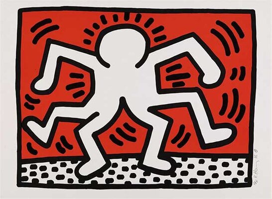
- Pop Art: Artists like Keith Haring used red as a visual disruptor, making everyday objects into striking works of art.
These influences highlight the universal and cross-cultural appeal of red as a design element. The use of red as a focal point transcends time, geography, and medium, embodying both simplicity and depth. By drawing from these movements, the Unexpected Red Theory continues to inspire designers and artists to evoke powerful emotions, create contrast, and redefine the visual language of their work.
Lasting Impact
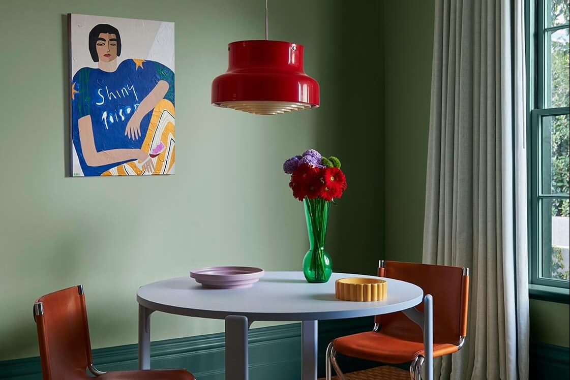
The Unexpected Red Theory has transcended its origins to become a staple in modern design. It has influenced everything from fashion to architecture, where red serves as a bold statement in minimalist and contemporary spaces. In advertising, red is often used sparingly to grab attention in cluttered visual environments. In interior design, a single red object can anchor a room, making it feel both dynamic and cohesive.
Conclusion
The Unexpected Red Theory continues to thrive as a tool for designers seeking to create visual tension and narrative within their work. Whether in architecture, interior design, or art, the intentional and unexpected use of red captures attention, evokes emotion, and elevates the ordinary into the extraordinary. This aesthetic reminds us of the power of a single, well-placed choice to transform an entire composition.
Images Reference Links
Figure 3. https://en.wikipedia.org/wiki/Beat_the_Whites_with_the_Red_Wedge
Figure 4. https://alberthern.com/blogs/news/7-japanese-aesthetic-principles-wabi-sabi-on-jewelry
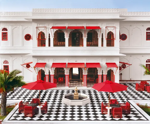
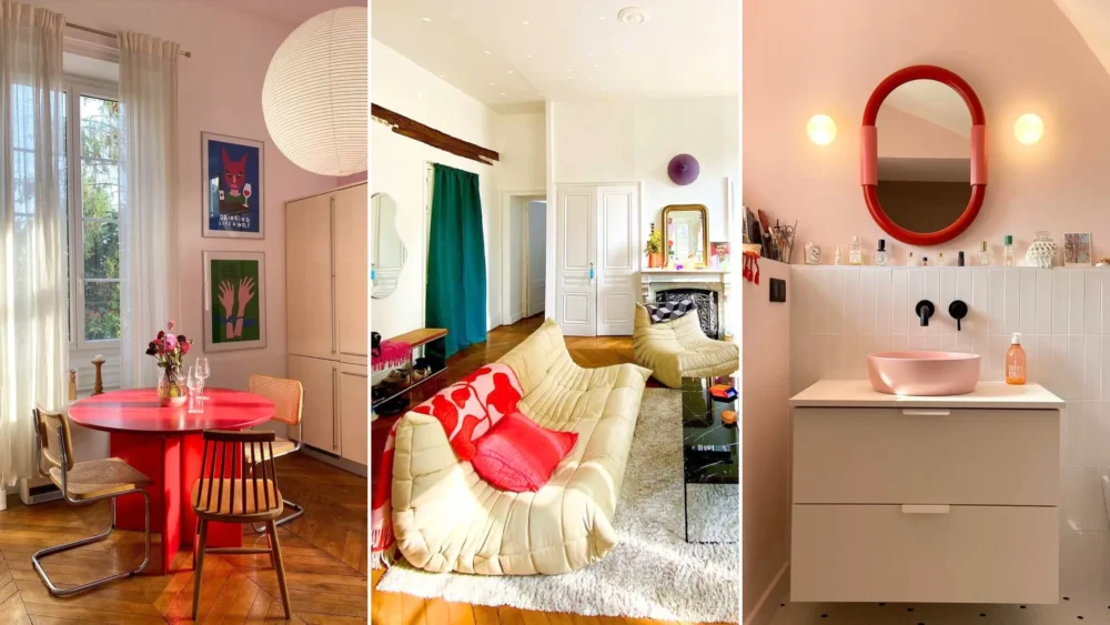
Figure 7. https://www.realhomes.com/news/unexpected-red-theory
6 Comments. Leave new
This was a great post to read! I like how you highlighted the psychological and cultural significance of the color red. The connection to movements like Bauhaus and Japanese aesthetics adds so much depth to the idea. I did my post about Bauhaus and I love the use of just primary colors in the aesthetic. It’s amazing how a simple pop of color can create such powerful visual tension and narrative. Definitely makes me want to experiment with this in my own creative projects. Thank you for sharing!
Hello Arden,
Thank you for replying to my post, it’s really nice to get the importance of psychology and art be reiterated. I would love to see how you use this to your own projects!
Hi Airyl,
This is such a cool aesthetic, I really enjoyed reading about the origins of the concept and the different applications and uses. Your post was clear and very well organized, and the pictures provided a fantastic visual reference as well as inspiration for applying this concept to my own art and projects.
I think it would be cool to add some way to visually compare a space with red in it versus without. You could maybe photoshop one of the example pictures to not have red in it and put it next to the original image, like a before and after. Overall, very well done!
Hello Ayesha,
I am glad you enjoyed reading my post. I tried very hard to keep it entertaining and be thorough. I also appreciate your suggestion, it would be nice to have a comparison, so I will try and do that!
Hello Airyl, what an interesting aesthetic! I never realized that there was a particular name (or aesthetic) for this concept! I even realized that I am guilty of using red to add a pop of color (either lipstick or as interior decor) without considering why I may have been drawn to red for such decisions. I appreciated the influences/inspirations section, as it helped me better realize how prevalent this aesthetic truly is! You mentioned it being used in fashion and I think it could be a neat idea to add some images to highlight that for visualization! You discussed the significance of the color red and why it often acts as the focal point within this aesthetic, but are there other colors that have similar theories of their own?
Hello Dawn,
Thanks for appreciating and learning about this aesthetic, I never really knew it existed until recently, and I have always used it myself to make a scenery pop. I do believe that there is also another theory for the color blue! But I do tend to like red and the meaning of it way more 🙂