
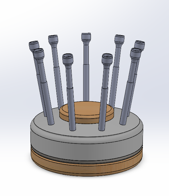
For my project, I’ve chosen to create something I’ve long wanted to make: a watchmaker’s screwdriver stand. This project finally gives me the perfect excuse to invest time into not only making it highly functional but also aesthetically refined.
Recently, I’ve picked up the hobby of watchmaking, which involves the repair and servicing of vintage mechanical watches. In the near future, I plan to launch an Etsy shop, where I will specialize in selling vintage Art Deco-style ladies’ wristwatches, primarily from the 1940s and 1950s. Given this, I want my tools and workspace to reflect the same level of precision, beauty, and craftsmanship that I admire in vintage watchmaking.
Functional Considerations
The screwdriver stand is designed with several key ergonomic and functional elements:
- Rotating Carousel Mechanism
- Inspired by Swiss tool manufacturers, I opted for a rotating design to facilitate quick and effortless switching between screwdrivers.
- This feature will improve workflow efficiency, ensuring that the right tool is always within reach.
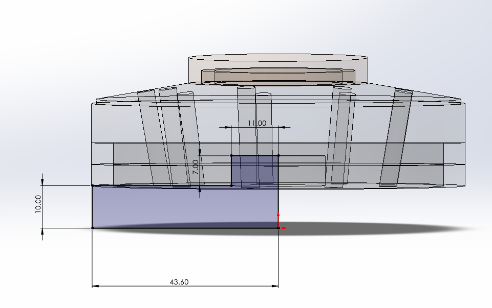
- Material Selection
The stand will be primarily composed of Delrin (a durable engineering plastic), bamboo, and aluminum.
-
- Delrin is ideal for the section where screwdrivers are inserted, as it is smooth and non-abrasive. Unlike aluminum or steel, it won’t scratch the delicate tips of watchmaker’s screwdrivers.
- Bamboo was chosen for its natural warmth, lightweight properties, and its strong association with Japanese minimalist design.
- Aluminum, while used sparingly, will provide structural integrity and a tool-like appearance to the design.
Aesthetic Inspiration – Japanese Stationery Design
The aesthetic direction for this project is deeply influenced by Japanese stationery design, which is characterized by:
- Minimalism & Proportions – Clean lines, balanced elements, and carefully considered proportions.
- Thoughtful & Functional Design – Every element serves a purpose while maintaining visual harmony.
- Soft, Neutral Colors & Natural Materials – A color palette emphasizing simplicity and warmth, which relies mor on texture to bring out design traits.
- A well-balanced Japanese Minimalism color distribution follows the 60-30-10 rule
I chose Japanese stationery as my aesthetic inspiration because the screwdrivers remind me of high-end Japanese mechanical pencils. Japanese stationery not only shares a visual resemblance with many watchmaker’s tools but also has similar proportions.
One brand that particularly influenced my aesthetic choice is Muji, a Japanese company renowned for its minimalist, functional, and high-quality design. Muji’s stationery avoids unnecessary embellishments, focusing instead on ergonomic utility and simple, refined materials, such as recycled paper, smooth plastics, and matte or satin-finished metals.
Implementing the Aesthetic
To bring this aesthetic into my design:
- Bamboo and Delrin will be used in equal proportions, achieving the white-and-wood motif commonly seen in Japanese minimalist design.
- Aluminum with a knurled texture will be subtly incorporated between the bamboo and Delrin. This will ensure the stand doesn’t appear too organic or furniture-like, reinforcing its identity as a mechanical tool.
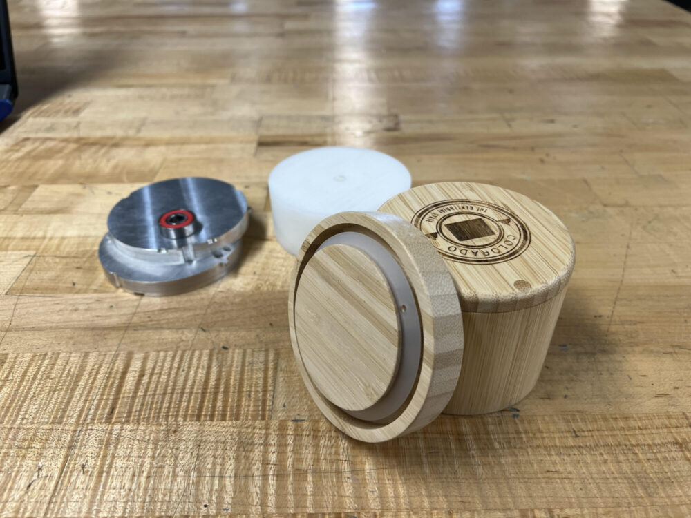
- The base will be weighted aluminum, wrapped with a wooden ring to maintain visual balance while ensuring stability.
- For the rotating mechanism, I repurposed a scrap bearing I found at the ITLL.
Final Thoughts
Through this project, I hope to deepen my understanding of design, particularly the delicate balance between form and function. Japanese stationery exemplifies this harmony, transforming everyday tools into objects of both utility and beauty. Having lived in Japan myself, I developed a profound appreciation for Japanese aesthetic sensibility, functional design, and craftsmanship. These are values that I aim to reflect in my own work.
2 Comments. Leave new
This is super cool project! I really like how the simplistic wood pattern really matches the Japanese stationary aesthetic. How are you planning on connecting the aluminum with the bamboo?
Wow, it really looks like you put a lot of thought into this project. Will any of your aluminum/bamboo/delrin come from a recycle source? I’m also curious what you mean by the 60-30-10 rule? You mention it but don’t really elaborate on what it is or how you will use it in your project? I cant wait to see the final design. It looks great in concept and I could see it doing well selling on Etsy.