
What is the opposite of a Parisian Jazz Aesthetic? Is it Mongolian rap, or maybe Canadian heavy metal? Im not exactly sure, but I know that Parisian Jazz is often characterized by its bright, vibrant colors with a flowery, light aesthetic that is not afraid of being original. 
Figure 1: My Parisian Jazz Aesthetic lamp

Figure 2: A picture of a Parisian Jazz club taken by me
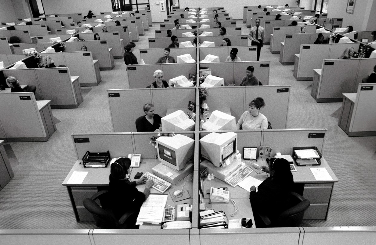
As you can tell in figure 2, a Parisian Jazz club fits the aesthetic of a cozy, warm, yet loud environment. It has a unique playfulness, exciting nature, and is not boring at all. Its cramped, free forming, and just meant to be enjoyed. Therefore, I believe that the opposite of a Parisian Jazz Club aesthetic would be a large, cubical dense, office space aesthetic of the 1960’s.

Figure 3: Office cubicles from the 1960’s
I believe this is the opposite of a Parisian Jazz club aesthetic because its a quiet, boring, and often described as a soulless environment. The colors are often muted grays, whites, blues, and greens, completely different from the bright colors associated with Parisian Jazz. Furthermore, this is a very designed environment, compared to a free forming, natural form of a jazz club. In essence, one is pure function and one is pure form.
Therefore, if I were to change the Parisian saxophone lamp into a 1960’s Office Aesthetic lamp, I would firstly probably have to not use the saxophone. A saxophone just does not fit in an office space unless it was a music store. However, if I had to use my current materials and form it into a 1960’s Office Aesthetic lamp I would begin by changing out the lightbulb from a RGB speaker bulb to a normal white bulb.
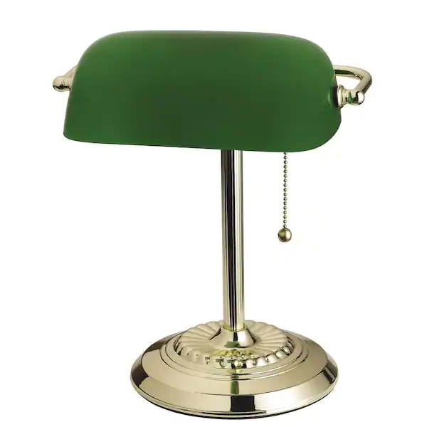
Figure 4: A popular 1960’s library/office lamp
Then I am going to borrow the colors from one of the most popular office lamps from the 1960’s, the Tensor Lamp(shown in figure 4). Then, I am going to paint the saxophone a dark green and leave the area around the keys there natural brass color, which matches the lamp from figure 4. Next, I am going to remove the vinyl record from the bottom of the saxophone lamp. It was used to match a jazz/music aesthetic and since an office space is pure function, I am going to remove that. I am going to replace it with a simple brass bottom plate, its purely functional and will match the brass outlines around the saxophone keys. Therefore, what remains is a dark green saxophone with brass accents, a white light, and a brass bottom plate for a support.
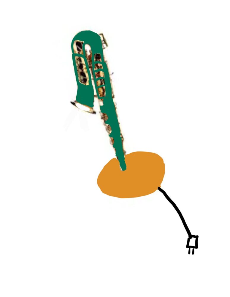
Figure 5: A sketch of my 1960’s office aesthetic saxophone lamp
The following is my attempt at sketching this design. I feel that the colors could fit in a 1960’s office, however, I feel the saxophone is just to far outside the realm of an office space to make sense for this aesthetic.
Citations
[3]Nikil Saval. “A Brief History of the Dreaded Office Cubicle.” WSJ, Wall Street Journal, 10 May 2014, www.wsj.com/articles/a-brief-history-of-the-dreaded-office-cubicle-1399681972. [4]“Tensor 14.5 In. Brass Banker’s Desk Lamp with Green Shade 17466-017.” The Home Depot, 2025, www.homedepot.com/p/Tensor-14-5-in-Brass-Banker-s-Desk-Lamp-with-Green-Shade-17466-017/303390886. Accessed 10 Feb. 2025.
6 Comments. Leave new
Hi Max, I was drawn to your post by the resemblance of 1960s office aesthetic to a current show I am watching, “Severance.” The aesthetic in the show nails what you display here while diving into an eerie thriller. For your project, I agree in that I don’t see a saxophone in quite a setting like this. In severance however, you might see something odd like a saxophone. My project is exploded view electronics, and I keep thinking how cool it would be to see all the parts of a saxophone in exploded view. Good luck with your project.
Hi Joe, I am also watching severance, that show is amazing. Thank you for your comment and I agree the saxophone lamp would look really interesting or creepy in that show! I hope your project goes well also!
Great post! I am personally fond of the 1960’s aesthetic, especially the colors and shapes that were prevalent during the period. I think making your project fit that aesthetic would be quite difficult due to how disconnected a saxophone is from the office. I do agree with your color choices, but I think that a way you could make it fit better is by giving the lamp a more functional purpose as well beyond just a lamp, such as a place to store papers. How do you think you could incorporate that?
Hi Bryce, thank you for your comment. I didn’t think about using the saxophone for other purposes other than a lamp, that is a great idea. I think if I were to build this for an office aesthetic I would use it for paper storage, a bell, or clock somehow.
Your post does a great job of comparing two completely different aesthetics: Parisian Jazz and 1960s office spaces. I really like how you explain the contrast not just through color and design but also through the vibe each space gives off. The idea of free-flowing creativity vs. rigid functionality makes the comparison super clear.
Your approach to transforming the saxophone lamp into something that fits the 1960s office aesthetic is really interesting. Changing the lightbulb, adjusting the colors, and removing the record all make sense for shifting the vibe. The dark green with brass accents is a cool way to tie in the classic office look.
One thing I’m curious about is since a saxophone doesn’t naturally fit an office setting, is there a way to modify its shape or structure to blend in more? Maybe incorporating elements from other office objects could help? Either way, your thought process is solid, and I like how you acknowledge the challenge at the end.
Hi Jacob, thank you for your comment! And I totally agree, I think that since the saxophone doesn’t fit naturally into the office I could cut up the parts and separate them, possibly creating a brass clock or something like that. Thank you for thinking outside of the box and I will keep this idea in mind for the future!