
Designing a Custom Cruiser: Merging Vintage Surf and Old-School Skate Aesthetics
For this project, I designed a one-of-a-kind skateboard deck that merges two iconic aesthetics: vintage surf and old-school skateboarding. The result is a hybrid cruiser that visually echoes the culture and craftsmanship of the 70s and 80s, while being fully functional for modern commuting and casual riding.
The Aesthetic Vision
This board draws inspiration from two distinct design languages. The first is the vintage surf aesthetic which pulls from the laid-back coastal vibes of 60s and 70s California. This shows up in warm tones, sun-faded pastels, and flowing curves that mimic surfboard shapes. There’s an elegance to it; simple, nostalgic, and smooth. I leaned heavily into this visual language when selecting the materials and colors for my board, opting for a palette that felt naturally aged and relaxed.. The second is the old-school skate aesthetic, which is rooted in the aggressive geometry of early vert skating. It’s all about bold lines, hard edges, and functionality for transition and street riding. I wanted my deck to reflect that attitude in its form. That meant incorporating more defined features: a prominent tail kick, a slight nose kick, and a low, consistent rocker throughout the length of the board.
Rather than choosing between these styles, I set out to combine them into a single design. The idea was to make something that feels nostalgic and relaxed, yet still bold and rideable.
Deck Shape and Design
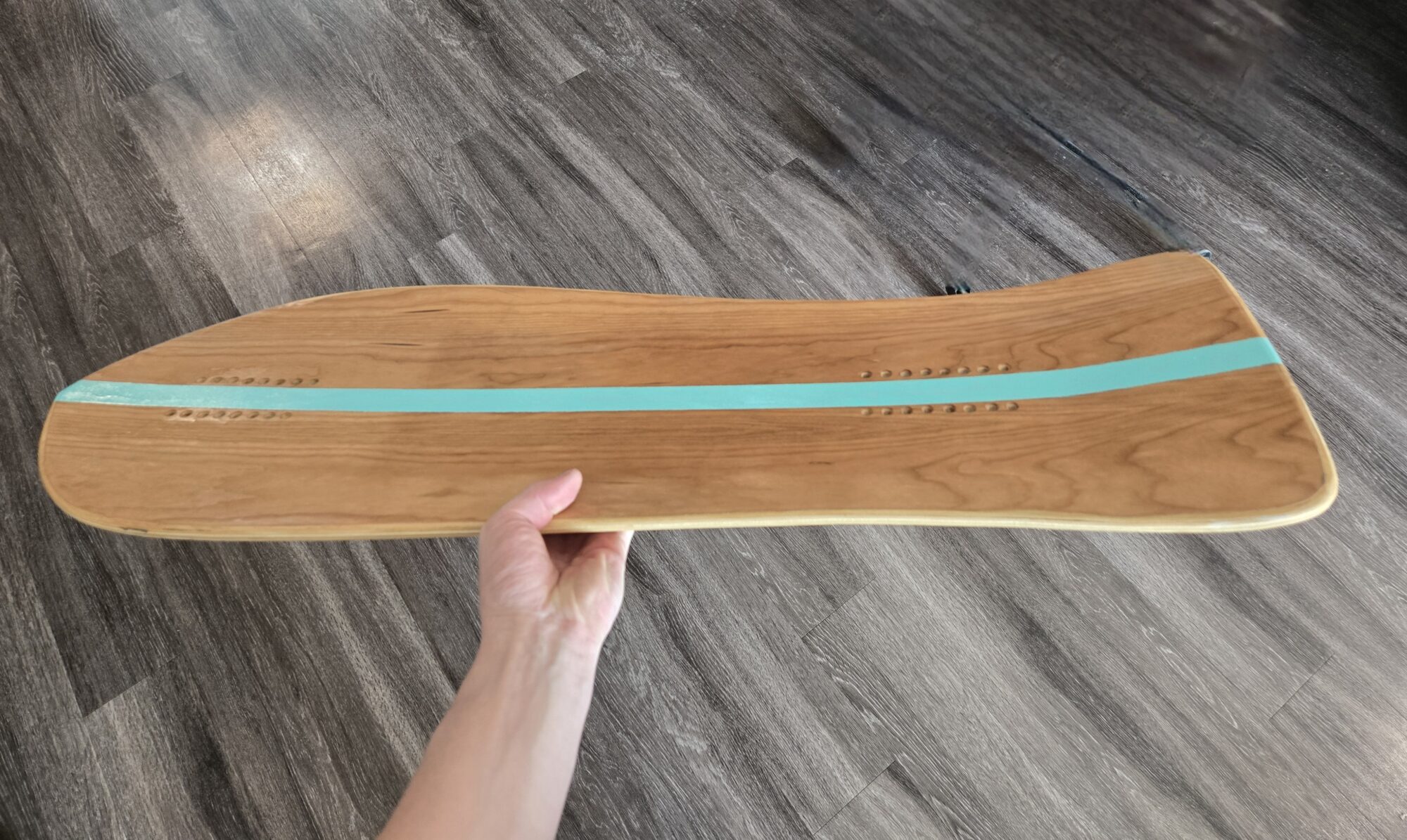
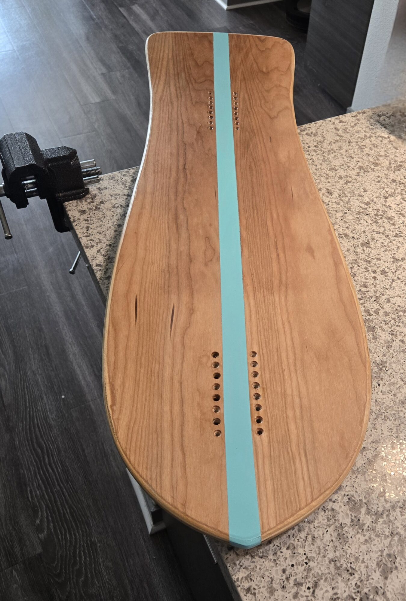
The final shape I landed on is a cruiser deck. It has a wide tail for foot stability and leverage, a narrow waist for agile turning and preventing wheel bite, and a wide nose that tapers to a soft point, reminiscent of a surfboard’s front end. The deck features a long tail kick that allows for tricks or bracing during fast turns, while the nose kick is subtle, giving just enough lift to help with curb hops and maneuverability.
From front to back, the deck carries a light rocker, creating a subtle U-profile that naturally locks the rider’s feet into place. I also added mild concave side to side, with stronger rails near the front of the deck that fade as they approach the center. These design elements not only improve control and comfort but also contribute to the visual style; they combine the curvaceous flow of a surfboard with the structured aggression of a street deck.
Material Selection and Construction
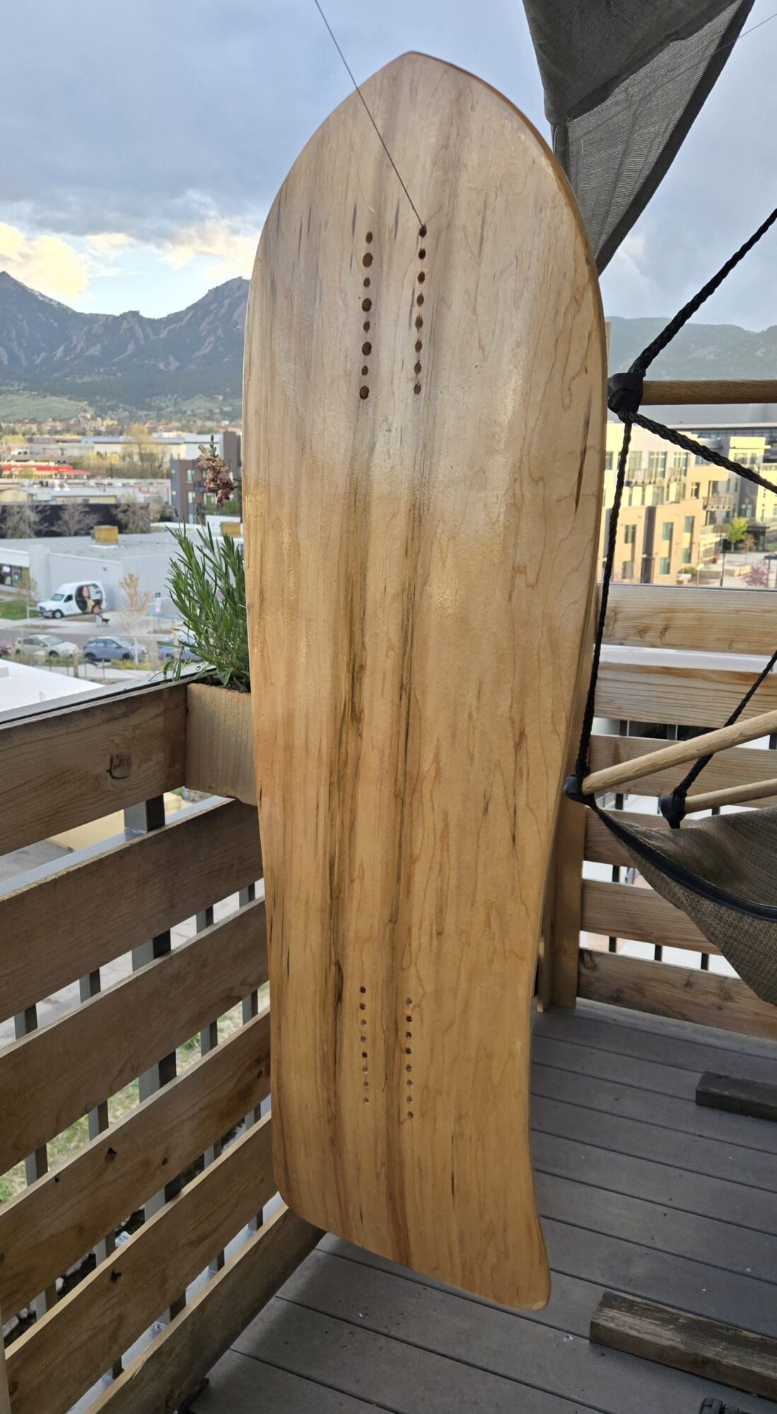
For the material, I used hard rock maple veneers sourced from Roarockit. These came in 1/16″ sheets: five longitudinally grained, with two cross-cut veneers for structural balance. The cross-cut layers are critical; they resist torsional flex and prevent cracking, similar to the cross-ply construction seen in traditional plywood.
The layering followed a pattern: face, core, cross-cut, core, cross-cut, core, and face. However, I swapped the final face veneer for a cherry wood layer. The cherry veneer was thinner than the maple but brought out the warm, reddish hues I wanted for the vintage surf aesthetic. The color variation in the grain, especially once sealed, created a natural visual warmth that I didn’t want to cover with stain or paint.
To protect the board, I coated it in an oil-based polyurethane. This provides a barrier against moisture, dirt, and daily wear; essential for any board that might be ridden in the real world. The edges were treated with a marine-grade two-part epoxy to further harden and seal them. Since edges are often the first to take hits from curbs or rough terrain, this step was important for long-term durability.
I selected clear grip tape to preserve the aesthetic of the top cherry and pinstripe; while it visually wears quickly, often getting impregnated with dirt, it will be worthwhile to replace the tape as the board ages, refreshing the look for years to come.
Aesthetic Details and Functional Features
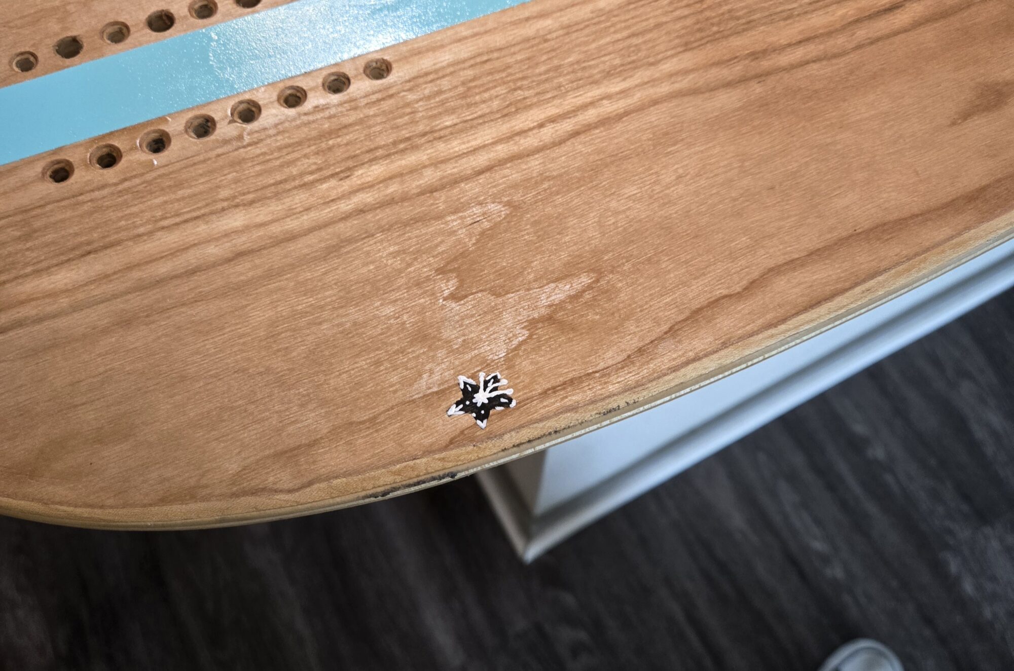
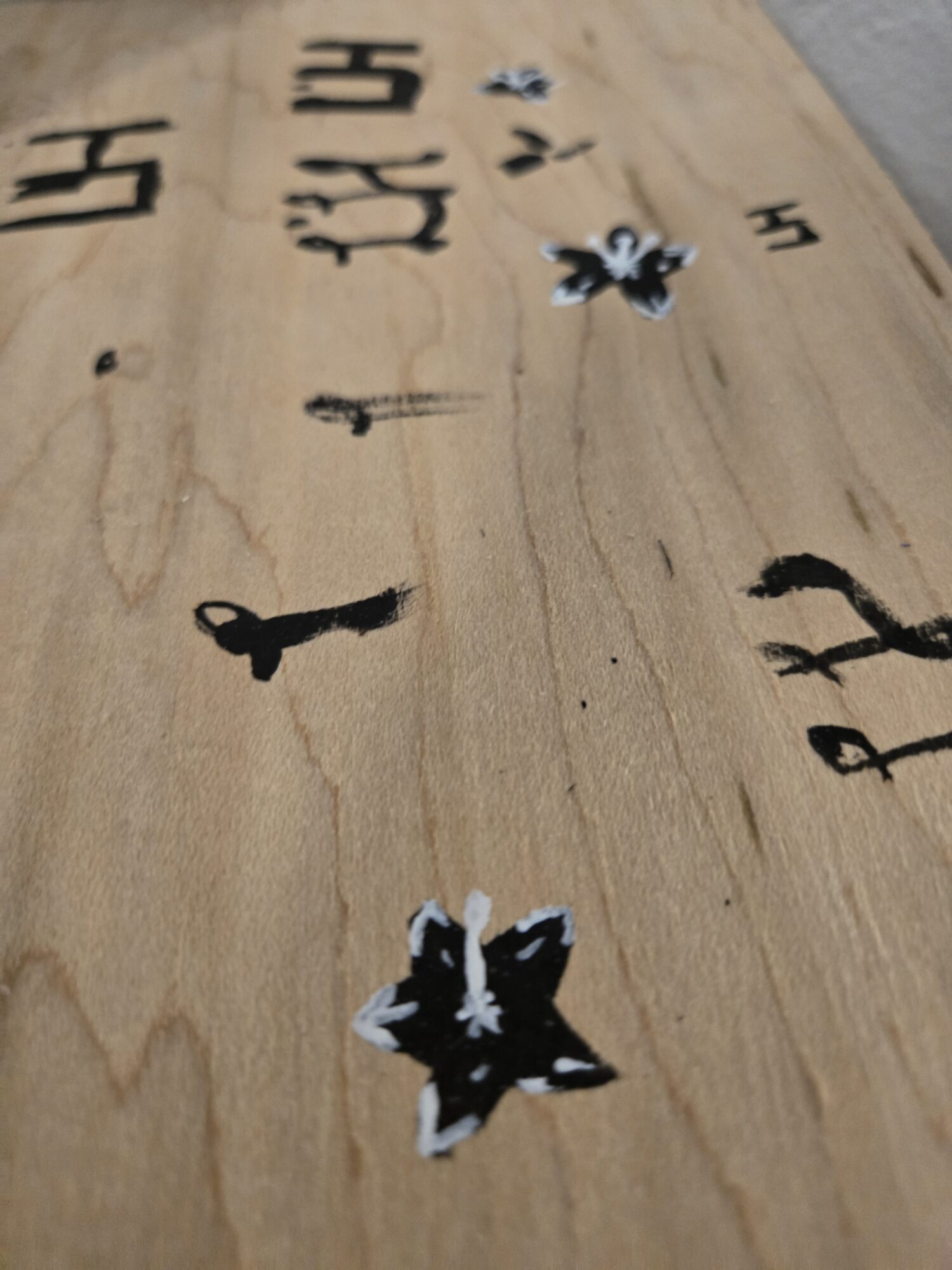
I kept the visual decoration minimal to highlight the natural materials. The only embellishments are a single light pastel blue pinstripe down the top face of the cherry veneer, a small painted flower to match the beachy surf aesthetic, and my maker mark. These subtle accents reinforce the surf theme without overpowering the organic wood tones. It’s also a nod to classic longboards and surf fins, where a small flash of color often defined a board’s personality.
Functionally, I drilled several truck mounting holes to allow for different wheelbase options. This gives the deck versatility depending on the rider’s preferred style, whether tighter turns for city cruising or a longer wheelbase for speed and stability.
The end result is a cruiser that feels purposeful and personal. It balances style with utility and feels equally at home displayed on a wall or carving down a hill.
Design Trade-Offs and Constraints
While shaping the board, I also evaluated alternative design directions. One popular option in the commuting world is the platypus deck, a wide, symmetrical longboard with an entirely different ride feel. Platypus decks emphasize adrenaline-fueled downhill and freeride performance. While I appreciate that energy, I intentionally moved away from it to preserve the mellow, expressive ride style that aligns with vintage surf and old-school cruiser boards.
However, even my aesthetic goals had to contend with real-world constraints. Budget was a big one; I had one shot at ordering the materials, so precision was non-negotiable. Any mistake would have meant restarting the process or compromising on the final product. Time was another major factor. I shared a makerspace with many others, which meant limited access to machines. Processes that created dust or fumes had to be scheduled carefully, often around the needs of other users.
Rather than chase performance metrics or flashy design, I focused on creating a product that reflects care, clarity, and character. It’s a board that tells a story visually, without needing an explanation.
Conclusion
This project was more than just a woodworking assignment or a design exercise. It was a way to combine two parts of skate culture that I love into a single object that reflects both aesthetics and utility. I wanted to create a board that feels like something you might have found in a coastal garage in the late 70s but rides like a purpose-built cruiser for modern urban terrain.
The blend of vintage surf warmth and old-school skate geometry gave me a unique challenge: how to preserve personality without sacrificing performance. I learned how to work within tight tolerances, how to adapt to shop limitations, and how to make finishing choices that serve both form and function.
Most importantly, I came away from the project with a deeper appreciation for the craft of skateboard making. Every curve, layer, and finish tells a story. This board is not just something I built. It is something I learned from, and something I will ride with pride.
2 Comments. Leave new
Wow! I really like how it turned out, especially with the smaller hints of the aesthetic you painted on, like the little flower. The story you tell with the board is a really nice touch that I feel gives the board character. I do wonder if you have had the chance to ride it yet?
I finally got to ride it this weekend! I was surprised to find it had no deck flex and felt very solid!