
The aesthetic of my current Upcycle project is firmly rooted in the Ski Town aesthetic, defined by rugged minimalism, natural materials, and functional charm. It captures the quiet, raw beauty of mountain life, blending upcycled elements with a strong connection to nature and place. But if I were to flip that aesthetic entirely, to explore its opposite, the result would be a radically different visual and conceptual experience.
The opposite of the Ski Town aesthetic would likely fall into the category of Hyper-Urban Pop Art. Where Ski Town draws from nature, nostalgia, and simplicity, Hyper-Urban Pop Art is artificial, loud, and deliberately overstimulating. It leans into bold colors, reflective materials, neon lighting, and graphic patterns. Think chrome finishes, plastic elements, geometric forms, and a high-contrast, high-saturation color palette. Instead of modesty and calm, it celebrates maximalism, consumer culture, and constant energy.
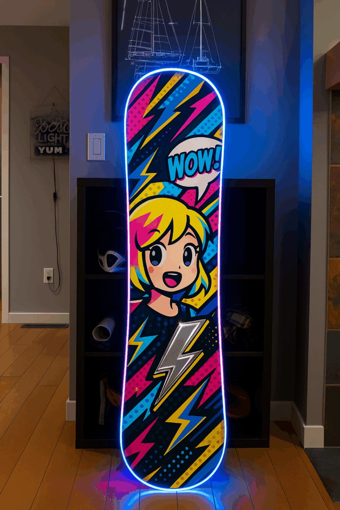
Hyper Urban Pop Art Aesthetic Snowboard
If I were to reimagine my upcycled snowboard coat rack within this opposite aesthetic, the first step would be to abandon the natural tones and minimalist execution. Rather than preserving the integrity of the board’s Orca whale artwork, I’d paint over it with a bright, high-gloss design—perhaps something retro-futuristic with thick neon lines, comic-book-style iconography, or geometric stickers. Think Roy Lichtenstein meets a Times Square billboard.
The hooks, instead of being transparent and discreet, could be oversized, glossy, and colorful, maybe even in the shape of exaggerated icons like lightning bolts or speech bubbles. LED strip lights could be mounted along the edges of the board, set to pulse or shift color with motion. The mounting method could become part of the aesthetic itself: exposed chrome brackets or fluorescent wall anchors that contrast sharply with the board’s surface.
Functionally, the board would still act as a coat rack, but it would no longer blend into the space with quiet elegance. Instead, it would demand attention as a visual centerpiece, even bordering on absurdity. The vibe would shift from “found object art in a mountain cabin” to “gallery installation in a neon-lit streetwear boutique.”
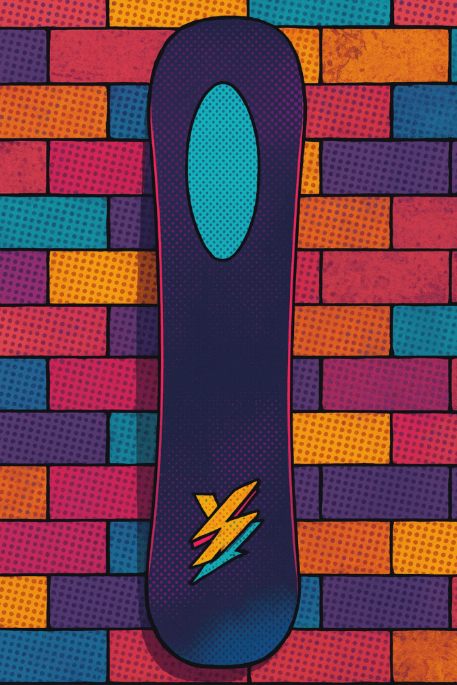
Hyper Pop Art Aesthetic inspired from Orca Design
To enact this using the materials I already have, I could start by applying a chrome vinyl wrap or fluorescent decals directly onto the snowboard. The transparent hooks could be swapped or painted in bold colors. The reflective surface of the board could be enhanced using mirror-effect tape. If I wanted to push the tech angle, I could incorporate a motion sensor and speaker module to play a sound effect or jingle every time a coat is hung, something playful and exaggerated to mirror the high-energy nature of the aesthetic.
While this version would completely contrast the calm, earthy tone of the original concept, it would still retain the core purpose of functionality and reuse. Exploring this alternate direction highlights just how much aesthetics can shape the emotional presence of an object—and how the same materials can tell two completely different stories.
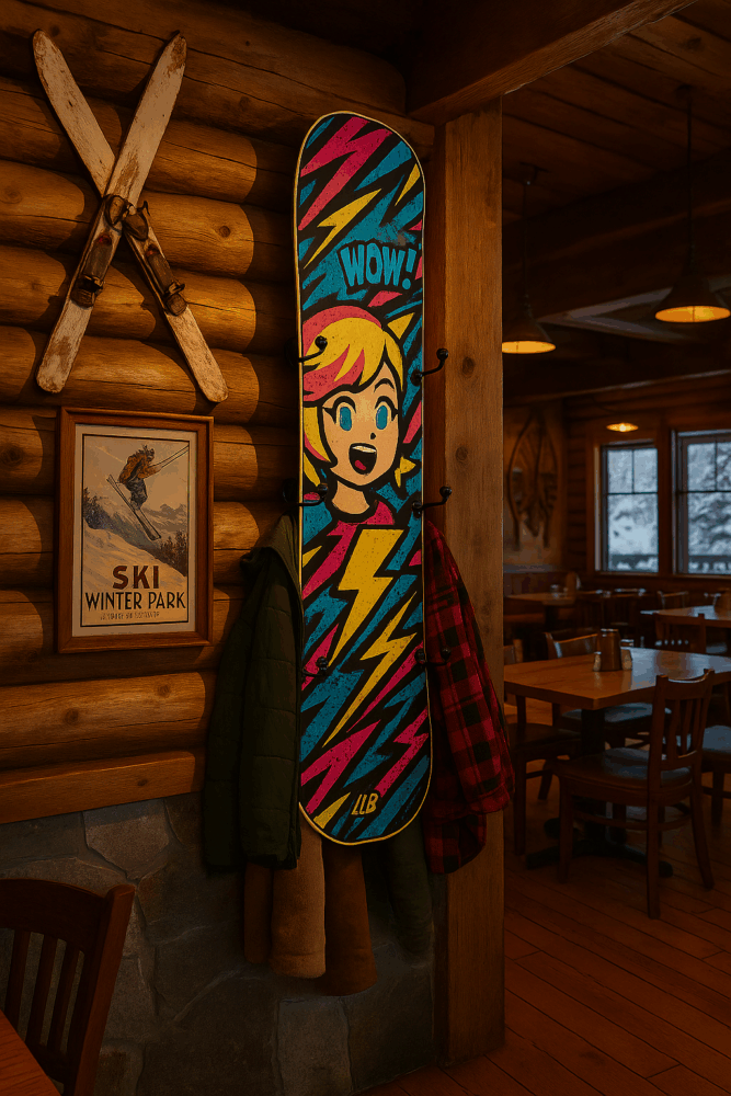
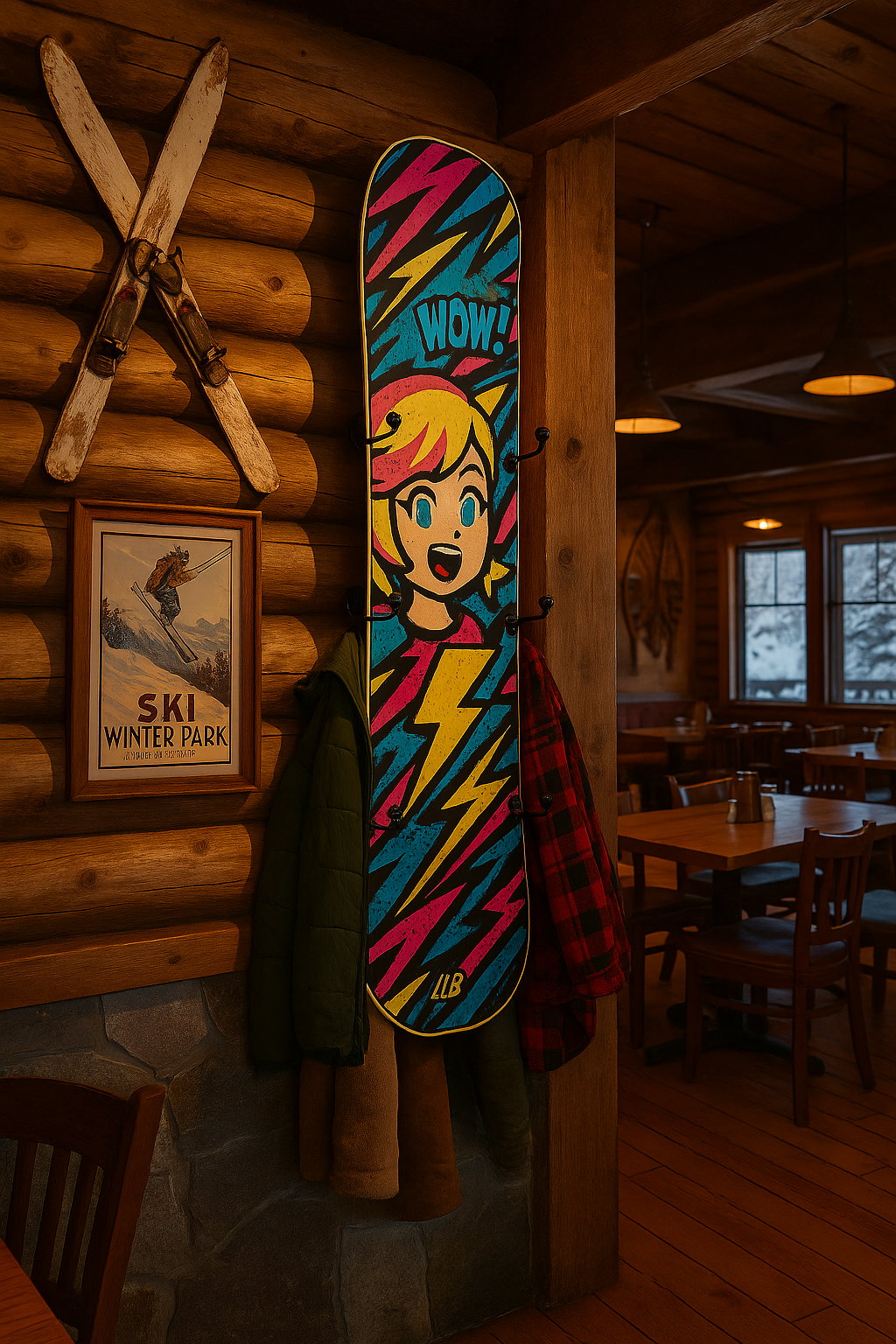
Hyper Pop Art with Ski Mountain Aesthetic Combinatoin
Citation:
Used ChatGPT Image creation to make the snowboard renders for Figures 1-3.
3 Comments. Leave new
Love this, Mateo. The way you flipped the quiet, natural ski town vibe into something bold and overstimulating is super creative. I especially liked the idea of LED strips and comic-style icons—totally changes the energy while keeping the object’s function intact.
I really like the renders and the amount of thought put into how you would physically create elements for this board.
Having looked into this aesthetic (or something tangential) for both of my projects in this class, I love how you framed hyper-urban pop art in reference to Ski-Mountain aesthetic. Reading more on your aesthetic choices makes me want to redo my “opposite aesthetic” post to reciprocate! Fantastic work Mateo.