
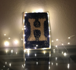
The aesthetic that I attempted to achieve for my project was that of string and flow. I was inspired by how many aesthetics of the modern world have been simplified to a cleaner and sleeker look. I wanted to obtain that sharp yet flowing look for my art piece. Instead of an item I can use, I decided to create a piece that can be displayed and create satisfaction when looked at. My design is basically writing out a letter on a plaque with nails and string/yarn. The letter of choice was “H” for my name and to just express some creativity for display. I began with finding a font that was satisfying to look at and drew out the letter by looking at a blown up “H” of that font on the computer. After creating that outline, I started lining the outside edge of the plaque and the inside of the letter with nails about an inch apart. With the nail outline complete, I began wrapping the yarn from nail to nail creating a blooming pattern and trying to fill in the wooden space that is supposed to be the background. I made sure that the empty space was filled so that the letter could clearly readable and from far away, you couldn’t even tell there was wooden space remaining. After completing this, I wrapped some led strings around the edge and created a nest of led strings to display my project in my empty apartment room. To my surprise, it actually looked a lot cleaner and “store-bought” than expected. I am very pleased with the project overall and the adventure leading up to the final product. The dynamic portion was satisfied by the piece having lights that turn on with just a switch and how that creates another zone of brightness in my room.
Plaque ($10), Yarn ($8), LED Lights ($9), Nail set ($12)
The total cost of my project comes out to be about $42. I set my budget out to be $50 so that was satisfied.
11 Comments. Leave new
I liked the addition of the LEDs. Adding a coupe more to it I think would make it pop even more! It is a simple design but the simplicity adds to the overall effect. Great job!
Cool project. I think you did a great job creating a string and flow aesthetic. I’d love to see a next generation of this idea with some of the improvements you mentioned. Great work!
Very aetherial! I think the LEDs look like stars floating around the H. What was the particular type of LED strand that you got for this?
I would have liked if the project showed a more dynamic factor, such as change the color of the LED lights or light H by laser cutting the H part of the wood.
I like the way you create the string letter. The negative displacement method makes it outstanding and the contrast between LED strips and navy nail raise the aesthetic level of your project!
I like how you stayed under your original budget. The aesthetics of the final product looks very clean. It’s a nice touch that you used LEDs. I think it’d be really cool if you put LEDs on the letter H.
Hogan, I believe that this fulfilled the aesthetic you were going for. I think synchronizing the lights up to the ones on your floor would be a great idea to make this more dynamic.
Nice! Have you thought about using another color with the black? a bright color that you can see in the dark for example. Good Job!
Awesome project! I really like the blooming effect you used for your string and how you incorporated LEDs. I thought the string art lamp you showed was really cool also. Have you tried putting the LEDs under the string? I think that might have a cool effect.
I’ve seen this done before and really like the way that it looks. I particularly like how you made the yarn more of a background rather than filling in the letter. I also agree with you that it is both simple and clean. Good job!
I really like how this came out! I like the idea of making your actual H design the negative, and had string around the outside to make the contrast to shape the letter.