
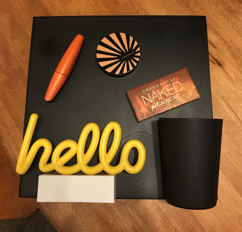
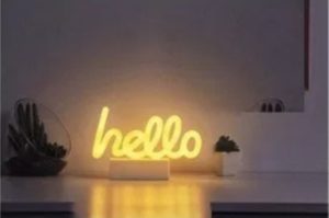
For my final project, I made a magnetic makeup organizer. I was inspired by neon signs and the high-tech aesthetic. I wanted to make something that I would be able to use, but really focused on how it looked before functionality. I previously debated different neon signs, but chose the hello one showed below and above on my final product.
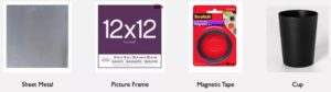
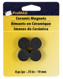
In terms of materials used, I did not deviate much from my design review. I used the steel sheet metal from Home Depot, the frame from Michael’s, and the cup from target. However, I did change the type of magnets due to some concern brought up in my design review. People pointed out that the tape might not be strong enough and after further consideration, I agreed. I purchased some circular magnets from Michael’s and these did the trick. They were much stronger than the tape, but not too intense for the purpose of my project. The overall cost ended up coming to around $40 which I was happy with. I also purchased extra magnets, so I can add them to future makeup that I buy and choose to put on the organizer.
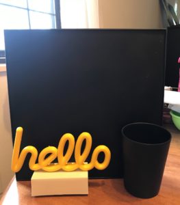
In order to create my project, I started with putting the sheet metal into the frame and spray painting all of it black. I wanted to keep it clean and stick with the high-tech aesthetic I was originally inspired by. After this was dry, I first tried hot glue to attach the cup and the sign, but this proved to not be strong enough for the sign. I ended up using hot glue for the sign and may end up using it for the cup if the hot glue does not hold up for the expo. Next, I used hot glue for all of the magnets. I put two to four magnets on each makeup item, so they would not be able to slip. I’m considering painting the base of the hello sign as well for expo, just to keep the colors limited. Although I did not fully achieve the high-tech aesthetic I liked originally, I did put a fun twist on it and I think it matches better this way.
For future recommendations, I would try this out in a larger size, so I can add more makeup. The 12×12 size is enough for me right now and perfect as I will be moving soon, but when I am settled in one place for a good amount of time, I will probably want a larger version of this organizer. I would also try to get a sturdier frame because this one can be a bit flimsy. This hasn’t been problematic yet, but I worry I might run into issues with it down the line. Lastly, I would fit the material to the frame a little better because it pops out on the sides sometimes, but all in all this has been a really fun project to work on and something I’ve gotten a lot of use out of.
Citations
- https://www.homedepot.com/p/M-D-Building-Products-12-in-x-12-in-28-Gauge-Galvanized-Sheet-56032/100287204?MERCH=REC-_-PIPHorizontal1_rr-_-100293264-_-100287204-_-N
- https://www.michaels.com/format-frame-basic-by-studio-decor/10395156.html#q=frame&prefn1=size&pmpt=qualifying&prefv1=12%22+x+12%22&start=5
- https://www.amazon.com/Merkury-Innovations-Pedestal-Decorations-Accessories/dp/B07MDL9CVY/ref=sr_1_32?keywords=neon%2Bsign&qid=1552249461&refinements=p_85%3A2470955011&rnid=2470954011&rps=1&s=gateway&sr=8-32&th=1
- https://www.target.com/p/18oz-plastic-short-tumbler-black-room-essentials-153/-/A-53139330
- https://www.michaels.com/scotch-repositionable-magnetic-tape/10428591.html#q=magnetic+tape&start=1
- https://www.michaels.com/default/10307908.html#start=6
10 Comments. Leave new
I like how your project came out! It is simple yet functional and would be a nice aesthetic addition to a room. The contrast between the yellow light and the black board is really nice and also functions to draw people to the more aesthetic aspects of the piece as opposed to the function aspects (cup and makeup).
Your project is very clean looking. It was cool being able to see it in person too! I like the addition of the LEDs as well! Great thing to add to make your product pop!
Danielle, you chose a great aesthetic. Imagine if everything black you made out of VANTABlack! It would be pitch-black. and there literally wouldn’t be a glow behind the “hello” sign.
I love the color contrst between yellow ‘Hello’ and dark background. The magnet seems to be quite solid. After this course, you not only get a an exposure to a varity of different aesthetics but also the a useful organizer!
Danny, I like how your project turned out. It’s very simple and clean. I wish you added more neon lights into the project, such as a neon frame or add neon magents.
I like the simple color choice you made, the yellow hello pops over the black background. The LEDs make the letter even cooler! Overall great design!
What a great, practical project! I think it fit your aesthetic well. I’m surprised the hot glue didn’t hold up. Maybe try superglue. I like the future improvements that you would make. Maybe you should try and make a second version with these improvements. Great job!
Danielle, I love how this turned out and I am so glad you brought it in so that we could see the finished product. I also liked how the neon yellow fits your personality/style.
Hi Dannie, I loved how it turned out! Good Job! I think you have a good opportunity to add to the aesthetic of your design by doing something to the base of “hello”. Have you thought about writing something on it? like your name for example? I think it will be awesome!
Danny, I really like the idea behind your project. I also tried to make something that I would use in my day to day life. I notice that you say that you want to paint the bottom of the sign for expo. How does this match with your aesthetic? Is the limited color scheme a part of your design? I really like the ‘hello’ light up sign that you chose to use for your project and I think that it adds a cool flair without complicating the process. I look forward to seeing your project during expo.