
Between 1890 – 1910 a new aesthetic movement flourished in both the United States and Europe. This style separated itself from the academic styles of the time by introducing flowing lines and nature. Art Nouveau stands out with its sinuous lines, depictions of flowers or vines, and often an asymmetry that gives the art piece a sense of movement and flow. This aesthetic is seen in both graphical art and architecture. The linework is apparent in graphical art and stands out even when incorporated into a greater form or shape. When used in architecture the style causes pillars and supports to curve and bend, and is often applied ornamentally on windows and walls.
Examples of Art Nouveau:
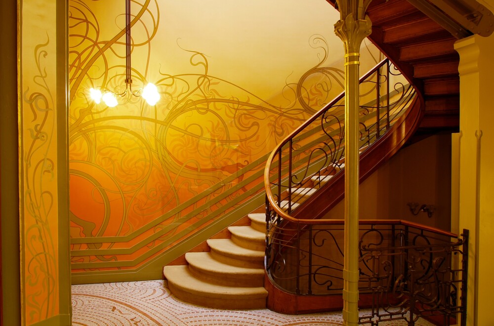
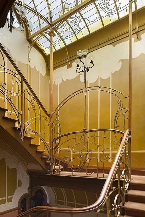 Horta Museum Staircase
Victor Horta was a true pioneer of Art Nouveau. His work makes up the title image of this post, and also many of the most popular works of this style. The metal banister is bent into curving, almost symmetrical, organic shapes. The stained glass windows above share the style with movement and curves. The atmosphere created is light and airy, bringing a sense of beauty and nature indoors. His work with metal and wood creates a clean cut and flowing atmosphere.
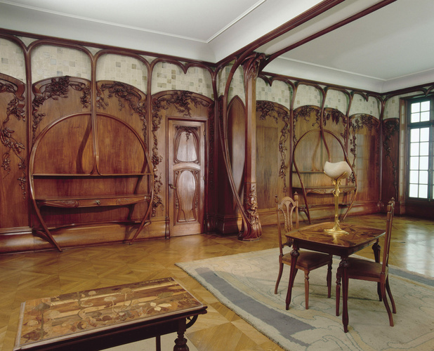
Dining Room Woodwork
Alexandre Charpentier brings the style of Art Nouveau again to interior design but also furniture. This room is displayed inside the Musée d’Orsay as the only surviving decor created by the artist. Here the style is applied to make the walls and ceiling supports feel ornate, and the walls are lined with varying forms of flowers that protrude dramatically. The wall mounted desks are framed in large natural arcs that are not chaotic but rather purposeful. This is also a good show of how this style of art can be used in functional peices similar to the railings.
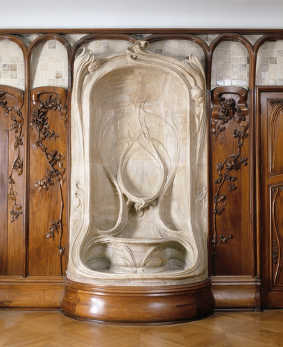
Planter + Dining Room Woodwork
Located in the same display as Alexandre Charpentier’s woodwork, this planter by Alexandre Bigot matches the aesthetic exactly. With purposeful but natural lines and curves the piece is natural and sweeping. The inlayed designs have abnormal geometry but are simple in form, and leave room for more intricacy in the corners and edges.

Pimpernel
This wallpaper was designed by William Norris. It has small shapes of flowers and leaves that are placed asymmetrically. However the underlying lines and curves of the leaves and stalks with large flowers are symmetric. Because of the subtle asymmetry the design becomes flowing and natural, but is very controlled in its symmetry. This piece is very busy and organic, but keeps strong features throughout so that it is still appealing at a glance.
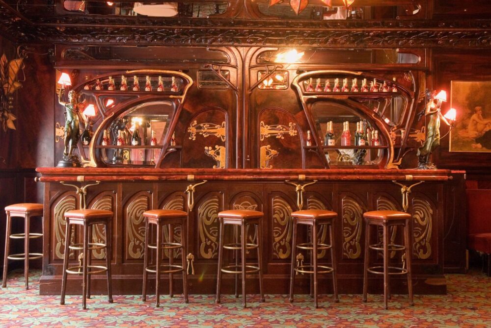 Maxim’s Pub, Paris
This world famous restaurant is heavily clad with with detailed aesthetics of Art Nouveau. The mirrors and shelves are curved and abnormal, there are strong lines running along the walls in both wood carving and metal cladding, and the ceiling above has intricate patterns in lines of plants. This style of art fits into many types of buildings and environments, never failing to keep the spaces it occupies ornate and interesting.
Sources:
Boiserie de Salle à Manger. Boiserie de salle à manger – Alexandre Charpentier | Musée d’Orsay. (n.d.). https://www.musee-orsay.fr/fr/oeuvres/boiserie-de-salle-manger-19114
Centre, U. W. H. (n.d.). Major town houses of the architect Victor Horta (Brussels). UNESCO World Heritage Centre – Document. https://whc.unesco.org/en/documents/131253
(Designer), W. M. (n.d.). Pimpernel. The Art Institute of Chicago. https://www.artic.edu/artworks/249083/pimpernel
Encyclopædia Britannica, inc. (2025, January 19). Art deco. Encyclopædia Britannica. https://www.britannica.com/art/Art-Deco
Higgins, C. (2022, April 13). The 20 year long architecture trend that *almost* took over the world. Emily Henderson. https://stylebyemilyhenderson.com/blog/art-nouveau-architecture-trend
Victor Horta midjourney style: Andrei Kovalev’s midlibrary. RSS. (n.d.). https://midlibrary.io/styles/victor-horta
3 Comments. Leave new
This is a really cool aesthetic that I knew that I already liked but was unable to identify what it was called! One thing I really like about this aesthetic and many of the images that you included was the heavy use of dark woods. I liked your description of how the flowing lines and organic shapes are organic/asymmetric but still have a functional purpose.
One thing I would have like to see more of is how this aesthetic became popular. Complex architectural pieces tend to need a lot of convincing to become popular due the the difficulty of making them, so I would be curious to see if there was media/movements of the time that drove this aesthetic to popularity.
When observing this kind of aesthetic purposeful organicness and controlled chaos come to mind which I think you described very accurately. This style seems to embody free-flowing art full of intent which can be semifunctional as you described with the wall-mounted desks and I think this is an important point to highlight.
I was a bit confused reading your description of William Norris’s wallpaper. To me, it seems that the placement of the leaves and flowers is very symmetrical and the underlying leaves and stalks are slightly asymmetrical. I wonder if the aesthetic in this piece is better emphasized through its organicness, depth, and busyness, rather than the symmetry.
These are all amazing points and show me that you really engaged with the post, thank you. I’ve made sure to edit the original post to include what you recognized as it will hopefully make it less confusing and a more complete post.