
For my final project, I opted to create a lazy susan style spice rack that fits into a minimalist aesthetic. My main goal with this piece was to create something that would be functional in storing spices, that could also fit in to any kind of kitchen and not look out of place. The design for this piece was loosely based off a similar style rack that my grandma used to have in her kitchen, and is something that I loved to spin and play with when I was little. That rack was smaller, with white plates and a thin metal rod, and when brainstorming for this project, something triggered that memory and I decided it would be fun to make something similar. I opted to pursue a minimalist aesthetic for a couple of different reasons. The first, is that I think it matches up with my own personal aesthetic, which in an earlier post I described as being athletic casual, which in a less specific sense, I would describe as being both simple and practical. I have never been a person who has wanted things to be ornately decorated and filled with tons of complexities, and thus those were not things I didn’t want to prioritize on this project.
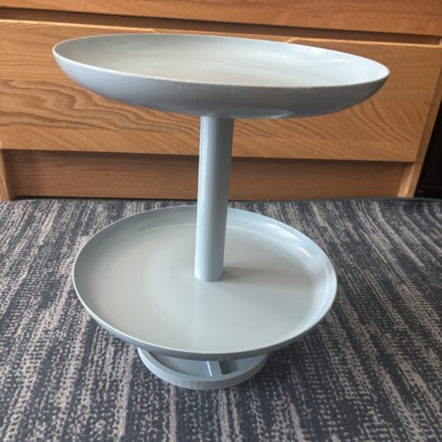
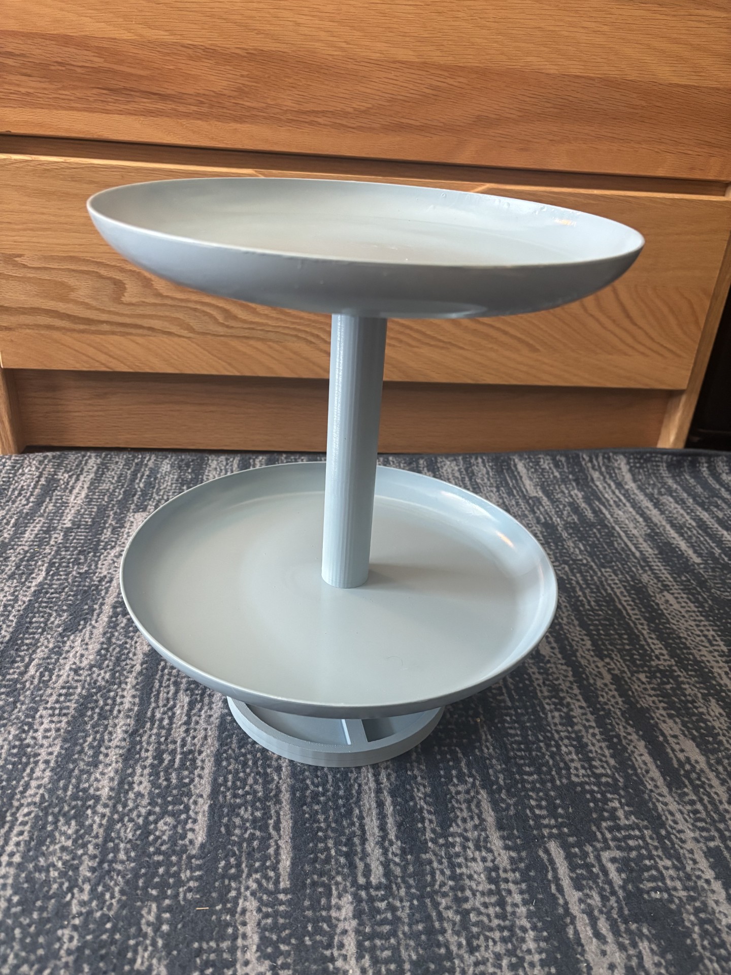
Figure 1: A photo of my completed project
There were a few different specifications that I had for this piece. The first specification for my project was that the rack allows easy access to spices. I went about accomplishing this in a couple of ways, mainly by making the tower of the rack spin on a bearing located in the base, but also by ensuring that the clearance between the bottom and top racks is high enough to easily reach in to grab a bottle. My second specification was that the rack hold the weight of many bottles and containers, which was accomplished due to the size of the supports I used. My third specification is that its shape must be somewhat basic. Because I aimed for a minimalist aesthetic with this piece, it was important that I utilize more basic shapes and geometries, and not let the rack look too exotic. My fourth specification was that the tower should be stable, and should be able to be spun or moved without tipping or bending. This was achieved through the use of super glue/epoxy as a bonding agent between parts to ensure the whole structure remains intact. My only slight concern in this regard is that after testing, I am not sure I made the base heavy enough, and it has occasionally needed to be held down for the tower to spin properly. My final specification was that the color needs to be neutral, but still fit into most kitchen environments. This is a piece that I am looking to use in the future, so I want to make sure that whatever I develop won’t stick out like a sore thumb, and will look like it belongs in a kitchen. I accomplished this using the color French blue, which is a very nice pastel blue that I think will fit in just about anywhere.
This project began as me wanting to create a piece that would be useful and practical, but I had not narrowed down any kind of scope. When I was considering kitchen devices, my mind though of a rotating lazy susan as a piece that would fill the motion requirement and provide practical use to me. In this initial design process, I considered some other aesthetics that would have looked much different than the minimalist approach I took. I considered making this piece either rustic, which I used for my upcycle project, or Victorian. To fit the rustic aesthetic, I changed a couple of things about my design. First, I changed the material from a smooth simple plastic, to a rough wood. I also decided that the “bins” would feel more rustic if they were squares rather than circles, again due to the added roughness feel that it would bring. The grain of the would specifically is what I feel makes this an opposite aesthetic to my plan, and yet is still one that you would likely see very commonly in homes all over the world.
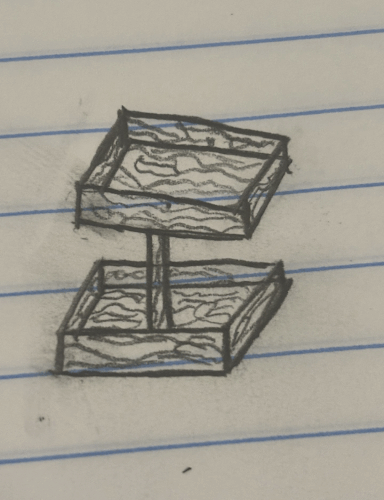
Figure 2: My first alternate aesthetic design encapsulating a rustic look
The other opposite aesthetic I thought of was a Victorian aesthetic. The changes that would be made to fit this style would include eliminating the sides that I used for the rustic one, and replacing them with thin wire/metal that would be bent into small and intricate patterns. There would be lots of curves and patterns to give the piece as much detail as possible. I would likely use black for the wire, giving the rack a feel that is very different from my practical and simplistic approach.
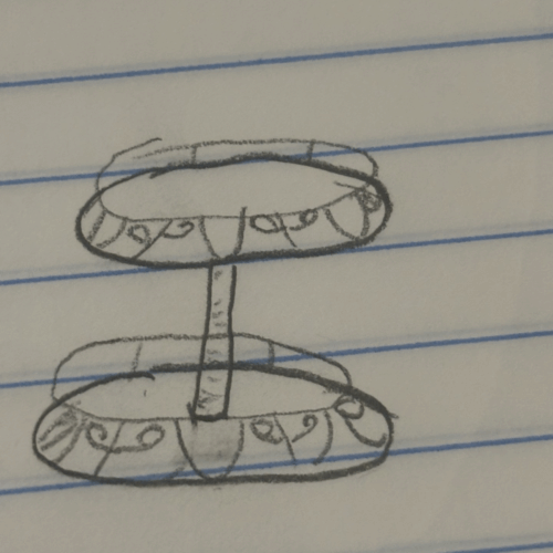
Figure 3: My second alternate aesthetic design encapsulating a Victorian look
After I landed on the minimalist aesthetic I began to dial in the actual components that would become this piece. After more brainstorming, I also decided that my design would only incorporate 2 levels rather than the 3 I was originally planning on. After seeing the design in CAD, 3 layers felt like it would be way to tall, unbalanced and clunky looking so I decided to move on from that idea. My design is made up of a base component, a bearing, a short support that interfaces with the bearing, a long support, and 2 plates. I wanted to keep the overall design rather simple to help emphasize the minimalist aesthetic of the piece.
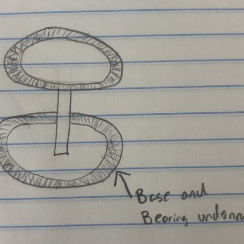
Figure 4: My first sketch of my spice rack idea
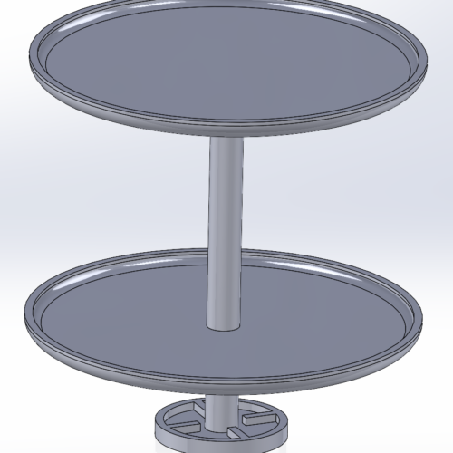
Figure 5: The full CAD render of all components of my project
The base of the tower was 3D printed and is circular, and contains a hollow area in the center. The 4 arms seen in the picture are there to hold the bearing in place, which allows for the entire tower to rotate. The diameter of the bottom is 6 inches, and is half an inch thick, and the arms are designed for the bearing I used witch has an outer diameter of 1.125″,
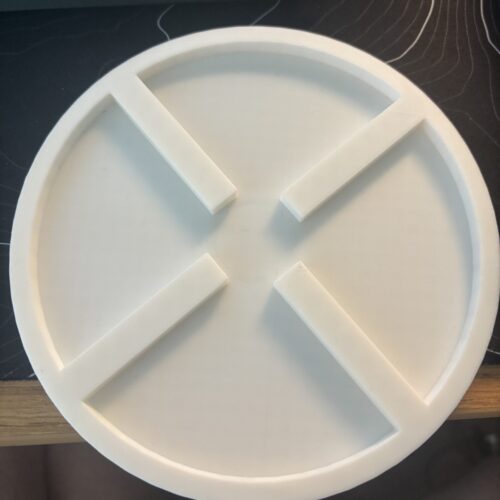
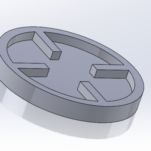
Figure 6: Actual printed base used in my project Figure 7: CAD rendering of my first base design which had a smaller diameter
The plates that I used as the platforms were actual plastic dinner plates that I purchased from target. I opted to buy these components rather than 3D printing my own for a couple of reasons. 1 was that I really liked the shape of the plates, specifically the taller rim the plates have, which work very well in keeping items from falling off the edge as the rack is spun. The second is that I felt much more confident in its strength than I would with a 3D printed component. Both of my support columns were 3D printed, both having a diameter of 1.5″. The upper support has a length of 8 inches which was chosen to make sure that the spacing between the top and bottom shelves would be enough to both hold bottles that are taller than normal, and to allow me to easily reach in to grab a specific one. The bottom support is much shorter at only 2 and a half inches of total length, but also has one end that comes to a much smaller point with a diameter of half an inch, which allows the support to interface with the bearing.
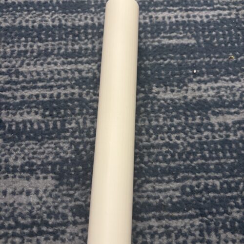
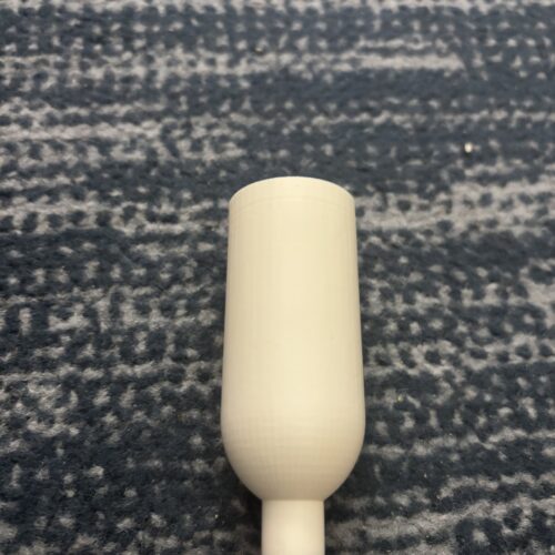
Figure 8: The 3D printed longer support beam Figure 9: The 3D printed shorter support, tapered to fit the bearing
The final product can be seen below. Over all, I am very happy with how everything came together. The sizing is perfect to both sit in the corner of a kitchen without taking up too much space, while also being big enough to hold an adequate amount of spices and whatnot. I also really like how the French blue color looks on the piece its self. It combines with the curves of the plates to give the piece a very smooth feel, which was a big component of the minimalist aesthetic I was hoping to encapsulate. When giving my presentation in class today, I heard some feedback saying that the rack looks like something that would come out of a 1950’s diner, which had not occurred to me before, but is something I definitely think is true. It has lots of simple curves, and a slight shine to it that make it really fit into that aesthetic as well. I am pretty happy with how everything went and my product is just about what I envisioned when I first started working on it.
References:
All photos are my own