
Introduction
For my latest project, I’ve developed an interactive installation that creates a subtle sense of discomfort followed by intrigue. Inspired by computational mirrors and interactive design, this piece uses simple forms and movement to track and point at viewers as they move in front of it. What begins as an “I’m being pointed at” moment quickly transforms into a dance between viewer and artwork, creating a unique interactive experience that blends technology with minimalist aesthetics.
Inspirations and Existing Designs
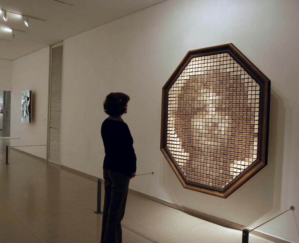
My primary inspiration comes from Danny Rozin’s work using computation to create “mirrors” out of moving physical materials. His pieces that reflect individuals through non-mirror materials particularly influenced my approach to this project. The way his installations imply human form and shape through simple movements and patterns directly informed my design thinking.
Other significant influences include the interactive installations from BREAKFAST STUDIO and ART+COM. What resonates most about these creators’ work is how they imply presence and form through simple shapes and responsive movements. The interplay between predetermined patterns and responsive reactions to human presence creates a compelling tension that I wanted to explore in my own work.
For the technical aspects of this project, coding was significantly enabled through Claude.ai, while the 3D printed gears were modified from a miter gear Printables file made by Resphiq Ann
Vision and Specifications
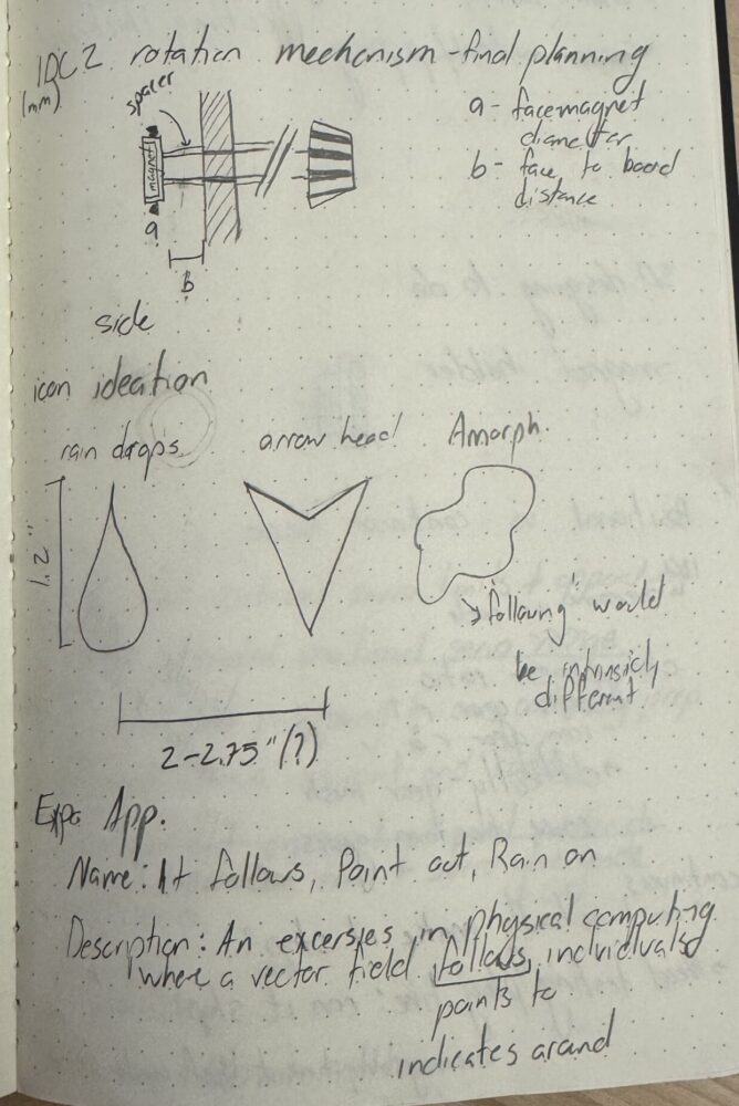
The core concept began as a theoretical vector field gif playing in my mind—a pattern of movement that would respond to human presence. I wanted to create a slight feeling of discomfort (being pointed at is often considered rude) that would quickly transform into intrigue. The goal was to encourage viewers to move back and forth in front of the piece, creating an almost dance-like interaction between person and installation.
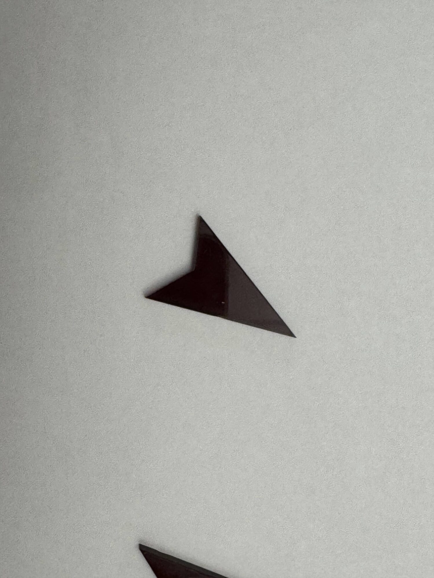
Functionally, the piece needed a clear input mechanism (person tracking) and visible movement output (pointing). Aesthetically, I aimed for very clean design with solid edges, clean lines, and bold colors. The project draws on neoplasticism principles, though it ultimately leaned more minimalist in execution. An important design feature is the interchangeable icon heads, making the piece aesthetically modular for future iterations.
My personal style typically involves eclectic minimalism with a preference for raw materials, hard lines, and strong angles. For this project, I chose a white background because it’s unassuming, a black frame to formalize boundaries, and red icons to draw the eye. While I typically work with raw wood and acrylic, I painted these materials to achieve the desired aesthetic effect.
The project also served as a learning opportunity, pushing me beyond my comfort zone while working within the constraints of time and my developing knowledge of microprocessors.
Initial Sketches and Design Plans
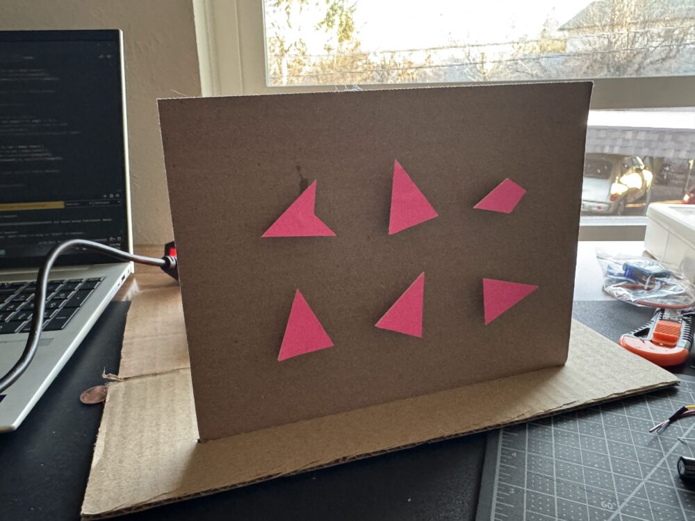
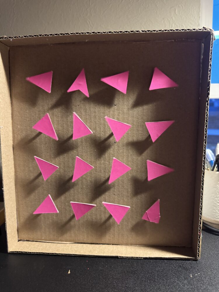
My design process began with pencil sketches on paper and physical manipulation of paper cut-outs. The first iteration involved experimenting with arrangements of triangle cut-outs. From there, I explored alternative moving icon shapes, which eventually led to a replaceable, modular strategy for the pointing elements.
The form was largely determined when the project was first ideated, while the functionality was developed through iterative problem-solving to ensure all components worked together without interfering with the aesthetic. I knew early on that person tracking would be the core interactive element, driving the pointing motion.
My original concept was much larger—several feet in height and width—but I scaled down to approximately 3′ × 2′ to keep the project manageable within my timeframe. This scaling decision required careful consideration of the relationship between icon size and spacing.
The project received positive reactions when I discussed the concept with others, which reinforced my determination to execute it as envisioned.
Final Execution and Reflection
The final piece achieves my vision of creating an installation that transforms discomfort into engagement. The arrows effectively point at viewers, creating that initial moment of being singled out, which then evolves into a playful interaction as people move in front of the installation.
The precision craftsmanship of the final product is one of its most successful elements. The clean lines, solid colors, and strong contrast between the white background, black frame, and red icons create a visually striking piece that draws attention without being overwhelming.
If I were to develop this project further, I would create more sets of interchangeable icons and implement different movement patterns to expand the range of possible interactions. The modular nature of the design allows for these future iterations without requiring a complete rebuild.
This project pushed me to learn new technical skills while staying true to my aesthetic principles. The integration of computational tracking with physical movement created exactly the kind of discomfort-to-intrigue emotional journey I had envisioned, proving that even simple shapes and movements can create compelling interactive experiences.
The arrows pointing at viewers serve as both a technological demonstration and a subtle commentary on attention and observation in contemporary society—a simple gesture that creates a moment of connection between viewer and artwork, between being observed and becoming the observer.
*writing helped with AI
Sources
Danny Rozin: https://www.smoothware.com/danny/woodenmirror.html
Video: https://www.youtube.com/watch?v=HVhVClFMg6Y
1 Comment. Leave new
This project stands out for its clear transformation of discomfort into engagement using clean design and responsive motion. The integration of tracking and modular physical elements creates a strong interactive experience that aligns well with your aesthetic. The minimalist execution and bold color choices make the concept visually direct and technically effective.