
For my upcycle project, I fabricated a shelving unit out of recycled carboard 3D printer filament spools and scrap wood. The aesthetic goal of this project was to fit the “pop industrial” aesthetic of the ITLL makerspace on campus – dominated by the aesthetics of clean shapes and clearly-manufactured components, with pops of bright colors as accents to the neutral tones of heavy industry.
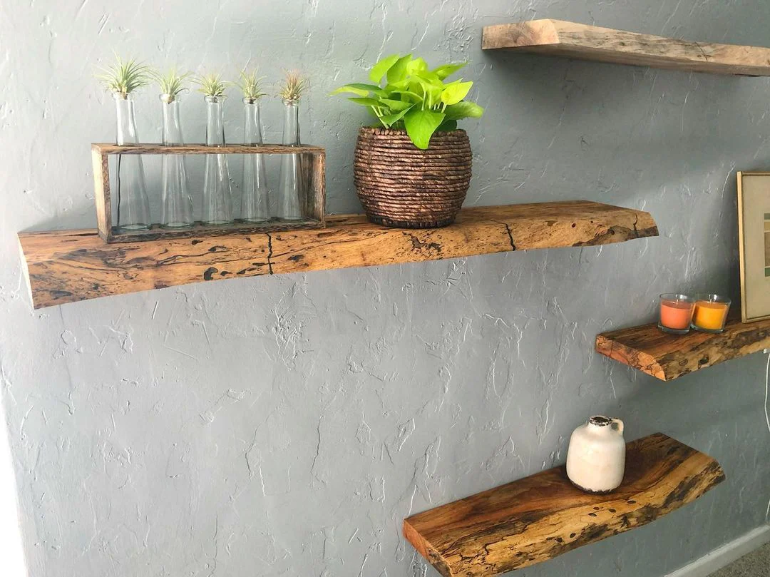
I believe the polar opposite of this aesthetic would be naturalism. This aesthetic focuses on naturally-occurring shapes, materials, and tones, which reflect the imperfections and calming feel which nature gives humans. I have attached examples of naturalist furniture below – notice flowing curves, rough edges, and earth tones dominating the looks of each of these rooms. [1] [2]


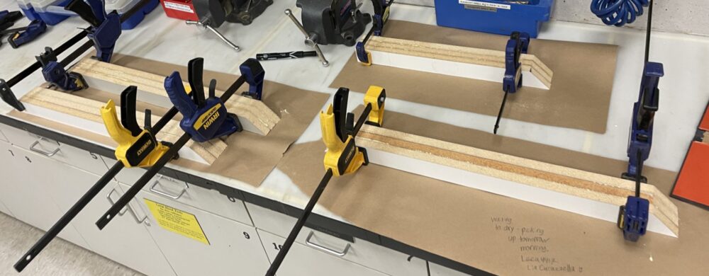
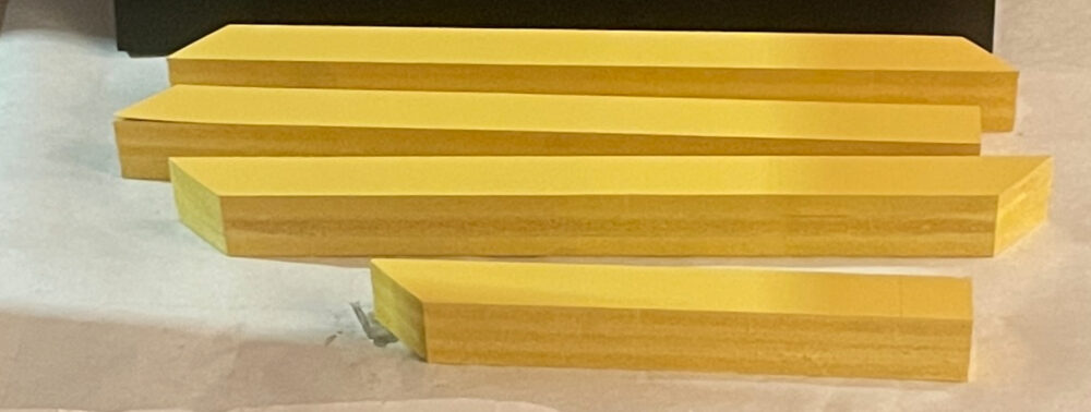
My upcycle project featured sharp, machined angles in the wooden frame, which was spray-painted to a bright-yellow to serve as the colorful accents of the pop industrial aesthetic. However, this look is distinctly unnatural, as the light-colored fiberboard which I found in the ITLL was covered up with the manufactured tone of the spray-paint. (see frame pieces below, before and after painting)
A naturalist approach would be to use a wood with a more natural grain pattern than the fiberboard, which maintains a clearly-manufactured feel. A stain could then be used to draw out the grain and natural colors found in the wood. There wouldn’t be any ability to achieve the highly-saturated yellows that I used for my upcycle project, but with the right stain and wood choice (i.e. southern yellow pine with a stain that brings out golden tones), this golden frame could be imitated with a much less artificial feel.
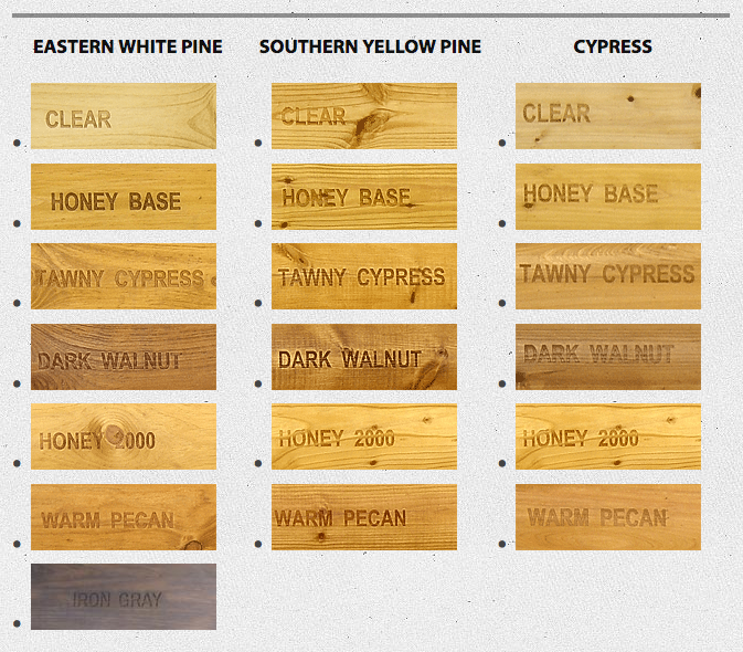
As a reference, see the picture above, showing different stains – sourced from Log Home Center and Supply. For the golden tones in my project, Honey 2000 would be the stain of choice, being as saturated as possible while still maintaining a natural look.
For the shelving units themselves, I used a glossy white spray-paint to cover the rough look of the recycled cardboard filament spools. This look again matches the bright colors and manufactured feel of the pop-industrial aesthetic, with each shelf’s sheen catching the eye and bringing focus to the center shelving (and therefore the items on the shelf). However, this full-gloss look is distinctly manmade and would be the opposite of the naturalist aesthetic.
Unlike the frame, I would not want to leave these shelves unfinished as they would not be pleasing to the eye… so a paint is still necessary. However, the finish should be matte rather than glossy.
Lastly, for the baseboard – this solid plastic piece was recycled from the ITLL and spraypainted with a deep satin black. Again, this reflects a manufactured feel to fit into the overall look of the ITLL. If this project were taken with a naturalist approach, this baseboard would be better as a deep-stained wood, taking a deep natural texture rather than a solid painted finish. From the example shown above with wood stains, Iron Gray would be my stain of choice.
Credits:
[1]: https://old.bakstone.az/en/media-and-blog/naturalistic-design-bring-nature-into-your-home/
[2]: https://plantdecorshop.com/blogs/plant-guides/diy-design-how-to-make-a-live-edge-floating-shelf
[3]:https://loghomecenter.com/products/isk-biocides-woodguard-exterior-log-stain
2 Comments. Leave new
Really cool project! I like how you broke down the differences between the pop-industrial and naturalist looks. I think the contrast is spot on, especially with the spray-paint vs. wood stain ideas.
Really enjoyed reading about your project. Your analysis of the pop-industrial aesthetic is clear and well-supported, and I thought the contrast you drew with naturalism was especially thoughtful. The way you compared each design choice with how it would shift under a different aesthetic showed a deep understanding of both styles.
One question I had was about the cardboard spools. Since they already come from a natural material, did you consider leaving some of that texture exposed to bridge the gap between the two aesthetics? Also, do you think there’s a way to integrate a hybrid approach in the future, blending both aesthetics in one piece?
Overall, this is a well-reasoned and creative exploration. Great job connecting form, function, and style.