
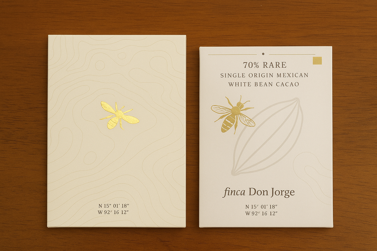
Figure 1: Chocolate Packaging Render
 Introduction
The story of chocolate is often reduced to indulgence, sweetness, or luxury. But true chocolate, dark chocolate made from carefully harvested and fermented cacao, holds much more than flavor. It holds culture, land, people, and process. For my final project, I set out to design packaging that would elevate chocolate to what it truly is: the result of agricultural precision, craft, and centuries of cultural richness. My inspiration was rooted in a real-life experience I had during an internship at a vertically integrated cacao finca located in Chiapas, Mexico: Finca Don Jorge.
This project evolved over time, but at its core it aimed to reflect what chocolate really represents when made with care, a story told through materials, form, and aesthetic.
Inspiration & Evolving Vision
My earliest vision for the packaging came directly from my time at the finca. There, I experienced firsthand how cacao is harvested, fermented, and dried. I learned about the vital role of the Forcipomyia midge, a tiny pollinator insect that plays a critical role in the fertilization of cacao flowers. The chocolate I helped produce was not made in a factory thousands of miles from its origin; it was made meters from the trees that bore the pods.
That immersive experience served as the philosophical and aesthetic core of this project. Initially, I set out to create a wooden package that mimicked the form and surface of a cacao pod. I was inspired by eco-brutalism: the combination of natural textures and unrefined materials with strong, clean modernist forms. The box would slide open to reveal the chocolate inside, a symbolic act akin to opening a real cacao pod.

Figure 2: First Edition Cacao Pod Inspired Packaging
However, after having to leave the U.S. and return to Mexico City, I reevaluated the feasibility of producing a wooden object at the level of craftsmanship I envisioned. I decided to adapt. The vision would remain intact, but the execution would shift to a more traditional chocolate bar wrapper, made of luxury sustainable paper, while still holding the essence of the aesthetic I had defined.
Final Design and Aesthetic Direction
The final design of the chocolate bar packaging drew heavily from topographic maps of Finca Don Jorge, a decision that helped visualize the tree-to-bar process geographically. The contour lines subtly integrate into the visual identity of the brand, while simultaneously rooting the product in place.
On one side of the package, I featured the story of the Forcipomyia midge. The layout, typography, and pacing were crafted to mirror the minimalist, elegant visual languages used in luxury packaging, but with content deeply tied to science and agriculture. On the other side, I explained the fermentation, drying, and chocolate-making process.
The aesthetic of the package was designed to reflect “Modern Mexico,” steering away from clichéd Mesoamerican motifs. Instead, I drew from the concept of mestizaje, the cultural blend of Indigenous and Spanish heritage that defines modern Mexican identity. This came through in the balance between traditional stories and modern typography, as well as the deliberate use of white space and understated colors.

Figure 3: Final Design
Specifications
- Inspired by Nature: The cacao pod and topography of the finca are central to the packaging design.
- Modern Mexican Aesthetic: Avoiding stereotypical motifs in favor of modern fonts, clean layout, and subtle references.
- Educational Content: Designed to offer a meaningful, informative experience for the consumer.
- Luxury Minimalism: Quality over quantity. Every line and word matters.
- Sustainability: The packaging uses eco-friendly luxury paper to preserve both product and planet.
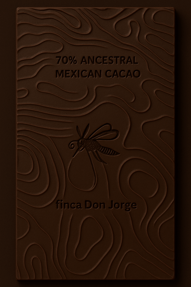
Figure 4: Chocolate Bar Design
Materials and Components
While no longer built out of wood, the final package uses:
- Luxury textured paper (biodegradable and recyclable)
- Foil-stamped elements to denote elegance
- Embossing on the cacao pod and topographic lines for tactility
- Double-panel folding mechanism that reveals two sides of the chocolate story
The form is functional but also dynamic. The user unfolds the bar and is immediately met with a two-part educational narrative that elevates the chocolate from commodity to experience.
CAD and Design Development
While traditional CAD modeling was abandoned with the shift from wood to paper, I transitioned to graphic design platforms like Adobe Illustrator and Canva. Here, I recreated the sketches I had made on paper, mapping out grid systems for typography and experimenting with line weights to simulate topography.
The goal was to achieve the feel of a scientific field guide crossed with a high-end wine label. The internal grid ensured that every element, from the Forcipomyia midge illustration to the Swiss-Mexican collaboration story, had room to breathe.
Alternative Concepts Considered
Two alternate aesthetics were explored in the early phases:
- Scandinavian Minimalism: Clean sans-serif fonts, neutral tones, and extremely restrained layout. Elegant, but ultimately lacking the cultural grounding needed.
- Pop-Luxury Maximalism: Bold colors, foil bursts, layered visual elements. This felt over-designed and ran counter to the quiet excellence of the chocolate itself.
Returning to the eco-brutalist mestizo aesthetic felt more honest, more aligned with the product and the values behind it.
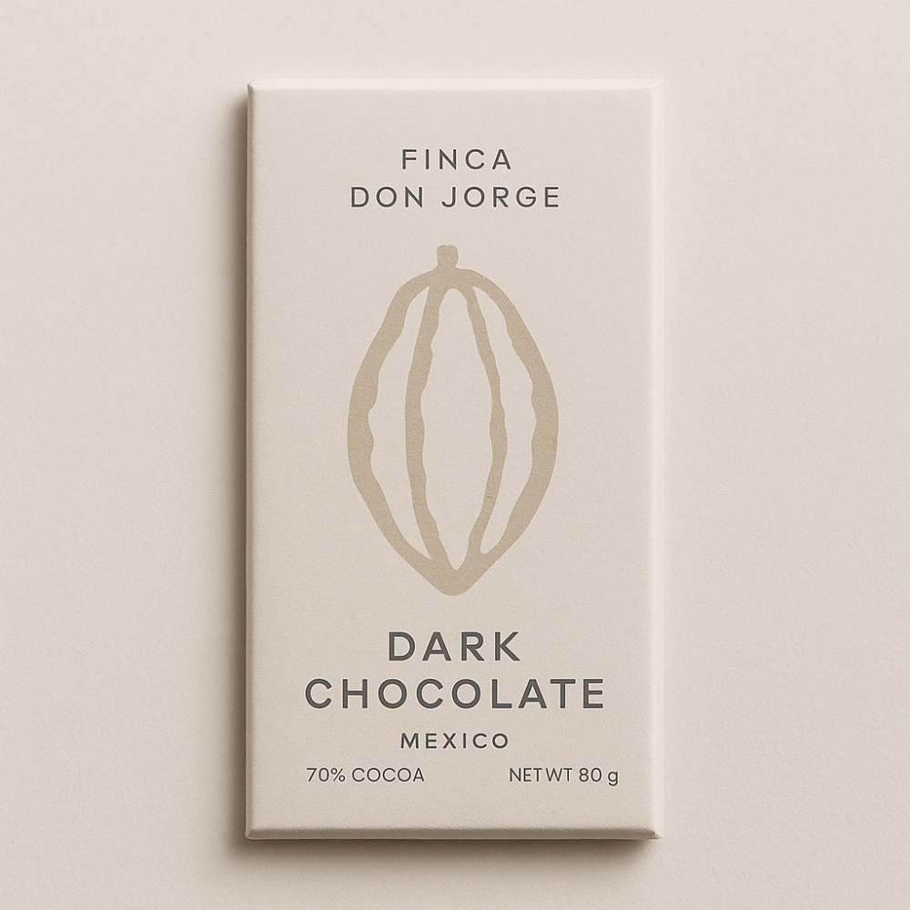
Figure 5: Alternative Standinavian Minimalism
Aesthetic Implementation
This aesthetic lives in:
- The color palette: Earth tones, soft gold, ivory white.
- The form: A folding panel structure that mimics discovery.
- The texture: From embossed topography to paper that feels handmade.
- The tone of voice: Professional yet intimate; scientific yet rooted in storytelling.
Opening Experience


Figure 6: Opening Experience
![]()
![]()
![]()
![]()
![]()
![]()
![]()
![]()
![]()
![]()
![]()
![]() Conclusion
Conclusion
The packaging for Finca Don Jorge is more than a wrapper; it is a statement of values. It represents modern Mexican design, ecological responsibility, and a full-circle production process that starts in the soil and ends in the hands of a curious and discerning consumer. By shifting from a wooden structure to a luxury paper format, I believe I’ve created a product that stays true to its story while meeting the practical realities of production.
This is chocolate that speaks. Through its flavor. Through its process. And now, through its packaging.
Citations:
Used ChatGPT to render figure 1
Used ChatGPT image generation to create figures 4 & 5
2 Comments. Leave new
[…] Project 1: Chocolate Packaging – Finca Don JorgeView Full Project Post […]
Your journey in designing the packaging for Finca Don Jorge chocolate is a compelling narrative in itself. The evolution from a wooden, eco-brutalist cacao pod replica to a sophisticated, sustainable paper wrapper, while adapting to constraints, impressively retains the project’s soul.
The final design, integrating topographic map elements of the finca and the crucial story of the Forcipomyia midge, beautifully grounds the chocolate in its unique origin and meticulous process. Your “Modern Mexico” aesthetic, embracing mestizaje through elegant typography and minimalist design, successfully elevates the product beyond clichés, transforming it into an educational and luxurious experience that truly honors its cultural and agricultural richness.