
Timeline Graphic
The following graphic documents my actual design process over the course of the semester. The process has been split into the following stages:

Figure 2: Timeline
Fabrication Process
Phase 1: Exploration & Concept Refinement
The semester began with momentum from my Upcycle project proposal: a vertically integrated chocolate brand inspired by my internship at a cacao plantation in Chiapas, Mexico. My initial plan was to build a dynamic chocolate box made of wood with a sliding or interlocking mechanism. I began exploring eco-brutalist aesthetics rooted in natural textures, raw materials, and modern Mexican design.
During this stage, I focused on:
- Reviewing packaging precedents in the wine, specialty food, and luxury goods industries.
- Refining the brand identity of Finca Don Jorge, aligning it with themes of traceability, sustainability, and mestizo culture.
- Sketching multiple wooden enclosure concepts and studying cacao pod geometry.
Phase 2: Skill Acquisition & CAD Modeling
Once the concept was solidified, I began practicing woodworking skills at the CU Boulder Idea Forge wood shop. I learned:
- Basic joinery techniques
- How to safely use band saws, sanders, and hand tools
In parallel, I used Solidworks and Fotoshop to:
- Build early CAD models of a box with a sliding mechanism
- Explore a dynamic opening that optimizes client experience
- Simulate ergonomic interaction with the packaging
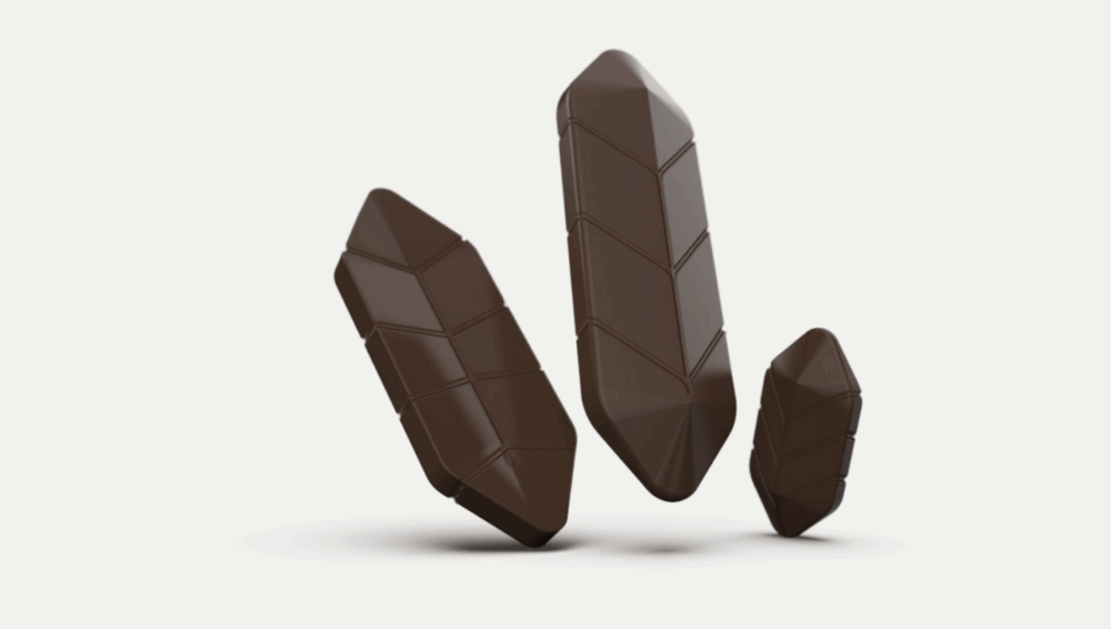
Figure 2: Chocolate Bar Initial Idea
Phase 3: Sketching and Digital Modeling
This was a critical design convergence phase. I translated my aesthetic into proportions and mechanical relationships. I sketched a shell with rounded cacao-inspired geometry and laid out internal compartments:
- Chocolate bar inspired in cacao shape and texture
- Slot for chocolate insert
- Room for a folded info card or storybook
CAD work continued with versioning of exterior and internal layouts. This phase overlapped with the final exploration of alternate aesthetics (Scandinavian minimalism, Pop-Luxury Maximalism), which only reaffirmed my confidence in the Eco-Brutalist Mestizo direction.
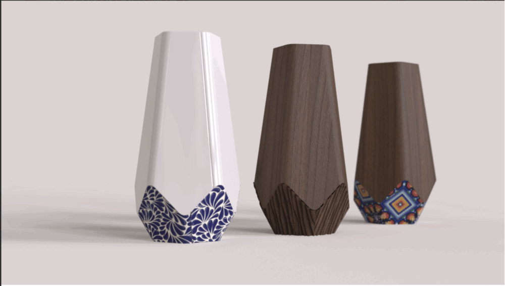
Figure 3: Cacao Pod Inpired Packaging
Phase 4: Material Sourcing and Mockups
I visited the Woodshop and Machineshop at the Idea Forge as well as Homedopot to find:
- Reclaimed wood candidates
- Finishing oils
- Brass pin sets and magnet closures
However, by this time an unexpected constraint reshaped the project: I had to leave the U.S. and continue remotely from Mexico City. I brought sketches and CAD work with me but left physical materials and shop access behind.
This logistical shift prompted the need to pivot.
Phase 5: Looping & Design Revisions
Once back in Mexico, I realized that sourcing wood and gaining shop access in time would be impractical. I researched wood shops in Mexico City and emailed a few about access. None offered quick enough turnaround.
After reflecting on time and feasibility, I pivoted to an alternate plan:
- Designing a high-end chocolate bar wrap using luxury print materials instead of wood
- Maintaining the same aesthetic narrative (eco-brutalism and mestizaje)

Figure 4: Materials Sourced
Phase 6: Packaging Redirection & Digital Design
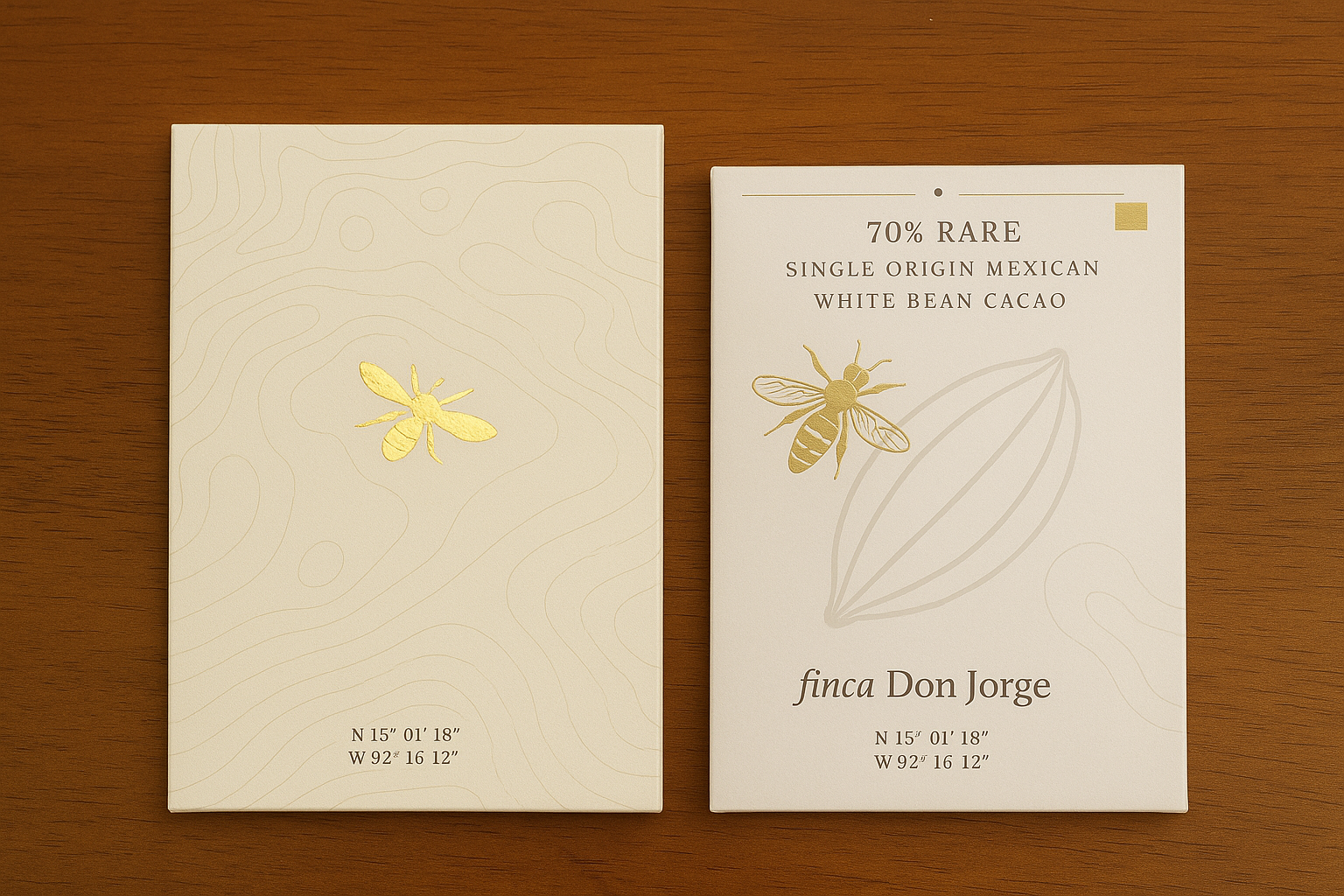
I transitioned to Canva digital designer and began working on a flat chocolate bar wrapper design. Inspired by Finca Don Jorge I feature topographic lines of the finca to reference the “Tree 2 Bar” vertically integrated process of the chocolate. Additonally included:
- Share the story of the Forcipomyia midge pollinator on one panel
- Feature origin, coordinates, and fermentation info on another
- Remain minimal and elegant, using white space and restrained color
I used typefaces that reflect both luxury and cultural nuance, mixing serif and sans-serif weights. Gold foiling and blind embossing were considered in the digital mockup.

Figure 5: Prototyping
Phase 7: Final Fabrication
The final design was printed on high-quality matte cardstock with linen texture. The process included:
- Preparing dielines
- Exporting final CMYK PDFs for professional output
- Creating mock folds with dummy paper to check proportions
Although no physical product was made from wood, the wrapper became an elegant and professional prototype, showcasing the visual storytelling and sensorial journey originally intended.

Figure 6: Final Product
Phase 8: Documentation & Final Touches
I compiled all CAD, sketches, and Illustrator files. I edited photographs of the final printed design, adjusted lighting for texture visibility, and uploaded images to the course blog.
All branding and imagery were documented:
- Coordinates of Finca Don Jorge
- The story of tree-to-bar production
- Environmental storytelling, including the volcanic soil of Tacaná
I also reflected on user experience: unwrapping the bar is an intentional act, revealing not just chocolate but a carefully layered narrative.
Conclusion
Looking back, my project evolved considerably from its original scope. The plan began with woodwork, precision joinery, and a puzzle-like enclosure. It ended in a luxury paper-based wrapper. Though the materials changed, the story did not. In fact, being forced to adapt may have deepened my commitment to aesthetics over function, the real objective of the course.
Had I stayed in Boulder, I likely would have continued down the wooden packaging route. However, I now realize that this shift pushed me to develop skills in graphic design, storytelling, and material substitution that are equally valuable.
In terms of aesthetics, the final product honors eco-brutalism through minimalistic layout, tactile paper finish, and content grounded in organic processes. The mestizo inspiration is carried through in the design choices, color restraint, and layered symbolism: volcanic soil, cacao pollinators, artisanal tradition, and geographic authenticity.
My creation now serves as a prototype for the packaging of a real chocolate product. If brought to production, I would explore sustainable paper sources, alternative inks, and possibly combine this design with a thin wooden frame to revisit the tactile strength of my original plan.
If I were to start again, I would front-load more time for fabrication or establish contingencies earlier. Still, this project has taught me how to embrace constraints and stay true to a story. And in the end, the aesthetics, not the materials, told that story best.
Reflection: What I Learned About Aesthetic Focus
This project reminded me that constraints often sharpen creativity. While my initial excitement was tied to learning woodworking, the necessity to pivot to graphic design helped me expand the aesthetic language of the project. Working with tactile paper finishes, color palettes, and print layouts gave me more control over the fine-tuned experience of the user.
In graphic design, storytelling through layout, space, and typography demands a different kind of aesthetic precision than physical fabrication. I found joy in balancing content across the front and back of the packaging. I was able to give each side of the wrapper its own visual cadence, one grounded in data (coordinates, fermentation details, altitude) and one grounded in storytelling (the Forcipomyia midge, environmental conditions, and pollination).
This approach also allowed me to see packaging as a form of storytelling. Packaging should never be an afterthought. For a product as rooted in place, culture, and craft as Mexican dark chocolate, the wrapper must be as considered as the chocolate itself.
In the end, aesthetics were not sacrificed, they were transformed. And I feel proud of the evolution this project underwent to become what it is today.
Citation:
Used ChatGPT to renderize Figure 1
1 Comment. Leave new
Hey Mateo,
Your final product looks great, I could see myself purchasing this in any store. The topography adds a ton of character and intrigue while the gold emblem pops and screams luxury. I also am impressed by how far you pivoted and how great it still turned out. Would you still consider pursuing the wooden containers in the future? I think those renders look awesome too.