
For my main project, I’ve decided to revisit and fully pursue the idea I originally proposed for my upcycle project,a chocolate packaging concept inspired by my internship on a cacao plantation in Chiapas, Mexico. The original upcycle version was overly ambitious given the constraints of reused materials, but the idea stuck with me. Over time, it became clear that this was something I was genuinely excited about,something rooted in both personal experience and broader cultural meaning. The goal is to create a high-end chocolate packaging that honors a vertically integrated, bean-to-bar philosophy, and showcases Mexican culture with elegance and authenticity.
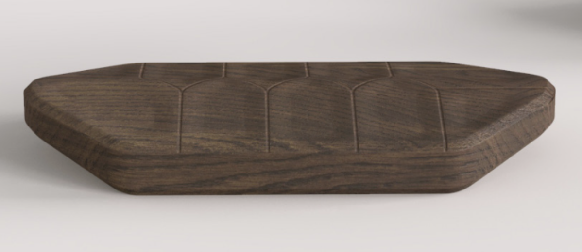
The aesthetic I am currently aiming for can best be described as eco-brutalist artisan. I want the packaging to echo the raw beauty of a cacao pod, earthy, textured, and unrefined, while simultaneously reflecting expert craftsmanship. Inspired by the rugged honesty of brutalism and the rich organic quality of nature, the packaging will combine raw wood with modern finishes and minimalist typography. The color palette will be warm and muted, taking cues from nature and traditional Mexican tones, but executed in a way that feels forward-looking and premium. The packaging should feel substantial in your hands, like an object that belongs in both a design boutique and a farmer’s market.
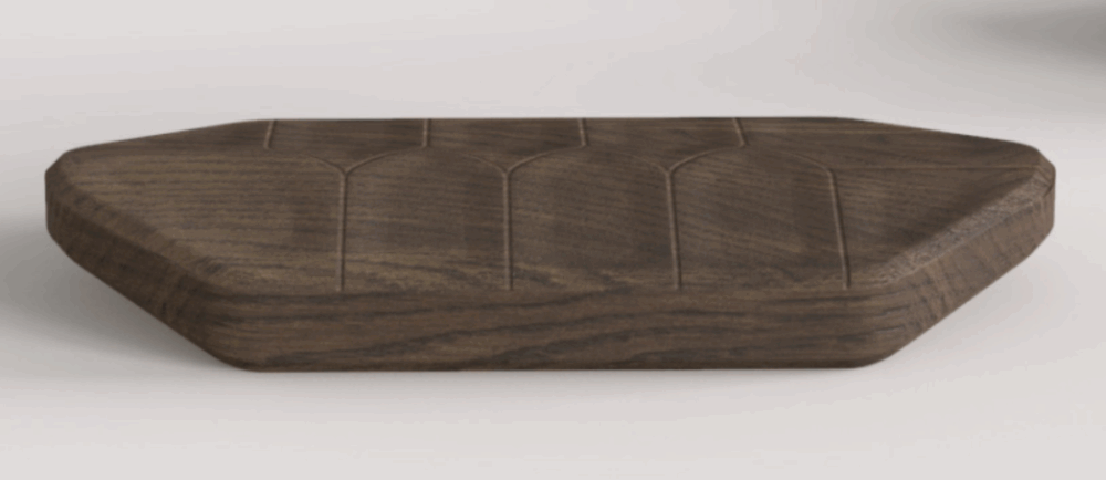
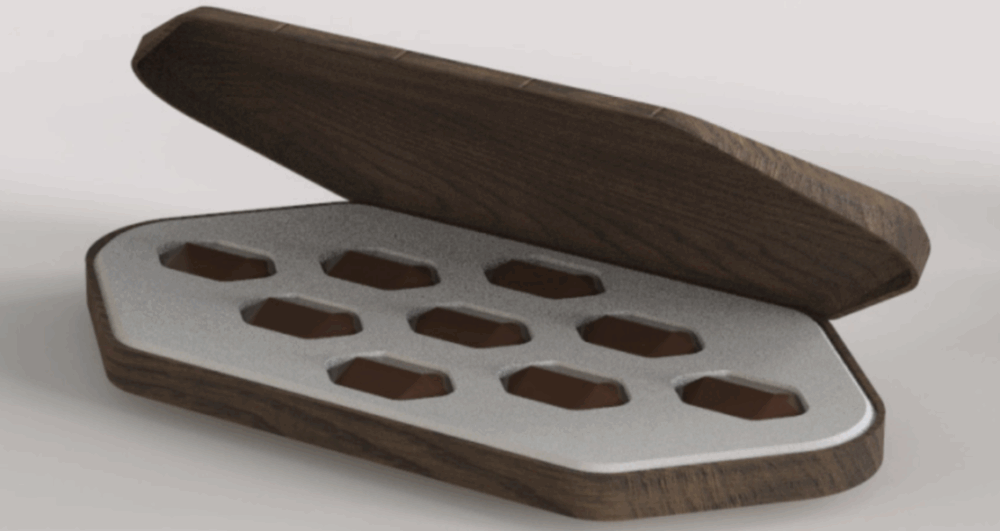
Figure 1: Cco-brutalist Artisan Aesthetic
But what if I took this same project and applied a completely different aesthetic? Let’s imagine two alternatives:
- Maximalist Pop-Luxury Aesthetic
What if I went in the exact opposite direction of eco-brutalism? Instead of natural tones and raw textures, this version would lean into glossy, metallic surfaces and bright jewel tones. Think bold colors—fuchsia, electric blue, gold foil, and highly stylized patterns inspired by luxury fashion houses. The chocolate bar itself might be encased in a mirrored box, and opening it would feel more like unboxing a designer accessory than a food item. Fonts would be large and loud, graphics would be digital and dynamic. The goal here wouldn’t be subtlety, it would be to scream luxury and indulgence. While this look may attract a very different kind of consumer, it could be a viable approach for positioning the product as an aspirational gift item.
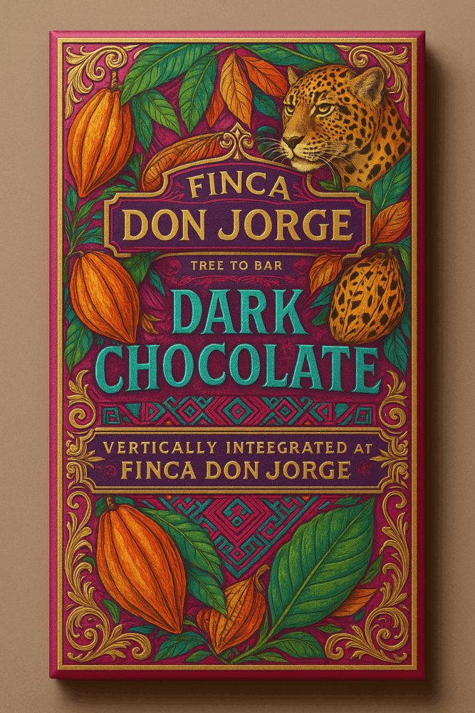
Figure 2: Maximalist Pop-Luxury Aesthetic
Scandinavian Minimalism
On the other extreme, what if the packaging reflected the soft, clean aesthetic of Nordic design? In this version, the packaging would focus on muted pastels, recycled paper textures, and ultra-simple, lowercase sans-serif typography. The cacao pod inspiration could still be subtly integrated, perhaps in the form of a minimalist embossed outline. This aesthetic would appeal to eco-conscious consumers who value calmness, simplicity, and restraint. Everything would be recyclable, biodegradable, and low-impact. This direction would push sustainability to the forefront but may risk losing the rich cultural storytelling I want to preserve.
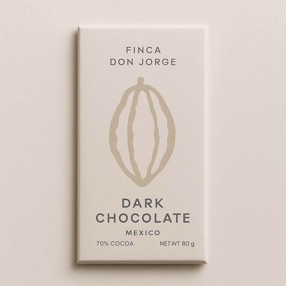
Figure 3: Scandinavian Minimalism
Reflection
While these explorations are wildly different from my primary aesthetic, they help me see new potential directions, and clarify what matters most in the current concept. Ultimately, I’m committed to pursuing the eco-brutalist direction because it’s the one that best captures the soul of the project: raw yet refined, grounded in nature but elevated through design, and deeply Mexican in both story and spirit.
Citations:
Used ChatGPT Image generator for figures 2-3.
1 Comment. Leave new
Hi Mateo, I really enjoyed your presentation in our pods. It seems like your internship was a huge inspiration for you, so I just wanted to ask how you feel that your vision differs and contrasts from existing chocolate brands such as Nestle. What is the unique brand identity you’re creating and how does your aesthetic enhance and support this image in the eye of your consumer. Furthermore, who is the ideal consumer for this brand?