

Inspiration
At the start of this project, I knew I wanted to create something visual and expressive—different from my last piece, which was a functional fruit bowl. This time, I didn’t want to make a product or something practical. I wanted to make art that people could look at, think about, and experience in a more open-ended way.
Coming up with a strong idea wasn’t easy at first. I spent a lot of time brainstorming and sketching, but nothing really clicked. Eventually, I stepped away and scrolled through Instagram. That’s when I came across a post about the Early Virtual Aesthetic. It showed examples of old computer graphics, early 3D video games, and digital art from the late ‘90s and early 2000s. Something about the style—the blocky designs, pixelated textures, and limited color palettes—stood out to me. It wasn’t polished or realistic, but it was full of personality.
That aesthetic celebrates the look of early technology, back when hardware had real limits. Things didn’t look smooth or high-res, but those “flaws” became part of the charm. I liked that idea: using limitations as a style. I decided I wanted to make something that looked like it came from that digital world—something inspired by games, screens, and old virtual spaces.
Artistic Vision and Requirements
I wanted this piece to feel like a window into a digital space. Instead of using a canvas or traditional surface, I decided to layer clear acrylic in front of a mirror. This setup would let me paint characters and shapes on the acrylic, while the mirror behind would reflect the artwork, the viewer, and the space around it.
That layering idea felt right for the aesthetic I was after. It reminded me of old computer screens and how digital characters could float in front of strange backgrounds. The mirror would create visual depth without needing extra materials or lighting. The reflection would also make the piece interactive in a subtle way—people would see themselves in it as they looked at the floating shapes.
At first, I thought I might fill in the drawings with bold colors to match the early game look. But after testing it out, I liked the linework better. Keeping the characters just as outlines let the mirror show through them, which made them feel like they were hovering in space. It added a strange, layered effect that I wouldn’t have gotten with solid colors. It also let the viewer’s reflection become part of the piece, passing behind the shapes like they were part of the digital world.
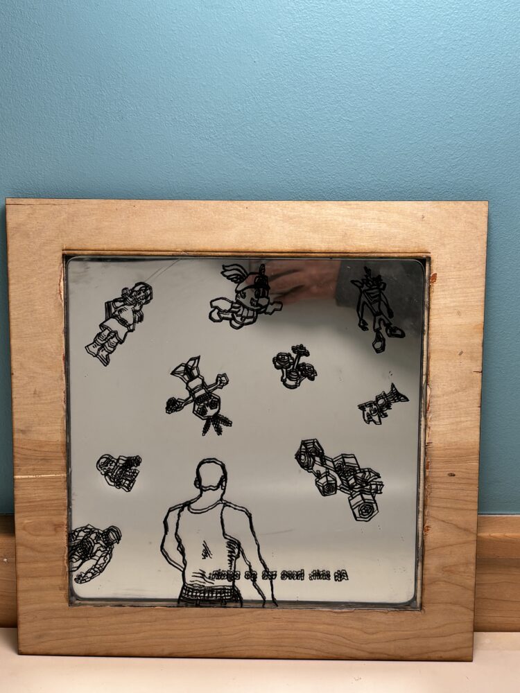
For materials, I used a 10×10″ sheet of clear acrylic and a matching 10×10″ mirrored acrylic. I needed a frame to hold the layers together, so I designed one to laser cut. At first, I used acrylic for the frame as well, but I had trouble gluing the pieces—there were cloudy marks and it didn’t hold together cleanly. So I switched to wood. I laser cut a wooden frame that held the sheets better, looked cleaner, and added a nice contrast to the mirror and plastic.
I also thought about adding LED lights to make the piece interactive when someone walked by or moved near it. But as the painting came together, I decided to leave the lights out. I didn’t want to overcrowd the piece or distract from the simple, layered look. The mirror already added motion through reflections, and I wanted that effect to stay the focus.
Sketches and Design
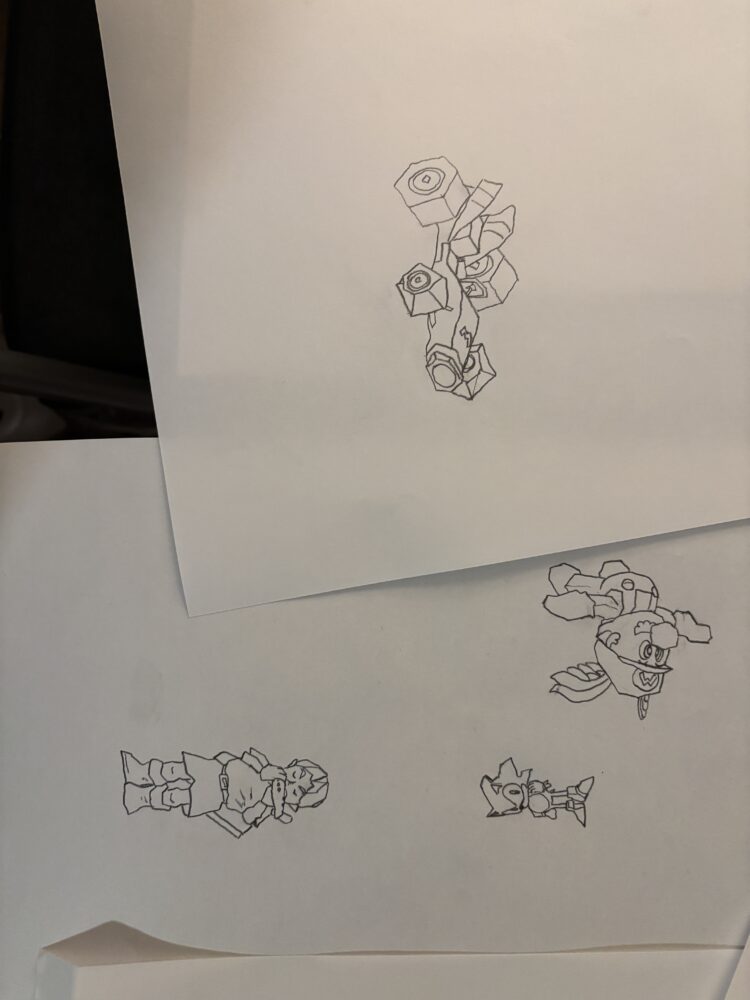
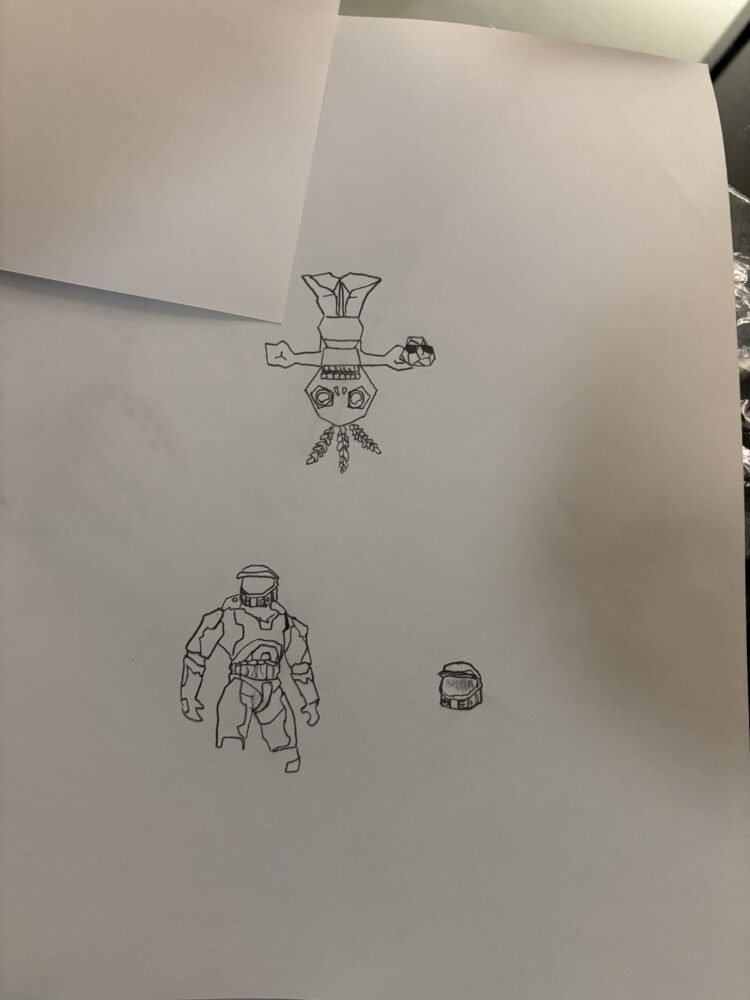
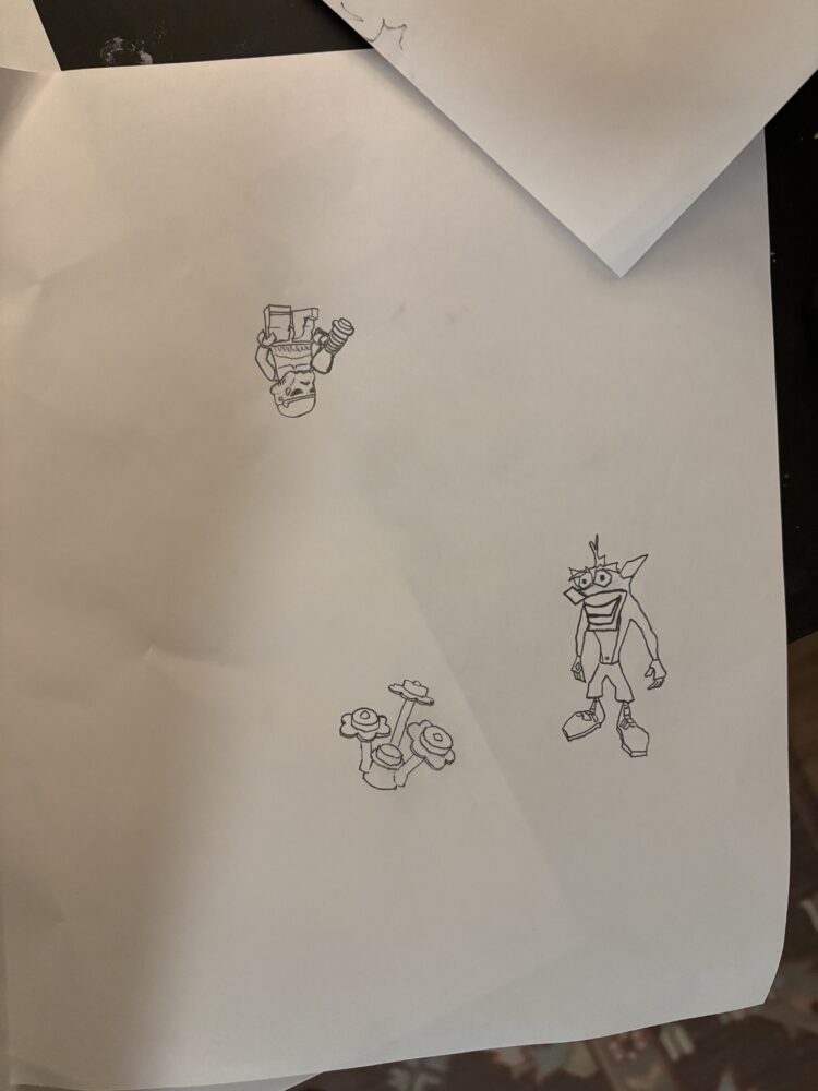
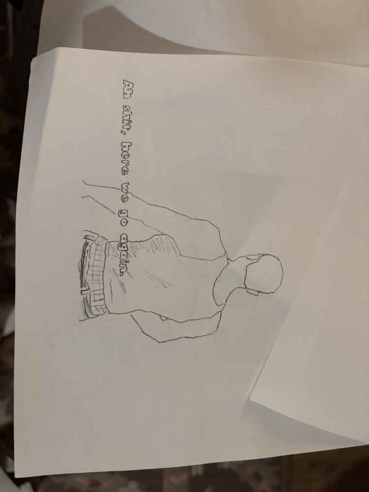
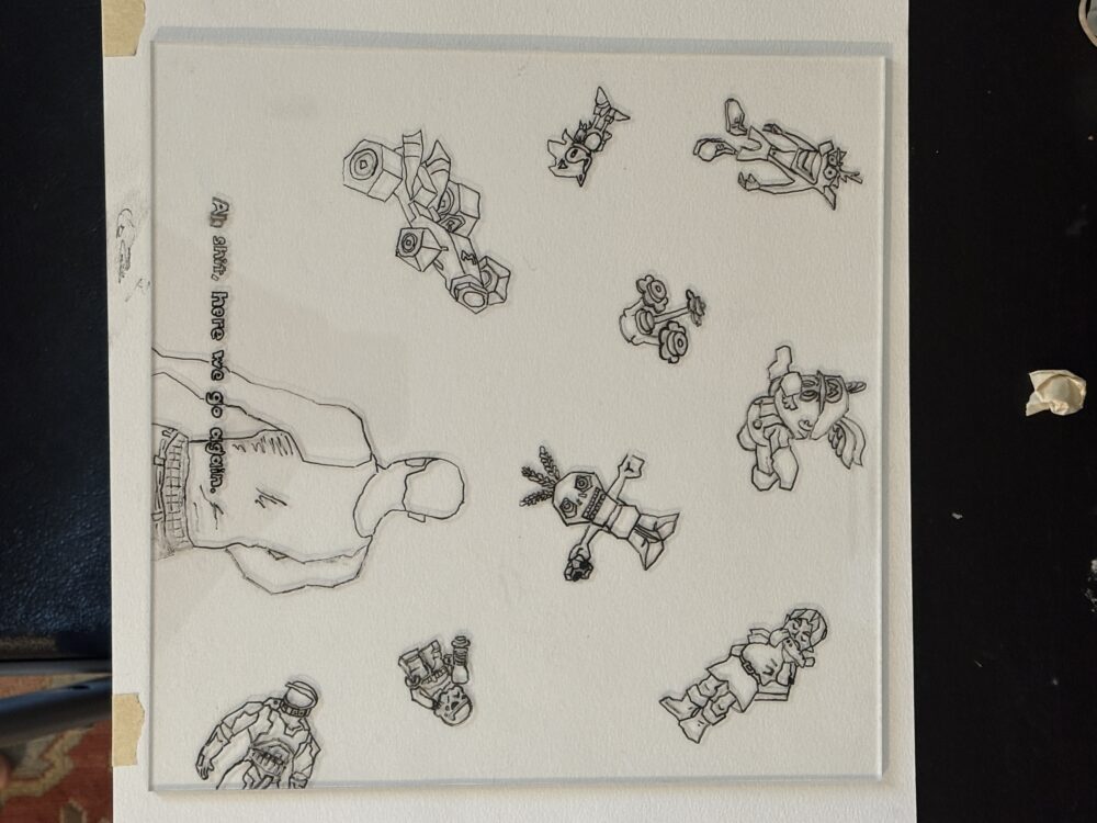
I started by sketching characters and icons that reminded me of early video games. My drawings included simple, low-detail figures and graphic shapes—nothing too realistic or detailed. I liked the idea of floating figures with no clear ground or gravity. I sketched out different layouts, trying to see how I could spread the characters around without making it look too random.
In most versions, I didn’t want a single main subject. Instead, I imagined a bunch of figures interacting or orbiting each other, like pieces of a paused game screen or background design. Some were tilted or upside down, adding to the feeling that this was a digital space without rules.
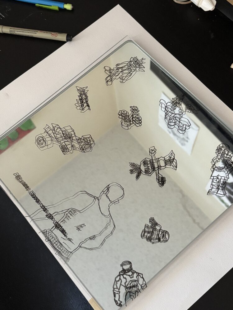
Once I had a layout I liked, I gathered my materials. The clear acrylic came from the BTU Lab on campus, and I ordered the mirrored sheet online. I painted directly onto the clear acrylic using permanent black ink. This worked better than expected—no smudging, and the lines stayed sharp. The clear layer sat on top of the mirror, and the mirror added reflections that made the drawings look doubled or layered depending on where you stood.
I designed the frame using Illustrator and cut it on the laser cutter. The first version in acrylic didn’t glue well, so I reworked the design for wood. The wood held the pieces securely and added a warm, textured edge that worked surprisingly well with the high-tech feel of the mirror. It was a happy accident—the wood balanced out the cold, smooth materials and gave the whole piece a more finished, crafted look.
Initial Sketches:
Drawings on Acrylic:
With Mirror Behind it:
The final Product:
 Reflection
This project taught me a lot about letting go of overcomplicated ideas. In the beginning, I imagined color, lighting, and a more detailed composition. But as I built and tested, I found that simpler choices—just linework, no LEDs, and a clean wooden frame—led to a stronger piece. It helped me realize that good design doesn’t always mean adding more. Sometimes it’s about finding the right balance and letting each element do its part.
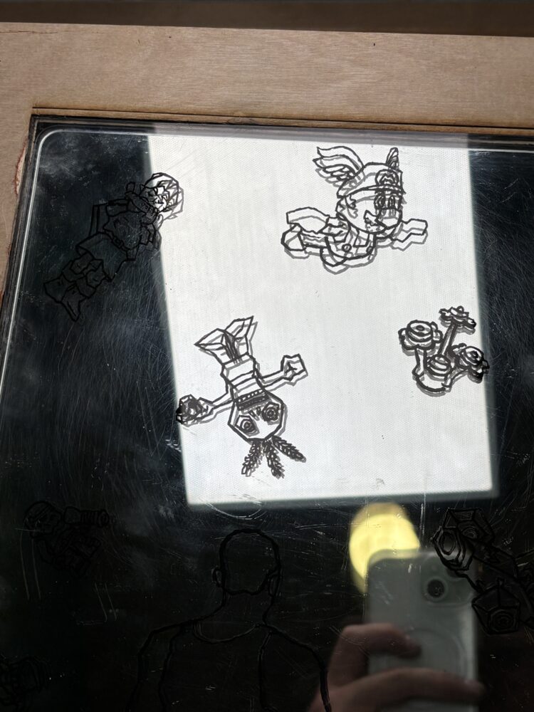
The mirror added more depth than I expected. It didn’t just reflect the drawings—it made them come alive. When people moved past the piece, their reflection would pass behind the drawings, creating the feeling that the figures were in front of them. From some angles, the reflected lines and real lines would double up or slide apart, making the characters feel like they were shifting or glitching.
Choosing to keep the drawings transparent helped this effect even more. If I had filled them in, they would have blocked the reflection and felt flatter. With just the outlines, the mirror stayed active in the piece. It wasn’t just a background—it was part of the art. That choice made the whole thing feel more digital, more like a screen than a painting.
The frame switch from acrylic to wood was frustrating at first but ended up being one of the best changes I made. The wood was easier to work with, and it gave the piece a handmade quality that felt good alongside the virtual aesthetic. It made the final work feel more grounded and more personal.
Even though I didn’t end up using LEDs, the piece still feels interactive. The mirror encourages people to move, look at it from different angles, and notice how the visuals change. That was my goal from the start—to make something visual that also pulls you in and makes you part of it.
Conclusion
This mirror painting started as a way to explore visual art and the Early Virtual Aesthetic, and it turned into something that taught me about layering, reflection, and simplicity. Using a clear acrylic sheet painted with linework and placed in front of a mirrored surface let me play with space and movement in a low-tech but effective way.
The floating characters, the shifting reflections, and the contrast between materials came together to create something that feels part screen, part memory. It’s not trying to be realistic—it’s more about capturing a moment from a digital world that doesn’t quite exist anymore.
Leaving out color and LEDs helped keep the focus where it needed to be—on the interaction between mirror and line. The switch to a wooden frame not only solved technical issues but improved the look and feel of the piece in a big way. These small decisions made a big difference in the final result.
In the end, this project showed me that working with limits—visual, material, or technical—can open up unexpected creative paths. It also confirmed that I want to keep exploring art that plays with materials, movement, and perception. This piece is about looking—but also about being seen, layered in with characters that feel both digital and distant.
Sources:
https://www.welcomejpeg.com/p/a-return-to-early-virtual-aesthetics
1 Comment. Leave new
Hi Witt,
Wow your drawings are really good! I love the comic book crossover look!! I had initially worried that the mirror would be too visually distracting from the etched design and frame, but I actually love it. The lego flowers are such a great touch, I’m in love! It would be cool if you made a version where the center of the mirror is left open that way it could be functional as well as decorative. Great work!