
This week, I made major progress in refining the graphic and visual design elements of my layered tree wall art project, specifically focusing on designing the hidden photo that will sit behind the tree silhouette. Although the fabrication phase is nearly complete, this stage has been about bringing together the emotional and visual storytelling behind the piece. It’s one thing to build something technically; it’s another to make sure the final composition feels intentional, polished, and meaningful.
Finding the Right Details: Tree vs. People Balance
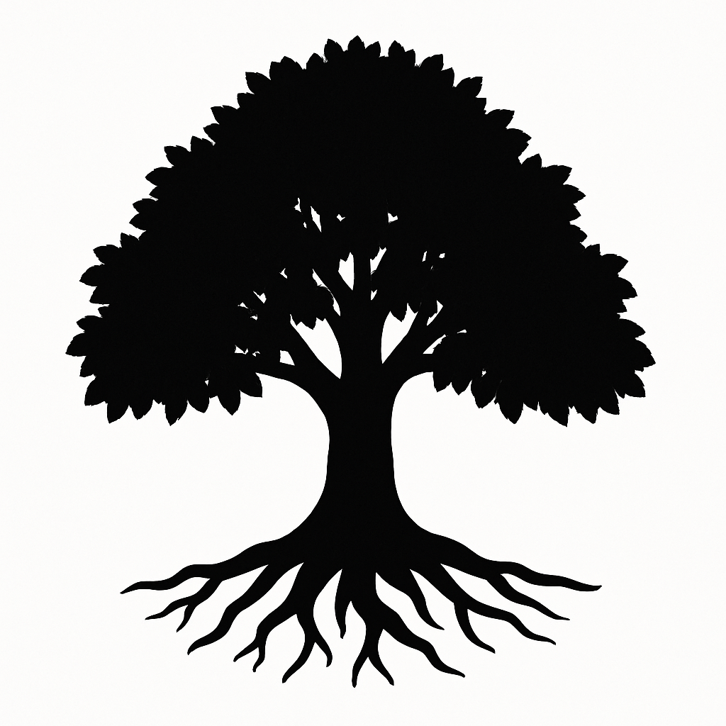
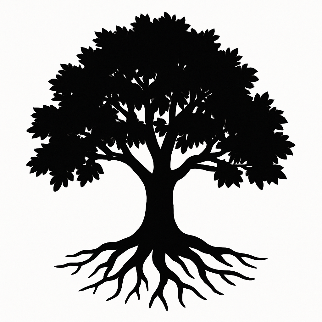
One of the biggest challenges this week was figuring out how to balance the silhouette of the tree with the visibility of the photo underneath. The laser-cut design has a lot of negative space, especially around the upper branches. I didn’t want any faces to be awkwardly cropped or hidden behind a thick piece of wood.
To solve this, I brought a snapshot of the laser-cut tree silhouette into Canva as a semi-transparent overlay, which let me preview how the actual cuts would align with the photo beneath. This allowed me to strategically position the portraits and design elements in areas that would remain visible when the frame is closed, while leaving less critical details in areas that would be partially covered.
This method saved me from having to print multiple versions, and it also gave me confidence that the photo would feel intentional, not like an afterthought or randomly placed behind a cutout.
Designing the Visual Narrative in Canva
I spent a good amount of time in Canva, designing the photo insert that will live behind the tree silhouette. Because this piece is ultimately a gift for the scholarship foundation that supported me, I wanted to make sure that the photo design was carefully curated, not just a simple printout, but something stylized to reflect the tone of the piece.
I chose to lay out a collage-style black-and-white image with subtle sepia tones for warmth. The design includes individual scholar portraits arranged around a central tree icon that mimics the laser-cut pattern of the top layer. I tested different filters, layouts, and compositions until I found one that visually aligned with the mood of the wood piece: calm, grounded, and elegant.
As seen above, the goals were to combine the graphics chosen.

Determining the Correct Frame Size
Lastly, I finalized the exact dimensions of the hidden photo frame. I measured the inner area behind the tree silhouette, taking into account the curve of the trunk and branch density, and mapped out the maximum space available for the photo insert. After a few tests, I settled on a 6”x8” internal frame size, which fits well within the structure without making the image feel cramped.
I printed a sample version to scale and tested it behind the cut layers. The final result felt balanced and well-composed, exactly what I was aiming for.
This week was all about tying the visual story together. I now feel confident that the photo, tree silhouette, and frame size are all working in harmony—and that the final presentation will carry the emotional weight I set out to achieve.
