
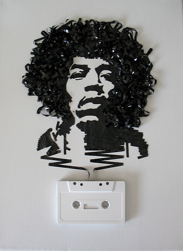
The upcycling process, for me, took some really interesting turns during the design process. I originally started off with the idea of creating art using cassette tapes and/or paper clips.
This proved to be much more challenging for me than I thought going into to project. I could not get the cassette tape to form the way I wanted it to. It also would never serve any purpose besides reusing old cassettes, which was less than ideal for me. I wanted whatever I created to do at least 1 thing, no matter how simple. After some time I abandoned the cassette project and had to find a new one. Feeling the time crunch I was drinking a lot of caffeine, specifically Red Bull.
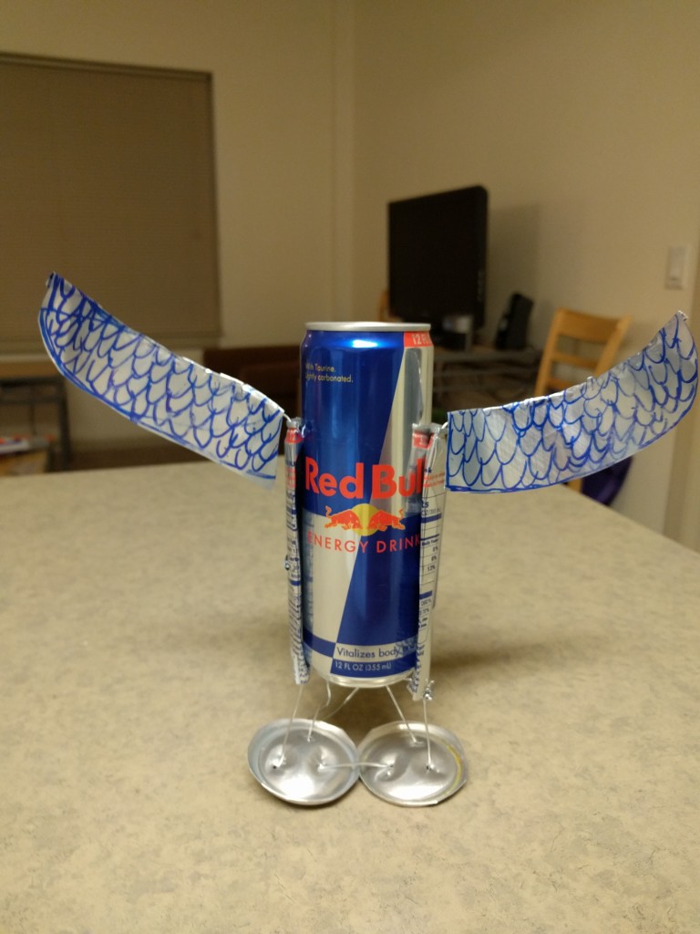
Then it hit me. Red Bull gives you wings! I love a good play on words, so I thought “What if I made an object that can hold a Red Bull that is made from paper clips, and an old Red Bull can, and shaped it in such a way that it had wings?”. From there, the rest was history.
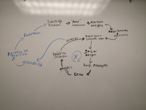
In class we had a discussion in smaller teams, and then as a class, about the design process and its steps. The process my group and I came up with is as follows.
- Identify the Problem
- Create a “Need” statement
- Conduct Market Analysis
- Develop Requirements & Specifications
- Generate concept ideas
- Create an initial design
- Build prototypes
- Test prototypes
- Analyze test results
- Redefine the problem
- Redesign
- Develop the aesthetics
- Release product to the market
- Receive feedback from customers
- Repeat steps 1-14
The flow of the process can be seen in the image below:
My design process for this project went more like this:
- Create a “Need” statement
- Develop Requirements & Specifications
- Generate concept ideas
- Create an initial design
- Build prototypes
- Test prototypes
- Analyze test results
- Redefine the problem
- Redesign
- Develop the aesthetics
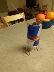
Overall the process was very similar. There was no problem, no release to market, no feedback from customers, and no market analysis. I created a need statement where this object had to have wings and hold a full can of energy drink. This also translated into requirements & specifications that it had to be sturdy, and other factors like that. I created some concept ideas where the body would either be holding wings in a set of hands, or it would have wings itself. I chose the latter over the former. My initial design would have wings on the body. From there I built a prototype that looked like it had chicken feet, and also was not sturdy enough to hold a full can. I’ll talk about how I solved that problem later.
I tested the prototype by trying to tip the object with and without a full can inside it. I took the results from those test, and redesigned and rebuilt the feet to be more supportive. Once I had that complete I tried to work on the aesthetics by smoothing out curves and other loose wires. Overall I feel that I followed a general design process fairly closely.
Inspiration from this project came from a few places. One place is a love for play on words that I have. This is what inspired the Red Bull holder to have wings incorporated into the design, since Red Bull has had a long running commercial slogan that “Red Bull gives you wings”, but there aren’t any wings on the can. The next inspiration came from other people making sculptures from old soda cans and wire.

My vision for this project was simple: Make an object that can hold a single, full, 12-oz Red Bull can that also incorporates wings of some kind. The object has to be stable enough so that it won’t simply tip over if it is bumped or the table is shaken. Going off of these only two requirements and specifications, I went into building the stand.
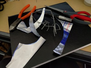
Materials & tools used were as follows:
- Two Old Red Bull Cans
- 13+ Paperclips
- One set of Need-Nose Pliers
- One Blue Sharpie
- A pair of scissors
- A can opener
 I ended up not using the exacto knife
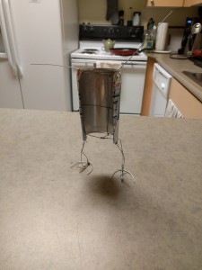
First I built the framework that would support the drink. I started with the feet and legs
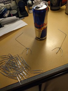
From here I build the “ribs” of the frame. These would wrap around the body of the can in order to hold it.
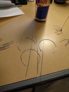 Ribs being shaped
 Making sure the ribs would be spaced correctly on the can
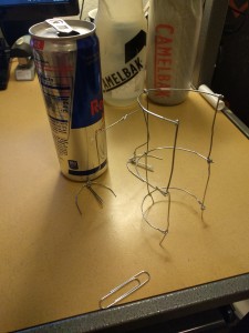 Completed frame and feet, not attached yet
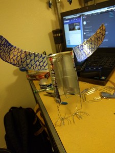
After I had the frame done, I used two paper clips to form the profile of the wing and also attached the legs & feet.
Next I cut one of the old cans in order to hide the paperclip frame.
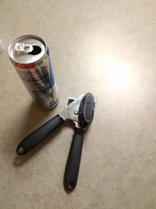 tools required to cut the top of the can off
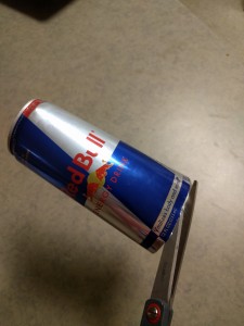 After cutting down the side of the can, the bottom was cut off
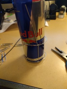
 Fitting the can to the frame, Front view
 Fitting the can to the frame, Back view
Once the cover was attached, I made sure a can would still fit inside the body. Next I cut the other can and drew on it in order to shape the wings and give it more depth.
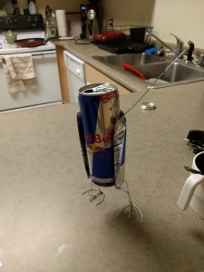
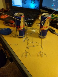
After some shaping the structure can stand on its own, however it is incredibly unstable.
From here I redesigned the legs and added a “kick-stand” to help support the weight. This new version is much more stable.
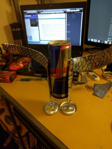 I cut off the old legs and made new ones that would be able to support more weight
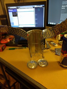
Comparing the final product to what I had envisioned in my mind, I have achieved parts of what I set out to accomplish. What I mean by that is that the stand is able to hold a full can of Red Bull without easily tipping over and has the correct play on words I set out to create, but does not look exactly how I’d like it to. Functionally I have achieved my goals. Aesthetically, I think it came close. It was a good concept and first attempt. With more time and a different wire type (not paperclips, ideally thinner gauge wire), I think that this could have potential to be a fun holder to be displayed. What is next for this project is that it will most likely be properly recycled.
Overall I learned a lot about how to work with paper clips, recycled material, and that things are not as easy in reality as they might be in your mind. It was important to me to have what I make serve a purpose and actually “do” something. I did not want just an art piece. While this does not necessarily contribute much in terms of functionality, it serves one purpose and is able to successfully complete it. That is good enough for me for only using recycled material.
References/Sources
Hendrix Tape Image: http://www.noiseaddicts.com/2009/03/celebrity-art-made-with-cassette-tapes/
Can Car: http://bitsandpieces.us/wp-content/uploads/2009/12/imagescan7_small.jpg
[/vc_column_text][/vc_column][/vc_row]
This is custom heading element with Google Fonts
I am text block. Click edit button to change this text. Lorem ipsum dolor sit amet, consectetur adipiscing elit. Ut elit tellus, luctus nec ullamcorper mattis, pulvinar dapibus leo.
43 Comments. Leave new
Personally being such a huge fan of red bull, I love the inspiration. I think adding a textured element to the wings would create a unique depth element
I liked that you wanted to have something functional at end of use. The idea of playing on words also gives your work special thing. Your designing process loop adapted for this project is somewhat different than usual and I thought that this was interesting. Liked your end result, nice work!
It is a very interesting play on the slogan and aluminum can art. It would be cool is the wings could move.
Nice job translating Red Bull’s slogan into something concrete! It’s also cool that you managed to do so using the original can.
I am amazed how structurally sound you were able to get paper clips. How did you wrap them together tightly enough?
Cool idea, I love plays on words. Future work: you could make it actually fly. This may be a bit tricky but I’m sure you can do it.
Ha gives you wings but you gave it wings riot.
Like the display holder, if you could get the wings to flap would be amazing. Any thought to adding lights or motion to the design?
As a huge redbull fan I really like this idea nice work!
I love the idea of giving wings to a can of Red Bull. My only suggestion would be to file down the edges so you don’t cut yourself!
Cool play on the red bull tagline! I like the overall look but you might want to consider making it a bit more robust. Good work!
That’s cool! It looks very clean and well-put together! I like the aesthetic of the shiny aluminum. You might want to redo the feathers with something other than a Sharpie. It takes away from the clean aesthetic the rest of it has.
This was pretty creative! The legs could be wider apart to provide more stability. The feathers should be drawn on the other side of the wings as well. Good work!
Being that one of the improvements you mentioned was to improve the wing aesthetic, did you consider during the design process cutting up some red bull cans, and then overlaying them as feathers on the current wings on the sculpture? Adding some texture and dimension to the wings could give the wings the aesthetic improvement that you desire.
Fun idea! My only concern is how sharp the edges look. Did you fold them all over to reduce the risk of cutting yourself?
I’m not sure red bull needs any incentive for me to drink more of it but this would be great to have on my desk and present my red bull to me.
I like the idea of making the contents of the compartments related to the content of the book. Nicely instantiated.
I like how you made a pun into a specification. Could the feet be more robust eagle claws with many more paperclips or other wire?
Clever idea and it turned out really well.
If I had this around the house I would drink waaay too much red bull!
The paperclip frame is a cool concept, maybe you could add a paperclip bird head to make it look even more like a bird.
I like the play on words you went for and how you got your inspiration while drinking a redbull. The project turned out well!
This was an interesting concept and the final result is cool. The wings are beautiful.
I think that this is a cool idea. I really think that you could get something so you can really see the scales on the wings better. I like the minimalistic feet. It looks like it flying from far away.
I like the can Art. It’s important to give credit to the inspiration. You had a nice description of the design process. The prototypes. That’s a good save that you used the can bottom to use it as a feet. Can you clean the sharp edges of the can? How many cans did you use to get the final design. Good thoughts on moving forward.
Looks sick! This is a good looking can holder. Maybe do something to the edges so that it doesn’t scratch.
Man, making paperclips perfectly straight is hard ain’t it??? I’d love to have found a better way to do this for my piece too. Instead of making it functional (red bull holster), this would make for a really interesting art piece if you kept going with it from that approach.
The process shots are interesting. I appreciate that you challenged yourself to create a piece with the minimal material.
Nice play on words. I think the feet had some more substance or used a bull with wings design. Nice job using the same color theme when making the wing design.
I like the quirky idea and the materials that you used. I think the wings could be improved upon if instead of drawing on the feathers you used another material to actually make feathers, like more cut aluminum pieces layered on top of each other.
A lot of design work went into this! Interesting concept with the wings.
This turned out great– the drink holder design is functional as well as symbolic. One suggestion that would require some additional work would be to form the feathers by cutting shapes from the blue and silver of the can and overlaying them instead of drawing the shapes.
I think its really cool how you held it all together with red bull cans and paperclips. Could you have made the wings move when you put the can in? As in, the wings are down without a can and raise when you put a can in.
Nice job of brining a metaphor to life.
It took me a while to understand that the purpose of this was to hold a not-yet-empty can of red bull, but that I see that I really like the idea. It would be neat if the holder had some insulation aspect to it to help keep the can cold.
It turned out well! It would be cool to try and get the wings cut from a plasma cutting service to get cleaner cuts, maybe engrave the wing pattern on the face, and give the edges of the wing a pattern.
I like the idea of designing something to embody a play on words. The wings might be improved by attaching feathers cut from more red bull cans.
Instead of using wire, maybe you could roll the can aluminum sheets into tubes? I think that may give you a little more stiffness, and would keep in theme with your main body. It would be cool to integrate a cooling device, so you could temporarily cool it on your desk while drinking it.
The little wing-stand looks awesome! I am not a big soda or energy drink person, but I do enjoy play on words and puns. Your design loop during your presentation, was very thought out and really took us through your design iterations and frustrations.
I really like how you embraced the red bull slogan for your design! I think it would be really fun to send an image of this to red bull and see what they say!
your design process is really well thought out! I like the creative cross between slogan and actual product. I like the wings!
I appreciate your honesty of your inspiration and original design ideas not really working out. I like how you were inspired by red bull cans and their advertising. I think this would be a great thing for marketing. Great job!
I love how adorable this! I wish that my red bull always had wings! I think a cool next step would be to make it able to move or even deliver the red bull to you! Albeit that would be a very difficult adjustment, but cool nonetheless.
Like the play on words. I bet red bull would appreciate it if you sent this design to them.