
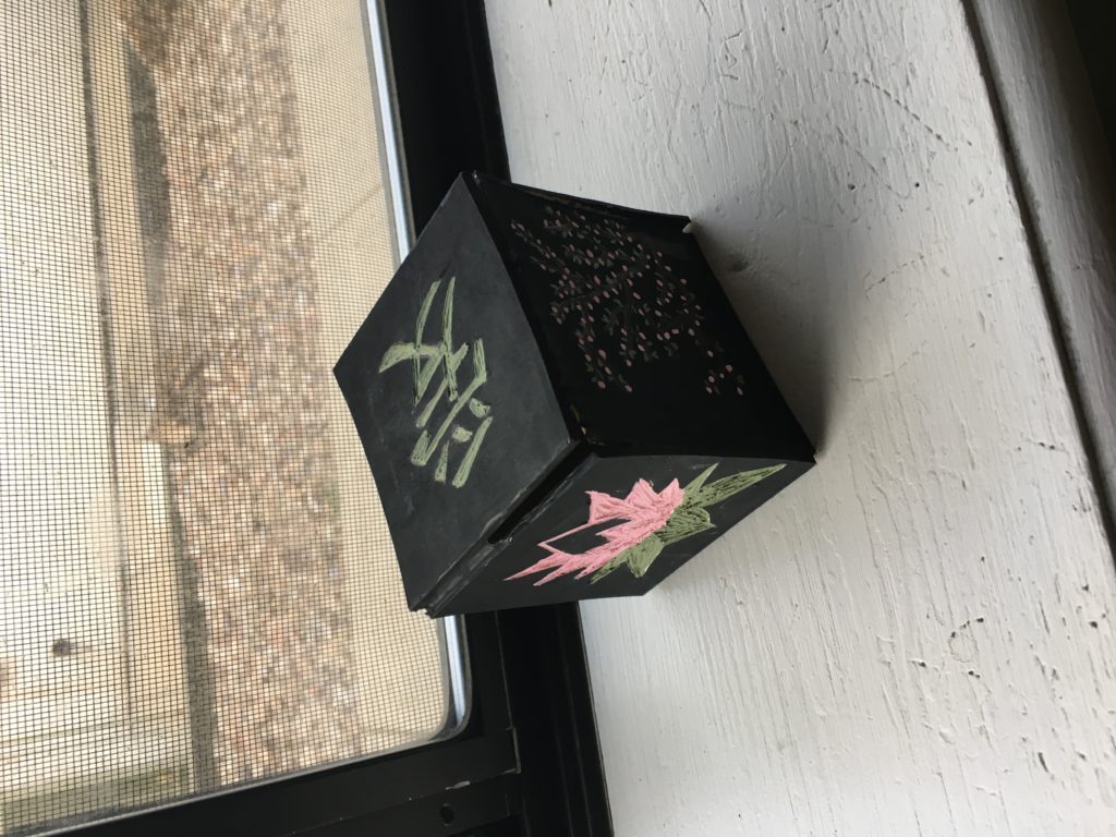
The most closely related 20th century design movement to the design of my jewelry box is Art Nouveau. The trees and flowers, combined with the smooth flowy lines, resemble those often used in the art of the Art Nouveau movement. It also fits into the Arts and Crafts design movement based on its simplistic, blocky wood design and natural themes. The carvings that I made into the wood to produce the designs somewhat push the design of my jewelry box in the direction of the Organic Design movement. However the overall shape is just a simple cube, which does not represent Organic Design.
I chose to cast my design first with a Constructivism Aesthetic. I feel like this is wildly different from the aesthetic that I am going for with the classic bright, pop-out colors and sharp lines to create geometric patterns. I do not like the way that this looks (in terms of my final project design) because it doesn’t feel representative of what I believe a jewelry box should be — it’s way too in-your-face.
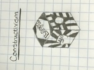
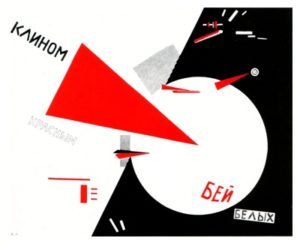
Below are some of the images that I used to draw inspiration for the Constructivism design.

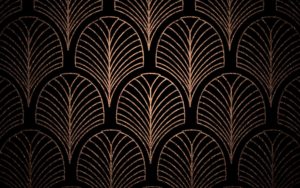
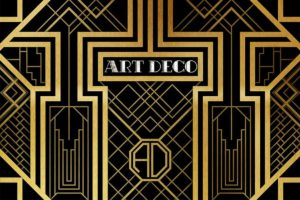
Secondly, I cast my design with an Art Deco Aesthetic. The sharp lines and patterned geometries of this design style also represent something very different from my intended design. The color scheme for Art Deco also often features shiny metallic colors such as gold and silver, which is nearly the opposite of the color scheme that I am going for. However, Art Deco often features black as a prominent color as I have in my design for my jewelry box.
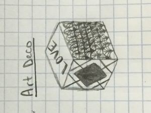
Below are some inspirations that I used to create the above Art Deco design. The geometries did not come out as clearly and symmetrically as I would have liked, but that just means I need some more practice designing with Art Deco.
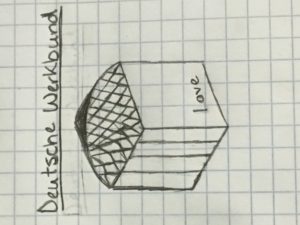
Finally, I cast my design with a Deutsche Werkbund aesthetic. This design includes very simple shapes and a reflective dome top with a Helvetica font. While I struggled a bit to draw the exact dome pattern I was going for, I still believe that this is a great divergence from my intended design. The dome top, along with its reflexive nature and patterning is essentially the opposite of the simple square top that I am going for. However, I don’t think that this would be a bad design for a jewelry box — I actually think that it would look quite elegant. The vertical lines along the one side of the box are intended to represent the edges of window panes, so this side would actually show the inside of the box.
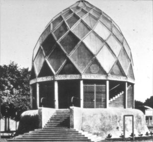
The above image, is the Werkbund Exhibition envisioned by Joseph Olbrich with the use of elaborate geometric designs. This is the image that I used for inspiration on the Deutsche Werkbund design.
References:
Constructivism 1: http://cargocollective.com/constructivism
Constructivism 2: http://artglobalized.blogspot.com/p/neoclassical.html
Art Deco 1: Karin Baier
http://lightinghomes.net/gallery/art-deco.asp
Art Deco 2: http://www.widewalls.ch/art-deco-period/
Deutsche Werkbund: Joseph Olbrich
http://history1and.blogspot.com/2014/09/deutscher-werkbund-movement.html
4 Comments. Leave new
Private proxies and best rates: 50 discount, free proxies and special deals – only on DreamProxies.com
https://dreamproxies.com/tag/50-recurring-discount-for-all-proxy-orders/
I like the Deutsche Werkbund style dome shaped jewel box design. That could give the jewel box a kind of a treasure chest look. I totally agree with you when you say that would look elegant. and showing the inside through is also a nice idea.
I think my favorite is the Art Deco design! All of your ideas would make a beautiful box though. Maybe you could incorporate different designs on each side of the box? I’m excited to see how it turns out!
Nice Constructivism! That’s a pretty cool design, I think it’s my favorite of your three, though an Art Deco box would also be really cool. Do you think any of these will change how you realize your final box? Maybe there are some patterns or colors from these that you like and think fit with your current aesthetic?