
My Aesthetic:
I would like to keep the aesthetic of my shipping pallet garden as simple as possible. The medium stained pine wood and use of sanding allow it to have a rustic feel, while the chalkboard paint induces a childish feel and a nostalgia of grade school days. The garden is not eccentric in any way, on the contrary, it is built from standard lumber sizes and connections are mostly 90 degree angles.The repetitive shelving is an organized and orderly way of displaying the plants.
20th Century Design Movements:
1) Bauhaus
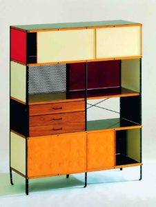
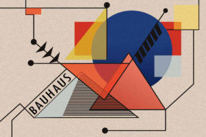
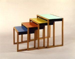
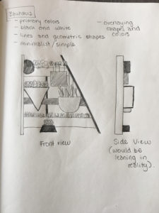
The Bauhaus movement is credited with interesting use of intersecting lines and geometric shapes and the use of bright primary colors and black & white. The images below show a varying degrees of Bauhaus designs in furniture and art. The center photo is an art piece with lots of overlaying shapes and colors, while the left photo uses the same rectangular shape with contrasting colors, and the right photo employs primary colors in an effective coffee table design. From my point of view, Bauhaus is loud and somewhat confusing. The movement does not employ a focal point and my eye never focuses on one thing.
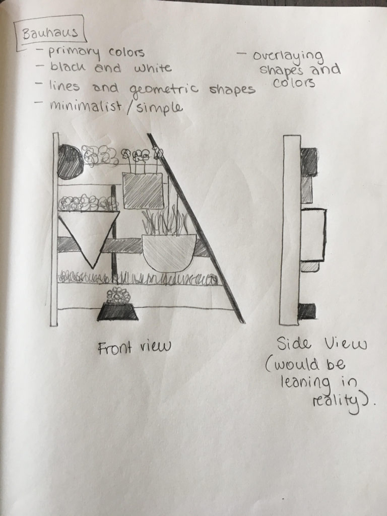
To make my garden appear as though it is from the Bauhaus movement, I employed a variety of shapes for the planters instead of just rectangles. The spacing between the planters does not have a pattern, and all the shapes are different sizes and colors (shown by the shading). Additionally, the right support is angled as to not be the same as the other side. I like this design as a set of shelves, but don’t plan to implement it into my garden design.
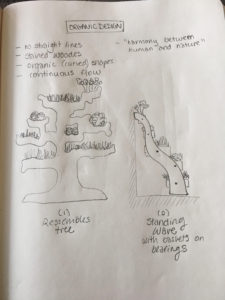
2) Organic/Biomorphism Design
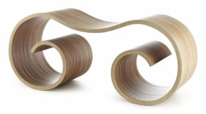
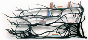
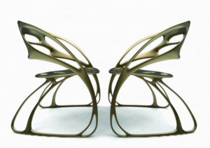
Organic/Biomorphism design is described by wavy organic curves and the use of shapes and forms seen in nature. Generally, the designs are smooth and have a continuous flow with them to accentuate the harmony between humans and nature. For example, the middle and right photos below emulate tree branches and butterfly wings. The left most photo is what screams organic design to me: curved lines, continuous flow, wooden, lightly stained, and emulates a wave.
An organic/biomorphic version of my garden would not be too far removed from what it looks like right now. For this design movement, I did two sketches: the goal of the left most sketch was to emulate a tree, and the side-view shown on the right has a wavy shape. The individual sketches were demonstrating different ideas, and I prefer the one on the right better. If I knew how to bend wood like that, I would definitely implement it into my project as I find it very aesthetically pleasing. The baskets in that design would be able to rotate within bearings to add a dynamic effect to the project.
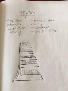
3) High Tech
High Tech design is accentuated with aerodynamic looking curves as well as sharp edges, as shown the pictures below. White, black and silver/grey are the most popular colors in this aesthetic. Additionally the aesthetic evokes a feeling of luxurious and intrigue with its futuristic, shiny exteriors.
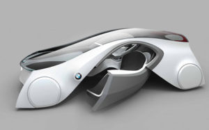
A high tech version of my garden would be made of stainless steel and would be one single piece of metal. The shiny exterior would make it look expensive and the continuous piece would invoke intrigue on how it was fabricated. The main support would be curved similar to the BMW car above, while the shelves would be sharp and angled. This aesthetic would be really interesting because it would contrast organic greenery with harsh metal.
1 Comment. Leave new
I really appreciate the thought that you put into each one of these designs. Each was apparently, carefully constructed based on common aesthetics from each movement and the design intent of each is very clear — I can see your garden being very aesthetically pleasing with any of these designs. I think the only comment that I have for improvement has to do with the layout of the images — centering some of them on the page or making them offset might make the post feel a bit more playful. Maybe attaching comments to your own drawings and creating citations for the other images would be wise as well. It’s cool that you chose a couple of movements that incorporate a lot of curves and one that is based on hard lines and shapes — it really shows the contrasting views on the possibilities for your project. Glad you stuck with something that is true to you for your final design, though. It will be awesome!