For my main project, I will create a small series of original woodwork pieces for my bedroom at home in Beach Haven, New Jersey. The aesthetic of my main project will be a combination of my own personal aesthetic– early 2000s, roxy surfer girl/ beach girl aesthetic– along with that of my parents’ pristine, coastal aesthetic that they have created with the rest of the house’s interior design. Now onto this week’s prompt.
The first wildly different aesthetic I will sketch my project in is a “corporate office” aesthetic. Within the corporate office aesthetic, a lot of the visuals we see are “very safe, sterile, and designed solely to motivate you to continue being a useful part of the corporate infrastructure.” (https://aesthetics.fandom.com/wiki/Corporate). On top of that, we see lots of straight lines, clean edges and symmetry. There will be lots of emphasis on rectangular layouts, in a similar manner to office buildings and spreadsheets. Similarly, we can see the use of grid systems, as a means to reinforce this notion of extreme organization alignment. Another widely observed principle present within this aesthetic is that it is white space-rich, meaning, they provide lots of breathing room as well as minimal clutter. Rather than being distracted by one’s wildest dreams or fantasies, the corporate aesthetic serves to inspire productivity over one’s individual passions or interests. The main goal at hand with this aesthetic is to communicate competence, security, and structure.
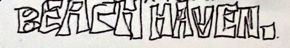
So, when trying to figure out how I would sketch my main project with this aesthetic, the first thing that came to mind was a reference to the office– when Dwight was told to make a banner for Meredith’s birthday. Rather than having something fun, colorful, and full of life, he unironically and simply printed out the words: “it is your birthday.” in black ink on white paper. Although this scene has come to be iconic, it very much highlights the lifeless feel that the corporate aesthetic has. So, when trying to figure out how I could take inspiration from this scene, I began thinking of rather obvious statements I could fabricate with wood to hang in my room as decor. Here is what I came up with… (insert sketch). By simply utilizing the words “Beach Haven” for this piece, I am paying homage to Dwight’s “it is your birthday.” banner, while making a “statement of fact” as Dwight puts it. Here one can see I used straight edges for the custom typeface and did not add any excess icons or decoration, staying true to the corporate office aesthetic.
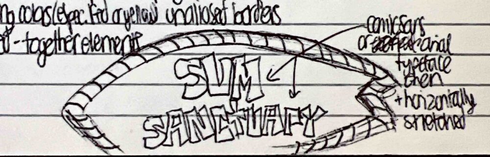
The second wildly different aesthetic I will sketch my project in is the “dollar store vernacular” aesthetic. In essence, this aesthetic is “…based around design that looks and feels cheap” (https://aesthetics.fandom.com/wiki/Dollar_Store_Vernacular). Some of the visual elements within this aesthetic are overly packed information, word art, overpacked elements, skeuomorphism, stretched or squeezed text, as well as stock photos and/or clipart. The goal of this aesthetic isn’t to look aesthetic, it’s to get the point across. This can be seen through exaggerated typefaces, images, colors, and language. Additionally, this aesthetic is widely used and can be seen through infomercials, carnival signs, knock-off products, event flyers on telephone poles, and of course, package design of products in the dollar store.
In taking in this information regarding the “dollar store vernacular,” I thought of the “homegoods” surfer girl beach decor that is mass produced and almost looks like decorations you would find for a beach themed party in a party city typestore. This prompted me to use stereotypical beach design elements that would be found with this type of decor. In taking inspiration from this as well as “skeuomorphism,” I decided to sketch my main project with this aesthetic by illustrating the words “svm sanctuary” upon a wooden surfboard that has a cheap bamboo border. The typeface I used to write out the text is bolded in an arial or impact font. On top of that, I made sure to make the text feel crowded and cluttered, to give a sort of over stimulating feel, as a way to honor this “carnival sign” like aesthetic. Although this concept unironically came out pretty cool (in my opinion) I know for a fact it would absolutely terrify my parents if I fabricated this design and hung it up in my room. (Insert image of sketch).