

Introduction to Aesthetics and Project Objective
Aesthetics explains why we consider some things good and others bad—it’s the philosophical backbone of how we interpret and respond to artistic experiences. These experiences can be as simple as walking into a new home, eating a new dish, or hearing an unfamiliar artist. At its core, aesthetics is about the emotional and cognitive response that design evokes. It pushes further to ask why we react the way we do. What makes something “good” or “bad” art? What psychological or perceptual mechanisms shape these judgments?
Unlike broader art philosophy, which explores history, culture, and material context, aesthetics focuses on the immediate, sensory response. It’s the instinctive reaction to beauty—or its absence. Aesthetics operates as a set of subconscious rules that guide how we decide whether something feels right, looks good, or resonates on a personal level.
For this project, I set out to explore how aesthetics and directionality interact in the context of human space travel. In microgravity—such as in orbit or deep space—the typical rules of up and down disappear. Movement becomes fluid and multidirectional, untethered by Earth’s gravity. That raised a key question: how does our interpretation of design shift when orientation is relative?
I wondered how perception changes when we lose our default frame of reference. Does being able to view an object from multiple angles change how we judge its aesthetic quality? Do we need new design principles to create beauty in space? Are some aesthetics more adaptable to multidirectional environments? And, does our internal “yuck/yum” scale change depending on how we view something? Ultimately, what does design look like when we remove the constraint of a fixed orientation?
Project Scope and Intent
As I explored these questions, I quickly found myself pulled in many directions—researching geometric aesthetics, dynamic media, and cognitive design. But it became clear that a complete answer would be far too broad for one project. I needed to narrow the focus. Rather than aiming to preserve aesthetic consistency from all angles, I took the opposite approach: I wanted to design something that looked dramatically different depending on the angle from which it was viewed. If I could create something joyful from one direction, somber from another, and chaotic from a third, I could show that orientation meaningfully shapes aesthetic interpretation.
Because I’m deeply interested in the emotional dimension of design, I framed this experiment through emotion. I didn’t just want visual change—I wanted emotional change. Could one angle evoke calm and another unease? This became the central question: how does orientation affect emotional response to design?
This exploration supports a theory I’ve been developing called emotional ergonomics. It proposes that emotional experience should be formally integrated into the field of Human Factors. Traditionally, ergonomic models have focused on physical and cognitive performance, avoiding emotion due to its complexity and difficulty to measure. But with emerging tools for tracking physiological responses, we now have the ability to explore emotional states more precisely. Emotional ergonomics argues that accounting for emotion in design—especially in extreme environments like microgravity—can lead to better outcomes, deeper engagement, and more human-centered solutions.
Background Research
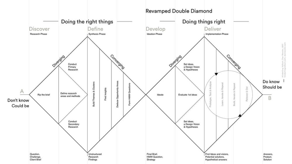
Before diving into design, I followed the Double Diamond process and began with research. I wanted to understand what was already known about orientation, perception, and emotion. Has this idea been studied before? Are there examples in psychology, art, or architecture that explore how direction shapes perception?
A foundational cognitive phenomenon is the Margaret Thatcher Effect. This study shows how facial recognition is impaired when faces are inverted. The brain, optimized for upright faces, fails to recognize subtle distortions when orientation changes. This highlights how perception is deeply tied to directionality. In microgravity, where there’s no universal “upright,” design must account for potential perceptual dissonance.
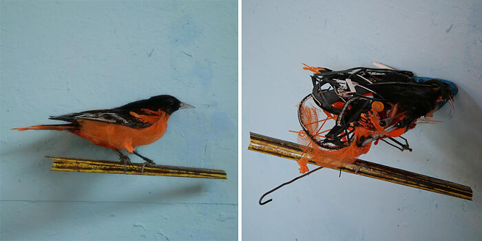
I also studied the work of artist Thomas Deininger, whose sculptures look like chaotic debris piles from most angles—but resolve into recognizable, cohesive images from specific viewpoints. His work is a perfect illustration of the “yuck/yum” scale in practice. Orientation doesn’t just influence how we see—it changes what we see. This directly supports my goal of exploring multi-angled emotional response through design.
Architectural examples, like domes and cathedrals, provided historical context. These structures use symmetry and concentric geometry to remain aesthetically pleasing from multiple angles. Whether viewed from below, across a hall, or under different lighting, they are intentionally designed for spatial movement—something highly relevant to the multidirectional movement of microgravity.
Contemporary media also offered insight. The band OK Go and their music video The Writing’s On the Wall use single-shot illusions that only resolve correctly from a specific perspective. What appears flat becomes 3D, or vice versa, depending on the camera angle. Their work highlights how drastically visual interpretation shifts with orientation, and how powerful that shift can be when creatively harnessed.

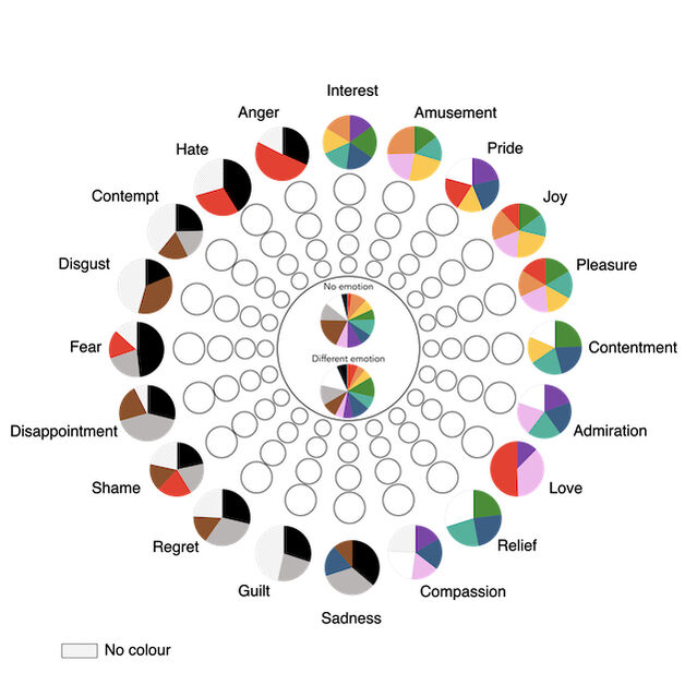
To expand my understanding of emotional design, I explored the link between color and emotion. A study featured in Psychology Today surveyed participants across 30 countries and found consistent emotional associations with certain colors: red with anger, blue with sadness, yellow with joy. These patterns held across languages and cultures, suggesting they may be neurologically or evolutionarily embedded. This insight pushed me to include color as a variable in my design experiments—so emotional response could vary not just with orientation, but also with palette.
Color and direction became dual levers in my design. By manipulating both, I aimed to deepen the emotional resonance of the object depending on the viewer’s position. This approach aligns perfectly with emotional ergonomics, reinforcing the need to treat emotional experience as a core factor in design, especially when conventional cues like gravity are removed.
Together, these studies and examples gave me a strong foundation. They confirmed that orientation meaningfully affects perception and emotion. I wasn’t starting from scratch—I was building on deep, cross-disciplinary insights and reframing them for a new context: aesthetic and emotional experience in microgravity.
Aesthetic Framework and Concept Direction
After synthesizing my research, I chose to base my design in Neuroaesthetics—the study of the brain’s response to beauty and art. I had considered cubism and postmodernism, but those movements prioritize form over psychology. I wanted a framework grounded in cognitive science. Neuroaesthetics offered exactly that.
As discussed in my upcycle project, neuroaesthetics explores how neural processes drive aesthetic experience. It blends psychology, perception, and human behavior to create design principles that aren’t just visually appealing—they’re emotionally and cognitively effective. This made it the perfect foundation for a project focused on emotional response in a sensory-challenging environment like space.
Unlike traditional styles defined by visual motifs, neuroaesthetic design is flexible in form but strict in intent. Every visual choice must support a targeted emotional or behavioral outcome. It’s about designing with purpose, using scientific insights to build experiences that resonate deeply with human perception
Initial Ideation and Brainstorming
I started the ideation and brainstorming process with a simple thought experiment; I wanted to better frame the problem and gain a better mental model of microgravity.
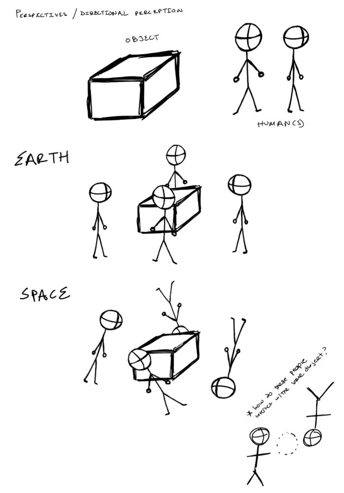
The image below shows an object with two humans standing in two different directions. The “Earth” picture shows the humans standing around this object in a terrestrial based setting where this is only one orientation of “up and down.” The second “Space” picture shows all the orientations of these people if they were in microgravity. With this, I started to think what object I could actually make that would demonstrate this effect in a one g environment.
Therefore I started to sketch out how people on earth would interact with an object that was intended for use in multiple directions. The image below shows how people on earth would view some theoretical box if it enticed them to view from all the different angles. I really liked the idea of people having to move around the object to discover these views.

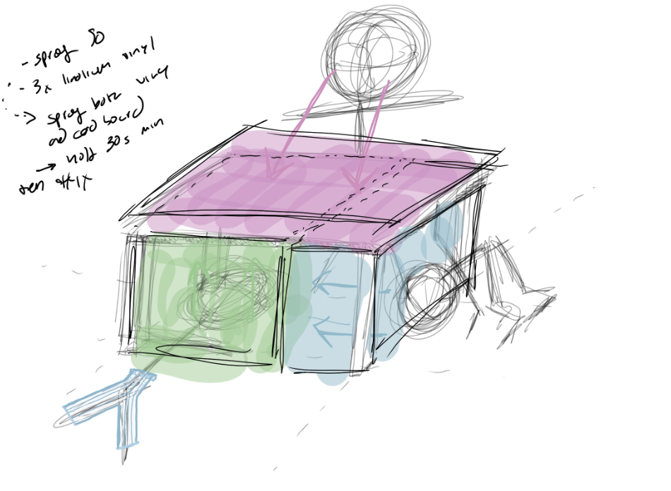
From there I started to encase my idea in reality and I sketched what this object could be as shown below.
However, as I continued down the ideation of a larger object I could not justify the moving part requirement as the human moving about the object, therefore I reduced the size of the object such that I could create a system to move it but maintain the omnidirectional and multi orientational effect.
Overview of Project Outcome
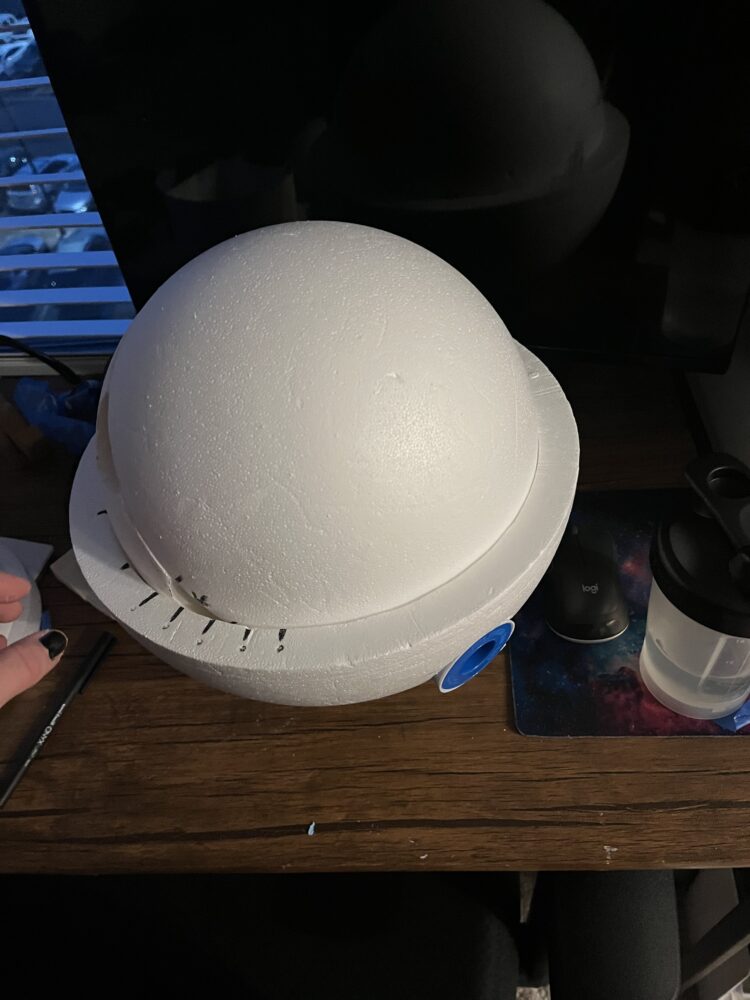
In the end, what I created was small visual effect object as shown below.
I have provided images of the object inside and outside of its case; note that the case (spheres) provide the moving aspect of the design. In the next post I will elaborate on the design and prototyping process in greater detail, and, how I went from a “not flat table” idea to the present object. It is of note however that this object still demonstrates the effect of a not flat table in space and shows how all orientations of a design should be considered as they can evoke varying responses based on the orientation they are viewed at.
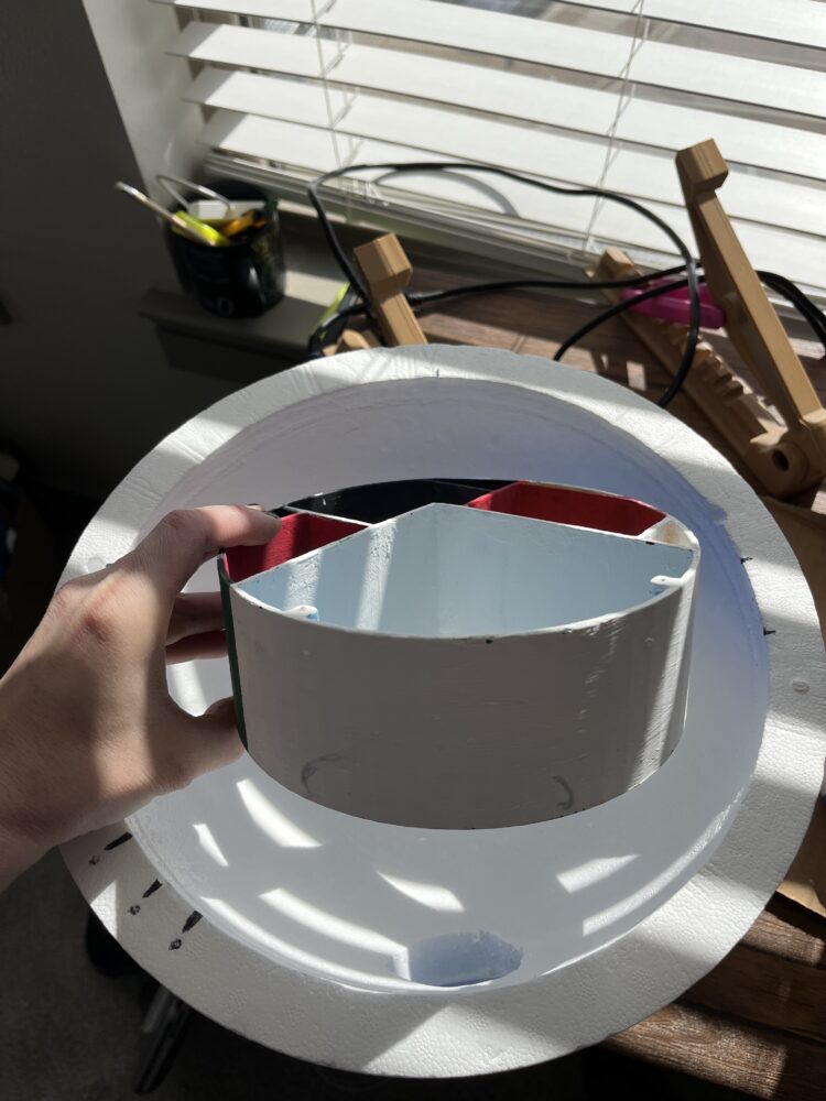
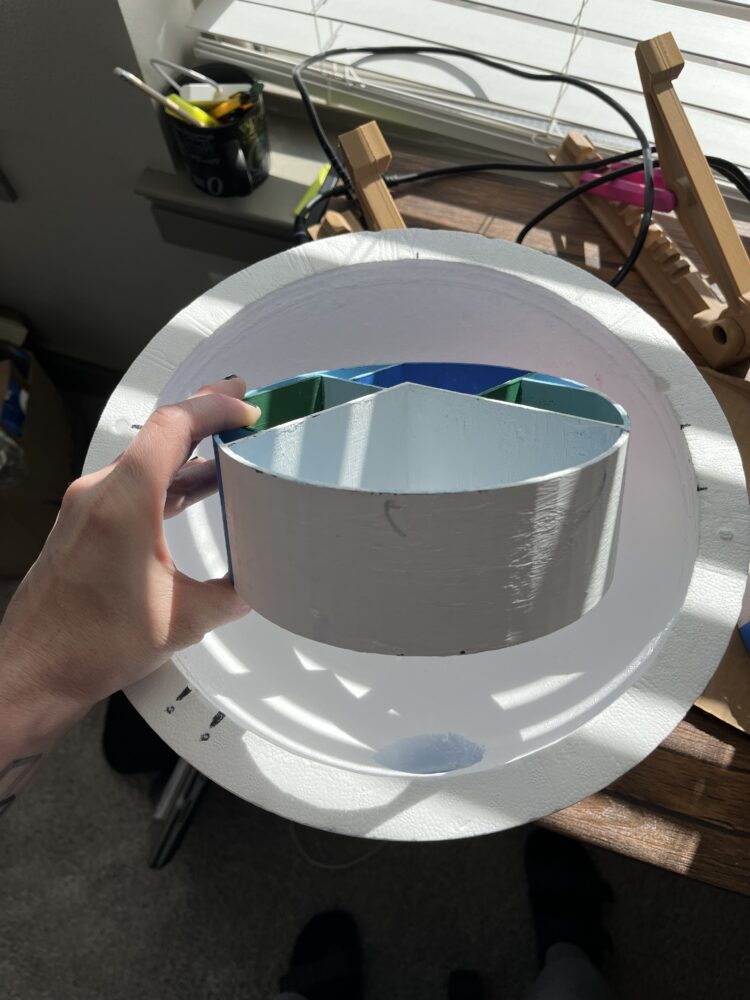
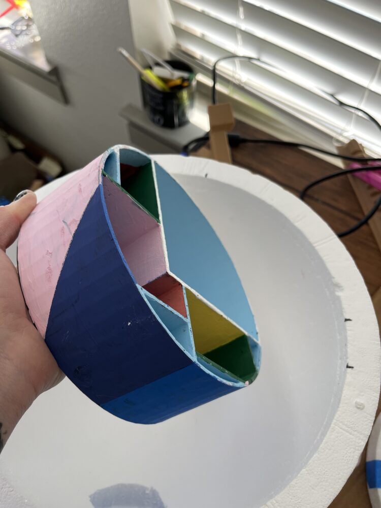
WIth this object, I leverages the emotions color scale and tried to demonstrate three very different emotions in one object; anger, joy and pleasure, and relief. I incorporated these emotions through the use of the emotion based associated colors, as determined by the Garzilli et al study.
The images above show the three “emotions” this object can evoke based on the varying angles it can be seen from.
The case it is in allows it to move in three dimensions similar to that of how it would move in microgravity. The viewing holes encourage the viewer to see the object from the intended angles and lighting holes allow the object to be illuminated with a phone light.
Next Steps
In the case that I update my design ahead of the symposium, I wanted to protect for the fact that I may rework the case and create a static phone stand. Other than that, I am extremely thrilled with my design and think that it not only demonstrates the aesthetic and function of neuroaesthetics but provides a great example of how orientation can greatly impact our perception.
1 Comment. Leave new
Andrea, this is a super cool project. Absolutely one of the most intellectual and challenging I have seen thus far. I have always been fascinated by this kind of design, and I’m really excited to see you doing it. I love the color theory references and how your final design is looking. Will be actively looking for updates!