

Vison
The vision for my project came to me as I was about to fall asleep one night. Originally I thought that I was going to craft a bowl or cup out of a log, but it didn’t feel quite right. I was thinking of other things but couldn’t nail anything down until an idea to use my old dirt bike rotor as a clock came to me. I instantly knew that this was the idea that I wanted to explore because I wanted to make a project that was functional, incorporated an aspect of my life that was important to me and was something that I would be proud to show off. Motocross has been a large part of my life for 6 years. It has been my favorite pastime ever since I first threw my leg over a bike and my family has bonded over riding through taking trips across the country. By crafting a clock out of an actual component from my motorcycle I would be able to capture these memories in a functional piece of art. This clock is currently proudly displayed on my wall and it’s future home will be in the garage of my future home.
Design Process
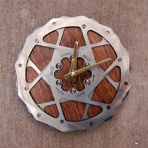
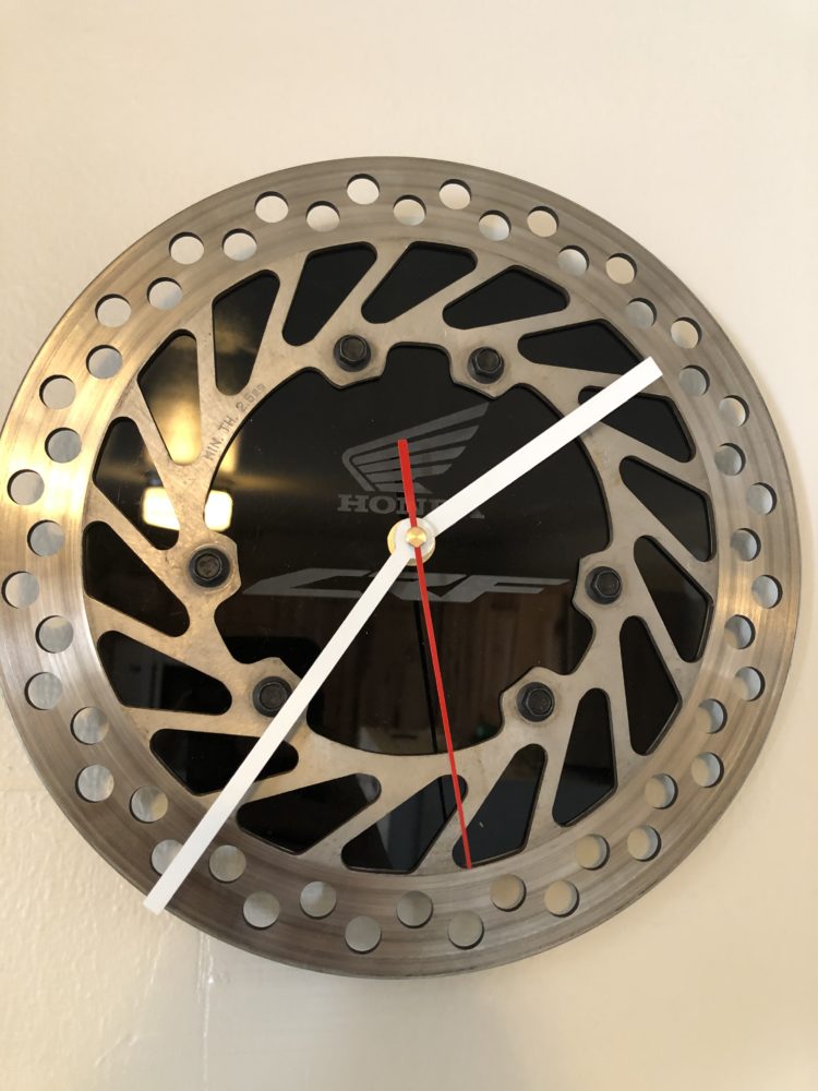
From the beginning I knew that I was going to use acrylic in the center of the brake rotor. Initially I planned on only using the acrylic to fill in the bolt pattern, but my research lead me to use more acrylic to fill in mid-section of the rotor as well as the center. This inspiration came from a photograph I saw where wood was used as a background in a similar clock. This clock used two galfer rotors stacked on top of one another as the main face with wood providing the background (This image can be seen below). This was aesthetically pleasing to me because the background allowed the clock movement hands to stand out no matter the background. Conveniently, the piece of acrylic I had from a previous project had enough material to support this change.
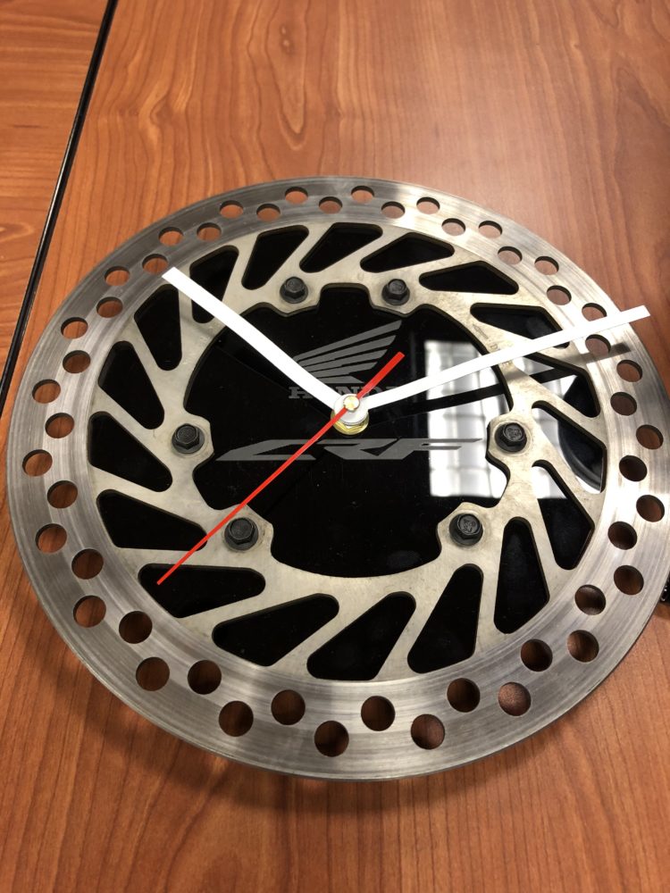
I also changed the clock hands in the process of my design. After deciding that I was going to fill in the mid-section of the rotor I realized that the clockworks I had procured from an old wall clock would not stand out enough to be seen. Additionally, I did not like the aesthetic of the clock hands. The hands were traditional in style and did not capture the feel of a racing machine. I also determined that the hands were too small for my liking and that I wanted something that would cover more of the rotor’s surface. For this reason I researched new movement; I settled on a set of white minute and hour hands with the second hand being race red. I chose these colors because my motorcycle (I have included a picture of me riding it below) is white with red accents.
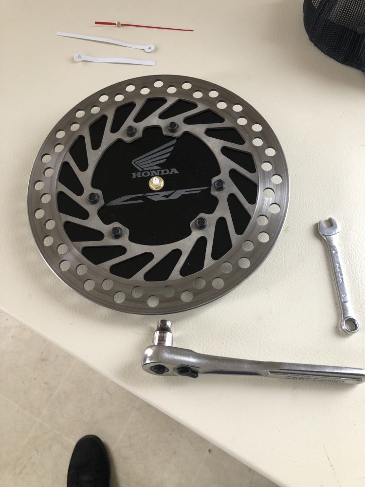
I was even particular in the selection of the bolts that mated my clock face to the acrylic. I wanted to capture the essence of the actual fittings that would normally hold the rotor to the hub so I decided on socket head M5 bolts. This gives the clock the look and feel of being fastened together; this even allowed me to use the same wrenches I would use to work on my actual motorcycle in the assembly process.
Fabrication
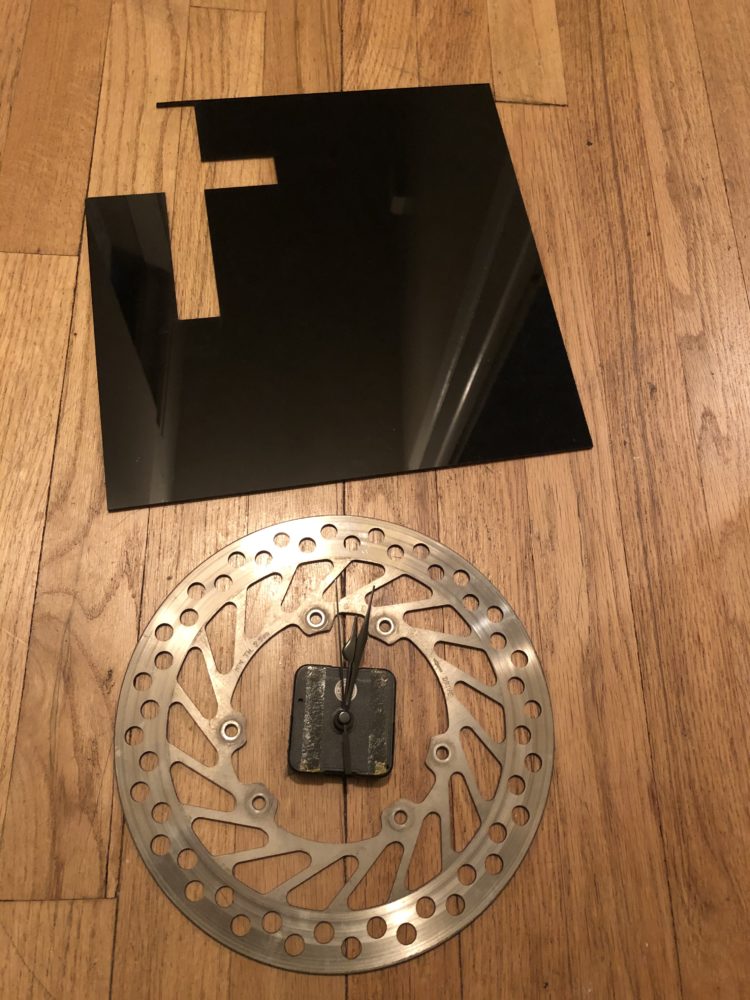
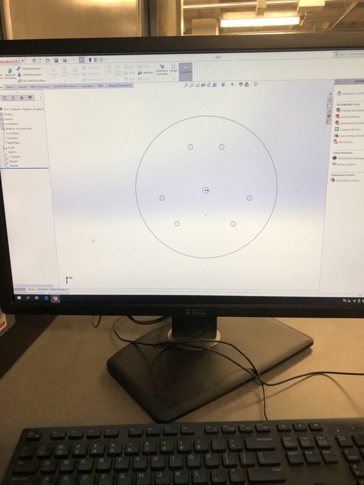
The only fabricated component in this project was the acrylic plate that served as the background to the clock face and as the mounting point for the clock movement. Design of the face was carried out in Solidworks and began with determining the outer diameter. This dimension was too large to measure with calipers so I used a traditional ruler to determine this. Next I had to map out the bolt pattern of the rotor disk. This was the most challenging part of the project because no documentation was available to reference for the hole placement, the only information available was that the holes were 117mm from the center of the disk. I tackled this problem by first orienting my drawing of the disk with the center being between two of the bolt holes. This allowed me to exactly place the holes with a single measurement: the distance between each pair of holes. After this was determined I used the circular pattern tool to place the remaining pairs of holes. This drawing was then converted to a .dxf file to be “printed” on the laser cutters.

The engraving of the face was more straightforward. Using CorelDraw I was able to superimpose the manufacturer’s logo (Honda Powersports) and the dirtbike model (CRF) onto the drawing imported from solidworks. These images were then laser etched onto the acrylic face.
Goals/Looking Forward
I was able to achieve both my functional and artistic goals upon completion of my project. The clock’s aesthetics turned out to be exactly what I had envisioned and it functions magnificently. For this reason the only change I plan to make is where it is hung as I move around the country.
References:
“Recycled Mountain Bike Disc Brake Rotor Wall Clock.” Etsy, www.etsy.com/se-en/listing/705388144/recycled-mountain-bike-disc-brake-rotor?show_sold_out_detail=1.
8 Comments. Leave new
I like that you used the bolt pattern as an attachment point for the acrylic background
I like that you encorporated nods to the dirtbike the brake was taken from.
I think your color pallet is very well chosen it looks like a piece that would sit in a dealership
Your final project looks extremely polished, I think you nailed the mechanic/biker aesthetic. I wonder if the clock hands could also be shaped in some way to better match the rest of the design.
I really like the raster engravings of Honda and CRF model logos in the black acrylic, as a nod to the sourcing of the materials and Noah’s passion for Motocross.
Did you upcycle the clock parts or did you buy them specifically for this project?
I like that this is a very functional project, and that you plan to use it after the project is complete. It’s a very simple design, but integrates together very nicely. Did you consider using real wood instead of acrylic? It would have been more complicated to cut, but it would look more like the clocks that inspired this project.
The single black acylic piece adds a lot to the aesthetics of the piece. It’s so seamlessly attached, I thought it was actually part of the brake rotor. The laser cut logos and brightly colored hands pull the piece together, and I enjoy how every design choice is linked to something from the bike the rotor was taken from.
This is a great upcycling piece Noah! The final product quality is amazing along with it’s functionality. The simplicity of the project is also nice and adds to the professional quality. The detail in your vision, design, and fabrication within the post is very well laid out and comprehensive. A couple things I would suggest to update to help make your final report more strong, would be to re-upload your pictures. A lot of your post’s pictures don’t pop up. Other than that I think your final report is very comprehensive and details everything about your project!
Noah,
I think this project turned out awesome. I would agree that there is nothing I would change at all about this clock. I think the aesthetic is really appealing and the contrast between the metal of the gears and the wood background is outstanding. Well done.