
The term “psychedelic” as an aesthetic has broad implications and has shifted significantly from its rock and roll origins in the counter-cultural 1960s to a more technologically influenced ideology with the invention of modern electronic music and glitch art. Although my eye is drawn to both aesthetics, the original movement takes priority in my mind due to its connection to the warm sound of rock music which I love.
The psychedelic 60s owes much of its properties to an earlier movement, that of the late 1800’s and early 1900’s “Art Nouveau.” Art Nouveau was a countercultural movement in itself, which sought to bring beauty to the otherwise bleak designs of the industrial revolution. They sought to celebrate the vibrancy of city life through curvy, fluid patterns, feminine figures, and organic, flowery designs.
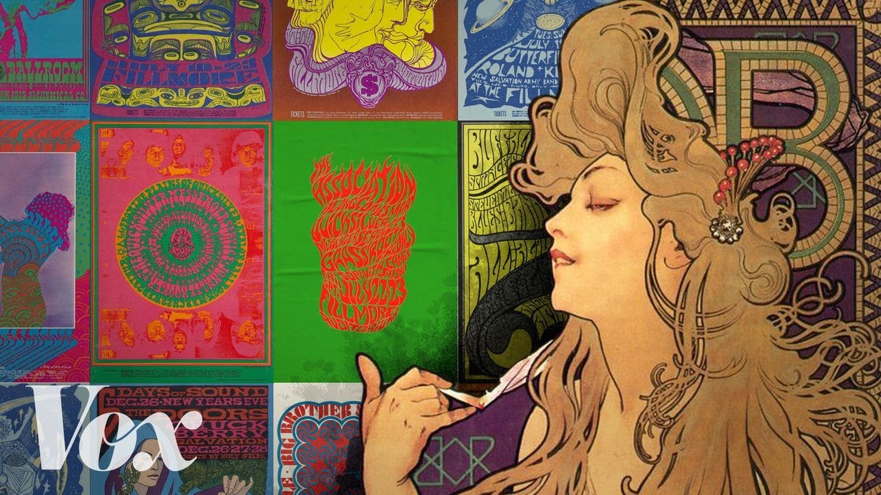
This video by Vox eloquently explains the connection between Art Nouveau and the psychedelic 60’s poster art:
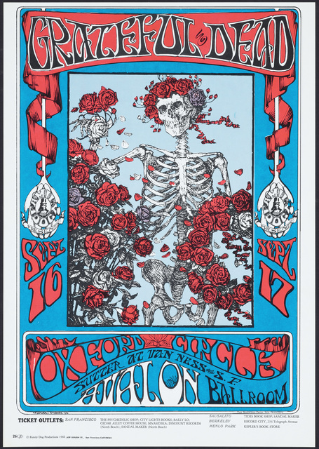
Certain artists even appropriate actual images from the Art Nouveau movement, replacing their color palette’s to create new art. A notable example is this notorious work by Alton Kelley done for the Grateful Dead, which was created with skeleton imagery sourced from Art Nouveau:
What made the 1960’s psychedelic aesthetic unique from Art Nouveau was that rather than featuring relatively flat color palettes, the 60’s posters feature saturated, high contrast colors, as well as repetitive line work. These aesthetic qualities became prominent in 1960’s poster creation due to their “eye catching” quality, as they were intended to advertise concerts for rock musicians, as well as the underlying notion that they represented some of the visual effects experienced by users of psychedelics, particularly LSD.
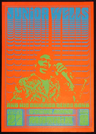
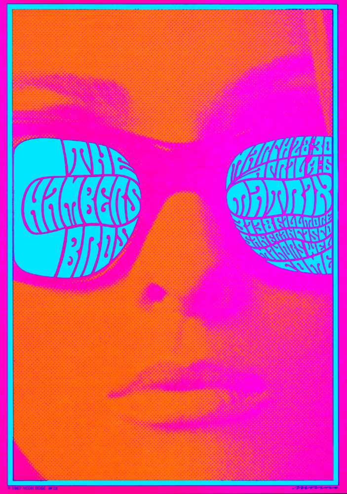
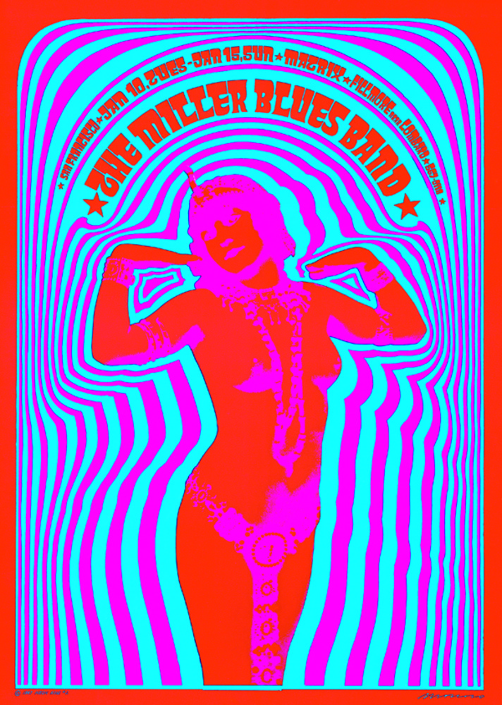
One artist who displayed these unique aesthetic qualities of the movement notably was American artist Victor Moscoso, who used his talents to advertise concerts in San Fransisco in the 60’s:
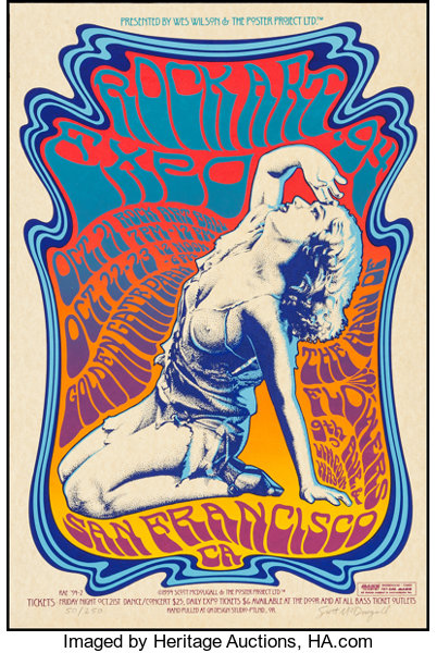
Another prominent aspect of the 60’s psychedelic aesthetic was the use of non-conventional, warped typefaces that were intended to convey a sense of movement, as if the letters were melting off of the page. Wes Wilson, another American artist who gained prominence through his advertisements in San Fransisco, is considered the father of this form of type. Here are a couple of his pieces, which feature both the “drippy” type as well as the feminine motifs found in both psychedelic 60’s and Art Nouveau movements:

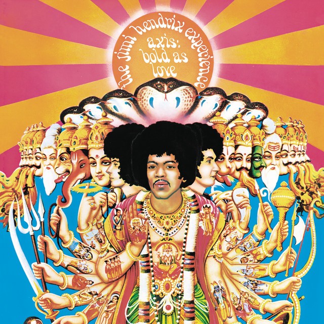
As eastern religion and mysticism started to make its way into popular culture in the west, certain religious iconographies began to be utilized in this movement, at times controversially. A notable example of this was the cover art for Jimi Hendrix’s “Axis: Bold As Love,” which featured Hindu iconography. This art was actually created without Hendrix’s consent, and he publicly denounced it as it could be offensive to practicing Hindu’s particularly with the placement of Hendrix’s image at the front of all of the Hindu deities pictured.
Citations:
https://en.wikipedia.org/wiki/Victor_Moscoso
https://en.wikipedia.org/wiki/Alton_Kelley
https://en.wikipedia.org/wiki/Axis:_Bold_as_Love
https://en.wikipedia.org/wiki/Psychedelic_art
https://en.wikipedia.org/wiki/Wes_Wilson
4 Comments. Leave new
I never thought of the 60’s psychedelic aesthetic being tied to Art Nouveau. From the pictures I can easily see the connections between the two though. I thought it was interesting seeing the history of how 60’s aesthetic came to be. My favorite part of the 60’s aesthetic is the music and how art was tied to the music and how both had the same feeling even though they were through different mediums
Yeah I think it’s really important for music to have a fitting visual aesthetic!
This aesthetic is new to me and I had never heard about it until now. That being said I enjoyed learning about this form or art and how it was implemented.
I thought that the biggest strength of the post was your use of pictures. Every paragraph had supporting media that demonstrated what was being discussed. This helped me to understand what was being said and made the post engaging.
One thing that I would like to see in the future is more in-depth explanation of ideas. I felt like some sections were surface level and could have provided more analysis of the given topic. For example, after writing, “Here are a couple of his pieces, which feature both the “drippy” type as well as the feminine motifs found in both psychedelic 60’s and Art Nouveau movements” I would have liked to have read a section further explaining how the styles were implemented by Wes Wilson or how the art was meant to make the viewer feel.
I definitely agree that I could have provided a greater analysis of some of the artists. Some of the information I left intentionally surface level, being that the movement has certain non-academic associations that I thought would be better to “read between the lines” due to their status as such. But I think a greater analysis could be beneficial for sure.