
Aesthetics of American Numismatics
The phrase ‘pocket change’ means something is inexpensive or cheap. But have you ever stopped to look at your pocket change? Although coins today carry very little value and are not used as a primary form of currency in daily life, that as not always been true. In 1929, the peak of the Gilded Age before the great depression, a manufacturing worker could make $25 dollars a week (Wolman, 1933). The gold and silver composition of coins during this period reflected on their denomination and worth. A $20 gold coin is now worth a week’s wages. A quarter is an hour’s wage. A movie ticket is 15 cents. With the high buying power of the American dollar in 1929, coins played a larger part in society, as did their beauty.
American silver, gold, and copper coinage has been minted since the early days of the country. Up until the early 20th century, most denominations have followed the same aesthetic for the design:
- The obverse (front) depicted Lady Liberty (or president)
- The reverse (back) depicted an eagle and/or listed the denomination (value)
The depictions of Lady Liberty and the eagle varied over time. For this aesthetic exploration, I will look at generations of coins from the mid-19th century to the mid-20th century.
The Gobrecht Era
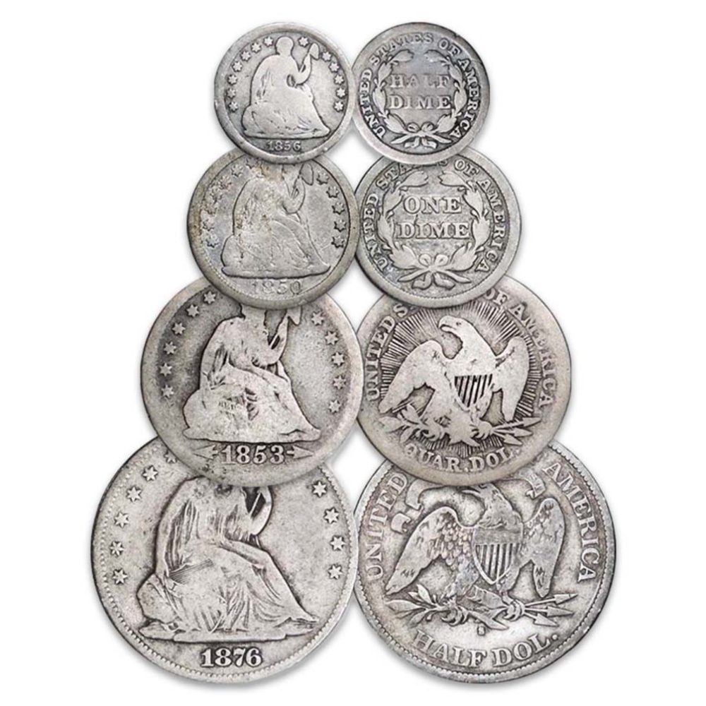
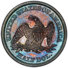
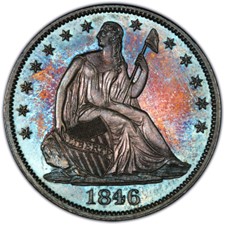 The third Chief engraver of the U.S. mint, Christian Gobrecht, saw his coin designs define a generation of numismatics across denominations. His design, often referred to as “Seated Liberty”, absorbed the faces of American coinage ranging from the half dime to the dollar coin. The Seated Liberty design depicts Lady Liberty in a flowing dress, sitting on a rock. Her left hand grasps a liberty pole and cap, while her right holds a shield with ‘Liberty’ inscribed across it. The reverse shows an eagle with an olive branch in one talon and three arrows in the other. This design spanned the half dime, dime, quarter, half dollar, and dollar coins from 1839 to 1891, as well as a twenty-cent piece from 1875-1878. Variations on the design came and went, and the motto IN GOD WE TRUST was introduced in 1866.
(PCGS)
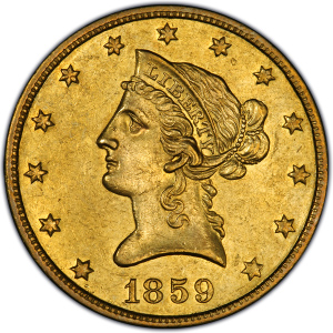
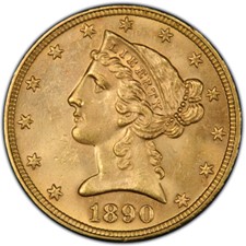
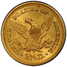
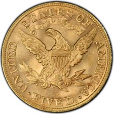
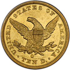
Gobrecht was also responsible for the design on the “Liberty Head” gold coinage. The $2.5 (1840-1907), $5 (1839-1908), and $10-dollar (1839-1907) gold coins all featured his design of Lady Liberty and an eagle. Lady Liberty’s head is shown facing left with her hair tied back in a bun with a string of beads. An eagle holding olive branches and arrows s shown on the reverse. The $2.5 coin is roughly the size of a dime, the $5 the size of a nickel, and the $10 the size of quarter. (ICCOIN)
(PCGS)
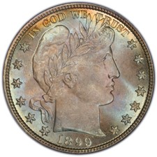
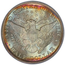
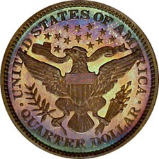
The Barber Era
Charles Baber was the sixth Chief Engraver at the U.S. mint and was responsible for the design that bore his name. Referred to as a “Barber [Denomination], like the “Barber dime” or “Barber Quarter”, the Barber design spanned the dime, quarter, and half dollar. The Barber designs swept across currency to replace the old Seated Liberty designs of Gobrecht. In 1876, the magazine The Galaxy (PCGS) critiqued the Seated Liberty designs by saying:
Why is it that we have the ugliest money of all civilized nations? -for such undoubtedly our silver coinage is. The design is poor, commonplace, tasteless, characterless, and the execution is like thereunto. Our silver coins do not even look like money. They have rather the appearance of tokens or mean medals. One reason of this is that the design is so inartistic and so insignificant. That young woman sitting on nothing in particular, wearing nothing to speak of, looking over her shoulder at nothing imaginable, and bearing in her left hand something that looks like a broomstick with a woolen nightcap on it-what is she doing there? What is the meaning of her?
The new Barber design features Lady Liberty looking right with her hair in a Phrygian cap with a wreath around her head stating LIBERTY. The reverse is a modified version of the Great Seal of the United States. This designed spanned coins from 1892-1916.
(PCGS)
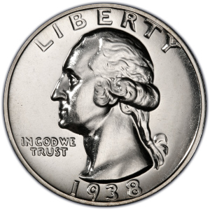
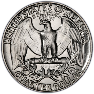
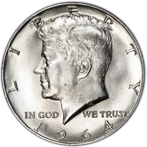
The Presidential Era
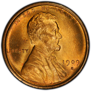
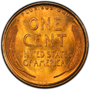
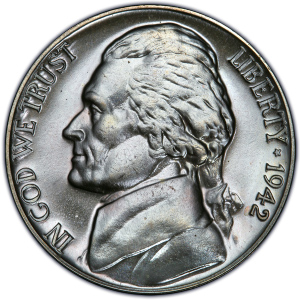
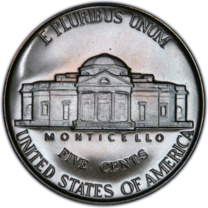
Transitioning out of the Liberty and Eagle aesthetic of the mid to late 19th century, presidential pictures on coins become common place in 1909. Changed the aesthetic from Lady Liberty to deceased presidents created a shift in aesthetics in American numismatics. Commemorating the 100th anniversary of Abram Lincoln’s birth in 1809, the Lincoln cent was the new penny design starting in 1909. Similarly, the 200th anniversary of George Washington’s birth was commemorated by the Washington Quarter in 1932. The Jefferson nickel was introduced in 1938 bearing Thomas Jefferson’s portrait. Presidents known by three initials, FDR and JFK, both of whom died in office were memorialized on coins the year after their death. The dime took on the face of Franklin Delano Roosevelt in 1946. John F. Kennedy has been seen on the half dollar since 1964.
(PCGS)
(PCGS)
(PCGS)

(PCGS)
The aesthetics of American coinage have seen transitional designs that have evolved to fit the population the coins are meant to serve.
4 Comments. Leave new
Hi Alex
This is my first time getting exposed to American Numismatics and the history seems very interesting. You are correct to question if I had ever stopped to look at my pocket change, because I never have and I guess many people don’t.
Reading through your post, I had similar questions like Nic, what is depicted on these coins and in what aesthetic are they depicted in? Is the material also a specific aesthetic choice?
We can see the eagle, past presidents, the presidential seal, monuments, texts and letterings, and a lot more. And they are depicted in a specific way, what do you think would have been the intention behind choosing the specific symbolism and its aesthetic of choice?
Hi Abhishek, Good questions!
I think the aesthetic that the coinage depicted is based on the beliefs and morals that the early American government wanted to foster. Lady Liberty shows the virtues of liberty and freedom, something just won out of the American Revolution. The Eagle, being the national bird holds an olive branch, referencing peace and prosperity, and arrows, symbolizing strength. These items symbol a new nation that is emerging from a revolutionary war and had just won its freedom.
This post was an interesting history lesson. I know next to nothing about the history of coins. I had also never seen what the designs of the coins were like before the current coins. It is interesting to see that the eagle and lady liberty were a constant across all of the designs. Why were these two symbols originally included? It would be interesting to explore how the symbolism on the coins connected with the symbols of America at the time. It is interesting to learn that the change in coins over the year was purely an aesthetic one and the older ones were critiqued for being “unartistic”. Did the new coins conform to a popular aesthetic at the time and that is why they were more pleasing? Overall, this post was a great exploration of a deliberate aesthetic change that is often overlooked in everyday life but is very ingrained in American symbolism.
Hi Nic, great question on why the eagle and lady liberty are so prominently displayed on older coins. This is something I have known about and accepted, but never asked ‘why?’. A little research shows that it was enacted as law in the Coinage Act of 1792. The symbols represent American ideas of liberty and freedom, and show the national bird, the Bald Eagle.
“SEC. 10. And be it further enacted, That, upon the said coins respectively, there shall be the following devices and legends, namely: Upon one side of each of the said coins there shall be an impression emblematic of liberty, with an inscription of the word Liberty, and the year of the coinage; and upon the reverse of each of the gold and silver coins there shall be the figure or representation of an eagle, with this inscription, “UNITED STATES OF AMERICA,” and upon the reverse of each of the copper coins, there shall be an inscription which shall express the denomination of the piece, namely, cent or half-cent, as the ease may require.” (https://www.usmint.gov/learn/history/historical-documents/coinage-act-of-april-2-1792)