

What- Inspiration

Works by https://www.carnovsky.com/works.htm
Carnovsky is a Milan based art and design duo comprised of Francesco Rugi and Silvia Quintanilla
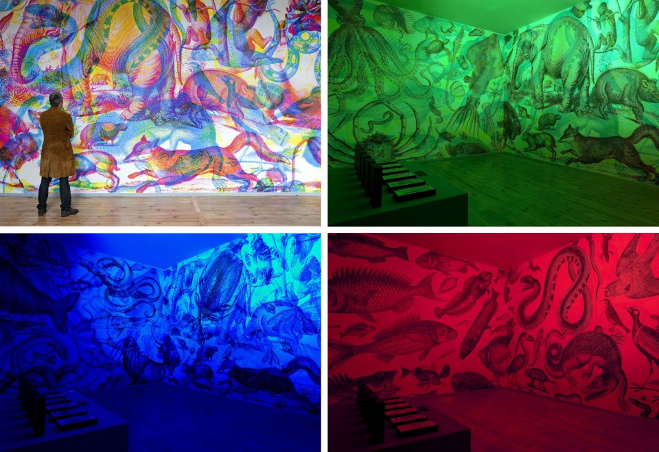
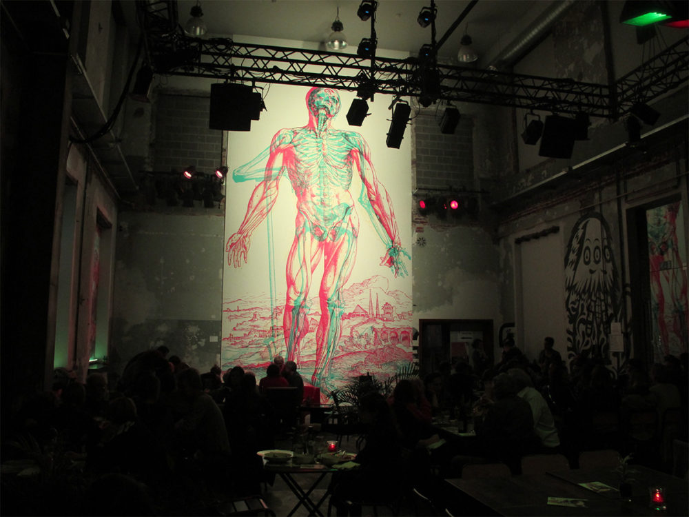
Carnovsky create and exhibit their unique style of art under different lighting colors and conditions revealing and hiding different aspects of their work. Layering different compositions with different tinted colors, making the magic happen when it interacts with the lighting and your perception. This art style uses some of the same basic principles used in ‘low tech’ 3D imaging (like the red and blue glasses) to achieve that desired effect. I am a fan of this type of art, and I think it has merit as a piece that can be appreciated in all lighting conditions. Unfortunately, I don’t have a selective light color picker for my lighting options where I might want to display a piece like this, which I feel like is a common barrier. Thus begins the technical plans of my project, creating a frame with LED lighting built in so that I can isolate different colors to get the full effect of this aesthetic. I am also going to generate my own art for the frame, but I think that I will only do the Red/Blue scale, because I feel like the Yellows in the Carnovsky pieces bleed into the effect of the Blue lighting, and do not show as well under green as compared to the others.
My notebook
Specs and Constraints
Specifications-
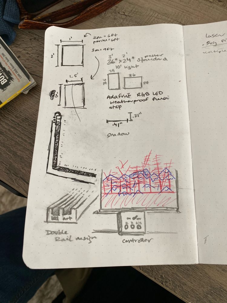
1. Art Frame: I want a decently constructed frame with the interior lighting built-in. This means that I will probably be making this frame from scratch, this is the majority of my planning and also my first step that will inform the rest of the process.
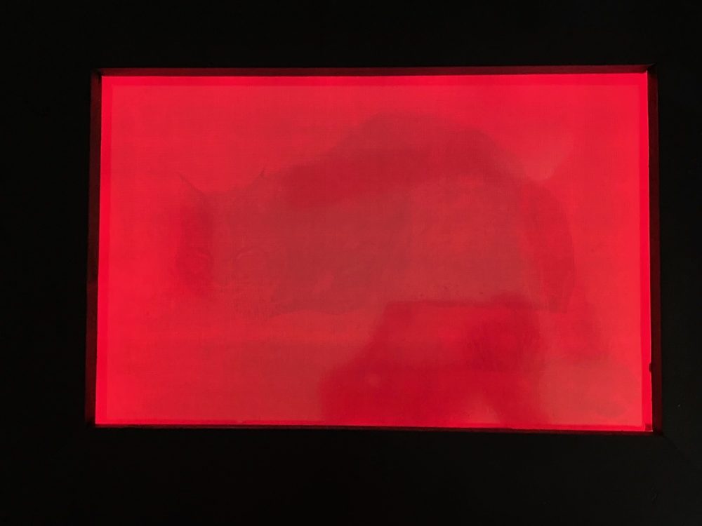
2. Art: Actually fabricating the art using photoshop is a part of the process that I have already run testing on and am feeling more comfortable getting a product that will work for my purpose. Choosing the subject and executing is the next step.
3. Lights: I’ve ordered RGB strips off of Amazon, and the width will be the minimum width of the external portion of the frame, setting these up gets to my first constraint.
4. Control: The user interaction with the piece is the critical element to a great execution, thus the interface that you command the object with should be curated as well.
5. Aesthetic Appeal: Obviously, I want this object to look professionally made and potentially gallery ready. Choosing a path that is executable is crucial. If I set my sights to high it may not all come together, but if I set them too low I would be left feeling as if I left something on the table.
Constraints-
1. Electricity: This project requires power, managing that alongside the aesthetics and construction is a major factor for me. The lights that I got connect to a wall outlet, meaning its possible locations are limited.
2. Construction: Making a perfectly square frame is not an easy task, especially with all the other specifications going into it.
3. Printing and 4. Color: Getting the colors exactly right to produce the desired effect is not easy either getting the right paper and print settings too. I banked a little bit on the variable light settings on the LED strip to hone any issues.
5. Ambient Light: Ambient light is my arch nemesis in this situation, it will ruin the effect if too powerful. Therefore, I added one-way window tint to the acrylic.
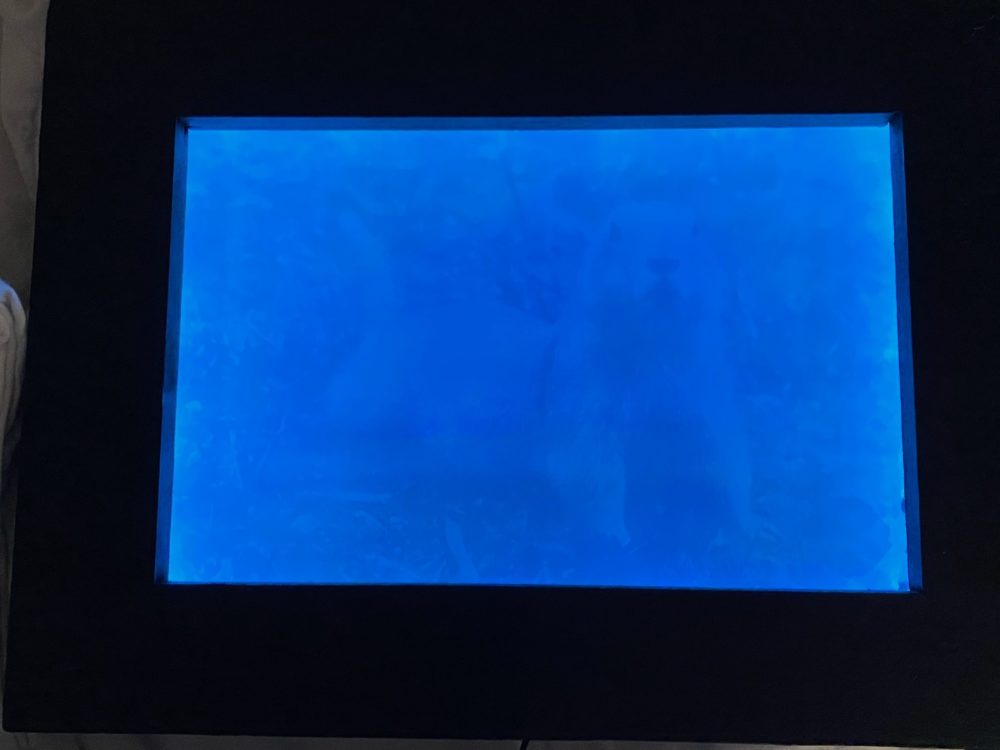
My work-
Bobcat
Prairie Dog
1 Comment. Leave new
Hi Chris! Very cool project. I can certainly see how your inspiration played into your final project to create your aesthetic? One question I had was how you chose the pictures to be in the red or blue since you mentioned the aesthetic was meant to bring out certain features of the subject matter.