
Post 1 – 2024 Aesthetics Explorations
By Hailey Usher
Introducing Minimalism
I’m choosing to explore the Minimalism aesthetic as it pertains to graphic design. I want to dive into this aesthetic because I enjoy using it in my day-to-day design work as a Creative Technology and Design student.
Something about minimalism that I enjoy is that it can be applied not only to graphic design, but to nearly all areas of our lives. We all have the ability to “minimize” our wardrobes, living spaces, routines, and social commitments.
In the graphic design sense, however, minimalism is commonly understood as the emphasis of function over form. In other words, minimalism removes all unnecessary elements in a design to best communicate the intended message to the audience.
Who and When Created Minimalism?
Minimalism as a movement emerged toward the beginning of the 20th century. In 1919, the Bauhaus school in Germany was founded by Walter Gropius. This institution brought together designers, architects, and artists to work together in creating efficient, aesthetically pleasing designs. Their unique vision and work spearheaded the minimalist movement in design.
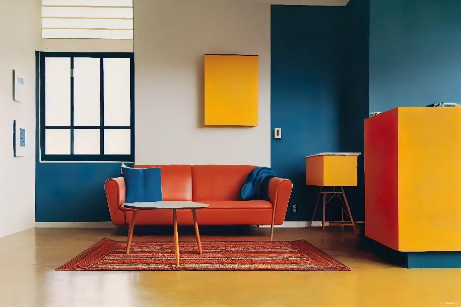
Image via Robern – What is Bauhaus Style and How to Adopt this German Rooted Design
Flash forward to the 1950s, a design movement known as the International Style was brought to the United States by architects Richard Neutra and Philip Johnson. The International Style emphasized natural materials, clean lines, and overall simple designs.

Image via Architectural Digest – How Richard Neutra’s Modern Designs Forever Changed Architecture
In the decade after, Paul Rand, Massimo Vignelli, Dieter Rams, and Jasper Morrison further built on the aesthetic of minimalism through their graphic and product designs.
![]()
Image via WNYC – Vignelli, Designer of Famous Subway Map, Defends His Version Over These Others
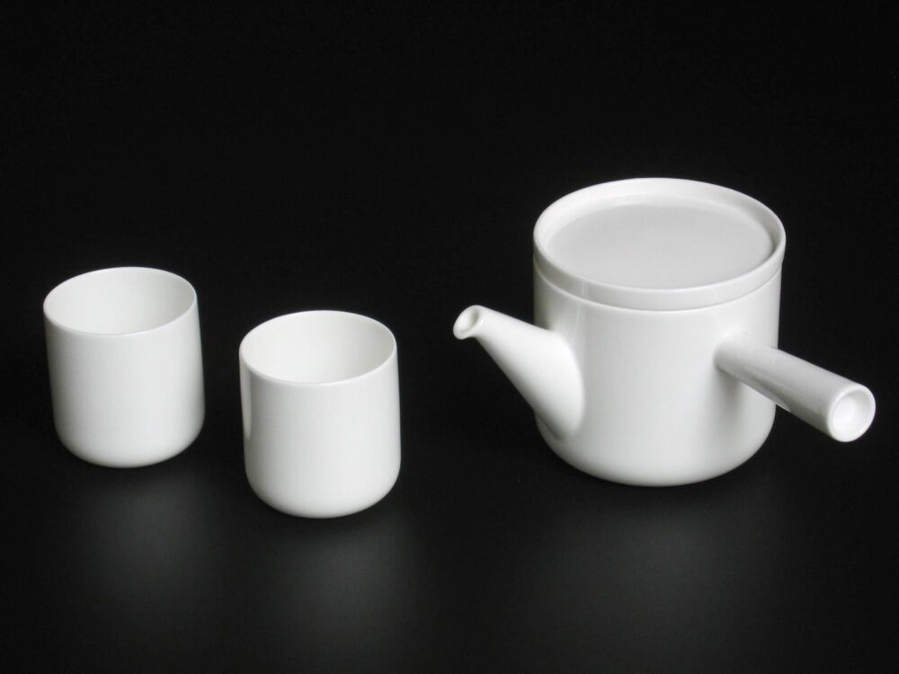
Image via Jasper Morrison – Teamaster
Throughout the 1970s and 1980s, architects Michael Graves and Robert Venturi continued to evolve minimalism by adding a slight layer of ornamentation in their work. Subsequently, graphic designers David Carson and Paula Scher pioneered dynamic minimalism through their graphic design work.
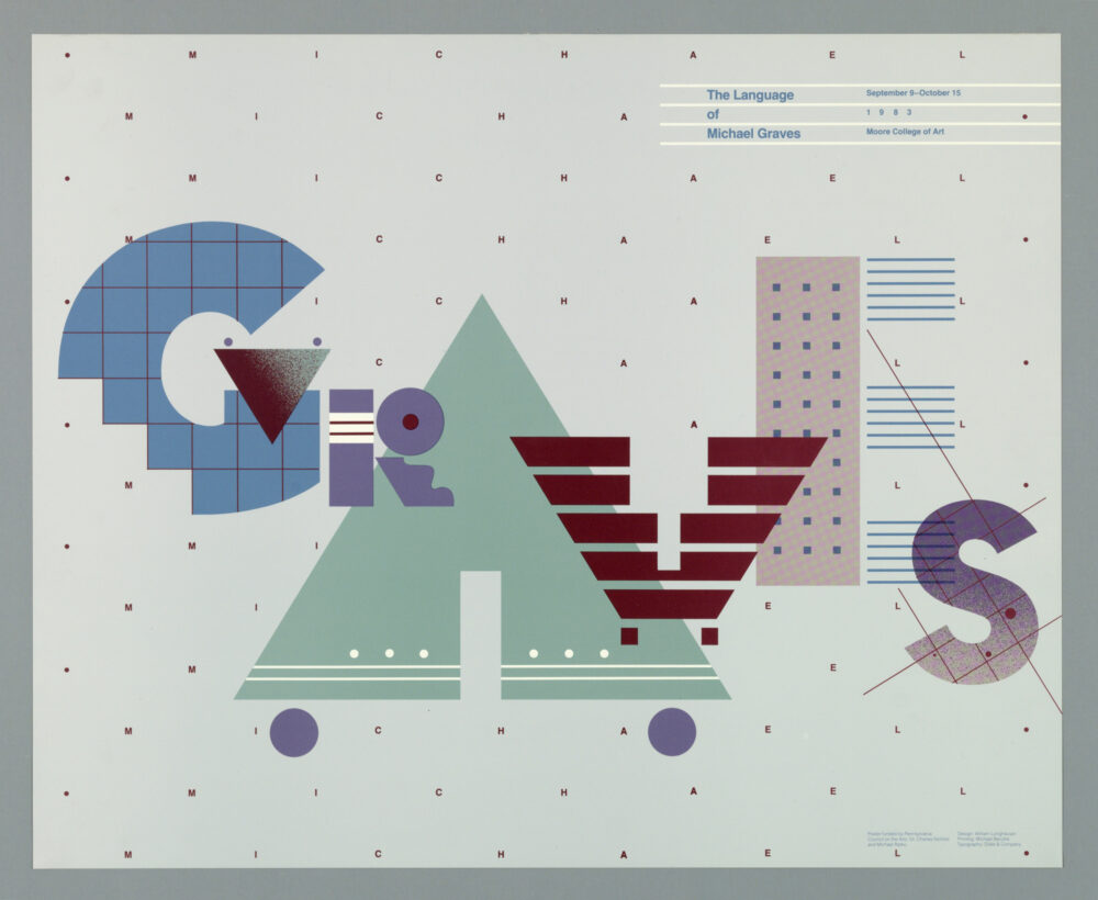
Image via Smithsonian Institution – The Language of Michael Graves
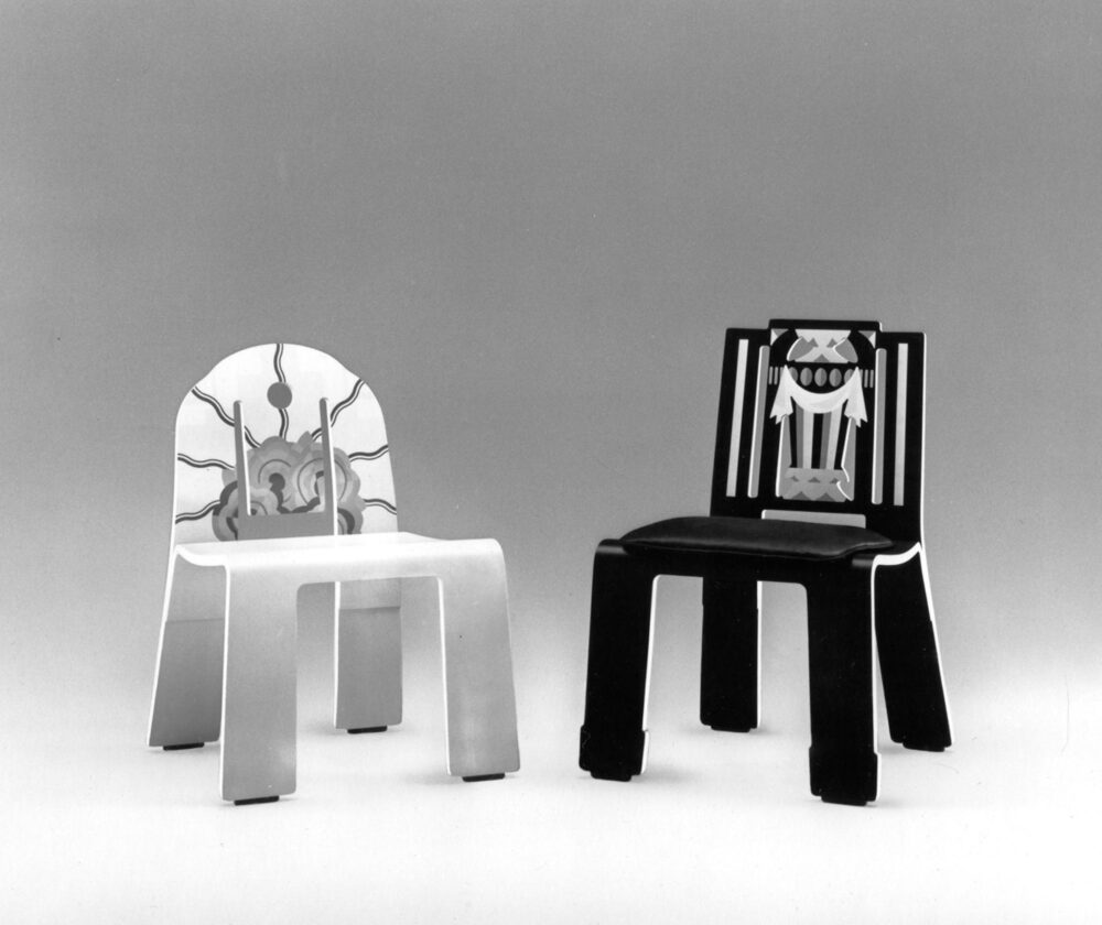
Image via Knoll – The Venturi Collection
Minimalist Designs Today
More recently, minimalism has been widely expressed in the digital form, in mobile apps, websites, and other online experiences.
Corporate branding has also recently embraced the ideals of minimalism. As minimalist designs clarify a brand’s message, create a strong brand identity, increase credibility, and enhance usability, it’s no wonder why many brands have opted for a minimalist strategy for these benefits.
Today, minimalist design follows several essential guidelines that graphic designers follow:
- Generous use of white space
- Grid-based organization of assets
- Flat design schemes (little to no layering of effects, color, etc.)
- Consistency and balance of elements
Pushback on Minimalism
With the rise of minimalism in the design sphere, has come the pushback and limitations of the aesthetic. One such downfall is that since minimalist design relies on fewer design elements, a lack of distinction can arise between designs.
Continuing on, minimalism offers limited flexibility in communication through design; designers may have to stray away from minimalism in order to communicate multimedia content.
Finally, designers risk losing critical information with minimalist design. Minimalism falls flat in terms of conveying complex ideas and concepts, and so loses its applicability in this sense.
Concluding Thoughts
Overall, minimalism is a unique aesthetic because of its timeless nature, and its application to both digital and physical design mediums. At the same time, minimalism is also considered as a lifestyle, and can be applied to improve our daily lives.
Article Sources (in order of appearance):
Minimalist Graphic Design – Tactica
History of Minimalism in Design – Medium UX Design Bootcamp
The Benefits of Minimalist Design in Branding – LinkedIn
What is Minimalist Design? – Design Shack
The Benefits and Limitations of Minimalism in Website Design – Entrepreneur
6 Comments. Leave new
Hi Hailey,
One aspect of minimalism which I love (and forgot about while writing my post) are maps in minimalism. You put an image of the NY Subway System which has very interesting ties to minimalism. From what I understand, it evolved through the desire for more efficient ways to produce a map of transit systems and that the idea originally came from an electrical engineer who redrew the maps for London’s Underground Tube. (https://tfl.gov.uk/corporate/about-tfl/culture-and-heritage/art-and-design/harry-becks-tube-map)
This also began to remind me of ski resort maps, many of which are drawn by James Niehues. These maps also follow the minimalist aesthetic; they are simple, easy to read, and always in a similar style.
I would love to hear some more of your thoughts related to the subway/transit maps or ski maps if you have any. I think they are a very aspect of minimalism which has worked its way into many people’s lives.
Hi! I’m glad I reminded you of minimalism as it pertains to maps! I really enjoyed digging into the NY subway system example because it’s a powerful example of how useful minimalism can be in helping the public understand complex topics! I’ll also definitely look into ski maps — I hadn’t considered them in my original post, but I’m excited to learn more about maps and minimalism!
Hi Hailey, I really like this aesthetic and the way you captured it in your piece. I always liked the New York subway design and I didn’t know it was part of the minimalist aesthetic. I think your post would benefit from an example of current minimalism design, to compare with previous iterations of the movement. However, I think your post is very clean and well-organized, so great job!
Hi! I’m glad to have introduced you to the minimalism aesthetic concerning transit maps. I think that in the present-day, minimalism is a huge movement and is displayed by most corporations/visuals. In fact, the over-saturation of minimalism might even be a problem… I’ll definitely be looking more into that, thanks for bringing it to my attention!
I really appreciated the design of your post, it was very aesthetically pleasing to read, and flowed nicely. It was also very informative, and the details included regarding the birth of minimalism were very interesting to hear about! I will add that the choice of the third and fourth pictures don’t seem to fit the minimalism aesthetic, so I would like to hear more about why you decided to choose those two pictures.
Hi! Thank you for the compliment on the design of my post! I enjoyed looking into the advent and popularization of the minimalism aesthetic — I definitely learned a lot from my research!
I’d also argue that the third and fourth pictures absolutely represent the minimalism aesthetic. The Manhatten map is a popular map/story that you should look into. Also, the teacup set is an example of a “minimalized” design. Let me know if you have any more thoughts on this!