
I’ve always been struck by the appearance of vintage science posters and charts – their combination of Victorian era printing practices, not quite realistic images, and underlying geometry is hard to find in anything else. For me, they spur a feeling of nostalgia for when I was learning the basics in grade school, as well as an impression of nature’s grandeur or industrial optimism, depending on the piece. In this post, I’ll show a few examples from posters, textbooks, and journals from the 19th century.
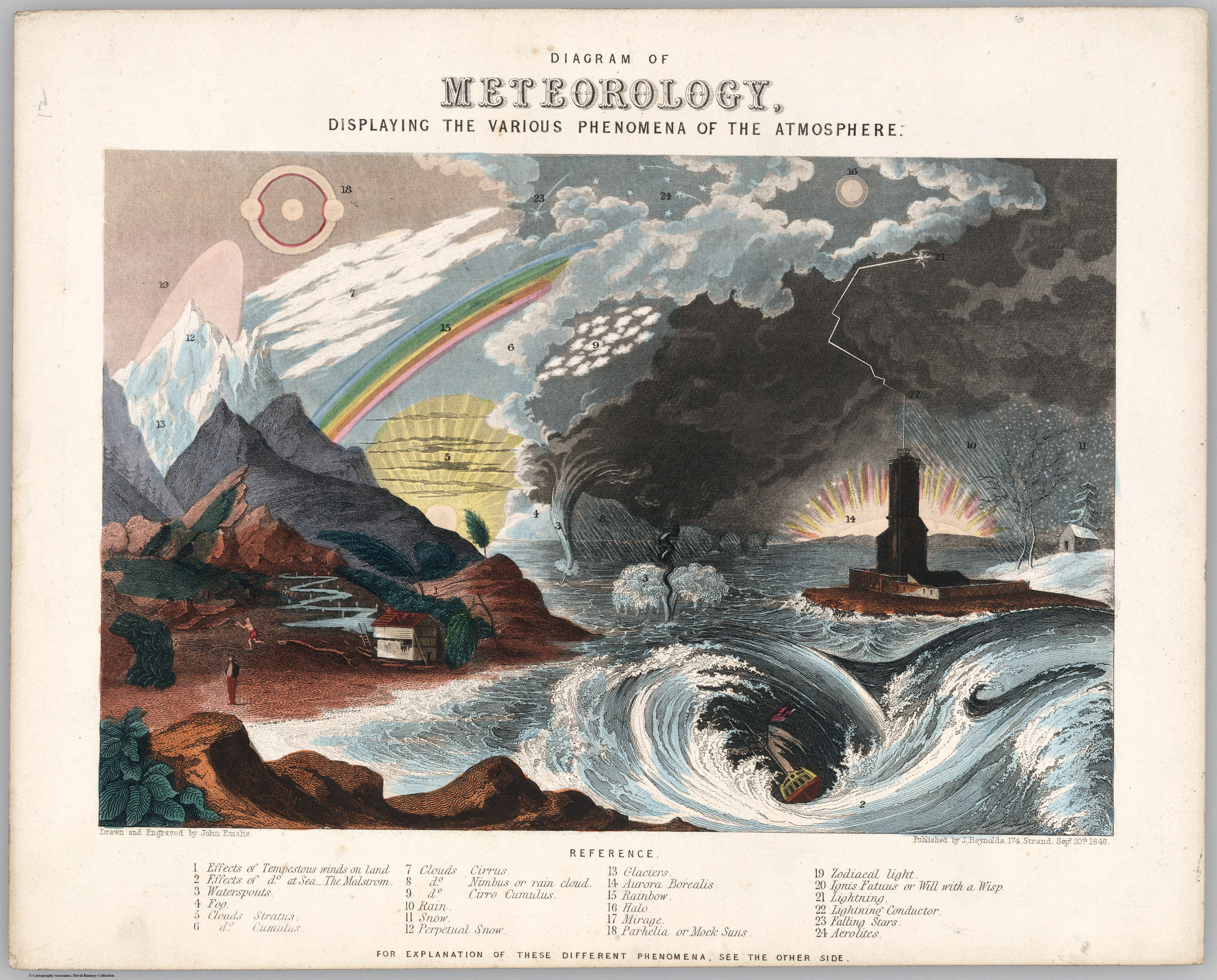
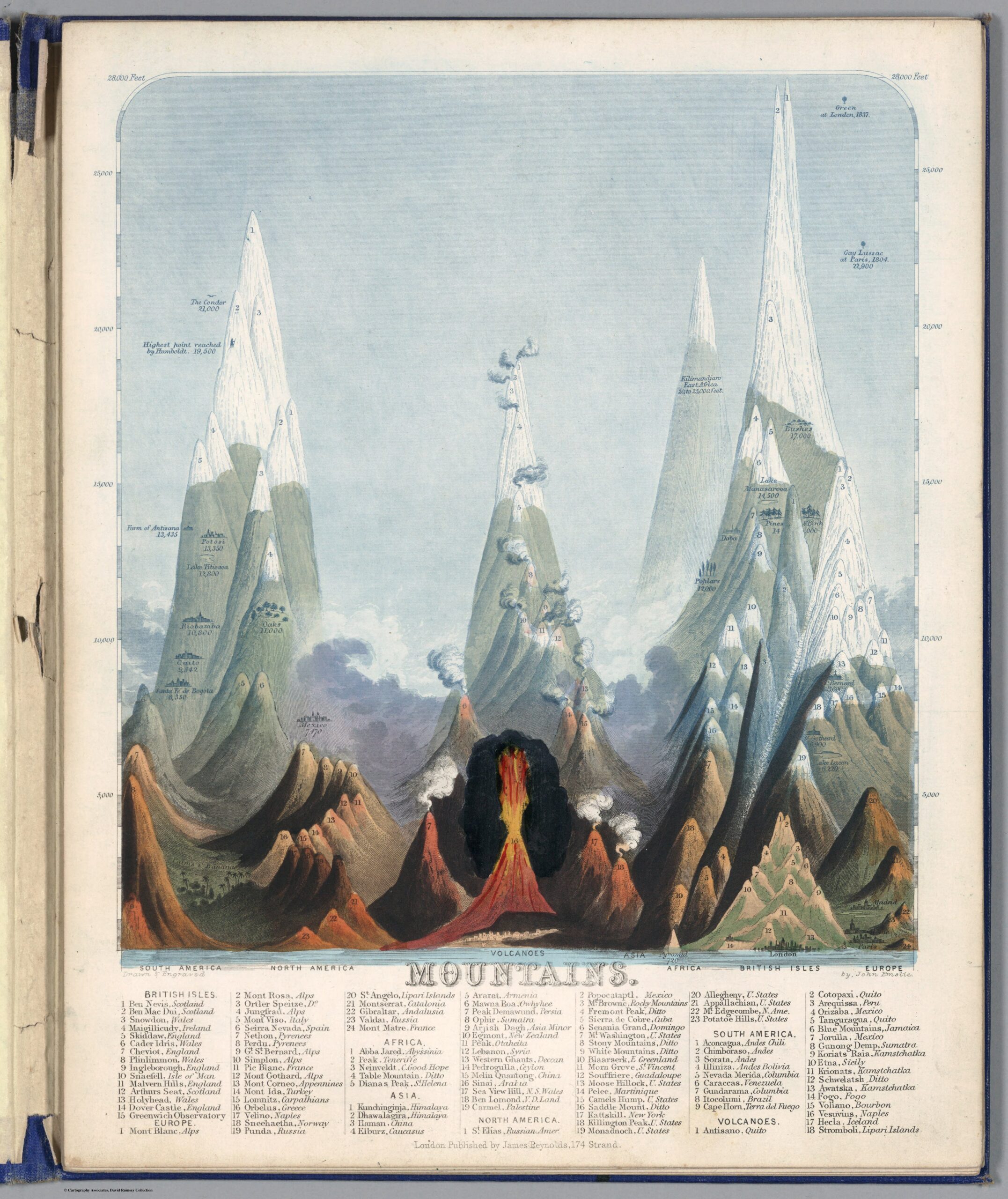
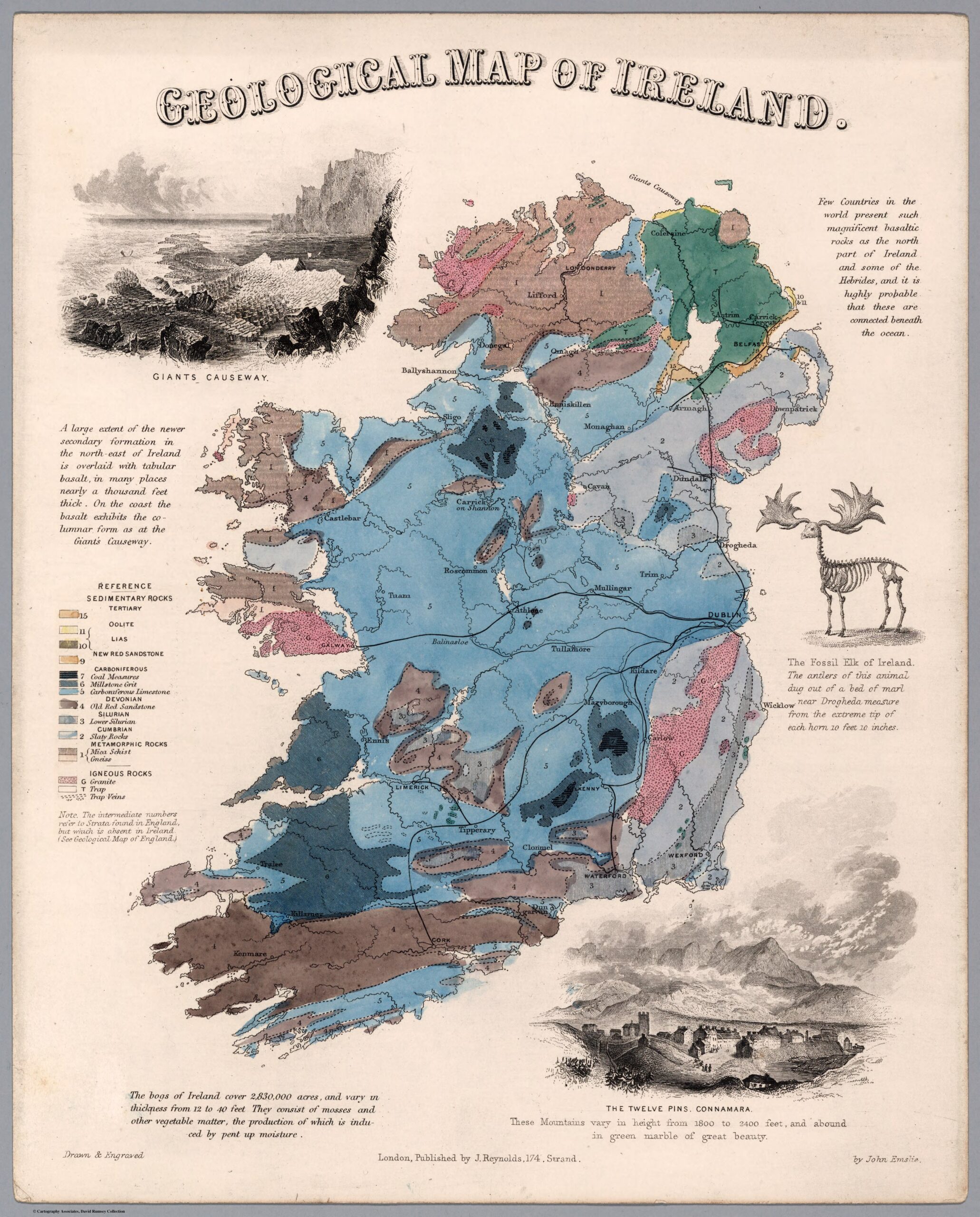
Examples of John Emslie’s work. [1,2]
One name that repeatedly showed up in my research is John Emslie; looking at his work, it’s easy to see why. His engravings are majestic and as colorful as can be (given the printing limitations of the time). They also show how, despite always concerning natural phenomena, these prints are sometimes a little unrealistic either due to forcing many things to exist in one frame or limitations in the level of detail.
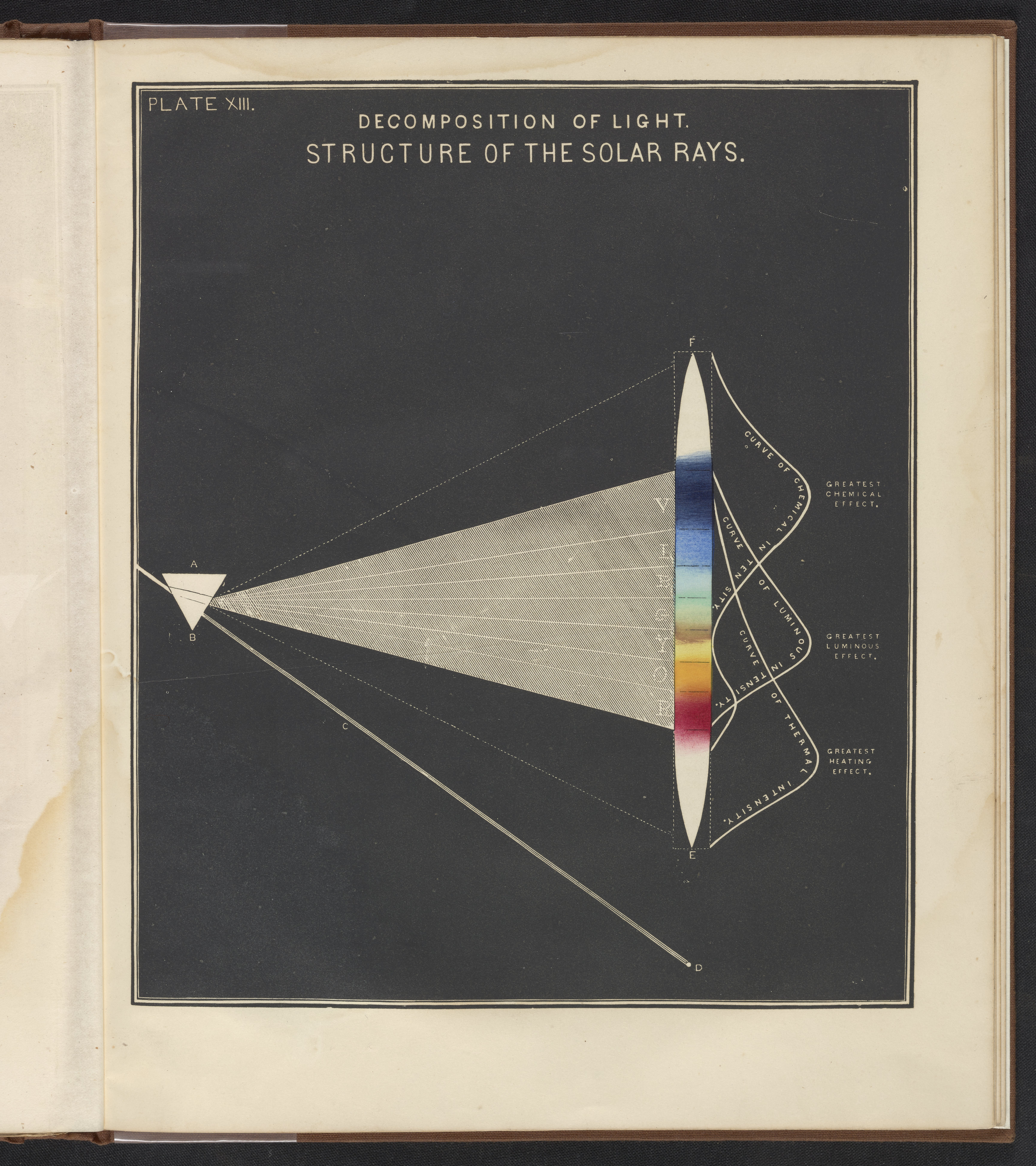
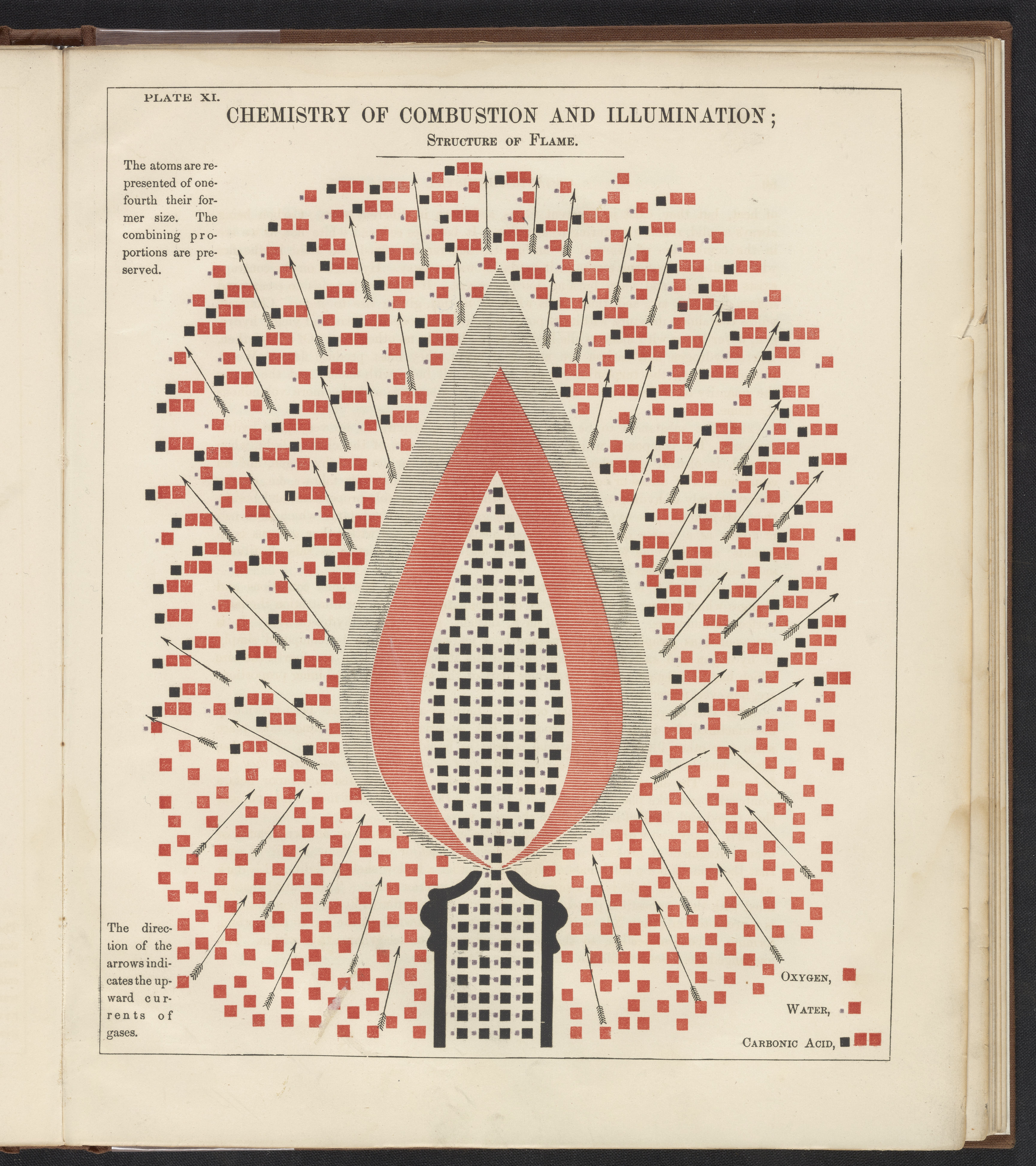
Graphics from ‘Chemical Atlas’. [3]
Not all science graphics of the time were like Emslie’s; plenty were more simplistic and geometric, such as these two from Edward Youmans’ 1856 textbook Chemical Atlas [3]. The fields of chemistry and physics lend themselves to being shown in this rigid fashion, and I personally find them the more compelling for it.
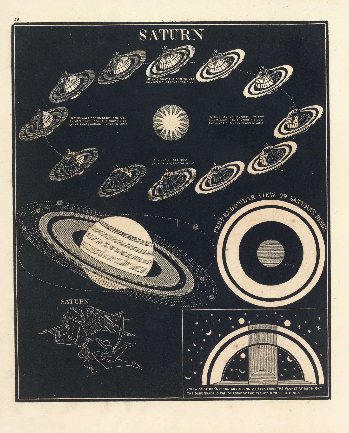
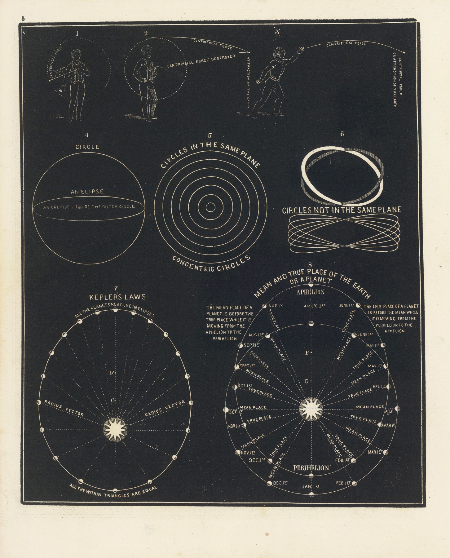
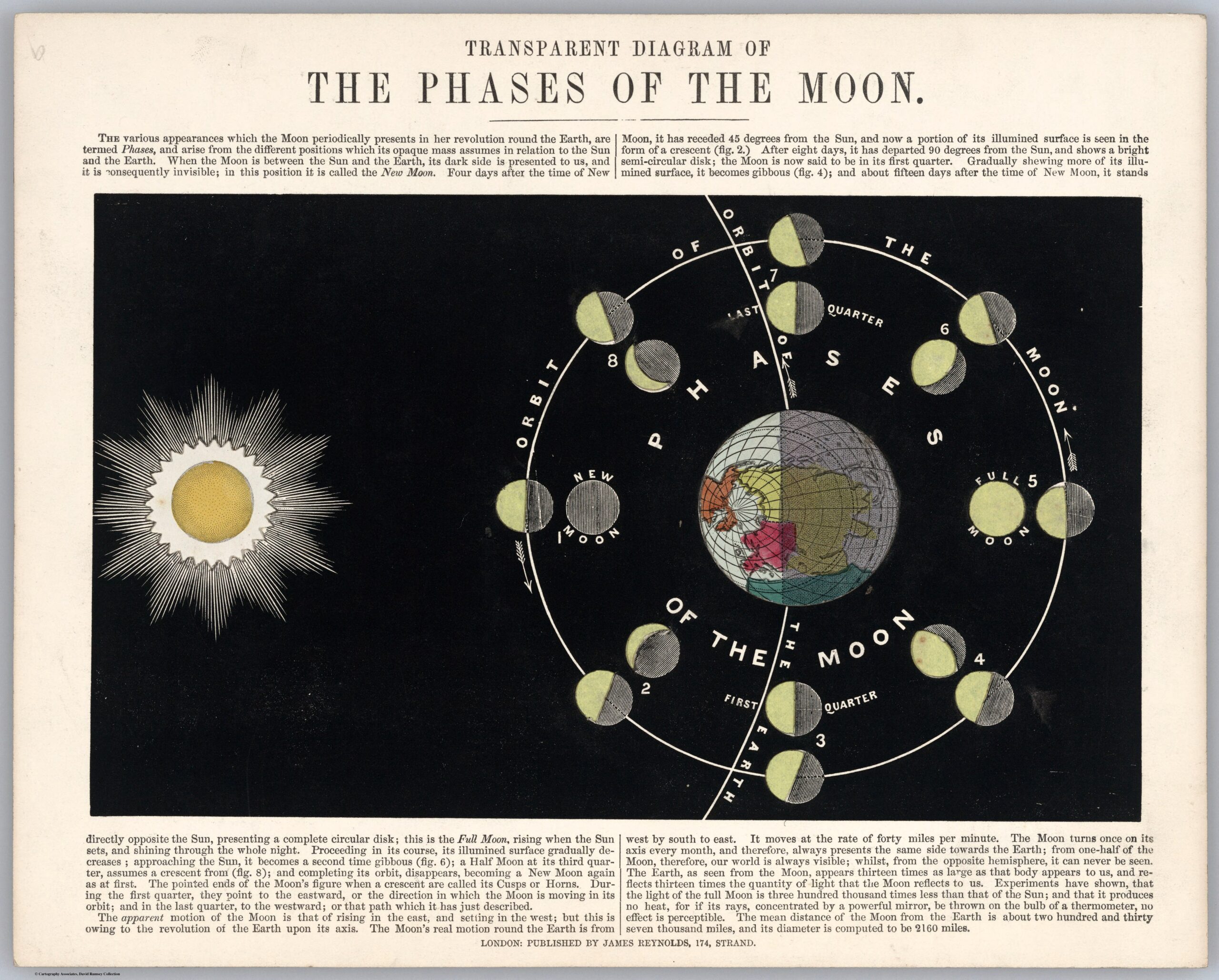
Graphics from ‘Smith’s Illustrated Astronomy’. [4]
Many more diagrams (I suspect the majority) were not afforded color. The higher time in making and cost in printing color images weren’t justified in such cases, so they were left in monochrome, like these two figures from Smith’s Illustrated Astronomy in 1849 [4].
The reasons for these graphics’ creation can be found in their containers; textbooks and scientific journals used these illustrations to help convey the points in the surrounding text. As largely practical things, it’s hard to determine any artistic influence outside of similarly practical concerns: printing technology, space restrictions, truthful depiction of reality. In that last way, it may be considered form of realism driven by a need to teach.
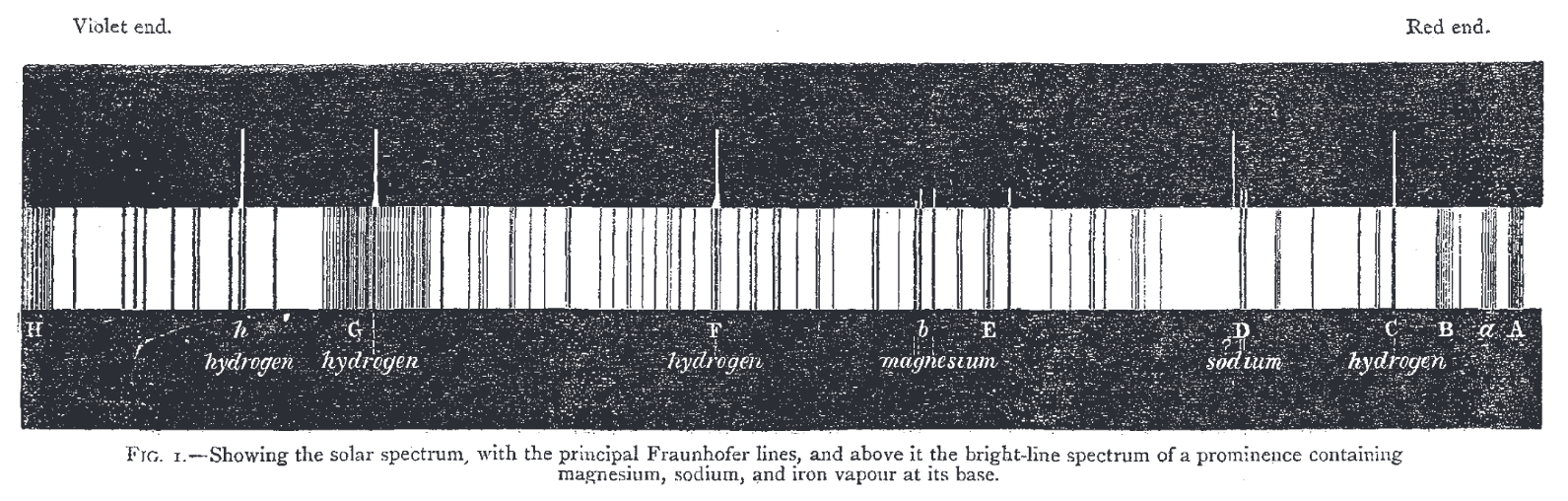
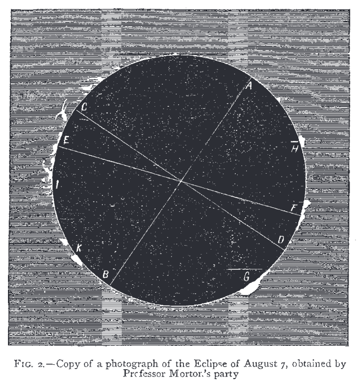
Figures from ‘The Recent Total Eclipse of the Sun’, Nature. [5]
These examples that I love are large, proud, and invoke the mental image of the World’s Fair, but numerous graphs are small and spartan, only enough to get their data across. These two figures from the very first issue of Nature are just that [5]. While I don’t get much feeling from them, I acknowledge that, in a way, these dutiful little charts have an aesthetic all their own.
Works Cited:
[1] Emslie, John. Astronomical Diagrams. Published by James Reynolds, 1851, London. Courtesy of the David Rumsey Map Collection, David Rumsey Map Center, Stanford Libraries. [2] Emslie, John. Geological Diagrams. Published by James Reynolds, 1852, London. Courtesy of the David Rumsey Map Collection, David Rumsey Map Center, Stanford Libraries. https://www.davidrumsey.com/luna/servlet/view/all/who/Emslie%2C+John?sort=pub_list_no_initialsort%2Cpub_date%2Cpub_list_no%2Cseries_no. [3] Youmans, Edward Livingston. Chemical Atlas; or, The Chemistry of Familiar Objects. New York, New York, 1856. Courtesy of the Science History Institute. https://digital.sciencehistory.org/works/5qhc2v8. [4] Smith, Asa. Smith’s Illustrated Astronomy. Cady & Burgess, New York, 1849. https://library.si.edu/digital-library/book/smithquotsillus00smit. [5] Lockyer, J. “The Recent Total Eclipse of the Sun.” Nature. 1, 14–15, 1869. https://www.nature.com/articles/001014a0
4 Comments. Leave new
Hi Lavender,
I effectively contextualize vintage science posters, showing personal enthusiasm and diverse examples. I could expand on color impacts, artistic influences, and modern comparisons, and explore the underlying geometry more.
The underlying geometry is largely determined by the subject portrayed, so I’m afraid that’d be more of the science than the aesthetic! Otherwise, I agree, this post could use some analysis of the influences felt in the artistic side of these graphics.
Hi Lavender,
I like how in your post you introduced then lead with your images. It is an interesting aesthetic that I’m not very familiar with. A question I had while reading was how might you apply this to your design project?
My current plan for my upcycle piece is a constellation star chart stylized like one of these old graphics, hence why I chose this aesthetic for this post.