
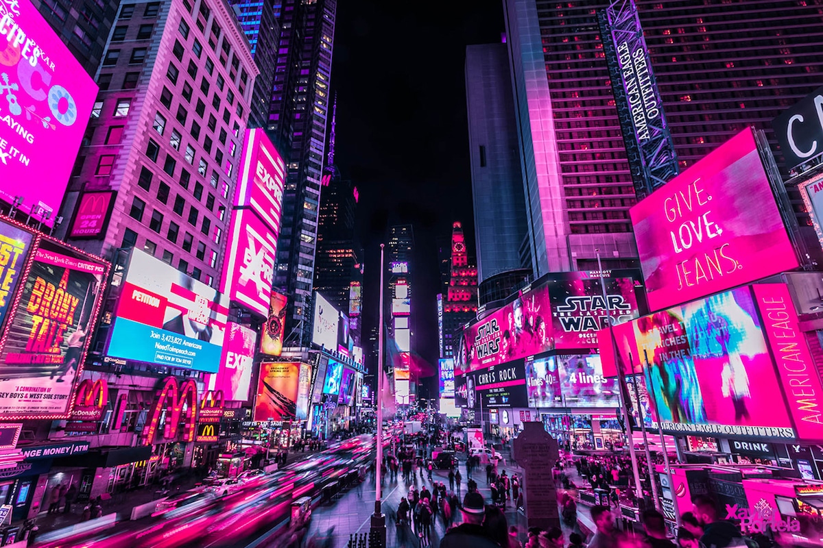
The upcycle project aesthetic I am going for is 1920s speakeasy. It can be identified by attaining a specific mystic through a use of dark shades and low lighting. I suppose that the opposite of the speakeasy aesthetic would be something that is very “in your face” with vibrant colors and lights. I believe that the neon lights of a major city achieve this look and act as a solid counterpart to the aesthetic I am going for.

Neon Lights in Times Square [1]
This aesthetic likely came about during the 1950s when neon lights became popular in marketing usage. They are often used as a way to draw attention to a specific store, restaurant, or bar in a bustling city. This look is often mixed with steampunk and used in video game design. In a broad sense, neon lights are so eye-catching that they are able to draw attention towards very specific things in a cluttered environment. Video games, like metropolitan cities, are often flooded with overstimulating content. Extremely bright lights are able to cut through the scene and command one’s full awareness.
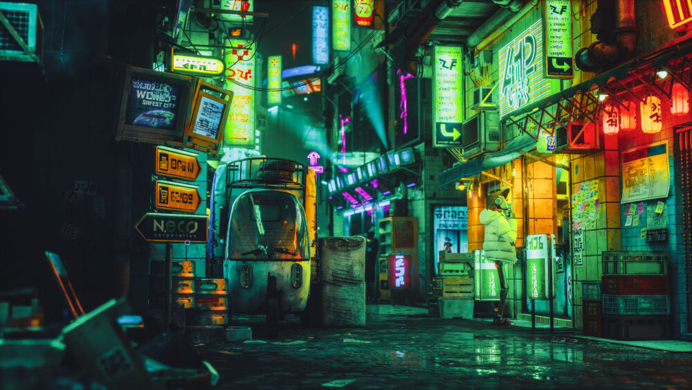
Video Game City [2]
Though I find this aesthetic to be cool, I will not be incorporating it into my lamp design at all. For one, sourcing a neon light is relatively expensive. Also, creating my own neon light would require a lot of knowledge and tools I do not have. However, it is a fun thought experiment to play with the idea in my head. I spent a little bit of time putting a sketch together of what a speakeasy might look like from the outside with a neon light.
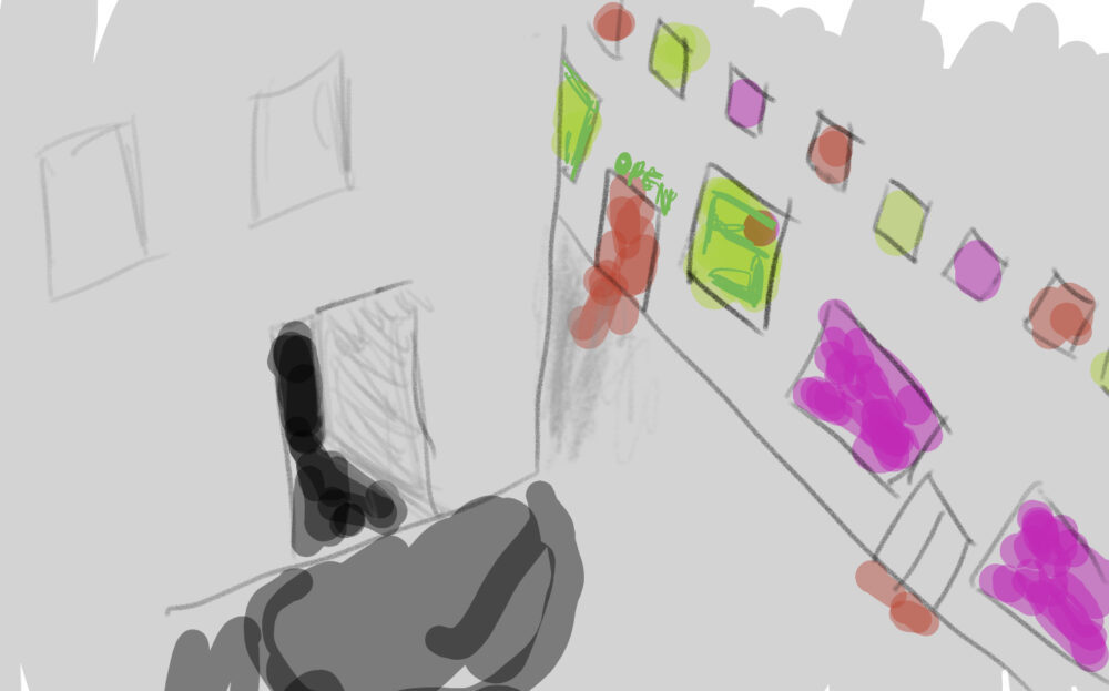
I believe my quick doodle is able to achieve the contrasting look I was going for. The neon bright lights draw more attention than the shadowy, dark door meant to lead to a hidden speakeasy. I think it would be a futile attempt to bring aspects of the opposite aesthetic into my design. I am just going to stick to my current game plan.
Sources:
[1] Stewart, Jessica. “Nighttime Photos Capture Vibrant Pink Glow of Times Square’s Neon Lights.” My Modern Met, 27 Mar. 2018, mymodernmet.com/neon-new-york-xavier-portela/.
[2] AgentMir. “Stray, Video Games, City, Neon, City Lights, Video Game Art: 7680X4320 Wallpaper.” Wallhaven, wallhaven.cc/w/p9o269. Accessed 14 Feb. 2024.
2 Comments. Leave new
Hey Oliver! What a cool contrast! Your comment about this aesthetic in video games immediately lead me to think about cyberpunk, I totally get that vibe. I think I agree with you that it wouldn’t be worth trying to implement a neon element into your project. I like the direction you’re going. It would be cool to see something similar to what you are making, but maybe with LEDs to give it a more futuristic look.
An interesting connection I made while reading your post: speakeasys came around sometime in the 1920’s but what also started to happen around that time was the big and loud metropolis boom with marquee lighting. So I wonder if another reason speakeasy’s became a thing (besides the obvious reason for alcohol during prohibition) was to get away from the loud city atmosphere.