
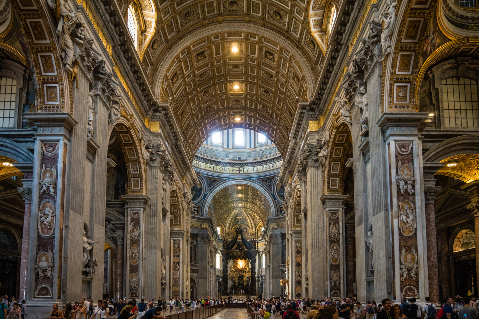
My upcycle aesthetic is minimalism combined with an organic shape, but I thought that the best comparison to the opposite to my upcycle would be to focus on the minimalist portion of that aesthetic. The first example of this that I found was that from the Baroque period and specifically Baroque architecture. The first example that came to my mind was St. Peter’s Basilica in Vatican City.

Unlike my knife block design, Baroque architecture is known for its flamboyant lines, as can be seen in the above image. We can see a massive nave that is lined with columns that each contain marble, frescoes, and gilded details, the epitome of excess.
Another example is the Victorian style, which can be seen in the St. Pancras Renaissance Hotel in London.
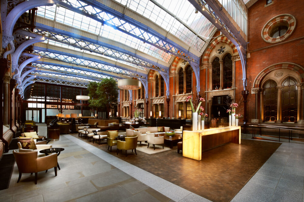
Much like St. Peter’s Basilica, the interior of St. Pancras is one that is quite busy. We can see this in the sheer number of colors that are present in the image above. The reds, silvers, browns, as well as the various lighting sources all draw our eye to many different places at once. This is in stark contrast to the minimalist aesthetic, which seeks to have one point of interest for the viewer (if any at all). This sense of business is further exacerbated by the various architectural touches that can be seen in this picture, such as the patterns on the ceiling trusses and the patterns on the arches. Even the floors are both patterned and have multiple colors and textures. All of this being said, the entire room does work well together and gives a sense of the timeless design aesthetic of the Victorian era. It still looks classy, even though it is extremely busy and is in complete opposition to my upcycle design aesthetic.
4 Comments. Leave new
Great job comparing aesthetics! I really appreciated the amount of research you put into this post and the examples you provided. I wonder if there’s any aspect of the baroque aesthetic that you might find interesting enough to incorporate into your project or any future projects?
Hey Juliette,
Thanks! When I think of what I would put into future projects, I think more towards my cello (I’ve been playing for over 10 years). There are some small inlays that are in it that I’ve always liked, especially the design of the F-holes (the little holes on either side of the instrument’s body). I think they’re both functional in that they help make the instrument sound better but also pretty. So some combination of those probably, if that makes any sense at all lol
Hi Josh, I love that you included these real work examples to help visualize this opposite aesthetic. If you had to redesign your knife block what elements of Baroque architecture would you use?
Hey Brandon,
I would probably use some kind of additional flourishes on the side of the wood. So either start with a blank piece of wood and then add a lot of spirals and curves or carve those into the wood itself 🙂